

This post is a summary of a talk the Windows Phone Design Team has given a couple times recently, on the history and the future of the Metro design language.
In November, myself and Albert Shum drove a few hours north to visit our friends at the Vancouver User Experience Meetup, to talk about Metro and the design philosophy behind Windows Phone. The beginning of the presentation traced the roots of the Windows Phone Metro design language, a topic we’ve spoken about at a number of developer conferences (Watch Albert at MIX 2010). From there, we decided to push the discussion a bit further this time, to look at where we see Metro going next. As you can imagine, this was a lot of fun. Our presentation was over an hour long and covered a lot of material, so rather than just posting the slides up, I’ll describe the talk in its four parts. First, the story of Metro. Second, a look back at the history of UI design. Third, visions of future UI design in Science Fiction. Fourth and finally, where we see UI (and Metro) headed in the future.
The story of Metro
A couple years ago the Windows Phone design team realized that the design path that Windows Mobile was on was not sustainable. Once we decided to reset the direction, we didn’t look towards other mobile or PC user interfaces for inspiration. Instead, we surrounded ourselves by what we considered to be the best examples of design work, from Josef Müller-Brockmann and other pioneers of the International Style, Massimo Vignelli’s design systems for the NY Subway Map and brands like American Airlines, to conceptual work by Experimental Jetset. Similar inspiration was being used in Windows Media Center, Zune, and Xbox. In addition to this visual inspiration for our art direction, we create a series of principles to guide the interaction design, motion design, and overall experience for the phone.

Our design principles were, and still are:
Clean, Light, Open and Fast
We took an approach that we call “Fierce Reduction” to remove any elements in the UI that we felt were unnecessary; both visual elements and feature bloat. It allows us to shine a focus on the primary tasks of the UI, and makes the UI feel smart, open, fast, and responsive.
Alive in Motion
The transitions between screens in a UI are as important the design of the screens themselves. Motion gives character to a UI, but also communicates the navigation system, which helps to improve usability.
Celebrate Typography
Our design inspiration is very typographic, and it felt like it was time for User Interfaces to be uncompromising about type as well. Type is information, type is beautiful.
Content, Not Chrome
It’s the content on the phone that people want, not the buttons. Reducing the visuals on the phone that aren’t content will help you create a more open UI, and it also promotes direct interaction with the content.
Authentically Digital
Finally, we believe in honesty in design. A user interface is created of pixels, so in Metro we try to avoid using the skeumorphic shading and glossiness used in some UI’s that try to mimic real world materials and objects.
So now that we’ve established Metro, where do we go next? To help us think about what the future of our experience is, we need to understand where we’ve come from.
Looking back
Before Metro, the UI of Windows Mobile 6.5 looked like most other software interfaces. How is it that most UI’s use the exact same metaphors and basically look the same? Well, we like to look back. Way back.
If we trace the history of modern User Interface, it all begins with Vannevar Bush’s Memex machine. In a 1945 letter to the editor in The Atlantic Monthly, Bush described a machine built in to a desk, that would allow its owner to store, annotate, and link documents and media. The interface to the desk was two displays; one would display information, and the other was a surface for taking notes, annotations, or linking to other material. The machine would help humans organize larger collections of knowledge, and is regarded by some as one of the original blueprints for the modern web. At the very least, the Memex was an important inspiration for the first computer designs at SRI and Xerox PARC, which are the foundation for the PC’s we use and live with today. In 1973, the first graphical user interface was built at PARC, using the desktop as a metaphor. The UI introduced windows, icons, menus, file management, and tool palettes. Looking back at the first screenshots of this first GUI, the designs feel familiar even now. In 1974 PARC developed a What-You-See-Is-What-You-Get cut & paste interface, and in 1975 the demonstrated pop-up menus. The desktop concept was pushed quite a bit further by 1981 in the commercial Xerox Star PC interface, which was an important influence for the PC UI’s created at Microsoft, Apple, NeXT, and Sun Microsystems in the 80’s and 90’s.

Fast forward years later to modern PC interfaces and you can see those same initial metaphors and design patterns have firmly cemented themselves. Icons – some which represent objects from the real world, and some which don’t – are rendered in increasingly greater detail. Media, like books, photos and music, are packaged and presented with outdated details, shading or textures to simulate the look and feel of real world artifacts. Some concept interfaces like Bumptop push the desktop metaphor deeper by adding a 3rd dimension to the desktop, and physics to the icons to allow them to move more realistically across the desk plane.
So here we are. The first interfaces were built on a need to communicate what they were. They were like a desk, but better. They were completely new, so an approach of direct representation was appropriate. Today it’s not necessary, and yet, it’s the path that most software interfaces seem to continue to follow. We don’t need to make an eBook look like a book for people to understand how to use it. The book isn’t the cover and binding, it’s the images and the text that make the story. With an increasing amount of digital content, we don’t have a good metaphor to render anymore – just information, text and images. What do you make a UI look like when it’s just information? That’s where we go next.
Design Fiction
It’s probably not surprising that most of the designers in our studio are fans of Science Fiction movies. Aside from the characters and plots, designers in our studio (myself included) get really excited at the user interfaces that are visualized in films. There’s been a lot of great discussion recently in the design community at large on this topic of Design Fiction: the design of products, interfaces, and other artifacts that we see in Science Fiction. The product and UI’s that are designed for film are important because by imagining the future without the constraints of current technology, the film-makers are really visualizing idealized interfaces for our present culture. These visions serve as a target for engineers to build towards, and educate audiences for the kinds of experiences they will have in the future.

When we look at the interfaces that Hollywood has forecast for us over the past 20 years, there are three clear trends. First, computer interfaces are no longer something that needs to be carefully explained to audiences, rather, they should push the imagination. Second, the time between a technology appearing and film and being available commercially is shrinking considerably. And third, the user interface becomes increasingly invisible. By that I mean, the interfaces in Science Fiction move away from existing on a computer to being layered over the environment. With that, the desktop metaphors and shaded buttons disappear. The interface surrounds us, lives with us, and augments our spaces. It’s just…information. When that information is an object, it’s an object. When it’s text, it’s text. There are no unnecessary elements.
Where Next
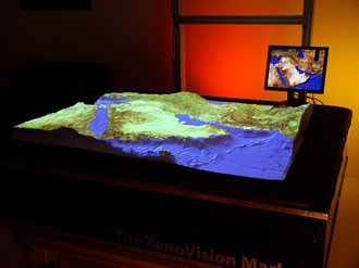
We believe that different inspiration leads to different results. Already we see how the interfaces in movies have inspired new products or interfaces that are currently being researched and developed. There’s the Microsoft Surface computer, which aimed to move software experiences on to the surfaces of more casual environments. In 2008, Esquire magazine published the first magazine with an e-ink cover; a nod to the digital newspaper in Minority Report (2002). The 3D table in the first Xmen movie (2000) was built by Xenotran in 2004. John Underkoffler, one of the visionaries behind the Minority Report interfaces, founded a company soon after to develop the gesture UI. Microsoft Kinect puts controller free gesture interaction in the living room for $149. Qwiki creates an information storytelling experience similar to the Artificial Intelligence aboard the ship in Pixar’s Wall-e, and Zebra Imaging is building 3D displays and prints that are a step towards those seen in the movie Avatar. For us, our inspiration for the future of interface lies in the information experiences visualized in films like Minority Report, Avatar, Star Trek, and Iron Man 2. We like the idea of information existing as it is without embellishment, seamlessly overlaying itself and complementing our environment, present when it needs to be and invisible when it doesn’t. It’s a vision that resonates well with the philosophy behind Metro.

Now back to the present
While we made a giant leap from Windows Mobile 6.5 to Windows Phone 7, our approach to where we go next with the design of Metro in the next few years will be a careful and considered evolution. Metro isn’t a new style designed for the sake of being different. It’s a foundation to build on for a long time to come. It’s our starting point for what we believe is the next era of user interface design, one that is focused on content over metaphors, information over tools, and movement over static pages. It’s a language designed to clearly augment the information around you, by removing the clutter around it.
The interfaces that we see in Science Fiction like Avatar and Iron Man 2 might be a few years off, but Metro feels like a good starting point to get us there.