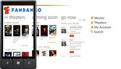
One of the requests I get most often from the developer community is “can you gave us good examples of panoramas”? As described in some of our previous posts the “panoramic control” also called “hub” or simply “panorama” offers a unique way to view content by using a long horizontal canvas that extends beyond the confines of the screen. This unique visualization model is a signature component of the WP platform and consequently of any app using it. Add the fact that, in the majority of cases, the panorama is where users land when entering an application, gives this control even more significance to the quality of your panorama control.
For starters, you should imagine your panorama as being similar to a magazine cover. As such, panoramas allow a user to explore content that highlights what is more relevant for them, and these highlights serve as an entry point to further action. The focus of the panorama should be on a small set of tasks that are fresh, dynamic, and compelling. The panorama should not to be the standalone interaction of your whole application, nor should they be overwhelming, dense, or all encompassing.
Based on these premises, I’m going to show some examples that follow well these recommendations.
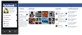
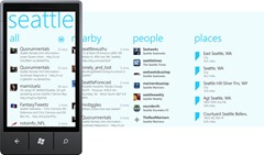
Facebook shows a good mix of sections format with the common denominator being the user interests relevance, same for Twitter although in this case the sections format are simple lists.
Using background images
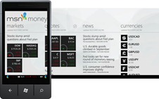
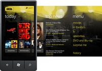
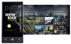
Panoramas can have a background image (fixed or updatable) that can help your app to reinforce brand attributes or just add a nicer touch to gain screen appeal. You can achieve this using a texture or pattern that contains brand assets or using photography. In both cases make sure the background gives enough contrast so the text and other assets are readable and not melted with the background image. The image should also be low on noise levels in order to not compete visually with the content.
The examples below are good examples of proper use of background images.
Tile formats
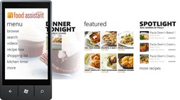
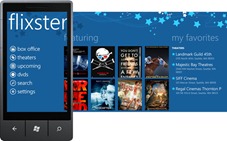
In most of the cases the hubs will contain tiles that serve as links to relevant content, that content goes from photography, people cards, news articles or movies to name a few. There are not too many restrictions on the use of tiles in your panorama. Almost any format can work as long as it follows a grid layout, rectangular shapes work well for movie posters, square shapes for portraits or close outs, panoramic views as header news or for landscape shots, even a mix of different sizes could work well as a collage style wall (check Facebook hub at the beginning of the post).
See below some examples using different size and format tiles.
How to use scrolling on different format sections
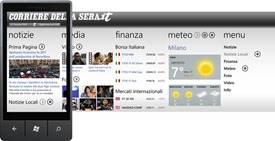
Note on some of the examples above that there is mixed ways of scrolling sections, the pictures section scrolls only horizontally and the text list ones vertically.
A section shouldn’t be able to scroll both ways, a common mistake we see in some hubs is sections containing tiles that expand vertically and horizontally that force the user to pan around instead of scrolling, panning results in an unexpected experience that breaks the user mental model not allowing them to visualize all the content within that section.
If you are developing an app where a panoramic control could be used feel free to get “inspired” by the examples seen in this post but if you have the resources or the talent and you come up with a format that is still usable but unique and original let me know, in an upcoming post we will showcase other examples that use the hub format in a more creative or unconventional way.
– Alfred Astort
Follow the Windows Phone Design Team on Twitter: @WPdesignteam

