At //build 2014 we introduced the ability to build universal Windows apps, which are able to share a large amount of code between Windows 8.1 and Windows Phone 8.1 projects. In particular, three sessions at //build discussed the important features for developers working with XAML:
- What about XAML UI and Controls? by Shawn Oster
- Quality and Performance for XAML Apps by Stefan Wick
- Animations in Windows Phone XAML Apps by Kunal Deep Singh and Rohan Thakkar
To follow up from those talks, we wanted to share with you the golflink sample app used for our demos and use it as a basis to share a number of tips and tricks for working with XAML controls in universal apps. For more background on XAML basics, refer to Create your first Windows Runtime app using C# or Visual Basic, Creating a UI (XAML), and Developing apps (XAML) in the documentation.
Adaptive UI
Sharing common pages
When sharing a page across Windows and Windows Phone projects, the first thing you must tackle is to ensure Windows has a software back button for in-app navigation and Windows Phone has a hardware back button for in-app navigation. The sample demonstrates a CommonPage.XAML and how to tackle the back button problem. We have done this using a separate user control, PageTitleUserControl.xaml, for Windows and Windows Phone that will be instantiated from the CommonPage in the shared project. You need to pass in a reference to the NavigationHelper for the back navigation.
public CommonPage()
{
this.InitializeComponent();
this.navigationHelper = new NavigationHelper(this);
this.InsertPageTitleUserControl();

this.navigationHelper.LoadState += navigationHelper_LoadState;
this.navigationHelper.SaveState += navigationHelper_SaveState;
}
private void InsertPageTitleUserControl()

    PageTitleUserControl pageTitle = new PageTitleUserControl(this.navigationHelper);
    pageTitle.PageTitle = "Common page";
    pageTitle.AppName = "APP NAME";
    rootGrid.Children.Add(pageTitle);
    Grid.SetRow(pageTitle, 0);
}
Sharing UserControls
UserControls can be different, like in the above sample, but be used in a shared page. The best and most common use is to have bunch of shared UserControls (think fragmentsJ) for common parts of the UI and use them for respective XAML pages (views). In the golflink sample, we could have used them more heavily. However, to demonstrate their usefulness, check out the SharedUserControlsProfileControl.xaml and its usage in HubPage.XAML.
Sharing Styles
Sometimes you have unique styles for respective frameworks and share them. This is a nice trick that can be very handy.
In golflink sample, WindowsStylesStyles.xaml has a resource dictionary with a set of unique styles that exist by default on Windows Phone 8.1’s generic.xaml. These styles (and maybe others) must be defined for Windows projects to be able to share the XAML with phone. Let us take a look at our example.
WindowsStylesStyles.xaml
<ResourceDictionary
xmlns="http://schemas.microsoft.com/winfx/2006/xaml/presentation"
xmlns:x="http://schemas.microsoft.com/winfx/2006/xaml"
xmlns:local="using:golflink.Styles">

<Style TargetType="TextBlock" x:Key="ListViewItemSubheaderTextBlockStyle">
<Setter Property="FontSize" Value="15"/>
<Setter Property="Margin" Value="0,6,0,0"/>
</Style>
<Style TargetType="TextBlock" x:Key="ListViewItemContentTextBlockStyle"/>
<Style TargetType="TextBlock" x:Key="ListViewItemTextBlockStyle"/>
<SolidColorBrush Color="Blue" x:Key="PhoneAccentBrush"/>
<SolidColorBrush Color="White" x:Key="PhoneForegroundBrush"/>
<x:Double x:Key="ContentControlFontSize">20.26</x:Double>
</ResourceDictionary>
ListViewItemSubHeaderTextBoxStyle does not currently exist on Windows 8.1 but it does on Phone 8.1. We define it here.
Similarly on the phone side we might require a style with a key shared with Windows to behave differently. We put it under PhoneStylesStyles.xaml.
Now, as you might imagine, these were styles unique to each project. The styles that are common to both projects are in shared project’s app.xaml (SharedApp.xaml).
Here, you will also merge the Styles.xaml’s resource dictionary using the highlighted mark up:
<Application
x:Class="golflink.App"
xmlns="http://schemas.microsoft.com/winfx/2006/xaml/presentation"
xmlns:x="http://schemas.microsoft.com/winfx/2006/xaml"
xmlns:local="using:golflink"
xmlns:localData="using:Shared">

<Application.Resources>
<!-- Application-specific resources -->
<ResourceDictionary>
<ResourceDictionary.MergedDictionaries>
<ResourceDictionary Source="/Styles/Styles.xaml"/>
</ResourceDictionary.MergedDictionaries>
<x:Double x:Key="largeCellHeightPercent">0.392</x:Double>
<x:Double x:Key="largeCellWidthPercent">0.392</x:Double>


<x:Double x:Key="mediumCellHeightPercent">0.205</x:Double>
<x:Double x:Key="mediumCellWidthPercent">0.205</x:Double>

<x:Double x:Key="smallCellHeightPercent">0.138</x:Double>
<x:Double x:Key="smallCellWidthPercent">0.138</x:Double>
</ResourceDictionary>
</Application.Resources>
</Application>
The end result is a nice way to merge dictionaries and share styles where appropriate.
Window-based width adaption
Sometimes you want to set the width of certain controls to be relative to the window size (or dimensions of the device). For example, on phone, a HubSections width should ideally be 90% of window width. The percentage-based dimensions can be handy at many places, and here we describe simple steps on how to achieve the goal using behaviors. An important note here is that one might get carried away and use percentage-based width/height everywhere, but you should step back and realize the need for it. Existing layout primitives like Grid/StackPanel coupled with alignment properties provide a pretty powerful adaptive UI mechanism. So, the take away is use WindowDimensionBehavior for percentage-based widths only when you absolutely cannot use Grid/StackPanel. Here is how you would do it:
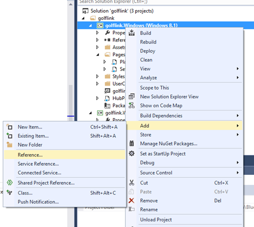
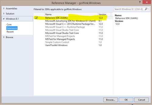
Step 1. Add Behaviors SDK. Right-click both projects Windows/Windows Phone individually and add reference. Select Extensions SDK -> Behaviors SDK.
Step 2. Create a shared Helper class, WindowDimensionBehavior.cs:
using Microsoft.XAML.Interactivity;
using Windows.UI.XAML;
using Windows.UI.XAML.Controls;

namespace golflink.Helpers
{

    [Microsoft.XAML.Interactivity.TypeConstraint(typeof(FrameworkElement))]
class WindowDimensionBehavior : DependencyObject, IBehavior
    {
public WindowDimensionBehavior()
        {
this.WidthMultiple = 1;
this.HeightMultiple = 1;
this.HeightPercentage = double.NaN;
this.WidthPercentage = double.NaN;
        }
public DependencyObject AssociatedObject { get; set; }

public FrameworkElement TypedObject { get; set; }
public int WidthMultiple { get; set; }

public double WidthPercentage { get; set; }

public int HeightMultiple { get; set; }

public double HeightPercentage { get; set; }

public void Attach(DependencyObject associatedObject)
        {
this.AssociatedObject = this.TypedObject = associatedObject as FrameworkElement;

this.TypedObject.Loaded += TypedObject_Loaded;
            Window.Current.SizeChanged +=Current_SizeChanged;

        }

void TypedObject_Loaded(object sender, RoutedEventArgs e)
        {
            Handle();
        }

void Current_SizeChanged(object sender, Windows.UI.Core.WindowSizeChangedEventArgs e)
        {
            Handle();
        }

private void Handle()
        {
            var frameWorkElement = (this.TypedObject as FrameworkElement);

//I base all the percentage calculations on shortest dimension, you can modify this depending on your layouts requirements.
double shortestDimension = (Window.Current.Bounds.Width <= Window.Current.Bounds.Height) ?
                Window.Current.Bounds.Width : Window.Current.Bounds.Height;

if (frameWorkElement != null)
            {
if(this.WidthPercentage!=double.NaN)
                frameWorkElement.Width = shortestDimension * this.WidthPercentage * this.WidthMultiple;
if(this.HeightPercentage!=double.NaN)
                frameWorkElement.Height = shortestDimension * this.HeightPercentage * this.HeightMultiple;
            }
        }

public void Detach()
        {
            Window.Current.SizeChanged -= Current_SizeChanged;
            (this.AssociatedObject as Control).Loaded -= TypedObject_Loaded;

        }
    }
}
Step 3. Use it in XAML
Don’t forget to add xmlns reference:
xmlns:Interactivity="using:Microsoft.XAML.Interactivity"
Then in the actual Hub section where you want to make the width twice of 90% of the window width:
<HubSection  x:Uid="Section2Header" Header="MY GAME" DataContext="{Binding Profile}">
<Interactivity:Interaction.Behaviors>
<helpers:WindowDimensionBehavior WidthMultiple="2" WidthPercentage="0.9"/>
</Interactivity:Interaction.Behaviors>
<DataTemplate>
And use it responsibly.
Revisiting the goodness of layout primitives (Grid/StackPanel)
The WindowsPlayers.xaml page makes almost no use of the WindowDimensionBehavior mentioned above. 99% of the layout is done using basic layout primitives like Grid, StackPanel, ListView and GridView. Make good use of the HorizontalAlignment/VerticalAlignment and HorizontalContentAlignment/VerticalContentAlignment properties coupled with the magic of Grid’s “star” capabilities.
On the other hand, on the Phone’s Players.xaml page, we have extensively used behaviors (not recommended, but left there for comparison).
Viewbox
This can be handy at times when you want the text font to scale with window dimension. We used it in a couple of places in the project (an exercise for you to search and learn why; let us know if you think of other ways to achieve the same desired scenario). Just knowing that this control exists for your layout magic is super useful.
VisualStateManager
Use it along with the Window_SizeChanged event to swap out item templates or show/hide different controls on your layout. Unfortunately, we haven’t used it in our demo app. However, there is nothing new or fancy here to demonstrate. XAML experts know the power of VSM. Folks who are not familiar with VSM can take a look at Quickstart: Designing apps for different window sizes.
Test test test…
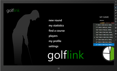
Universal apps will have a massively diverse dimensional reach. It is very important to test your app’s layouts in different resolutions and dimensions. Remember, width is not the only thing that varies. Height also varies significantly. An easy way to test is using Simulator for Windows and Emulator for phone or the designer.
The Golflink app has bugs; we could not fix all of them. Curious readers can try and see which layouts have problems.
Specific common controls but different behaviors
Hub
Windows Store Apps using XAML Hub share the same API as Windows Hub, but it looks and feels like the Phone 8.0 Panorama. When authoring an app using Phone Hub here are a few things to note or do differently.
- HubSection’s width is by default set to 90% of window width. If the content of the section is wider than this, it will get clipped.
- If you want the HubSection to expand to match the width of the content, you need to set the width of HubSection to Auto
<HubSection Width="Auto"/>
-
The recommended way to have a wide HubSection is to make the section’s width equal to a multiple of 90% of the window width. There are different ways to achieve this. In the sample we have used behaviors (recommendation from Jerry Nixon, thanks!) and shared a behavior class to achieve this. Check the adaptive UI section for step-by-step instructions on how to use WindowDimensionBehavior.cs.
- Use the Hub.SectionsInViewChanged event to identify SectionsInView. This is a replacement for the 8.0 Panorama.SelectionChanged event and SelectedIndex. In the golflink sample we have used it to show/hide app bar for “recent” section.
- Hub is designed to be used with Orientation=”horizontal” ONLY. Do not use it in Orientation=”vertical”.
private void Hub_SectionsInViewChanged(object sender, SectionsInViewChangedEventArgs e)
{
if(Hub.SectionsInView!=null && Hub.SectionsInView.Count>0)
if(Hub.SectionsInView[0].Name=="recent")
    {
        appBar.ClosedDisplayMode = AppBarClosedDisplayMode.Compact;
        (appBar.PrimaryCommands[0] as AppBarButton).Visibility = Windows.UI.XAML.Visibility.Visible;
    }
else
    {
        appBar.ClosedDisplayMode = AppBarClosedDisplayMode.Minimal;
        (appBar.PrimaryCommands[0] as AppBarButton).Visibility = Windows.UI.XAML.Visibility.Collapsed;
    }
}
Tip: Two section Hubs don’t wrap. This is by design. Having a Hub with fewer than three sections is not recommended UX and supporting wrapping for two section Hubs was very expensive.
SemanticZoom
SemanticZoom is available on both platforms but the interaction model varies significantly.
Windows behavior
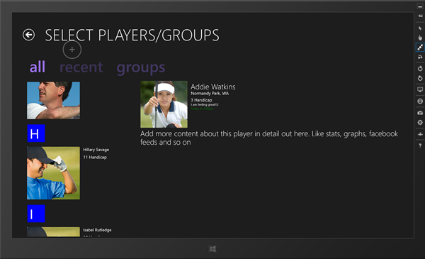
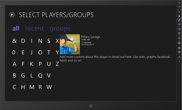
It is the same as you know on Windows 8.1. You pinch on the ListView/GridView within a SemanticZoom to get the zoomed out view. Our sample uses SemanticZoom in Players.XAML
After you pinch the contacts you get the ZoomedOut view:
Windows Phone behavior
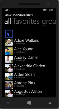
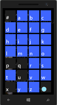
In the phone world, this used to be referred to as a JumpList in LongListSelector, and you invoke it by tapping on the group headers. Interaction for it stays the same. When the user taps the group header, SemanticZoom.ZoomedOutView is invoked with an animation similar to native phone jumplists. Here is an image to remind you what we are talking about. A sample for this is available in golflink.Phone project’s Players.xaml “all” players pivot item. Justification for the divergent interaction model has been that tablets are two-handed devices where the device is held with one hand and the screen is pinched with the other whereas phones are one-handed devices, and to invoke the zoomed out view (jump list) you only need to tap on the group header.
Tip: For the Listview on Windows Phone 8.1 XAML, do not forget to add a width to the ListView item template to avoid a horizontal bouncing bug. Check the sample comments in Players.XAML
DatePicker/TimePicker
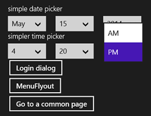
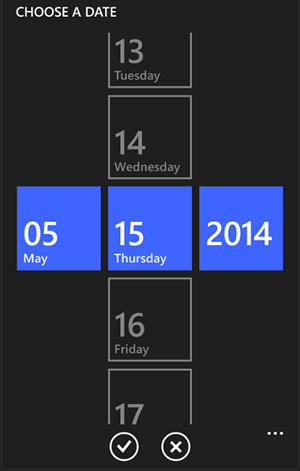
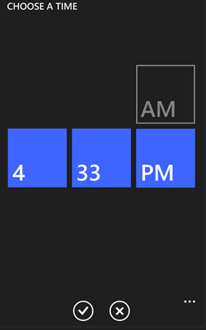
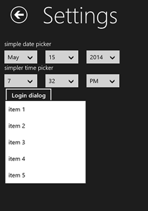
DatePicker and TimePicker APIs are both available on the Windows 8.1 and Windows Phone 8.1 XAML stack, but they look and interact differently. Settings.XAML includes a basic sample. Here are a few screenshots.
Windows behavior
Windows Phone behavior
ComboBox
Windows behavior
Windows Phone behavior
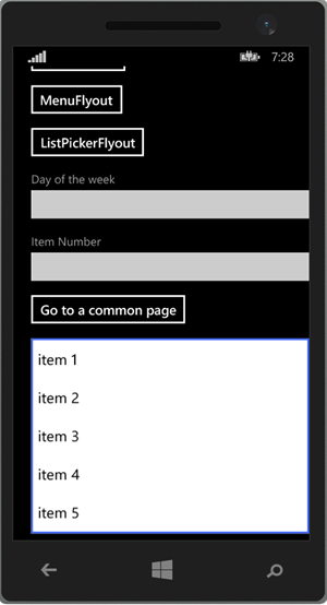
The Phone ComboBox item list expands in place when there are up to five items, but will turn into a picker flyout for more than five items.
MenuFlyout
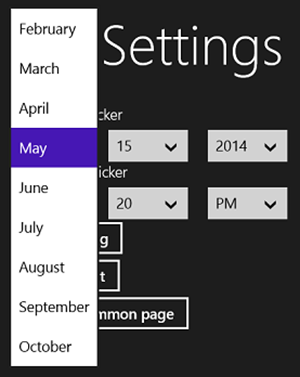
Similar to DatePicker/TimePicker. The experience for MenuFlyout is unique to each OS. The sample is in Settings.XAML page.
Windows behavior
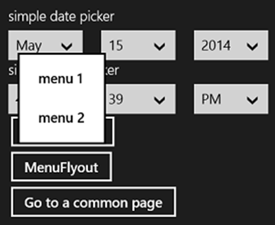
On Windows it’s a simple flyout with menu items.
Windows Phone behavior
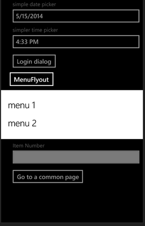
Windows Phone has an “elevator/escalator” animation (similar to ContextMenu from WPToolkit).
Phone-only control APIs
There are a few controls that we added after Windows 8.1 shipped that are only a part of the Windows Phone 8.1 stack (for now, yes, we understand and feel the pain of divergence).
Listview/Gridview additional properties
Converters for zoomed out view (jumplist)
JumpListItemBackgroundConverter/JumpListItemForegroundConverter helps with setting the right colors for the Jumplist (zoomed out semantic zoom view). Used in Player.xaml’s “all” pivot item.
ReorderMode
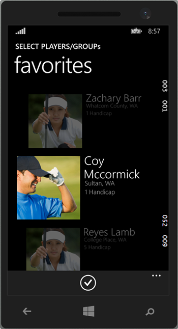
It is very easy to invoke reorder mode now. All you need is a two-way binding with the collection on your ListView and then Enable/Disable this property on the ListView. You will see the usage on Windows Phone’s Players.xaml page (“favorites” pivot item).
However, there is no ReorderMode_changed event, so you need to use data binding to get the state changes of ReorderMode. Here is how we have done it in the app:
Players.xaml
<Page
x:Class="golflink.Pages.Players"
xmlns="http://schemas.microsoft.com/winfx/2006/xaml/presentation"
xmlns:x="http://schemas.microsoft.com/winfx/2006/xaml"
xmlns:local="using:golflink.Pages"
xmlns:d="http://schemas.microsoft.com/expression/blend/2008"
xmlns:mc="http://schemas.openxmlformats.org/markup-compatibility/2006"
xmlns:prim="using:Windows.UI.XAML.Controls.Primitives"
xmlns:Interactivity="using:Microsoft.XAML.Interactivity"
xmlns:helpers="using:golflink.Helpers"
mc:Ignorable="d" Name="rootPage">
<ListView Name="favoritesListView" ItemsSource="{Binding RecentPlayers}"
ReorderMode="{Binding ReorderMode, ElementName=rootPage, Mode=TwoWay}"
ItemTemplate="{StaticResource RecentListViewItemTemplate}">
</ListView>
Players.xaml.cs code behind
public sealed partial class Players : Page, INotifyPropertyChanged
{
//other usual methods

private void editAppBarButton_Click(object sender, RoutedEventArgs e)
    {
this.ReorderMode = ListViewReorderMode.Enabled;
        ReorderModeChanged();
    }

private void acceptAppBarButton_Click(object sender, RoutedEventArgs e)
    {
this.ReorderMode = ListViewReorderMode.Disabled;
        ReorderModeChanged();
    }

private void ReorderModeChanged()
    {
if(this.ReorderMode == ListViewReorderMode.Enabled)
        {
            playerPivot.IsLocked = true;//lock the pivot
            editAppBarButton.Visibility = Windows.UI.XAML.Visibility.Collapsed;
            acceptAppBarButton.Visibility = Windows.UI.XAML.Visibility.Visible;
        }
else
        {
            playerPivot.IsLocked = false;
            editAppBarButton.Visibility = Windows.UI.XAML.Visibility.Visible;
            acceptAppBarButton.Visibility = Windows.UI.XAML.Visibility.Collapsed;
        }
    }

private ListViewReorderMode _reorderMode = ListViewReorderMode.Disabled;
public ListViewReorderMode ReorderMode
    {
        get
        {
return _reorderMode;
        }
        set
        {
if (_reorderMode != value)
            {
                _reorderMode = value;
                NotifyPropertyChanged();
this.ReorderModeChanged();
            }
        }
    }

public event PropertyChangedEventHandler PropertyChanged;
private void NotifyPropertyChanged([CallerMemberName] string propertyName = "")
    {
        PropertyChangedEventHandler handler = PropertyChanged;
if (null != handler)
        {
            handler(this, new PropertyChangedEventArgs(propertyName));
        }
    }
}
Pivot
Pivot for Windows Phone 8.1 XAML shares the same behavior as Windows Phone 8.0, but the API is not available in Windows 8.1 XAML. This makes it tricky to share the page across the two projects in universal apps.
In our example, we have two separate XAML files. The Phone side uses the Pivot and the Windows side uses a custom design implementation that suits the app’s content.
The Pivot API in Windows Phone 8.1 XAML SDK is same as the Silverlight 8.0 Pivot API. One delightful feature that was included was Pivot.SlideInAnimationGroup=”GroupOne”. The intent of this property is to slide in FrameworkElements when the selected PivotItem changes. All the elements in a group slide in together and you can have three different levels (groups). Use it responsibly. Check out Phone’s Players.xaml for the usage example.
StatusBar, margins on pages and headers
StatusBar (System tray) is now always visible on Windows Phone 8.1 unless explicitly hidden. Its opacity is set to 0. To explain this part, let us define CoreWindowBounds as the screen window, the size of the phone window in logical pixels. VisibleBounds is the size of the visible region of the window (CoreWindowBounds minus size of StatusBar+AppBar).
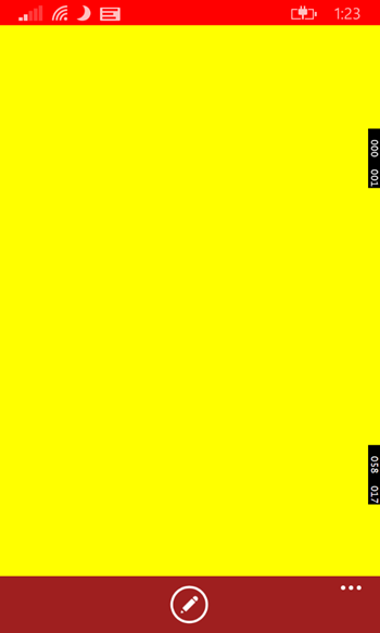
By default, the page’s content takes the VisibleBounds, however the page background, when set, takes the CoreWindowBounds. If you set a background on the page, it goes all the way from top to bottom, behind the app bar and status bar. But the content of the page stays in the visible region.
To be clear, let’s look at the basic XAML below:
<Page
x:Class="App29.MainPage"
xmlns="http://schemas.microsoft.com/winfx/2006/xaml/presentation"
xmlns:x="http://schemas.microsoft.com/winfx/2006/xaml"
xmlns:local="using:App29"
xmlns:d="http://schemas.microsoft.com/expression/blend/2008"
xmlns:mc="http://schemas.openxmlformats.org/markup-compatibility/2006"
mc:Ignorable="d"
Background="Red">

<Grid Background="Yellow">

</Grid>
<Page.BottomAppBar>
<CommandBar Name="appBar" Visibility="Visible" Opacity="0.5">
<CommandBar.PrimaryCommands>
<AppBarButton Icon="Edit"
Label="edit" Name="editAppBarButton"/>
</CommandBar.PrimaryCommands>
</CommandBar>
</Page.BottomAppBar>
</Page>
This is the result of the page:
This is good. Now you don’t need to worry about the content of the page being occluded by either StatusBar or AppBar.
Additionally, Pivot/Hub templates already offset their respective headers to account for a visible/hidden StatusBar, so you don’t need to worry about it.
Tip: You should be careful when toggling the state of the appbar’s ClosedDisplayMode as it resizes the content and could result in the page jumping. We recommend toggling the state of the appbar only when you have a ScrollViewer on that particular page (or HubSection or PivotItem).
Then, unfortunately, one of the scenarios was not caught earlier. It is better that we list the workaround here than to have you go through an ordeal trying to fix the issue.
If you have a Jumplist (SemanticZoom) as a child of a PivotItem/HubSection, the transition is not smooth from the ZoomedOut to ZoomedIn view because of this margin adjustment and because the Jumplist hides the StatusBar automatically. The workaround here is to disable the page resizing. It is important to note that this is a global, app-wide setting. So don’t forget to re-enable VisibleWindow when you leave the page.
protected override void OnNavigatedTo(NavigationEventArgs e)
{
    navigationHelper.OnNavigatedTo(e);
    (Windows.UI.ViewManagement.ApplicationView.GetForCurrentView()).
SetDesiredBoundsMode(Windows.UI.ViewManagement.ApplicationViewBoundsMode.UseCoreWindow);
}

protected override void OnNavigatedFrom(NavigationEventArgs e)
{
    (Windows.UI.ViewManagement.ApplicationView.GetForCurrentView()).
SetDesiredBoundsMode(Windows.UI.ViewManagement.ApplicationViewBoundsMode.UseVisible);
    navigationHelper.OnNavigatedFrom(e);
}
The PivotHeaders are fine and in place. All you need to do is ensure your content is not occluded by the AppBar (CommandBar). Add compensation padding at the end of the content to account for the app bar. In our case, we do it using the footer property on ListView:
<ListView.FooterTemplate>
<DataTemplate>
<Rectangle Fill="Transparent" Height="60"/>
</DataTemplate>
</ListView.FooterTemplate>
ContentDialog
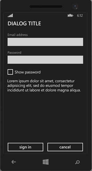
This is a custom message dialog with phone dialog UX that is completely customizable. You can also cancel the closing of the dialog if the result of the dialog is not to your app’s liking (example terms and conditions are not accepted).
A basic sample can be found on settings.xaml page for phone project.
AutoSuggestBox
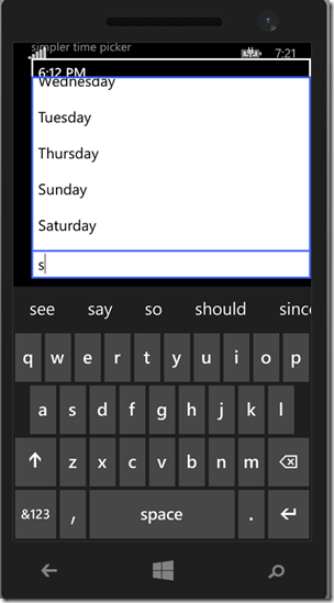
The Windows 8.1 functionality equivalent for this would be SearchBox, which allows you to do suggestions. AutoSuggestBox is lightweight, without Search integration, and suggestions in a list with ItemsControl. A sample can be found on Settings.xaml page for phone.
ListPickerFlyout
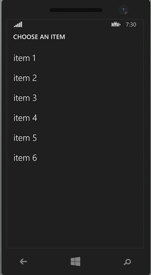
Unique to Windows Phone, you can now have ListPickerFlyouts to display a list of content in a pop-up-like fullscreen window. Sample usage in Settings.xaml of phone project
Animations
The talk on animation at //build pretty much covered everything. The sample demonstrates the usage from the talk. Here is a brief summary:
- All the animations existing on Windows also exist on Phone. Some might be modified for phone UX (for example, PointerDownThemeAnimation is more like the tilt effect on phone; refer to the Profile.xaml usercontrol sample).
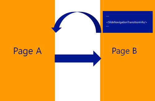
- Phone has added a new concept of NavigationThemeTransitions on pages. There are three different types of navigation animations: CommonNavigationTransitionInfo (default turnstile animation), SlideInNavigationTransitionInfo and ContinuumNavigationTransitionInfo. These are all covered in the animations talk and used in the sample. This could be a differentiating factor between a four star and a five star app. For more details refer to Kunal’s talk from Build – Animations in Windows Phone XAML Apps
- Here is an example of how to define it:
<Page.Transitions>
<TransitionCollection>
<NavigationThemeTransition>
<NavigationThemeTransition.DefaultNavigationTransitionInfo>
<CommonNavigationTransitionInfoSlideNavigationTransitionInfo/>
</NavigationThemeTransition.DefaultNavigationTransitionInfo>
</NavigationThemeTransition>
</TransitionCollection>
</Page.Transitions>
When going from page A to page B, the framework plays the animation as defined on page B. And then, when navigating back from page B to page A, the framework will play the right animation contextual to the navigation (example – in this case slide-out page B).
XAMLToolkit
Almost everything that was in WPToolkit is now part of the Universal XAML framework. What are you looking for in XAMLToolkit? We really want to know. Your feedback helps us prioritize the work we do.
Conclusion
Phew. . . that was a lot of content. We have worked really hard to provide this level of convergence in universal apps. We know it is not 100% perfect but it’s a step in the right direction. We hope this post helped you get past a few glitches you might have encountered when writing your universal app.
Thank you for reading this far and feel free to reach out with questions in comments or directly

