


What is your favorite color? Most of us have been asked this question for as long as we can remember. And for most of us, this decision probably marked our first and foundational experience with having an artistic preference.
Color matters. Previous posts have touched briefly on topics that have an artistic and a scientific side, such as typography and iconography. But whereas the effects of typography and iconography are subtle, the colors in your app have an immediate, emotional impact on your users.
Today’s post will deal with this emotional element of color in UX design, general rules of thumb for combining color, accessibility issues to consider, and finally, tips for finding the right colors to suit your specific app.
Color and emotion
Colors have an instantaneous effect on the brain and human emotion. Green rooms tend to make people feel calmer while red has been shown to enhance physical reactions. Although the influence of specific colors tends to vary depending on context as well as cultural background, the anecdotal evidence that certain colors can be used to influence people has been convincing enough that advertisers and product companies take color very seriously.
Here are some color attributes you should be familiar with:
- Red is a vibrant and activating color associated with passion and danger.
- Orange evokes nature as well as energy.
- Yellow projects joy, intelligence, and positivity.
- Green suggests renewal and is often found in financial apps.
- Brown is natural and organic and can often serve as a good contrast for more vibrant colors.
- Blue is often used to project calmness, security, and professionalism.
- Violet evokes royalty and luxury.
These attributes should be taken as guidelines only. The meaning of a color can shift dramatically depending on the other colors combined with it and the context and imagery it’s associated with in your app. If you are interested in a deeper dive into the relationship between color and emotions, you may want to explore the Color In Motion website.
Color theory
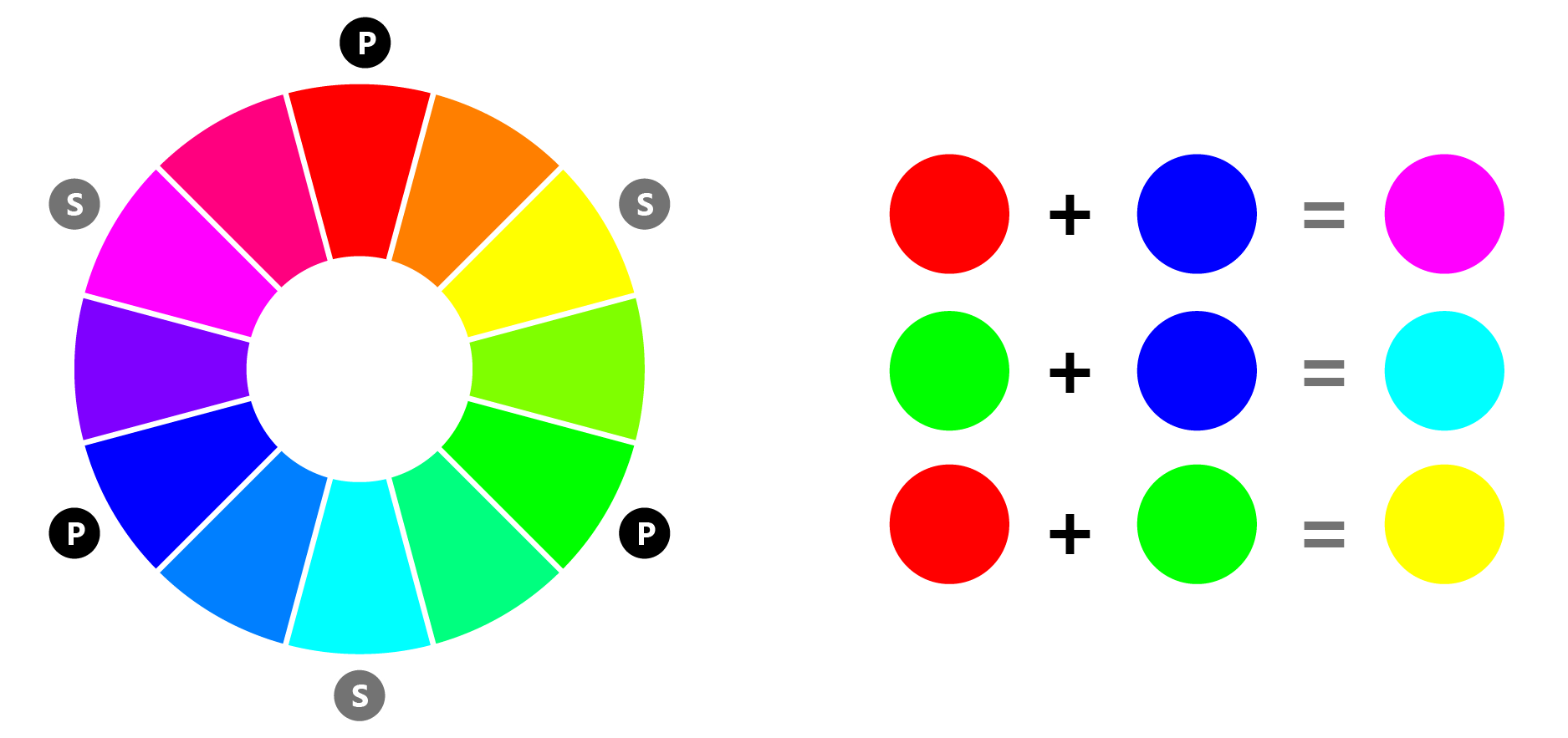
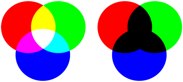
Isaac Newton came up with modern color theory and even created the modern color wheel. You probably discovered color theory on your own, though, using finger paints and crayons. There are three primary colors: red, green, and blue. By combining these in an additive system, we can get three secondary colors:
- red + blue = violet
- green + blue = cyan
- red + green = yellow
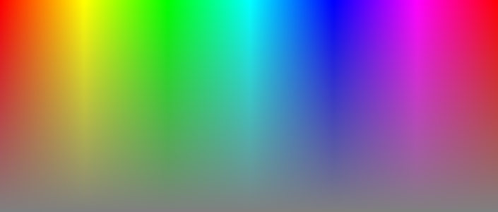
When you combine all these colors in an additive system, you get white (left). In a subtractive color model, like finger painting, mixing all your colors gives you black (right).
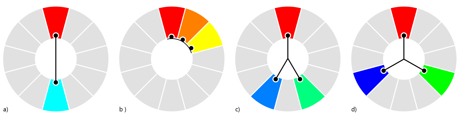
Colors can be placed on a wheel, as Newton did, with the secondary colors placed between the primary colors. This is a natural way to position colors and highlights some interesting relationships:
- Complementary colors (a). Colors that are directly opposite each other on the color wheel.
- Analogous colors (b). Colors on either side of a given color on the wheel.
- Split complementary colors (c). Colors that are the analogous colors of a complementary color.
- Triad colors (d). A set of three colors that are equally spaced apart on the wheel, each 120 degrees from the others.
Colors are also divided into warm and cool tones. The distinction between warm and cool colors is related to the anecdotal effects of color on the emotions discussed above. The warm colors extend from yellows at one end to reds at the other. The cool tones are blues, greens, and violets. Colors such as black, white, and the grays are neither warm nor cool. Instead, they are known as neutral colors. The remaining shades—such as browns, tans, and pastels—are called near neutrals.
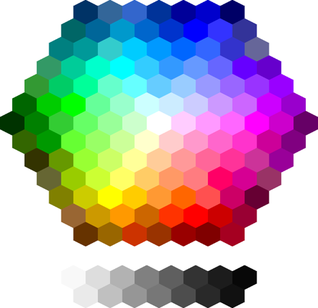
UWP color codes are based around the red, green, and blue (RBG) model of color creation—and so are computer screens, for that matter. Any color on the wheel can be derived from a value from 0-255 for each primary color component for a total of 16,777,216 colors.
Tip: Xbox knocks off the ends of the spectrum, supporting somewhat fewer color choices. HoloLens can’t use pitch black (0, 0, 0) because this represents transparency in Windows Holographic.
Because you will occasionally encounter it, you should also become familiar with the HSL system, which stands for hue, saturation, and lightness. It offers a different mathematical model for representing colors. HSL (as well as a variant called HSV) is popular with graphics programmers and is probably already known to you if you’ve ever used a color picker. A hue can be thought of as a pure color. Saturation is how intense the hue is. A lightness of 100% applied to a hue gives you white, whereas a 50% lightness gives you the pure hue.
Color contrast and accessibility
Contrast describes how far apart two colors appear to be. It is important for an app with text because a high contrast will make your app easier to read. It is also important for your visual hierarchy, since high contrast will more clearly differentiate different areas of your layout.
So far, contrast seems like just an aesthetic problem. Contrast becomes an accessibility problem, however, when your app is used by people with poor vision or by people who are color blind. Color vision deficiency affects 8 percent of men and 0.5 percent of women worldwide. Because of this, color contrast isn’t something you can ignore.

There are two ways to evaluate the color contrast in your app. One way is to desaturate your colors until they are effectively grayscale. If your text is still readable and your visual groupings are still clear, then your color contrast is effective. Alternatively, you can use a color contrast analysis tool, like this one on colorsontheweb.com, to plug in your color values and receive an immediate evaluation of your Universal Windows Platform (UWP) app’s visibility.
Color schemes
There’s a lot of background that goes into understanding color and using colors effectively. Fortunately, there’s a shortcut to all of this color stuff that you can start using right away. Adobe provides a free tool at https://color.adobe.com that will allow you to quickly pick a color scheme that you like.
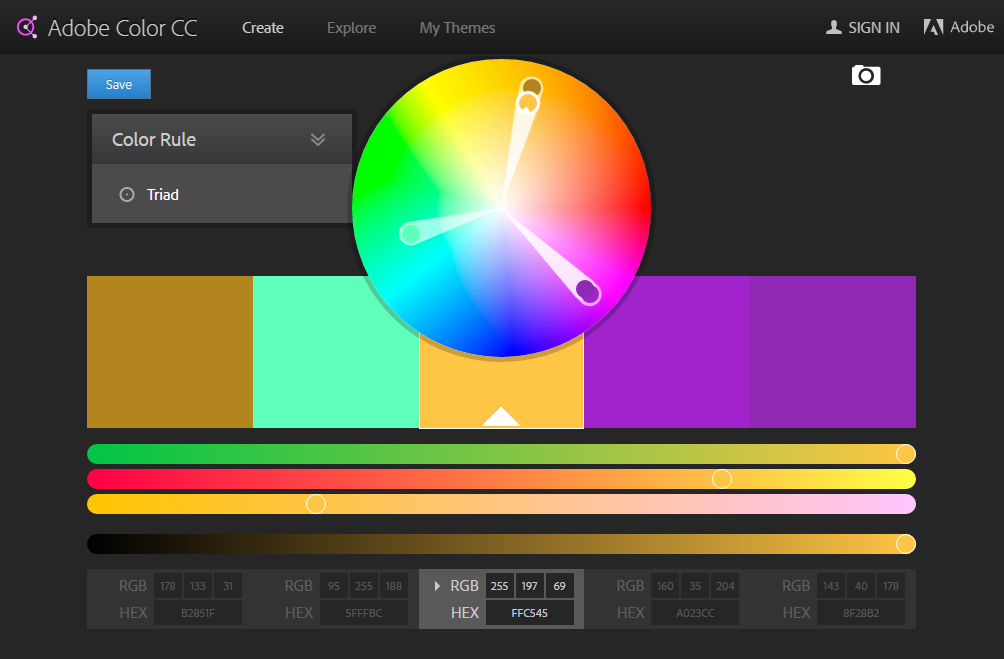
This color app will let you select any of the color relationships discussed in the color theory section above to select your color scheme: triad, complementary, analogous, or split complementary. It will then give you the color values for this color scheme at the bottom as both RGB and HEX values, which you can then plug into your UWP app. All you need to do is start with a dominant theme color that will create the right emotional context for your app using the descriptions in the color and emotions section. You can also play around with the tool until you find a main color that appeals to you and reflects the purpose of your app.
Wrapping up
We each have an intuitive understanding of how colors affect us emotionally. The goal of this post has been to provide you with the confidence to trust your own instincts when it comes to hues. With the color concepts provided in this post, you as a developer are in a position to better understand why you prefer one set of colors over another and are well equipped to have informed discussions about color schemes based on color psychology, color theory and accessibility.
Download Visual Studio to get started.