A web browser is a must-have feature of any modern smartphone, and yet many people probably don’t give it a second thought. My job on the Windows Phone Engineering team, on the other hand, is to think about phone browsers all day long and specifically how to make surfing on a small screen a more enjoyable experience.
If you already own a Windows Phone, you’ll notice we’ve made a few major changes to the look of Internet Explorer 9 Mobile, our new browser coming in Mango. The biggest change is that we’ve moved the address bar to the bottom of the screen. When we first showed off this new look several months ago, it sparked some chatter. (I like to tell people we traded in our old browser for a convertible and took off the top).
Today I’ll give you the inside scoop on how we arrived at this new design and talk about what else is new in Internet Explorer 9 Mobile.
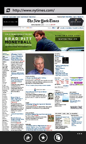
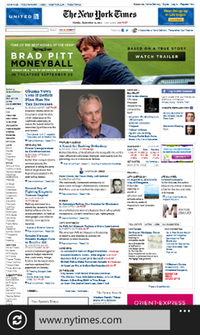
Internet Explorer Mobile in Windows Phone 7 (left), and in Windows Phone 7.5 (right)
What’s new in Mango
Before I talk about the visible changes to the browser in Mango (aka Windows Phone 7.5), let me briefly tell you about a few important under-the-hood updates that aren’t so obvious.
Probably the most important change is that the browser in Mango now shares its “engine” with Internet Explorer 9, Microsoft’s advanced PC browser. As a result, it can now tap into your phone’s built-in graphics processor to make web-based video and animation run faster and smoother. It also has a faster JavaScript engine and supports cutting-edge web standards like HTML5. (For more on standards support, check out today’s post on the Developer blog.)
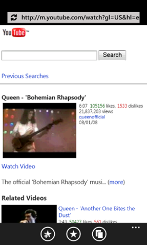
It’s up to web developers to take advantage of these new standards, of course. But when they do, the results on your phone can be really cool. YouTube, for example, recently upgraded its mobile site to be HTML5 compatible. One benefit: In Mango, you’ll be able to watch videos on the site without a dedicated app. This is just the beginning of what you’ll see as more sites embrace the new standards.
YouTube shown on Windows Phone 7 (left), and on Windows Phone 7.5 (right)
More web, less browser
Back to the new design. When we were planning for Mango and the next version of our phone’s browser, we took a lot of inspiration from the team building Internet Explorer 9. Their design philosophy was “sites in the spotlight.” In other words, they wanted to build a faster, more minimal browser that stripped away needless visual distractions.
That mission resonated well with my team and the overall Windows Phone design philosophy of “content not chrome”. So we also decided to press forward with a simple, clean interface that provides faster access to the sites you care about and more space to view and interact with them. Bottom line: We wanted to create a browser that didn’t constrain the web.
We were really energized by this goal, yet it presented some unique challenges. On a desktop PC, there’s quite a bit of screen real estate to work with. You also have a mouse and keyboard, which allow for shortcuts and precise clicks.
A smartphone, on the other hand, has a much smaller display, and buttons need to be large enough for you to comfortably tap with your fingers while you’re on the move. We wanted to carve out more space for the web, but we also wanted to make sure you could still navigate and get to key browser features (like the address bar) quickly.
How people use the browser
We thought could achieve both of these goals. But which buttons could we safely move out of the way? To find out, we looked at the anonymous usage data that some Windows Phone owners voluntarily submit to us.
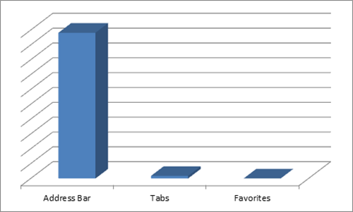
Not surprisingly, we found that people spend most of their time simply viewing and interacting with the websites they visit (reaffirming our belief that putting sites in the spotlight was the right design goal). The address bar—which doubles as a search box—was the most frequently used browser feature.
One big surprise was that that the favorites and tabs buttons were used much less frequently, even though they were front and center on the screen. Here’s a chart of the usage data that shows what I mean:
The end result
After establishing a goal, analyzing data from real users, and observing people holding their phones, we were at a crossroads. Design always involves tradeoffs. Since our primary goal in Mango was to put the focus on websites, we decided to move the address bar down into the app bar, and turn the favorites and tabs buttons into menu options.
That wasn’t all. We also heard from Windows Phone 7 owners that the refresh/stop button was difficult to tap, so we enlarged it and moved it out of the address bar. We also chose to hide the phone status info—time, signal strength, battery life indicator—to make the browser feel less “boxed in” and provide even more room for web content.
The result is quick, comfortable access to the address bar (given how most users hold their phone) and noticeably more space for web sites. You can see the striking difference in the New York Times screenshots above.
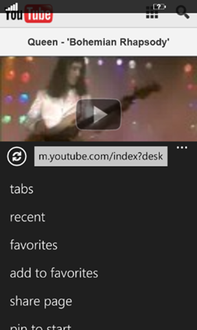
We do realize that some people love tabs and favorites (including some people on our team!) and would miss the buttons. So we decided to place them at the top of the menu for easy access. Here’s how the new menu looks:
We hope you enjoy the cleaner, more site-centric Internet Explorer 9 Mobile coming in Mango and would love to hear your questions and feedback in the comments below.
Amin Lakhani, Program Manager, Windows Phone

