This blog post is part of a series of guest posts we’re publishing this week from different people in groups across Microsoft who helped us build Windows 8.1. – Brandon
Hey all, Alex Garden here. I’m the general manager for Xbox MVR, which stands for Music, Video and Reading. The Windows team invited me to highlight the work our team has put into Windows 8.1, specifically the awesome enhancements we’ve made and are continuing to make with Xbox Music & Video. Our team has a long history of working with Windows to deliver amazing entertainment experiences. For Windows 8, we were one of the first app developers to help validate and refine the platform for music and video apps. For Windows 8.1, we’re taking all we’ve learned, adding some new tricks and releasing our best products yet. While there are many awesome new video features our teams created together like playing TV and movies from Windows 8.1 to Xbox One, and Xbox 360, improved video downloading, and movie hero search, I am going to focus on how together we have transformed music for Windows 8.1.
Our team has completely re-imagined and rebuilt Xbox Music for Windows 8.1. After shipping the initial version of Xbox Music for Windows 8, we collected a ton of useful feedback from our customers on what was working for them, and where we needed to do better.
Many of our customers appreciated the Xbox Music service features like ad-supported free streaming, custom internet radio stations and the ability to take their music and playlists to different devices. At the same time, we didn’t hit the mark for ease of use and simplicity. By putting our streaming and internet radio features up front, we unintentionally made it tougher for customers to access their own collections. And once they got to their collections, many customers told us they wanted a better way to manage and curate the collection of MP3’s they have been building for many years.
We knew what customers had come to expect from a music service and we knew we had great cues on which to build on top. We created an entirely new user interface that blends the magic of modern design elements with the utility you have come to love in Windows.
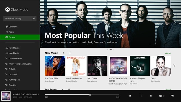
As you can see, we have condensed what were 3 layers of the app into a simple, single page with clear callouts of our major app features – collection, streaming radio, the store and playlists. Moving between the features is as simple as clicking the title. In addition, playback controls are always visible on screen making it simple to pause the song you are listening to or skipping to the next one. We’ve tested this design with a lot of customers and out of the gate it is much more understandable and comfortable to use.
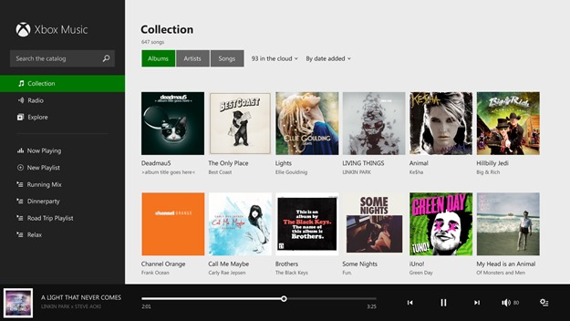
While it was an option before, now customers will launch straight into their collection by default. With platform improvements of Windows 8.1, we were able to build the rich album and artist views our customers were used to. Gone are the dull grey spreadsheet views, replaced by more beautiful grid view of album and artist art. Playlists are always visible in the left hand nav bar, making it simple to craft or kick off that perfect mix of music.
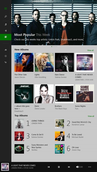
We set out to be a Windows showcase app, which means we designed and built the Music app to look great and be usable when in 50/50 or snapped mode. The app hides columns when a customer puts it into 50/50, and collapses the left nav bar to buttons as a customer scales down the window. Our improved snapped view is clearer and easier to use when a customer scales it down to minimum size. These investments allowed us to offer an amazing experience in portrait mode, which will undoubtedly be appreciated by our customers using the new, smaller form factor Windows 8.1 tablets.
Key to making this all happen was strong collaboration. To realize this new vision, we partnered closely with the Windows team throughout the development cycle on several important fronts.
A great music app is just as much about managing your personal collection of songs as it is about playing them back. We worked with Windows and the Mail app team to extend the modern design language to support these productivity-like scenarios. In particular, we worked to make sure it was easy to navigate between different areas of functionality, ensure large lists of content were intuitive to use, and complex commanding for collection management could be made simple. As a result, the new Music app has a greater information density, on-canvas commands and simplified navigation model.
In addition to being the default music player for consumers, we helped ensure the Windows platform is flexible enough to meet the needs of other entertainment app developers. We worked with Windows to add platform support for several features our customers told us they needed. For instance, new to Windows 8.1 is the ability to have music on an SD card show up in your music library, as well as the ability to manage the Music Library folders from within an app. These types of improvements make Windows better for all types of media apps.
The relationship between the teams was incredibly positive. We greatly benefitted from the design and engineering feedback from the Windows team, making our app simpler to use, better performing, and a great showcase of what’s unique and new with Windows 8.1. Windows benefitted by learning from our customers to improve both the user experience and platform for media scenarios.
Is it October 18th yet?! My team and I can’t wait for the release of Windows 8.1 and to unleash an all-in-one music service that can truly lead the industry. Check it out for yourself and let us know what you think. Explore the music store to see what’s hot. Discover new favorites with custom radio stations. Rock out while you surf the Web, get some work done or sling an upset bird around your screen. Play a song from the results page of a Bing search or pair your favorite playlist to a SkyDrive slideshow. Let music be your connector to all your Windows experiences.
Alex Garden
General Manager
Xbox MVR


