Making mixed reality: a conversation with Lucas Rizzotto
Welcome! This is the first chapter in Making mixed reality, a series celebrating the passionate community creating apps and experiences with Windows Mixed Reality. Here, developers, designers, artists (and more!) share how and why they got started, as well as their latest tips. We hope this series inspires you to join the community and get building!

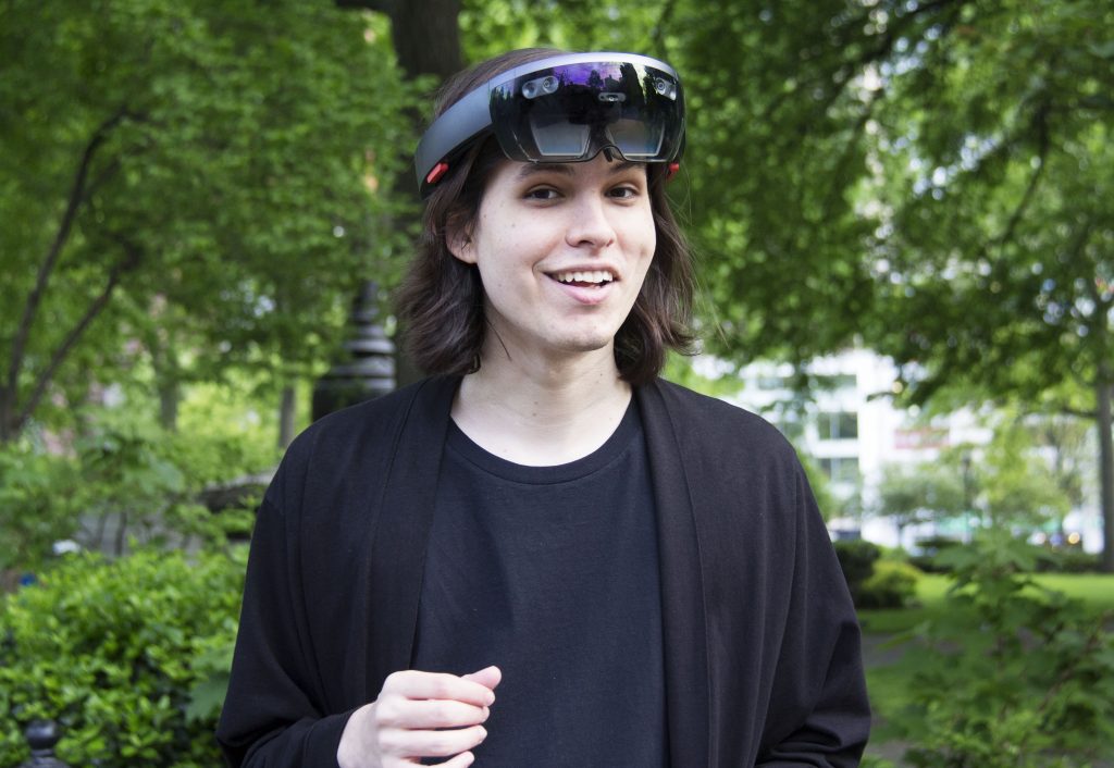
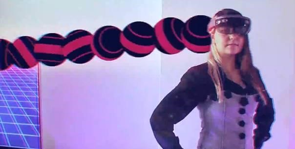
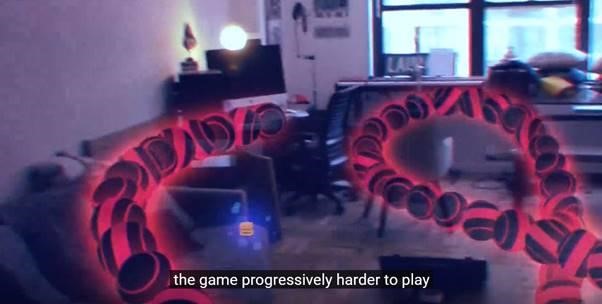
I first met Lucas Rizzotto at a Microsoft HoloLens hackathon last December, where he and his team built a holographic advertising solution. Fast forward to August, and he’s now an award-winning mixed reality creator, technologist, and designer with two HoloLens apps in Windows Store: MyLab, a chemistry education app, and CyberSnake, a game that makes the most of spatial sound…and holographic hamburgers. Little did I know, Lucas had no idea how to code when he started. Today, he shares how he and you can learn and design mixed reality, as well as some tips for spatial sound. Dig in!
Why HoloLens, and why Windows Mixed Reality?
It’s the future! Having the opportunity to work with such an influential industry on its early days is a delightful process – not only is it incredibly creatively challenging, you can really have a say on what digital experiences and computers will look like in 10, 20 years from now – so it’s packed with excitement, but also responsibility. We are designing the primary way most people will experience the world in the future, and the HoloLens is the closest thing we’ve got to that today.
The community of creators around this technology right now is also great – everyone involved in this space is in love with the possibilities and wants to bring their own visions of the future to light. Few things beat working with people whose primary fuel is passion.
How did you get started developing for mixed reality?
I come from mostly a design background and didn’t really know how to code until two years ago – so I started by teaching myself C# and Unity to build the foundation I’d need to make the things I really wanted to make. Having the development knowledge today really helps me understand my creations at a much deeper level, but the best part about it is how it gives me the ability to test crazy ideas really quickly and independently – which is extremely useful in a fast-paced industry like MR.
HoloLens wise, the HoloLens Slack community is a great place to be – it’s very active and full of people that’ll be more than happy to point you in the right direction, and most people involved in MR are part of the channel. Other than that, the HoloLens forums are also a good resource, especially if you want to ask questions directly to the Microsoft engineering team. Also, YouTube! It has always been my go-to for self-education. It’s how I learned Unity and how I learned a ton of the things I know about the world today. The community of teachers and learners there never ceases to amaze me.
Speaking of design, how do you design in mixed reality? Is anything different?
MR is a different beast that no one has figured out quite yet – but one of the key things I learned is that you need to give up a little bit of control in your UX process and design applications more open ended. We’re working with human senses now, and people’s preferences vary wildly from human to human. We can’t micro-manage every single aspect of the UX like we do on mobile – some users will prefer to use voice commands, others will prefer hand gestures – some users get visually overwhelmed quickly, while others thrive in the chaos. Creating experiences that can suit all borders of the spectrum is increasingly essential in the immersive space.
3D user interfaces are also a new challenge and quite a big deal in MR. Most of the UI we see in immersive experiences today (mine included!) is still full of buttons, windows, tabs and reminiscent visual metaphors from our 2D era. Cracking out new 3D metaphors that are visually engaging and more emotionally meaningful is a big part of the design process.
Also, experiment. A lot. Code up interactions that sound silly, and see what they feel like once you perform them. I try to do that even if I’m doing a serious enterprise application. Not only this is a great way to find and create wonder in everything you build, it will usually give you a bunch of new creative and design insights that you would never be able to stumble upon otherwise.
An example – recently I was building a prototype for a spiritual sequel to CyberSnake in which the player is a Cybernetic Rhinoceros, and had to decide what the main menu looked like. The traditional way to set it up would be to have a bunch of floating buttons in front of you that you can air tap to select what you want to do – but that’s a bit arbitrary, and you’re a Rhino! You don’t have fingers to air tap. So instead of pressing buttons from a distance, I made it so players are prompted to bash their head against the menu options and break it into a thousand pieces instead.
This interaction fulfills a number of roles: first of all, it’s fun, and people always smile in surprise the first time they destroy the menu it. Secondly, it introduces them to a main gameplay element (in the game players must destroy a number of structures with their head), which serves as practice. Thirdly, it’s in character! It plays into the story the app is trying to tell, and the player immediately becomes aware of what they are from that moment forward and what their goal is. With one silly idea, we went from having a bland main menu to something new that’s true to the experience and highly emotionally engaging.
HoloLens offers uniquely human inputs like gaze, gesture, and voice. So different from the clicks and taps we know today! Do you have a favorite HoloLens input?
Gazing is highly underestimated and underused – it implies user intention there’s so much you can do with it. A healthy combination of voice, hand gestures, and gaze can make experiences incredibly smooth with contextual menus that pop in and out whenever the user stares at something meaningful. This will be even truer once eye-tracking becomes the standard in the space.
What do you want to see more of, design wise?
I want to be more surprised by the things MR experiences make me do and feel challenged by them! Most of the stuff being done today is still fairly safe – people seem to be more focused on trying to find ways to make the medium monetizable instead of discovering its true potential first. I live for being surprised, and want to see concepts and interactions that have never crossed my mind and perfectly leverage the device’s strengths in new creative ways.
Describe your process for building an app with Windows Mixed Reality.
I try to have as many playful ideas as I possibly can on a daily basis, and whenever I stumble upon something that seems feasible in the present, I think about it more carefully. I write down the specifics of the concept with excruciating detail so it can go from an abstraction into an actual, buildable product, then set the goals and challenges I’ll have to overcome to make it happen – giving myself a few reality checks on the way to make sure I’m not overestimating my abilities to finish it in the desired time span.
I then proceed to build a basic version of the product – just the essential features and the most basic functionality – here I usually get a sense if the idea works or not at a most basic level and if it’s something I’d like to continue doing. If it seems promising, then the wild experimentation phase begins. I test out new features, approach the same problem from a variety of angles, try to seize any opportunities for wonder and make sure that I know the “Why?” behind every single design decision. Keep doing this until you have a solid build to test with others, but without spending too much time on this phase, otherwise projects never get done.
In user testing, you can get a very clear view of what you have to improve, and I pay close attention to the emotional reactions of users. Whenever you see a positive reaction, write it down and see if you can intensify it even further in development. If users show negative emotional reactions, find out what’s wrong and fix it. If they’re neutral through and through, then reevaluate certain visual aspects of your app to find out how you can put a positive emotion on their face. Reiterate, polish, finish – and make a release video of it so the whole world can see it. Not everyone has access to an immersive device yet, but most people sure do have access to the internet.


CyberSnake’s audio makes players hyper-aware of where they are in the game. Can you talk about how you approached sound design? After all, spatial sound is part of what makes holograms so convincing.
Sound is as fundamental to the identity of your MR experience as anything else, and this is a relatively new idea in software development (aside from games). Developers tend not to pay too much attention to sound because it has been, for the most part, ignored in the design process of websites and mobile applications. But now we’re dealing with sensory computing and sound needs to be considered as highly as visuals for a great experience.
CyberSnake uses spatial audio in a number of useful ways – whenever user’s heads get close to their tail, for example, the tail emits an electric buzz that gets louder and louder, signaling the danger and where it’s coming from. Whenever you’re close to a burger, directional audio also reinforces the location of the collectibles and where the user should be moving their head. These bits of audio help the user move and give them a new level of spatial awareness.
Sound is an amazing way to reinforce behaviour – a general rule of thumb is to always have a sound to react to anything the user does, and make sure that the “personality” of said sound also matches the action that the user is performing thematically. If you’re approaching sound correctly, the way something looks and moves will be inseparable from the way it sounds. In the case of CyberSnake, there was some good effort to make sure that the sounds fit the visual, the music and the general aesthetic – I think it paid off!
Spending some time designing your own sounds sounds like a lot of work, but it really isn’t. Grab a midi-controller, some virtual instruments and dabble away until you find something that seems to fit the core of what you’re building. Like anything else, it all comes down to experimentation.
What’s next for you?
A number of things! I’m starting my own Mixed Reality Agency in September to continue developing MR projects that are both wondrous and useful at a larger scale. I’m also finishing my Computer Science degree this year and completing a number of immersive art side projects that you’ll soon hear about – some of which you may see at a couple of major film festivals. So stay in touch – good things are coming!
As always, I’m impressed and inspired by Lucas’s work. You can connect with Lucas on Twitter @_LucasRizzotto and his website, where you’ll find nuggets of gold like his vision for mixed reality and AI in education. And maybe even his awesome piano skills.
Learn more about building for Windows Mixed Reality at the Windows Mixed Reality Developer Center.
Lucas is right about spatial sound—it adds so much to an experience—so I asked Joe Kelly, Microsoft Audio Director working on HoloLens, for the best spatial sound how-tos. He suggests using the wealth of resources on Windows Mixed Reality Developer Center. They’re linked below—peruse and use, and share what you make with #MakingMR!


