Nokia recently announced a pair of 6-inch Windows Phone devices: the Lumia 1520 and the Lumia 1320. To support these new devices, Windows Phone 8 GDR 3 includes changes to take advantage of the larger screen size, in addition to platform support for the new 1080p display resolution of the Lumia 1520. As you would expect, GDR 3 is backwards-compatible with existing Windows Phone apps but it also enables new apps to detect these larger form-factor devices and to tailor their user experience to fit.
I apologize in advance to all the metric-speaking developers of the world; this post (and the accompanying code) quotes all measurements in inches, but a simple multiplication by 25.4 will get you back to the more familiar millimeter :-).
The sample project that is described in this post can be found here on msdn.com
A bit of history
The Windows Phone platform has steadily evolved its support for differentiated screen sizes and resolutions over the past few years. Windows Mobile, the precursor to Windows Phone, didn’t have any limitations placed on the size or resolution of the screen. This led to a plethora of device form-factors and made application development tricky.
Windows Phone 7 simplified this by having exactly one supported screen resolution – WVGA (480 x 800) – and a range of physical sizes that was limited enough to not really matter for the purposes of application development and usability (most devices were around 3.7″ – 4.3″ diagonally).
Windows Phone 8 expanded the set of resolutions supported by the platform to three – WVGA, WXGA (768 x 1280), and 720p (720 x 1280) – but kept the same basic restrictions on physical size (by this time, phones were typically between 4″ and 4.5″). The multiple resolutions were handled by having the platform automatically scale the 480 x 800 base resolution to match the physical display, with the 720p displays being a little taller due to the 16:9 aspect ratio. So an app running on a WXGA phone (like the Lumia 920) has a resolution of 480 x 800 and a ScaleFactor of 1.6 to match the output resolution of 768 x 1280. Similarly, an app running on a 720p phone (like the HTC 8X) has a resolution of 480 x 853 and a ScaleFactor of 1.5 to match the output resolution of 720 x 1280.
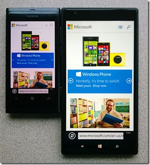
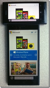
With Windows Phone 8 GDR3, not only has a new resolution been introduced (1080 x 1920), but phones are now large enough that the physical size can sometimes matter to the aesthetics and usability of certain applications. Here are a couple of pictures showing just how big the difference is between the Nokia Lumia 800 (a phone I once considered to be the ideal size at 3.7″) and a 6″ prototype device (click to see larger versions):
|
|
|
In theory, future Windows Phone devices might be even larger than this – up to 7″ diagonally – so the ability to detect and take advantage of that extra space can be important to certain classes of apps. At the same time, all the existing applications in the Windows Phone Store have to keep working even though they are unaware of these new devices. In order to maintain backwards compatibility with existing apps, 1080p devices will appear as if they are 720p devices, although under the covers the platform performs an additional 50% scale-up to achieve the full 1080p resolution. Note that just like the scaling applied to WXGA and 720p, this is not a simple bitmap stretch of the 720 screen; Windows Phone actually renders text and graphics at the full 1080p resolution. It is simply the XAML layout that is computed at 480 x 853.
Basic display information
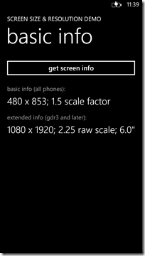
So the story for existing apps is easy – they continue to “just work” – but what about new apps? If you are building new Windows Phone 8 apps they will also continue to “just work”, the same as any existing apps. But if you want to take advantage of the larger-screen devices, or detect 1080p resolution to load different images or videos, GDR 3 includes a couple of new properties that enable your apps to detect this. Here’s a quick example of how you can do this, by querying for the PhysicalScreenResolution and RawDpiX extended properties:
string GetBasicScreenInfo()
{
var width = App.Current.Host.Content.ActualWidth;
var height = App.Current.Host.Content.ActualHeight;
var scaleFactor = (double)App.Current.Host.Content.ScaleFactor / 100d;
return String.Format(“{0} x {1}; {2:0.0} scale factor”, width, height, scaleFactor);
}
string GetExtendedScreenInfo()
{
object temp;
if (!DeviceExtendedProperties.TryGetValue(“PhysicalScreenResolution”, out temp))
return “not available, sorry”;
var screenResolution = (Size)temp;
// Can query for RawDpiY as well, but it will be the same value
if (!DeviceExtendedProperties.TryGetValue(“RawDpiX”, out temp) || (double)temp == 0d)
return “not available, sorry”;
var dpi = (double)temp;
var screenDiagonal = Math.Sqrt(Math.Pow(screenResolution.Width / dpi, 2) +
Math.Pow(screenResolution.Height / dpi, 2));
var width = App.Current.Host.Content.ActualWidth;
return String.Format(“{0} x {1}; {2:0.0#} raw scale; {3:0.0}“”,
screenResolution.Width, screenResolution.Height, screenResolution.Width / width,
screenDiagonal);
}
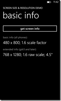
On a Lumia 920 running GDR 3, I get this result (click any of the screenshots in this post to see larger versions):
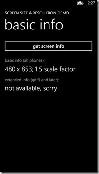
On the 720p Emulator (which isn’t running GDR 3), I get this result:
And on a prototype 6″ device, I get this result (note the basic info makes the phone appear the same as 720p, whilst the extended info tells the full story):
These properties tell you the actual size and resolution of the device, but in order to take advantage of that information your app needs to modify its behaviour accordingly. The sample that accompanies this blog post includes a handy control that helps you do just that.
Introducing the ZoomBox control
The sample contains a control called ZoomBox, which is similar to the existing ViewBox control (and the TARDIS) in that it allows its inside to be larger than its outside. When used in conjunction with the DisplayInformationEx class (also part of the sample), the control can render UI Elements at the appropriate size regardless of the screen’s physical size, but first let’s look at a simpler usage.
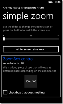
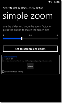
The images below show a simple page from the demo app that uses a Slider control to specify the ZoomFactor property of the control. On the left, the UI elements are sized with a 1.0 zoom factor and appear the correct size. On the right, the elements are sized with a 2.0 zoom factor and appear half their normal size (too small to actually be useful).
(One might argue that this effect is closer to dollying than zooming, since the field-of-view is effectively changing, but DollyBox just doesn’t sound right).
Although you can use the ZoomBox to specify arbitrary zoom values, it is most useful when used in conjunction with the physical screen size information to display content that is sized appropriately.
Rendering size-aware content
As illustrated earlier in this blog post, the existing XAML APIs report all devices as being 480px wide no matter what their actual resolution is (480, 720, 768, or 1080) and no matter what their physical size is (4″, 5″, or 6″). But if a standard 4.5″ device is allocated 480 pixels, it follows that a 6″ device (which is 33% larger in each dimension) should have 33% more pixels, or around 638px. The ZoomBox – in collaboration with DisplayInformationEx – computes this larger value and allows its content to layout using the extra resolution, and then it performs a ScaleTransform to fit the content back inside its own bounding box.
At this point, a few new terms need to be defined to avoid further confusion:
- Raw Pixels are the actual dots on the hardware screen, eg a 1080p device has 1080 raw horizontal pixels
- Host Pixels are the pixels reported by the XAML runtime, eg all devices are always 480 host pixels wide
- View Pixels are the pixels computed by DisplayInformationEx (and rendered by ZoomBox) and depend on the physical size of the device
It is possible for all three types of pixels to be the same – for example, the 4.3″ Nokia Lumia 820 has 480 raw pixels, 480 host pixels, and 480 view pixels – but for high-resolution and large-screen devices, the values will differ.
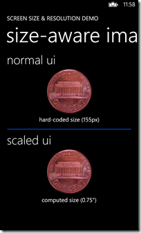
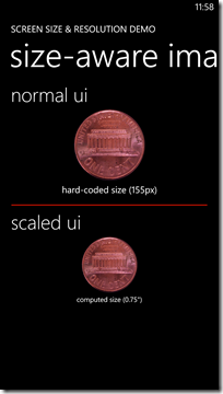
Here’s a simple page that utilizes the ZoomBox running on a Lumia 920 to display a US one-cent piece, which is 0.75″ in diameter):
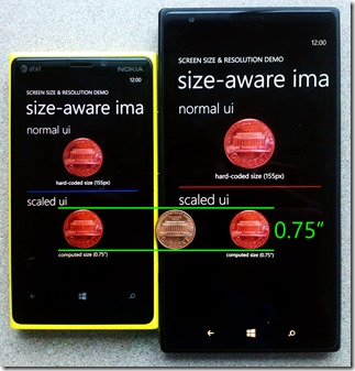
At the top of the screen the image is rendered at a fixed size of 155 host pixels (x1.6 = 248 raw pixels). Underneath that is the same image rendered inside a ZoomBox that is set to match the device’s physical size. Since the Lumia 920 is 4.5″ diagonal, and that’s also the size of our reference device, the normal UI and the scaled UI look identical.
But now let’s look at the same screen running on a prototype 6″ device:
Here we can see that the non-scaled penny is still rendered as 155 host pixels (x2.25 = 349 raw pixels) but the scaled penny is drawn noticeably smaller due to the fact that the screen is physically larger. If we place the Lumia 920 and the 6″ prototype side-by-side with each other, and include a physical penny for reference, it looks like this (the green lines were added in Photoshop):
Achieving this effect requires using the ZoomBox along with DisplayInformationEx class (described below). The XAML for the ZoomBox is as follows:
<screenSizeSupport:ZoomBox
ZoomFactor=”{Binding DisplayInformationEx.ViewPixelsPerHostPixel,
Source={StaticResource DisplayInformationEmulator}}”>
<StackPanel>
<Image Source=”/Assets/one_cent.png” Width=”155″ x:Name=”scaledPenny”/>
<TextBlock Style=”{StaticResource PhoneTextNormalStyle}” TextWrapping=”Wrap”
Text=”computed size (0.75")” />
</StackPanel>
</screenSizeSupport:ZoomBox>
And the code to render the penny:
const double sizeOfUsPenny = 0.75;
private void ResizePenny()
{
var width = App.DisplayInformationEmulator.DisplayInformationEx
.GetViewPixelsForPhysicalSize(sizeOfUsPenny);
scaledPenny.Width = width;
}
The {Binding} element used in the XAML will make more sense after reading the next section.
DisplayInformationEx and DisplayInformationEmulator
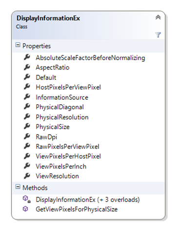
The sample includes the DisplayInformationEx class (loosely based on the WinRT DisplayInformation class) which provides information about both the physical display characteristics of the screen and the computed ideal resolution in view pixels. The API of the DisplayInformationEx class looks like this:
Most properties should be self-explanatory, especially if you read the code :-). The easiest way to get an instance of this class is to use the static Default property, which will return information specific to the physical device (if available) or some estimated defaults (if the phone isn’t running GDR 3).
Getting access to the default values is fine, but doesn’t help much if you’re using the emulator (which isn’t running GDR 3) or you don’t have access to a library of devices of various physical sizes. To help with these situations, the sample also includes the DisplayInformationEmulator class that is used to inject false information into the system. In the sample app, a DisplayInformationEmulator instance is added as an application-level resource, and it is this object that was referenced in the {Binding} expression in the previous section:
<Application.Resources>
<screenSizeSupport:DisplayInformationEmulator x:Key=”DisplayInformationEmulator”/>
</Application.Resources>
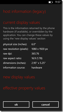
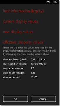
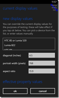
The sample provides two ways of accessing the DisplayInformationEmulator: there is a button at the bottom of the main page that brings up the configuration UI, and (in Debug builds only) there is a persistent “change display size” icon in the top-right-hand of the screen. The following screenshots show the physical display values and effective property values as seen on a 6″ device, and the UI for changing the reported screen size and resolution of a Lumia 920 (including the “change display size” icon in the corner):
If you’re working on a particular screen size layout and don’t want to invoke the UI every time you launch your app, there’s also a handy way to override the hardware defaults by setting the EmulatedScreenInfo property of the DisplayInformationEmulator. For example:
<screenSizeSupport:DisplayInformationEmulator x:Key=”DisplayInformationEmulator”
EmulatedScreenInfo=”6.5,1080,1.778″/>
The syntax for the property is [diagonal size],[raw resolution],[aspect ratio] so the XAML above emulates a 6.5″ 1080p device. Note that there are no limits on the size or resolution, but the aspect ratio must be either 1.667 (15:9) or 1.778 (16:9) since they are the only two supported by Windows Phone. Assuming you’re using the application-level resource as in the sample app, providing an override via EmulatedScreenInfo also affects the design surface, so it’s a great way to have a full design experience for the different screen sizes.
Something more creative
The sample application includes an additional control named MasterDetailsContainer that can help with standard master / details applications such as RSS readers, database browsers, and so on. Whereas the ZoomBox is a generally-useful control and is included in the ScreenSizeSupport library for you to use liberally, the MasterDetailsContainer is a more specialized control and as such is part of the app, not the library. You are free to use it as you see fit, but it’s not as generally useful as ZoomBox.
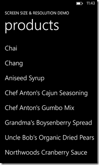
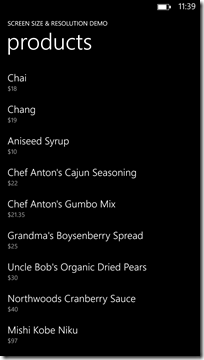
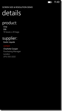
Let’s take a look at the MasterDetailsContainer in action on the Lumia 920 when placed inside a ZoomBox. The data is from the free Northwind Traders OData feed.
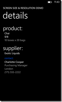
You can see that it’s a pretty standard – if a little boring – application that shows a list of items on one page, and then lets you drill in to details on a second page. As you would expect, the Back button lets you return from the details to the master page.
Now let’s look at the same app running on the prototype 6″ device:
The app has taken advantage of the larger screen by adding an extra line of information for each entry in the list (similar to how the e-mail app adds an extra line of preview in GDR3). The addition of this extra data on larger-screen devices is achieved by databinding the Visibility of a TextBlock inside the DataTemplate. The DataTemplate looks like this:
<DataTemplate>
<StackPanel Margin=”0,20,0,10″>
<TextBlock Text=”{Binding Name}” Style=”{StaticResource PhoneTextLargeStyle}” />
<TextBlock Text=”{Binding Price}” Style=”{StaticResource PhoneTextNormalStyle}”
Foreground=”{StaticResource PhoneSubtleBrush}”
Visibility=”{Binding SecondLineVisibility,
Source={StaticResource DisplayParameters}}”/>
</StackPanel>
</DataTemplate>
And there is a page-level resource named DisplayParameters that has its SecondLineVisibility property set by this code:
var minHeight = App.DisplayInformationEmulator.DisplayInformationEx
.GetViewPixelsForPhysicalSize(3.5);
if (masterDetailContainer.ActualHeight > minHeight)
displayParameters.SecondLineVisibility = Visibility.Visible;
else
displayParameters.SecondLineVisibility = Visibility.Collapsed;
In other words, if the list is more than 3.5″ high, show the second line; otherwise, don’t show it. Note that in this case the code doesn’t really care about how many pixels are used; it specifies the desired experience in terms of physical units. This enables the app to work well regardless of the physical size or resolution of the device.
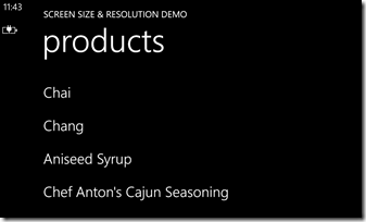
Adding an extra line to list items is nice, but something much more interesting happens in landscape mode. Here’s the Lumia 920:
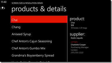
And here’s the prototype 6″ device – notice anything different? 🙂
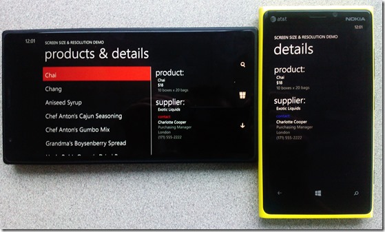
The MasterDetailsContainer automatically took advantage of the extra horizontal space on the 6″ phone by placing both the products list and the product details side-by-side. Remember that even though the text looks quite small in these screen shots, it’s actually the same physical size as on the Lumia 920, so if you can read the text on a 4.5″ screen you can still read it on a 6″ screen. Here they are side-by-side:
A note of caution: the side-by-side view you see above is not a standard part of the Windows Phone user experience. For starters, it introduces the concept of focus (or selection) – the big red highlight on the left shows you that “Chai” is the selected item on the right – and this is something that is otherwise absent from the Windows Phone UX. In a simple example like this where there are no visible commands it’s not too confusing, but if you were to add an AppBar to the page it might not be clear if the actions applied to the “left-hand side” of the screen or the “right-hand side.”
The MasterDetailsContainer exposes a few useful properties that control its behaviour. The SplitThreshold property sets the minimum width at which the control should show both panes side-by-side. Once the control is in side-by-side mode, the SplitMasterWidth and SplitDetailWidth properties dictate the size of each pane as a GridLength (eg “Auto” or “500” or “2*”). The grey line in the middle of the two panes can be controlled with the BorderBrush and DividerWidth properties.
Wrap-up
Windows Phone 8 GDR 3 enables hardware partners such as Nokia to ship devices that are much larger and have much higher resolution than ever before. Although by default the platform will ensure that all apps continue to work well, it is possible for your apps to detect and take advantage of the additional screen real estate where it makes sense in order to provide a highly optimized user experience. The combination of ZoomBox, DisplayInformationEx, and DisplayInformationEmulator make it easy for you to build apps that are fully or partially optimized for the new device form-factors, and also enables you to build, for the first time, Windows Phone applications that can render real-world objects at their exact physical sizes. Finally, the MasterDetailsContainer control gives one example of a new experience made possible on these larger-format devices, although it isn’t generally applicable to all application types.

