


In our previous post of this series, we introduced the art of typography: how the formation of letters and words affect usability, readability, and beauty. In today’s post, we introduce you to the science of communication through visual cues. We’ll look at:
- Visual cues in general—typical examples of visual communication
- Affordances—visual cues that tell us how to interact with an app
- Calls to action—visual cues to complete transactions
Visual cues are visual clues you leave for your users so they can spend less time figuring out what they need to do and more time simply getting things done.
Visual cues in general
If your app’s users hesitate because they don’t know what to do next, or don’t understand how to use your navigation, or can’t figure out if a bit of text is intended to be content or a button, they may close the app and never come back.
A great visual cue unobtrusively helps users understand whether they are in the right place for what they would like to accomplish. For example, as you can see in Figure 1, the text and icons are cues for Flipboard’s users, but note that they do not distract from what Flipboard is emphasizing—the image and its caption.

Visual cues can be executed in a variety of ways such as:
- Providing text instructions
- Using size, color and contrast to draw the eye
- Placement in a prominent location on the screen
- Using lines, arrows and unambiguous icons
For example, the visual cues highlighted in Figure 2 below demonstrate several of these characteristics in action.
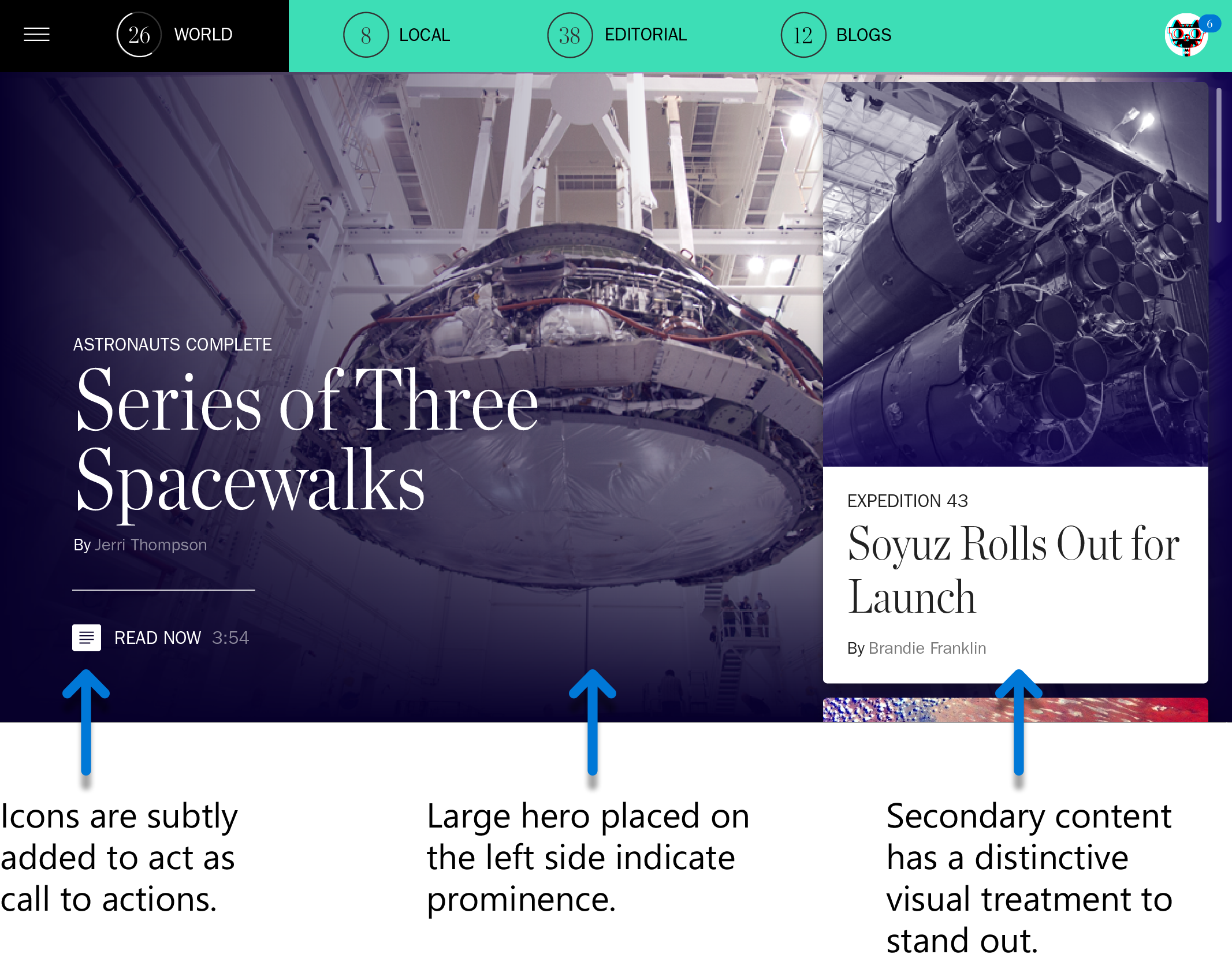
Visual cues help your user to quickly understand what is happening in your app and to see what is important and what is not. They also orient users within the app and show them the things they can do in it.
Affordances
An affordance is a special kind of visual cue that tells the user how to interact with objects on the screen. Visual cues in the real world create relationships between people and things. For instance, a doorknob affords twisting, a cord affords pulling, a button affords pushing.
Just as real world affordances don’t require any thinking, in-app visual cues similarly should clearly communicate to users how they interact with things. Clear digital affordances let the user know they should tap, drag, drop, pan, scroll, or pinch.
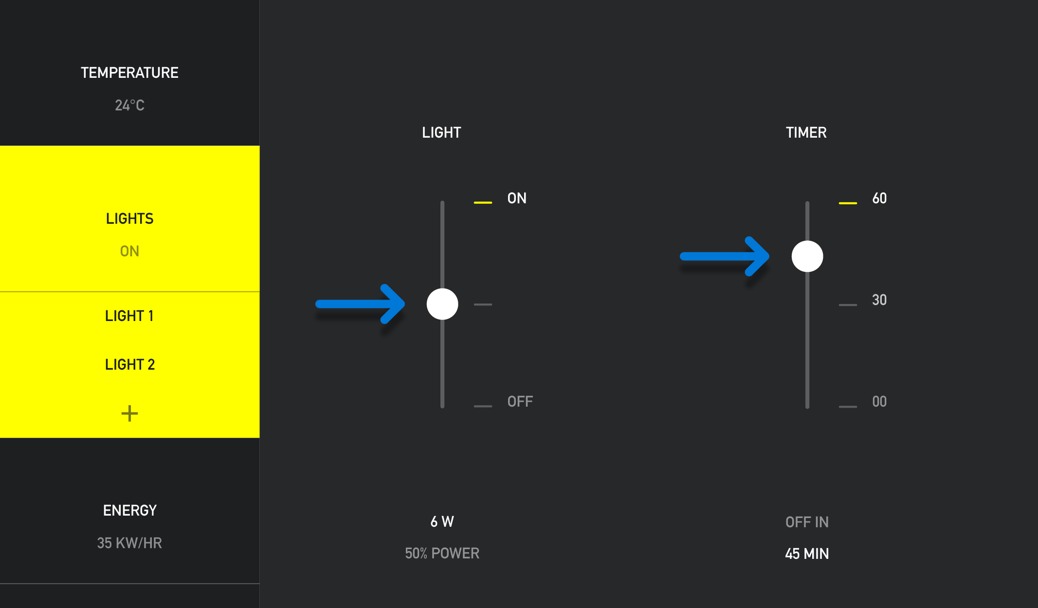
In the app world, perceived affordances generally rely on conventions to convey meaning. Buttons change their appearance when pressed. Draggable objects have handles (Figure 3). Drop zones change color when you drag items over them. Scrollable areas have arrows (Figure 4).

Don Norman, the great advocate of user-centered design, states that there are two things that matter in designing an easy-to-use affordance:
- Whether the desired control can be readily perceived and interpreted
- Whether the desired action can be discovered
As long as you rely on conventions like standard button templates, you’ll be fine. If you’re introducing a new sort of interaction and can’t rely on conventions, you can still base your affordance on real-world objects. After all, this is where our conventions originally derive from.
Calls to action
A call to action (sometimes known as a CTA) provides another example of how to use visual cues. Calls to action, such as sign-in/sign-up buttons, are transactional in nature. You’ll see them frequently in free-to-play apps that want you to perform an additional task, like clicking on an ad or clicking on a purchase button.
CTAs usually have wording and design features that invite users to see the button and act immediately. While you may sometimes need to provide detailed instructions to users for calls to action, typically an assertive command like “Become a member” suffices.
A call to action…
- invites the user to give information, such as an email address or profile photo
- urges the user to do something, such as “buy” or “download” or “save”
- offers the user an opportunity, such as a chance “to learn more”
Calls to action use one or more of the following characteristics to visually clue the user into noticing them and understanding their purpose:
- Contrasting color
- Noticeable difference in scale
- Larger font
- Noticeable margins
In Figure 5 below, the call to action button in the drop down navigation of LinkedIn’s Lynda app is bright blue. Its color and shape distinguish it from other clickable or tappable elements. This same treatment repeated throughout the app to establish a pattern and make it easier to identify calls to action. This trains users to understand what these buttons are for.

You can see a different take on the call to action in Figure 6. Additional content is available by selecting “Read More” below the introductory paragraph. To identify this as a call to action, it is in blue and bold style to set it apart from the content itself.

While visual clues should be noticeable to the reader, and calls to action should be doubly so, it is also important to ensure that visual clues and calls to action are not jarring. Jarring visual clues (Figure 7) and calls to action can actually frustrate the eye of the user and distract them from completing their goal.
Wrapping up
Great visual communication is at the heart of great visual design. It goes beyond simply making your app attractive and gets to basics of making your app usable and effective. In this post we reviewed three topics in visual communication: visual cues, affordances, and calls to action. By keeping these in mind as you design, you’ll make your apps more effortless to navigate, which in turn, helps your users get more done.
For more information, check out:
And don’t forget to check out the other posts in our app design series: