In the past several posts, we covered concrete design topics, like typography and visual cues. In this post, however, we’re going to do something a little different. We’re going to look at design thinking, inspiration, and creativity—and the right-brain techniques these involve when it comes to designing the user experience of your Universal Windows Platform (UWP) app.
The best way to get started is to begin the same way creatives and designers do: by asking what, where, and how.
- What are you looking for?
- Where are you going to look for it?
- How are you going to store it once you’ve found it?
What, where, and how are the secrets to finding what you need for inspiration and then arranging those inspirational resources in such a way that you can access them easily. We’ll explore them one by one.
Understanding what kind of inspiration you’re looking for
Are you creating a line-of-business app, a game, or a utility? This has a lot to do with deciding what type of inspiration to seek. Users interacting with a line-of-business app may not be thrilled with a quirky, playful design. Casual gamers, on the other hand, might find quirky and playful to be in perfect alignment with their interests. Knowing the kind of inspiration you need will help you narrow your targets as you hunt down interesting sources for new, creative ideas.
Think about breaking out your search by the different components of your app. You can look for inspiration for your navigation separately from your color theme or your grid system. Rarely will you find something that hits all your hot buttons in every category.
Don’t be afraid to mix and match design inspirations from different sources. Sometimes creativity just comes down to putting pre-existing things together in novel and interesting ways.
Where to go for inspiration
This is the fun part. There is a ton of information out there to glean. The trick is finding it. Here are a few gems that many designers use as their personal inspiration wells:
- Pinterest (https://www.pinterest.com/)
- Tumblr (https://www.tumblr.com/)
- Awwwards (http://www.awwwards.com/)
- Cool Hunting (https://www.coolhunting.com/)
- Creative Bloq (http://www.creativebloq.com/)
- Smashing magazine (https://www.smashingmagazine.com/)
One of the interesting things about being a designer is that even when it looks like you’re just surfing the web, you’re actually doing valuable work. This step of seeking out information is critical. In the early phases of a project, tracking down the right inspiration can even be a fulltime task requiring a significant portion of the design team.
How to store inspiration
Storing inspiration is not easy (someone should really build an app for that). There was a time when designers would keep magazine clippings, album jackets, and various inspirational material in their desk drawers to be pulled out as needed.
These days, there are online and digital options available for storing inspiration (including some of the suggestions above). These sites often allow you to tag photos and organize them in ways that are meaningful to you, and also share or collaborate on inspiration libraries with your friends or colleagues.
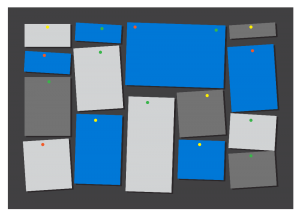
An old-school but still very useful way to store inspiration is to create a mood board. A mood board is basically a large collage made up of text, pictures, and even physical objects that are related to the current project.
Mood boards are effective because having an actual physical thing in front of you that you can touch, rather than something digital on a screen, affects the brain more powerfully. Also, a mood board can’t be turned off. Whenever you need to rest your eyes or take a break, the mood board is there to draw your attention and make you consider it. In consequence, moments of boredom can sometimes turn into sudden moments of creative insight.
Feeding your inspiration engine
So here’s how design thinking works. It usually happens when you aren’t paying attention. Great ideas come along in the strangest places – in the shower, during your commute, on your morning jog. It usually occurs after you’ve thought about a problem for a long time and then stopped thinking about it for a while. It’s as if your unconscious brain starts working even harder on the problem when your conscious brain takes a break.
The purpose of collecting all of these inspirational objects and then putting them someplace where you have to see them over and over again, like on a mood board, is to feed your unconscious. And you want to feed your unconscious because the hope is that soon, perhaps unexpectedly, perhaps while doing the dishes, a brilliant creative insight will suddenly bubble up into your conscious mind.
Designers understand this well. After collecting and digesting all of their inspirational material, designers know that their real task is to relax and let the mind do its job. The essence of design thinking, therefore, is learning to alternate between observing the world carefully on the one hand, and then forgetting about it completely on the other.
Wrapping up
Anyone who has to look at a blank app and figure out what it needs to look like can always use some inspiration. Over time, designers have come up with techniques for maximizing their chances of coming up with good ideas and it begins with asking what, where, and how. Successful designers collect pieces of inspiration that will help them to come up with good ideas and then meditate on them. They use tools like online and physical mood boards to help them organize their visions. More importantly, however, successful designers also know when to look away.
For additional inspiration on this topic, check out:
- Bill Buxton on Design Thinking
- The Importance of Design Thinking
- Feel: A Crash Course for Architects on Design Thinking
And don’t forget to check out our other posts in this series!


