

Iconography is a visual language used to represent features, functionality, or content. Icons are meant to be simple, visual elements that are recognized and understood immediately.
In a previous post, we explored communication through visual cues. We also dove a little deeper into specific visual cues, such as affordances and calls to action (CTAs). Whereas visual cues provide clues about how the user should use an app, icons go a bit further and actually communicate ideas using metaphorical associations: an image of an envelope says “mail,” an image of a house communicates “home,” a diagonally oriented pencil indicates “edit,” and so on.

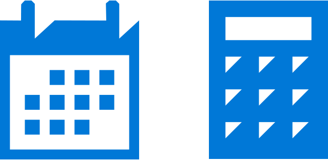
In many cases, there are already standard icons for the devices and OS your app is targeting. For example, the icon used to represent a calendar and calculator on a Windows 10 device can be seen in Figure 1 below.
Users of a particular platform are typically already accustomed to and understand these standard icons. So as a general rule, unless you have a specific reason for doing otherwise, you’ll want to defer to these standard icon sets whenever possible to save time and ensure easier user interaction.
When to use custom iconography
Standard icon sets only go so far, however. In addition to OS or device-specific icons, your app may also need its own set of icons to represent app-specific functionality that the standard sets cannot accommodate without creating ambiguity for the user (e.g. recipe search, movie bookmark, image download).
This goes beyond the user simply not knowing what to do. If the user is likely to hesitate or expend any energy in order to figure out an icon in your app, then you will probably want to use a custom icon.
Tip: Use the text test to determine if your icon is ambiguous. If your icon needs a title or description in order to convey it’s meaning, consider a different icon or using no icon at all.
If you do need to create and use custom icons for some of your app features, you will want to ensure that all of the custom icons have these two features in common with your other, standard icons:
- shared thematic style
- consistent design elements
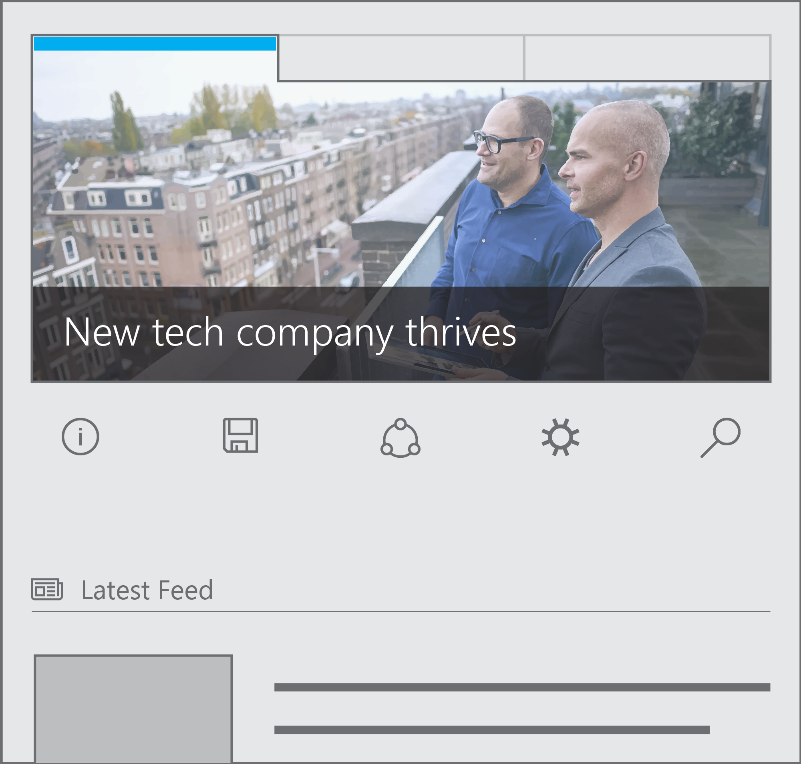
All of the icons in your app should look as if they were meant to be part of a set or family, even if some of them are customized. Besides being more aesthetically pleasing, consistency in iconography removes ambiguity and helps users distinguish an icon with which they can interact from a graphic or background image with which they cannot (Figure 2).
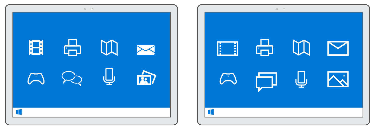
Likewise, consistency ensures that each icon has equal weight, drawing your users’ eyes equally. Take a look at Figure 3 below. Both the left and right images may look similar, but notice how the icon style on the left has both filled and unfilled shapes. This inconsistency pulls the eye of the user disproportionately to the filled icons—video, mail, and photo. In contrast, check out the icon set on the right. Those icons are consistent in both their thematic style and design elements. Each one engages the eye equally.
Where to find icons
Like fonts, icons are available for download. Icon sets are designed by professional artists and made available for you to use in your app. You may choose icons sets that are free (like vectoricons.org and freeiconsdownload.com) or icons that can be purchased (such as those on popular sites like istockphoto.com, shutterstock.com, and iconshock.com).
Either way, be sure that your use of them falls within the license guidelines and that you properly attribute them according to the requirements provided on the download site.
Wrapping up
Iconography may be the aspect of app design that comes closest to actual poetry because it depends on visual metaphors only to communicate meaning. Some associations are direct, such as using a stylized picture of a camera to represent a taking a photo with a webcam. Some are less so, such as using a shopping bag to represent the Windows Store in Windows 10. What makes iconography fascinating is that once users get used to these associations, they become automatic and effortless in a way that glancing over groups of letters can never be.
For additional resources on this topic, please consult …
- Guidelines for tile and icon assets
- Guidelines for Segoe MDL2 icons
- Generating tile/icon assets for UWP
Don’t forget to check out our other posts in this series!