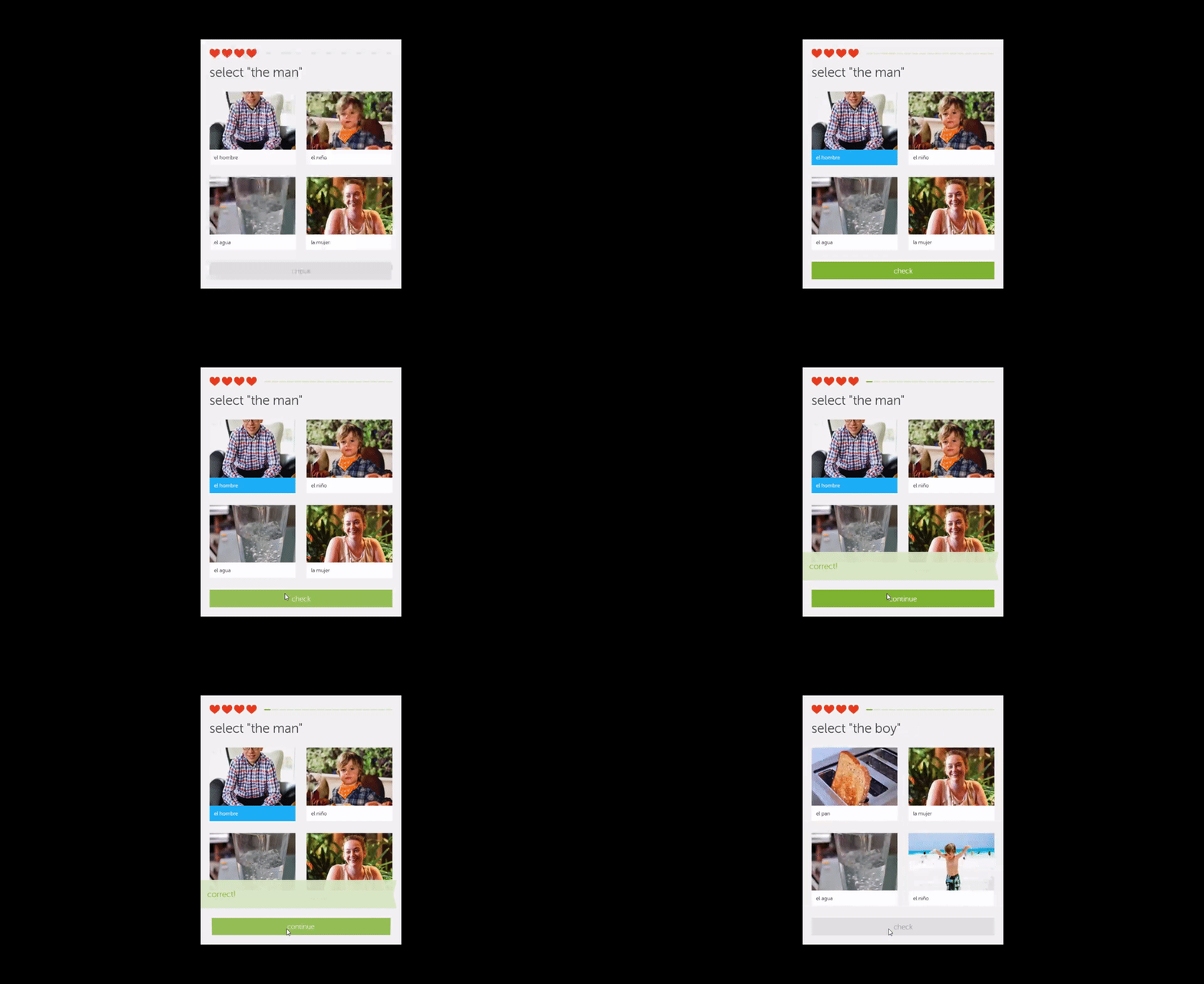
As you apply animations and audio cues in your app, it is important to remember that these elements are no longer optional. Contemporary app users expect regular feedback to let them know that their app is working and in constant motion. An app that lacks visual and audio flare is often seen as unresponsive or glitchy.
Animations that call attention
Animations are a dynamic way to add flare to your app, and they can be applied in many different ways. Sometimes, the purpose of an animation is to draw your attention, as with a call to action. At other times, animations are used as transitions between different states or screens in your app as you navigate. As a general rule, you want your animations to be subtle, smooth and unobtrusive.
| Animation | Polished | Okay | Overblown |
| Simple Button Click | Shift in color
or slight variation in light/shadow |
Skeuomorphic button up/button down | Special effects involving particles or light effects |
| Card Click & Release | Card rises from the surface, and shows slight motion toward the selected action, then flips around to reveal the result | Card enlarges to show content | Card performs an effect that calls attention to itself, rather than to the content |
Animated assets possess their own style in the same way that design assets do. Just as you want your icons and buttons to look like they come from the same set or template, you want your animations to look as if they share the same style. Additionally, the animations should share a similar pattern of motion when they are applied to elements or events.
In the video above, Flipboard takes advantage of in-app animations with every page turn. As users move from page to page, the pages flip over as if they were in an actual magazine.
Animations do not have to be limited to reactions to user actions, either. They can be used for notifications, confirmations and indicators. For example:
- App start or close
- App action beginning or finishing
- When a notification is received, such as a message from your app or another app
Animations do not need to be elaborate, time-consuming, or expensive to design. In fact, simpler is usually better. You can do much with simple transforms: size, color, opacity and position. For example, a button state change can be communicated with a small offset in position and a slight fade effect (a change in opacity).
How long should an animation stick around?
Like a good joke, animations are all about timing and pace. A movement that lasts too long will make your users impatient. A motion that is too quick can annoy or even agitate your users. The goal of a finely tuned animation is to find that happy medium between too quick and too slow.
Fortunately, motion designers have actually put a number to this happy medium. A good animation or audio cue will last between 150 and 350 milliseconds—in other words, around a sixth to a third of a second. Once you find an interval that works for you, try to use it consistently throughout your app.
Animations that transition
App navigation is enhanced through the use of transition effects. Having one page disappear while another takes its place is simply too jarring. Instead, one page should either fade or slide out smoothly while the other fades or slides in.
You already know that you want animations to last from 150 ms to 350 ms. Since transitions actually combine two motions, one leaving and one entering, a full transition will last from 300 ms to 700 ms. To make your transitions even more pleasing, however, you should vary the rate at which the transitions occur by adding an easing effect.
Easing reflects how movement occurs in the real world. Objects do not typically go from inactivity to a constant velocity and then back to a state of inactivity. Instead, they ease into motion, going slowly at first and then accelerating to achieve a desired speed. Adding easing to your transitions makes animations appear more natural and organic.
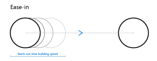
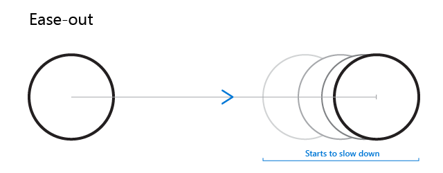
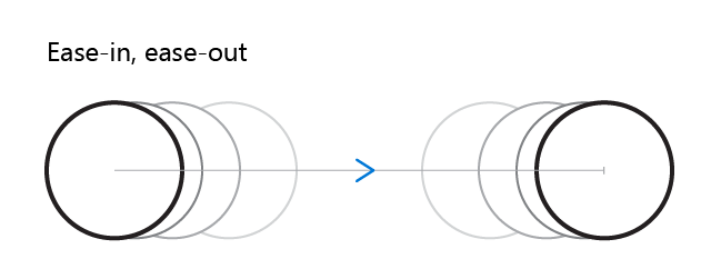
There are many mathematical formulas governing easing effects. As with many things, however, the simplest approach is often the best. If you can keep track of the difference between an Ease-in and an Ease-out, you are most of the way to mastering transition animations.
An Ease-in effect starts off slow and then speeds up. It basically eases into the motion.
An Ease-out is the diametrical opposite of an Ease-in. It basically starts off fast and then slows down. When in doubt, the Ease-out should be your go to when reaching for an easing. The Ease-in Ease-out, as you would expect, is slow-fast-slow. It imitates the motion of a vehicle such as a train or a car, and can be a very satisfying effect.
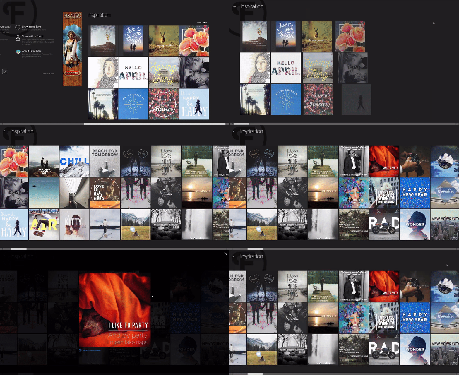
Here is a real-life example of transition animation that uses both easing and a subtle bounce animation to accentuate the behavior and beauty of the app. Controls in the left rail of FontCandy animate as they open to reveal the actual options. The animations include easing and bouncing, which accentuates the beauty of the app itself.
There are also variations of each of these easing effects such as sine, cubic, quad, and quint. You should play with these different effects and find something that you like. Once you do, try to use your preferred easing effect consistently throughout your app.
Sound effects
Every place you have an animation you could also employ audio, either instead of or in addition to the visual effect. Again, you want to go for subtlety rather than fanfare. If your audio effect seems fun or impressive, imagine the effect it might have if repeatedly played while a frustrated user tries to successfully complete a task. For example, if your error sound is an “Uh oh,” you might just drive your user away.
Conversely, some people will find any audio distracting, so it is a best practice to ensure your app has a setting that allows users to disable all audio cues and background audio in your app.
Best practices for sound design
As user patterns emerge in app design, sound effects have become simple, impactful, and purposeful. The touch of a keyboard, turning a device on/off, notification of an email/text message, the refresh of an application. When it comes to audio UI design, it is always wise to ask yourself, what does this sound bring to the app?
In game design, for example, sound effects and background music help make the experience rich and tell a story. In other types of apps, however, numerous sound effects can distract the user from accomplishing their tasks. Use sound effects with discretion for apps, suit them to the nature of your app, and ensure they feel intentional.
In some cases, you might also want to consider adding subtle haptic feedback. This is an obvious option for apps that are designed for a quiet setting but can also be valuable in providing a tactile experience where a user may otherwise miss something. For example, a fleeting pulse to confirm a button press, the success of a drag and drop gesture, or even the appearance of something important in a reading list. Different tactile patterns could be used to convey different feedback.
Wrapping Up
Whether you are lone developer or a small development team, the skillful application of design know-how can take your app from good to great, even if there is no designer on your staff. What’s more, putting great design principles into practice at the start of your process may save you wasted coding time down the road while also resulting in a more seamless, pleasing user experience.
For more information, see:
Get started with Windows Visual Studio!


