

Accessibility and your app design
Choosing to incorporate accessibility features is a good idea no matter what your motivation. Thinking about accessibility, in turn, will help you to become a better designer because you will be considering the user experience much more broadly for a greater variety of users.
Be accessible
Accessibility options include features relating to mobility, vision, color perception, hearing, speech, cognition and literacy. However, you can address most requirements by providing:
- support for keyboard interactions and screen readers
- support for user customization, such as font, zoom setting (magnification), color, and high-contrast settings
- alternatives or supplements for parts of your UI, such as audio descriptions of text for those who are visually impaired
Standard Windows controls already have Microsoft UI Automation support and are accessible by default. They require fewer accessibility attributes that are app-specific. If you want to create a custom control, you can add similar support by using custom automation peers.
In the UI design, here are some steps you should take to ensure you app works well with the following scenarios:
| Scenario | Steps to take |
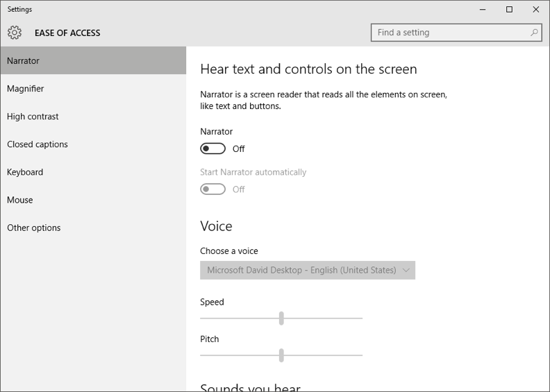
| Screen reading | Users of this feature rely on a screen reader like MS Narrator to help them create a mental model of your UI. To help them interact with your app, you need to provide information about its UI elements, such as name, role, description, state and value. Learn more about exposing basic accessibility information. |
| Keyboard accessibility | Allow users to interact with all UI elements by keyboard only. This enables them to: – navigate the app by using Tab and arrow keys – activate UI elements by using the Spacebar and Enter keys – access commands and controls by using keyboard shortcutsLearn more about implementing keyboard accessibility. |
| Accessible visual experience | Some visually impaired users prefer text displayed with a high contrast ratio. They likely also need a UI that looks good in high-contrast mode and scales properly after changing settings in the Ease of Access control panel. Where color is used to convey information, users with color blindness need color alternatives like text, shapes and icons. Learn more about supporting high-contrast themes and about meeting accessible text requirements. Important: To prevent seizures, avoid elements that flash. If you must include flashing elements, do not let them flash more than three times per second. |
Reduce UI button pressing
There are other design-related ideas you can employ to make your app more accessible. For example, try to reduce UI gestures to make common tasks require less button pressing.
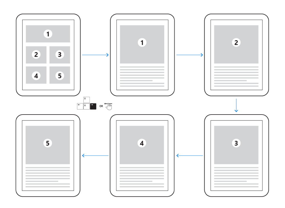
Provide multiple ways to interact with the same control. For example, activate UI elements by use of the keyboard, rather than just by touch or click. A control that only supports mouse interactions would be extremely difficult, if not impossible, for a visually impaired person to use. To make a control accessible to the visually impaired, you must provide keyboard shortcuts. Also, let users navigate your app using the tab and arrow keys.
Note: Include only interactive elements in the tab order.
Consider creating a tab flow diagram to help you plan how the user would progress through common tasks using only the keyboard. The tab order is also important because it indicates what order screen readers should present the text to the user. For more information, refer to the eBook Engineering Software for Accessibility.
Not everyone has perfect vision
Design your text and UI to support a high-contrast theme. While color is important, it must not be the only channel of communicating information. For example, users who are color blind would not be able to distinguish some color status indicators from their surroundings. Include other visual cues, preferably text, to ensure that information is accessible.
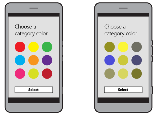
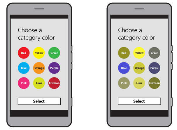
Imagine you had to work with a black and white printout of your app’s screen. The values of the colors – how dark or light they are on a grayscale – help you tell them apart. This is important to keep in mind when you are selecting colors for highlights and calls to action, which you read about in our blog on visual communication and visual cues. You can also add textures to help distinguish the colors – but try to keep them subtle.
Optimize your UWP app design for touch input and get basic support for mouse, pen and touchpad by default. Visit MSDN to learn more about designing interactions that are easy to use.
Scale
Allowing users to zoom and resize elements can be helpful to people with visual impairment, especially for images that include words. Ensure that text and UI scale appropriately when Ease of Access settings are changed. However, take care not to start with a font size that is too small in general for many users. Everyone’s vision deteriorates as they age; your app should be available to users of any age.
To allow for differences in vision, provide scaling options for your users in your app settings. They might change the font size for easier reading or, if you include the option, may shrink or enlarge the UI as well.
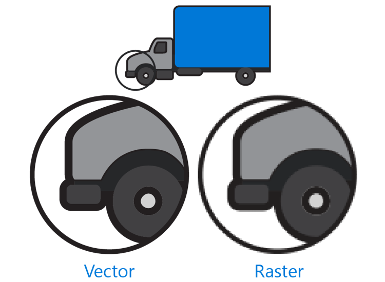
Note: Using vector images (SVG) rather than raster images makes scaling easier. Raster images can become pixelated when enlarged or distorted when shrunk. Vector images look proportional and clear at any scale.
Once you believe you have your design working, be sure to test it on your target device(s). The Windows Software Development Kit (SDK) includes accessibility testing tools such as AccScope, Inspect and UI Accessibility Checker. Testing the design should help you identify any areas that need correcting, as well as any opportunities presented on different screen sizes. For more information about these tools, see the article about accessibility testing on MSDN.
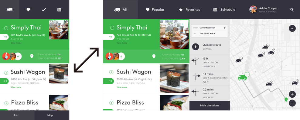
If you want your app to look good on very large screens, you may want to include optional larger images, add more whitespace, add rows or columns or incorporate more navigation options without using submenus. You could also take advantage of the extra space by adding something like an overlay on part of the screen to provide more information, such as details about a selected item or a view of the user’s cart.
Wrapping up
Accessibility design is really just usability design for a larger audience. While the Universal Windows Platform (UWP) can take care of some of this for you, you will find that a bit of thoughtfulness in incorporating built-in controls will actually go a long way toward making your app more accessible and usable for everyone. To learn more about UWP and accessibility, refer to the following MSDN articles:
- Developing apps for accessibility
- Designing inclusive software
- Developing inclusive Windows apps
- Accessibility testing
- Accessibility in the Store
- Accessibility for UWP apps
Practice your app accessibility skills – download Visual Studio and get developing!
The Windows team would love to hear your feedback. Please keep the feedback coming using our Windows Developer UserVoice site. If you have a direct bug, please use the Windows Feedback tool built directly into Windows 10.