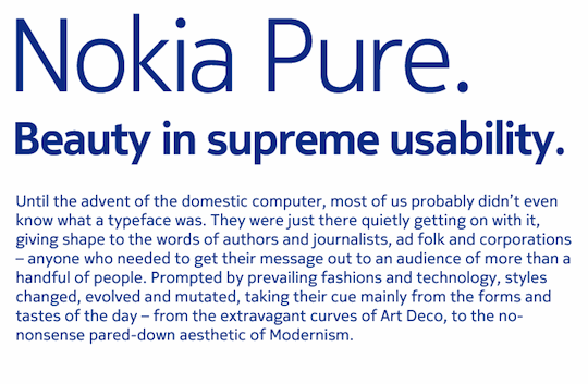
GLOBAL – This week, Nokia announces a new typeface and a new look for promotional materials. It’s a new brand image that’s simpler, fresher and stronger than before. Today we’ve been lucky enough to get a sneak preview of some assets, starting with the new Nokia font, Nokia Pure.
Nokia Pure

This is the new typeface that’s been created for Nokia by world-famous typographer Bruno Maag. It’s called Nokia Pure and we like it a lot. The first picture, with the lower case ‘c’ and ‘e’ up close is worth particular attention – and comparison with Helvetica and the old Nokia Sans font. Not only does it look… well, pure and simple, but the letters flow into each other somewhat, creating the impression of forward movement. The idea of flow and movement appears frequently in the new branding


Interface
Take the images below with a pinch of salt. They aren’t pictures of forthcoming products. Rather, they show some ideas of how the new branding might extend onto the user interface of our mobile devices.

This first image is how the current Nokia font appears on a device.

Here’s what Nokia Pure may look like on a phone.
Look out for the new branding on billboards and devices near you in 2011. Looks like we’ll have to give this site a bit of a mini-redesign as well, once we get our hands on the font. Let us know what you think below.
Related stories
