How did the Nokia N9 begin?
I headed up a team in Copenhagen during the summer of 2009, and that’s where it began. The brief was to evolve the story from the previous Nokia Nseries/Eseries devices, and define it moving forward. We chose to work with an Nseries product as it was interesting times at Nokia – things were bumpy in the high-end market. Extreme numbers on a spec sheet was not the way to win. We knew we needed innovation at every level.
I’ve had the option to do this before, but those occasions didn’t feel so very exciting: here we had a blank canvas. I wanted to define what high-end means today and take a more software-driven approach, and show people it’s not just the hardware that makes a great phone: it’s the UI and platform and how it all works together.
Did you know you’d be creating for something other than Symbian?
The MeeGo stuff had started bubbling, but we hadn’t seen it. We tried to simplify and distil the existing story, because there was a lot of good in the work that was done. That was the starting point – no compromises. We tried different styles; we did a range of devices like slide-and-tilt; we did a couple different sizes, but they were all based on the same design family. But the one that made it to the market was the Nokia N9.
What makes the Nokia N9 unique?
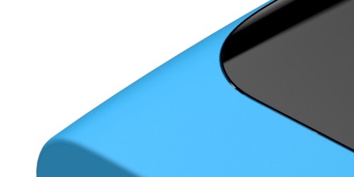
Above all, it’s the continuity that you feel from the shape of the glass continuing to the side profile. It just feels right. The basic concept is that seamless continuity of the form, and I think it was something we refined with the UI. It’s just something nice about interacting with a device that has a gentle curvature. Once you have something that’s more continuous in your hand, it’s just more pleasant to interact with it, all the way to the edges. Try to swipe stuff on other phones, and you’ll soon see that the edges will bother you.
When you see it in three dimensions, there’s not a single straight surface on the product. It’s actually really difficult to model in CAD. It’s almost like a pillow. In concept, a pillow is a simple form. It’s not hard to understand. But if you have to build those surfaces on a computer, you’ll realize how complicated they are. So the concept is simple, but as a piece of geometry, it’s quite elaborate.
No buttons! Just swipe!
Once you’ve got a flavour of life without buttons, it’s hard to go back. I find myself with other devices trying to swipe, but I can’t. Phones with keys feel old now, in some respects.
What’s so cool about a uni-body design?
No designer likes split lines. Split lines mean imperfection, parts and colours that may not match perfectly. It feels bad. It’s noise. You don’t want that. At the same time, most designers like metals. The Nokia N9 has many antennas, and that meant we knew we could never do a metal device. If you use plastic, the antennas would work better. But that leads to other challenges. Consumers may perceive plastic as of lower value than metal. But plastic is transparent to radio waves, metal is not.
The one piece polycarbonate plastic allows for really great antennas but it also feels expensive in the hand. You need great performance from your antennas, of course, for fast download speeds and quick connections with satellites. So it’s all about a good user experience from that point of view. The challenge was that when creating something that feels like high-end quality design with plastic, the material alone won’t carry that story.
It’s great to see another smartphone with colour, not just a “black rectangle”.
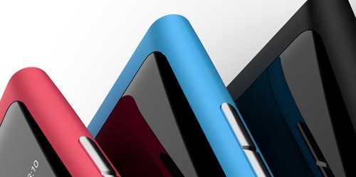
We started off looking at a plastic bar without paint, it gives us a chance to almost think in any colour we would like – eventually, it came back to essentially the basic colours. Cyan, magenta, black.
Plastic is all about offering colours. So we really wanted colours where people could express themselves. Brown and grey is almost an excuse for a colour with plastic. If you’re going to offer a colour, offer a real colour.
Last question, how would you like consumers to feel when they first pick up a Nokia N9?
That’s a good question. What’s important for us is that if this becomes a hardware story, we’ve failed. It needs to be in context with the UI. I hope the first point of delight will be about the interface, the button-less navigation. I hope it’s not only about the hardware design. The idea was to create a canvas for the UI and the user to shine. When you watch TV, you don’t want a frame, you just want the content.
Here’s Nokia’s Marko Ahtisaari, SVP Design and User Experience, announcing the Nokia N9 and talking about the design.


