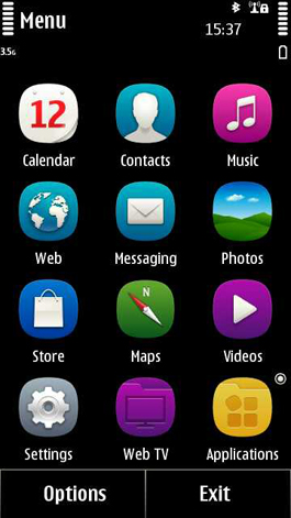
GLOBAL – One of the most obvious changes people will notice when installing Symbian Anna onto their smartphone, will be the icon changes. The jet-black backgrounds with the new square-cum-rounded colorful icons that adorn our homescreens didn’t just get that way by chance, they are designed. So, what goes into making the perfect icon? We’ve taken a look and also asked somebody who knows about these things, Elliot Jay Stocks.
Icon. It’s a simple little word, but what does it mean? Look it up in a dictionary and you’ll find it defined as a picture, an image, or other representation. In essence, an icon represents something that needs to be easy to understand at a glance. Otherwise, you’d just use words, right?
For me, what I like most about the new Symbian Anna update is the way it looks, which is mostly down to the icons. It’s a tricky task, creating icons. You need to make it simple, yet detailed enough that you know what it means.
We spent some time with designer, illustrator, speaker and author of Sexy Web Design, among other things – Elliot Jay Stocks. He knows what designing icons is all about and isn’t afraid to give his opinion on anything that interests him.
What’s the importance of icons in general and also when it comes to smartphones?
An icon should represent something in a concise, straightforward, easy-to-recognise manner. Often they need to describe potentially complex procedures without making it look complicated. When it comes to smartphones, particular attention should be paid to pre-existing conventions that are used by a variety of manufacturers and operating systems, so that someone can switch to a new phone with the greatest of ease.
How long do you spend designing an icon?
This depends massively on the icon being produced. On a purely aesthetic level, many will take roughly the same amount of time, but usually the hardest part to nail is the concept.
What are the challenges when creating an icon and in particular for smartphones?
As well as the ease of recognition I mentioned earlier, there are a number of technical considerations: the clickable region, the resolution and colors used by the display, and the various states/sizes used by the icon. It’s rare that an icon will only appear at one size, so it’s important to consider other instances and to work out if they need redrawing or simplifying.
Is it better to stick to conventional images, or create your own?
Convention is important because it offers the user an instruction to interact with something the same way they have elsewhere. However, the images established aren’t necessarily the best solution, and designers should remember to innovate where appropriate.

Above: Symbian^3 on left and Symbian Anna on the right.
How are the icons on Symbian Anna improved over the older version, Symbian^3?
There’s a much stronger connection between all of the icons and each one is easier to recognize, as it’s been given its own dominant color, as opposed to the more complex icons used previously.
How do you make icons sufficiently different from one another, while sticking to guidelines?
The way to successfully achieve this is to remember that you’re effectively painting from the same palette. Not in a literal, colour-specific sense, but in the sense that each icon should share common ground; a number of shared building blocks.
Thanks to Elliot for taking the time to answer our questions.
The shift in style with Symbian Anna brings a greater sense of commonality and style across Symbian’s icons. What do you think? Let us know in the comments below.


