Framed! How to take the perfect square Lumia photograph
Thanks to the phenomenal rise of Instagram, more people are taking square photos than at any other time in history. But how do you make yours something to be framed rather than something to be binned?
Any photograph you make is about selection. By including some things and cropping others out, you can direct the viewer into interpreting your photo the way you want. But it’s not just with the subject that you can control the viewer; the simple format of the photograph also enables you to guide the eyes looking at your image. So, when should you go square and if you do, how should you go about it? Read on to find out.
Gut reactions
The format of any photograph creates tensions. Whatever your subject matter, the simple shape of the border exerts forces and affects the way the viewer reacts to the image. A typical 3:2 ration rectangle will encourage your eye to move across it from side to side. (Or, if it’s in a portrait format, up and down). A square format, on the other hand, urges your eye to move around the square in a circular motion or focus on the centre.
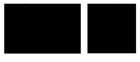
Of course, once we add any subject matter into the frame, we can use it in conjunction with the format to enhance a certain idea or to deliberately confound it.
The moment you add any form of mark to a format, further tensions are created – even a simple line pulls the viewers eye.
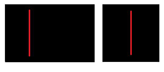
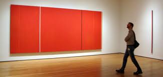
If you think about the Abstract Expressionist painters such as Barnett Newman, Franz Kline or Robert Motherwell you’ll get an idea of how much a simple mark influences the balance of a canvas or paper. (There’s even artists, such as Liam Frankland, who work as ‘Abstract Expressionist Photographers’ specifically making images which play with the ideas of colour field painting).
Balance it out
When using a rectangular format, the composition is often guided by the proportions of the Golden Ratio (or the Rule of Thirds as photographers often think of it). Centrally weighted compositions within a rectangular format can often appear a little lost.
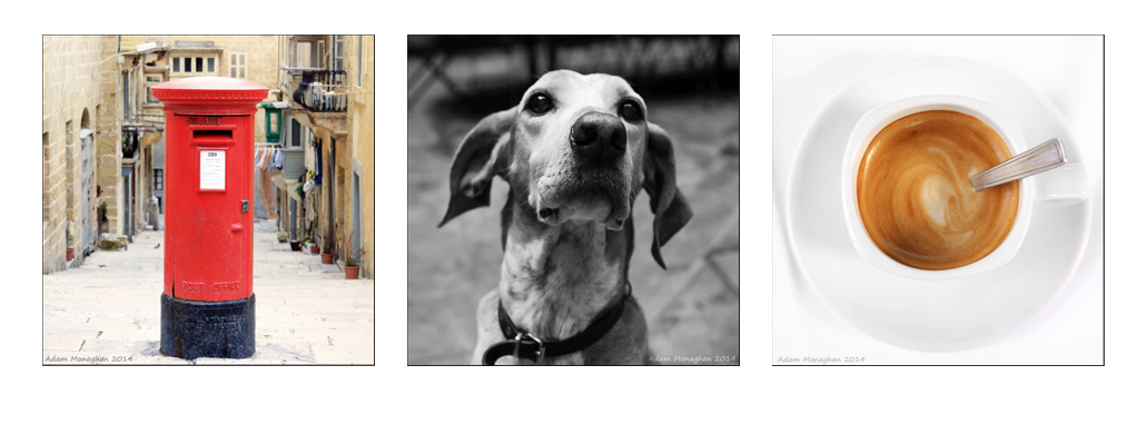
However, when using a square format, centrally composed shots come into their own. The square is more suited to symmetric compositions than the traditional 3:2 format.
Abstract, geometry and pattern
The one to one format also lends itself very well to abstract compositions with good strong lines.
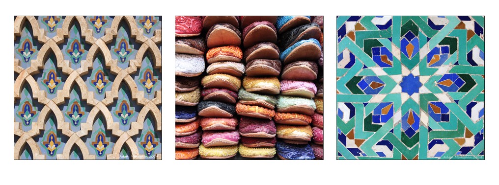
The defined verticals, horizontals and diagonals anchor the composition to the edges.
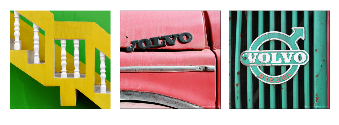
Think square from the start
I think this is a really important part of making square photographs: Nokia Camera is excellent for zooming and reframing your photos without losing any quality and gives you a world of possibilities. If you think square when you take the shot, you’ll have a far better idea of where to crop and how to maintain that all important tension.
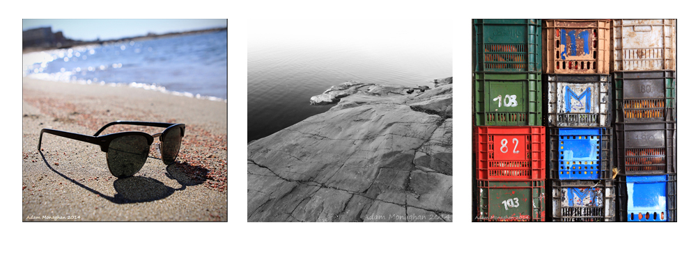
What’s more, if you think square from the start, it will influence how you see things. You’ll be thinking about how a view or subject will crop as a square and this will direct your vision to particular things. You’ll end up shooting different pictures.
You might even want to experiment with masking out bits of the screen so you are thinking in a 1:1 format.
And finally, ask yourself…
Another good guide when you look at a square photo is to ask yourself: ‘In which direction would it benefit from some more space?’ That is, if it was 3:2 in which direction would you extend it to give you (or the viewer) additional important information or a more balanced composition?

If it’s a successful square, the answer will be ‘In no direction!’
Confident you can take the perfect square with these rules? Hopefully the answer is yes. But if you can think of any other square essentials, which we didn’t mention, please share them with other phoneographers in the comments below.
