Using extended srcset and the picture element to tailor your image to every device and layout
Starting in Windows Insider Preview build 10547, Microsoft Edge supports srcset, sizes, and picture―the suite of technologies that make up responsive images. With these, you can tailor your image size and art direction to adapt to diverse devices and layouts. Prior to these features, you needed to provide a full responsive images solution via JavaScript, which can result in duplicate downloads, slower load times and performance due to having to execute logic on the UI thread.
Want to skip right to it? Visit our interactive Test Drive demo to see srcset and picture in action. Take me there!
An image is fully responsive if it has three principal characteristics: First, it should download at an appropriate resolution to provide best quality image for the user’s device and based on the expected layout dimensions of the image. Second, it should be served in an efficient format that is supported by the user’s browser, to achieve smaller file sizes without compromising quality. Finally, the focus of the image should adapt to device and viewport dimensions to ensure the primary subject of an image is always prominently in. The combination of srcset, sizes, and picture allows you to embed images with all of these characteristics so that your users have a great experience on any device or screen size. Let’s dig in to the new technologies to understand how each of these complement and build upon one another to provide a comprehensive responsive images solution.
The width descriptor
The first characteristic we discussed above is resolution switching. A responsive site should deliver the most appropriate image to every device, taking into account how the image is being displayed and even what sort of network its users are on.
Basic srcset provides simple resolution switching, but only takes the device resolution into account. This is sufficient for sites with static layout, but in a responsive layout this can result in the browser downloading an asset that isn’t necessary for the image’s size on screen.
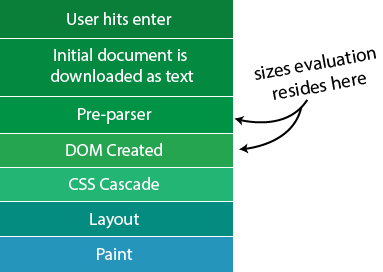
With srcset and sizes, the browser takes both the device resolution and the layout size of the image into account when selecting the best image. Normally browsers don’t know anything about an image until they download it, so sizes allows a site to provide some of that information ahead of time so the browser can make smarter decisions about which images it should download.
Let’s take a look at an example using the original srcset syntax:
| <img srcset="hero-img-small.jpg 1x, | |
| hero-img-med.jpg 1.5x, | |
| hero-img-lrg.jpg 2x" | |
| alt=""> |
Note: For simplicity, we didn’t include the
src attribute. In practice, this should be included so there is a fallback image for browsers that do not support srcset.
Using srcset, we tell the browser to fetch the 1.5x or 2x images if the user is on a higher definition device. Unfortunately, the browser will always select the same image for a given device, even if one of the other images would have been sufficient for the current layout of the page.
Now let’s take a look at what this would like using extended srcset:
| <img sizes="100vw" srcset="hero-img-small.jpg 500w, | |
| hero-img-med.jpg 1000w, | |
| hero-img-lrg.jpg 2000w" | |
| alt=""> |
Here, we have replaced the pixel densities with intrinsic width of the image along with a w, known as the width descriptor. So how does the browser determine the best image to show? That’s where the sizes attribute comes in.
The sizes attribute
At this point, we only have a list of images and their respective widths in pixels. The sizes attribute tells the browser how to organize them and determine the best image in a way that is backwards compatible with the original srcset. To make explaining sizes easier, let’s look at an example:
| <img sizes="(max-width: 350px) 200px, 400px" srcset="..."> |
sizes is a layout hint to the browser that reflects what the expected width of the image will be after layout. When the browser encounters an image with a sizes attribute it begins going through the media conditions in order from left to right. So in this case, if the device viewport has a max-width of 350px then the image will be 200px wide, if not it will be 400px wide.
If you have used media queries this should look familiar and it works mostly the same with one major caveat: you can’t use percentages within sizes. This is because the browser evaluates sizes well before layout occurs. Take for example:
| <img sizes="(max-width: 350px) 50%" srcset="..."> |
When sizes is evaluated, the browser doesn’t know what the width of the parent container is, so the 50% value is useless.
Tying sizes together with srcset
Now that we know what srcset with a width descriptor is and what sizes is, let’s put them together and see how the browser handles this. Let’s start off with a simple example:
| <img sizes="100px" srcset="small.jpg 100w, med.jpg 200w, large.jpg 300w" alt=""> |
The best way to think about this example is that the browser uses the output of sizes as the input to srcset to normalize the width descriptors. The formula for normalization is pixelDensity = width/computedsizes, so in the case of our example we would divide each width by that of 100. After the conversion, our srcset should look familiar:
| <img sizes="100px" srcset="small.jpg 1x, med.jpg 2x, large.jpg 3x" alt=""> |
From here the selection algorithm, which is specific to each browser, occurs as it did for the original srcset. When selecting an image, the browser is trying to find the image that best matches its optimal density (as defined by device’s display properties.) After the selection occurs, the browser sets the intrinsic size of the image by scaling the image based on the resulting pixel density divided by the optimal density. In our example above, if a device has an optimal density of 1x, the browser selects the first image resulting in a 100px image (100/1).
How to utilize currentSrc
The currentsrc attribute provides a means to tell which source was selected from either srcset or src. currentsrc is an asynchronous event and will return the selected source no matter where it was found.
| <img id="test" sizes="100vw" srcset="img.jpg 500w" alt=""> | |
| <script> | |
| document.addEventListener("DOMContentLoaded", function() { | |
| var test = document.getElementById("test"); | |
| test.addEventListener("load", function() { | |
| console.log("Current Src: " + test.currentSrc); | |
| }); | |
| }); | |
| </script> |
Note: We mentioned in June that we had to remove the currentSrc API, which gives you access to the selected source in srcset, but since we’ve implemented picture we have added it back in. This will be available starting in an upcoming Windows Insider preview build.
Introducing the picture element
Now that we have gone over the building blocks of how to do resolution switching for images, let’s talk about art direction. Often, you not only want to select a different image based on pixel density, but also want to select the image that ensures the main subject of the image is visible. You can do this with the picture element.
The picture element cannot stand alone, which is by design. You must include an img element insidethe picture element as a fallback for browsers that don’t support the picture element. In most browsers, when the HTML parser comes across a tag that it doesn’t recognize, it converts the tag to an inline box (e.g. <span> ). That means older browsers (including IE11) will ignore the picture element and expose the img element within. Perfect progressive enhancement!
The source element
The source element is what gives picture its power. Here is an example of a source element:
| <source media=”(min-width: 400px)” | |
| sizes=”100vw” type=”image/vnd.ms-photo” | |
| srcset=”small.jxr 400w, | |
| medium.jxr 800w, | |
| large.jxr 1600w” | |
| alt=""> |
The media attribute takes a media query list and if the media query returns true, then the browser begins to parse srcset and pick the correct image using the logic described earlier. In evaluating source elements, the first match always wins—pay close attention to the order. A good rule of thumb is to start with the largest image first if you are using min-width (a.k.a. “small screen first”) media queries; start smallest first if you’re using max-width (“large screen first”) media queries.
You can use the type attribute to serve specific image formats to browsers that support them. In the example above, only browsers that support the JPEG-XR image format would return true and thus, parse the srcset list. If present, both the media and type attributes need to resolve to true in order to analyze the srcset attribute.
Putting it all together
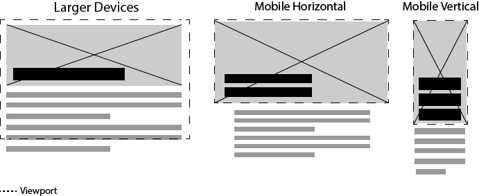
Now that you have a good sense of how all of this stuff works from a technical standpoint, let’s dig into a practical use case. Suppose you want to produce a blog post describing the story behind a painting, using as much imagery as possible. Your designer mocks up a blog where the featured art piece is in the header with the title on top of it. On viewports smaller than 750 pixels wide, the hero image becomes like a magazine cover, with the image and title filling the viewport. Here is an example wireframe:
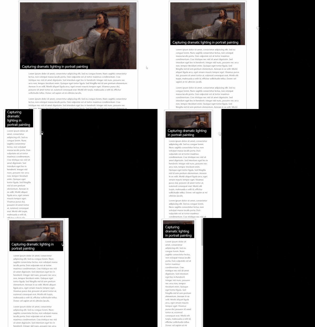
Let’s get started with the basic layout. Initially, we’ll start with no responsive images, so we can see how they help us out. Let’s see what we have:
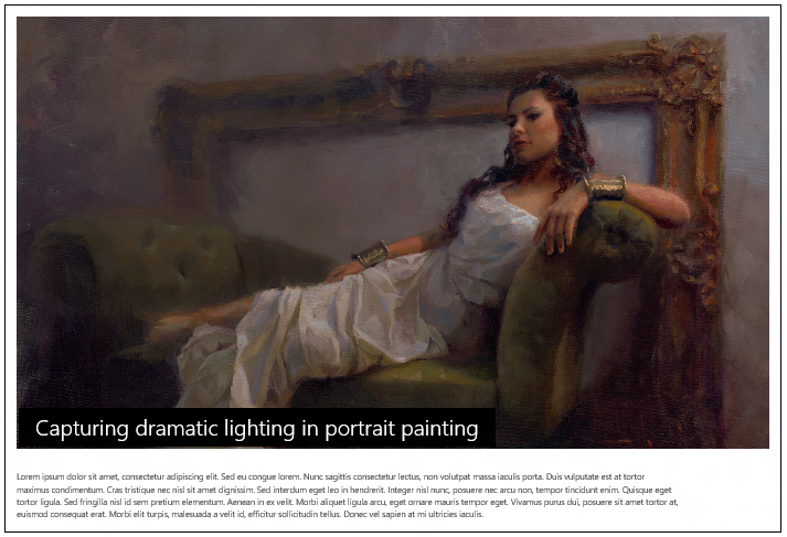
Improving performance by adding resolution switching
Now that we have the initial layout, it is responsive, but some issues do exist that responsive images can help with. The first issue is that while the image we included will work fine on all devices, it won’t be the best experience for people on a slower connection. The image that we are currently using is 2500×1435 and weighs in at 567KB (this is with 60% quality jpg compression) which is only desirable if you are on a high definition device or a large display. Especially on mobile devices, you want to save memory usage and battery life by serving an appropriately sized image. To do this, we create three additional sizes along with the original extra-large version:
| Image | Dimensions | File Size |
| hero-xlarge.jpg | 2500 x 1435 | 567 KB |
| hero-large.jpg | 1920 x 912 | 235 KB |
| hero-med.jpg | 960 x 456 | 62 KB |
| hero-small.jpg | 480 x 228 | 22 KB |
Adding srcset to our hero image will allow the browser to pick the best resource necessary for our viewport’s size, thus improving load time, memory usage and battery life:
| <img class="hero" | |
| src="imgs/hero-xlarge.jpg" | |
| sizes="100vw" | |
| srcset="imgs/hero-small.jpg 480w, | |
| imgs/hero-med.jpg 960w, | |
| imgs/hero-large.jpg 1920w" | |
| alt="A portrait painting of a woman on a couch"> |
We now have a responsive site that loads the necessary image depending on the width of the viewport, which gives us better performance—but we can do better. By using a more efficient image format, we can further reduce the file size for browsers that support it. In this example, we’ll only be using JPEG-XR, supported by Internet Explorer 9+ and Microsoft Edge, but you might consider other formats depending on your use case. We have created JPEG-XR images for the larger images, so now let’s compare them with the other files:
| Image | Dimensions | File Size |
| hero-xlarge.jpg | 2500 x 1435 | 567 KB |
| hero-xlarge.jxr | 2500 x 1435 | 277 KB |
| hero-large.jpg | 1920 x 912 | 235 KB |
| hero-large.jxr | 1920 x 912 | 121 KB |
| hero-med.jpg | 960 x 456 | 62 KB |
| hero-med.jxr | 960 x 456 | 42 KB |
| hero-small.jpg | 480 x 228 | 22 KB |
Note: In this example, I did not convert the hero-small.jpg because the benefits were negligible
In order to update our solution to both use resolution switching and only serve JPEG-XR to supported browsers, we need the picture
| <picture> | |
| <source type="image/vnd.ms-photo" | |
| sizes="100vw" | |
| srcset="imgs/hero-small.jxr 480w, | |
| imgs/hero-med.jxr 960w, | |
| imgs/hero-large.jxr 1920w, | |
| imgs/hero-xlarge.jxr 2500w"> | |
| <img class="hero" | |
| src="imgs/hero-xlarge.jpg" | |
| sizes="100vw" | |
| srcset="imgs/hero-small.jpg 480w, | |
| imgs/hero-med.jpg 960w, | |
| imgs/hero-large.jpg 1920w" | |
| alt="A portrait painting of a woman on a couch"> | |
| </picture> |
Using the media attribute for art direction
Resolution switching improves the performance of our images and can now focus on how the image actually looks when the viewport is at various sizes. On desktop viewports, the layout works exactly like our wireframe suggested, but once we start getting to smaller viewports you start to see issues where the image is too small and the headline begins to cover up the image.
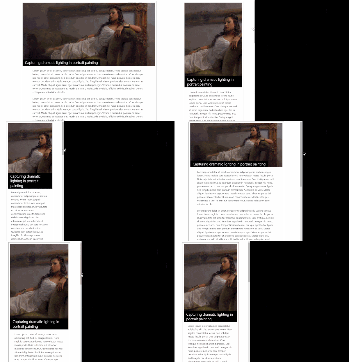
To make this look like our wireframe, we need to create some new images that are designed for vertical devices. After creating some new images and harnessing the power of the media attribute to have the browser pick one of our vertical images on smaller devices we end up with the following end result:
All we did to accomplish this was by adding in the vertical images and adding the following source to our picture element:
| <source media="(max-width: 700px) and (orientation: portrait)" | |
| sizes="100vw" | |
| srcset="imgs/hero-med-vert.jpg 245w | |
| imgs/hero-large-vert.jpg 490w, | |
| imgs/hero-xlarge-vert.jpg 980w"> |
The combination of extended srcset and the picture element gives you the power to optimize your images for various viewports, mime type support and even art direction. We’re excited to bring this capability to Microsoft Edge and to see how you’ll use it on your sites!
To view the live examples shown in this post along with the code to make it happen, we encourage you to check out our Test Drive demo.
– Greg Whitworth, Program Manager, Microsoft Edge

