Introducing Web APIs for Dual Screen and Foldable Devices
The browser is one of the most used apps on any device, and today it’s running on a completely new hardware category: dual-screen and foldable devices.
With a variety of new dual-screen and foldable devices coming to market, including last week’s launch of the new Surface Duo, there’s never been a better time to start thinking about how your site can embrace these form factors.
Today, we are pleased to announce the availability of two new experimental features that will help web developers effectively lay out content in a browser window that spans multiple display regions and create responsive websites that are a natural fit for this new class of device:
- CSS screen-spanning media feature and a set of environment variables to describe the geometry of the fold.
- JavaScript window segments enumeration API, a companion API to the CSS primitives, useful when working with non-DOM targets like Canvas2d and WebGL.
The foldable device class
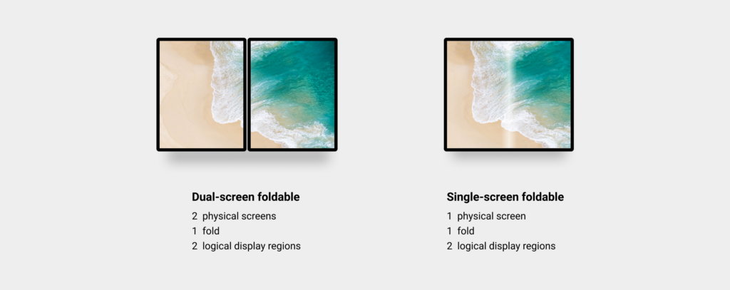
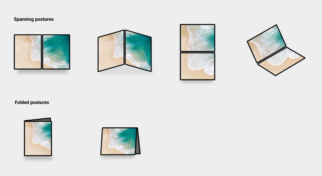
Broadly speaking, there are two variants of foldable devices: dual-screen devices, and single-screen devices that take advantage of the flexible display technology. Both have a lot in common: they are portable, multi-posture devices that allow users to rotate, flip and fold.
On this form factor, applications can reside on one side, or can be spanned across both display regions. A website that responds to this spanned state integrates with the semantics and intent of logically splitting the presented content.
The expansive screen real-estate and unique postures enabled by this device category allow web developers to unlock unprecedented experiences on the web in a device that can fit in your pocket or purse.
Transitioning from traditional contiguous screens to dual-screens and foldables
Although existing websites will continue to work out-of-the-box, making sites aware of the foldable nature of the device can greatly enhance the user experience.
To better illustrate the opportunity and demonstrate how the newly created browser capabilities work, we’ll take you through enhancing an example e-mail client layout.
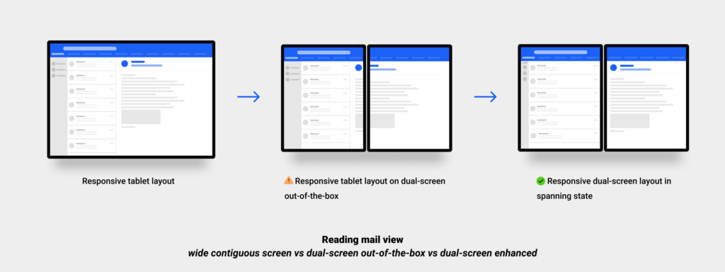
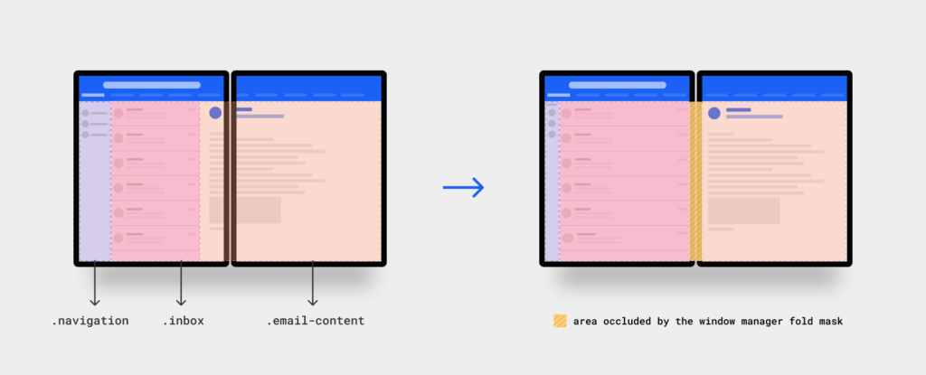
Showing a list-view of the inbox and the content of an email side-by-side is a common pattern that is naturally great for wider viewing areas. When the browser window is spanned across the two display regions on a dual-screen device, the overall viewport width is likely to be comparable to that of a traditional landscape tablet device.
Unmodified, the email client will continue to work as it always has. However, the experience could be dramatically improved if we could align the inbox and the email columns with the fold, keeping each within the boundaries of a single display region. That way, neither content area will be cut or masked by the device hinge or rendered over the fold of a flexible display.
To achieve the desired layout, we are introducing a new screen-spanning media feature and a set of pre-defined environment variables that allow web developers to treat foldable devices as another responsive web design target. Developers can now create layouts that adapt to every device category without taking a hard dependency on specific hardware parameters. This flexibility improves scalability because it does not require duplication of work for each new device type.
Detecting display regions
The CSS screen-spanning media feature will help web developers test if the root viewport is being spanned across multiple adjacent display regions, and provide details about the configuration of these adjacent display regions (e.g. stacked or side-by-side).
Syntax
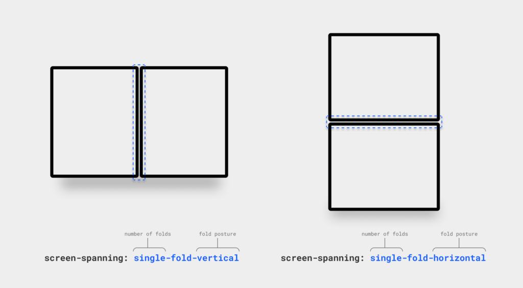
The screen-spanning media feature is specified as a value describing the number of folds (or hinges) the device has, as well as their postures. If the device is not a foldable device, the value is none. If it is a foldable, it can have one of these two values:
Single-fold-vertical: matches a device with a single fold (two display regions) and the fold posture is vertical.Single-fold-horizontal: matches a device with a single fold (two display regions) and the fold posture is horizontal.
Calculating display regions geometry
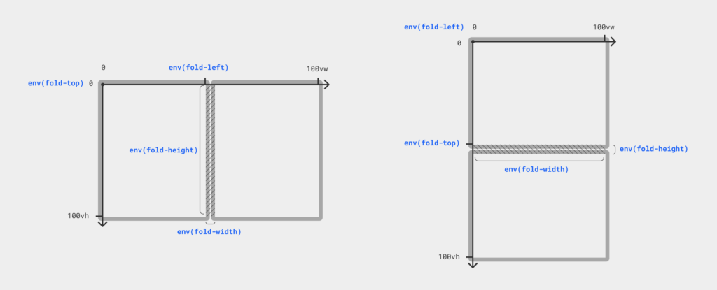
It’s not safe to assume that when in the screen-spanning state, the fold is always going to divide the viewport exactly in half. Additionally, some window managers may choose to mask the web content behind the fold. To help web developers calculate the size of each display region and ensure they know how much their content, if any, needs to be padded to avoid the mask, we are adding four predefined CSS environment variables.
env(fold-top)env(fold-left)env(fold-width)env(fold-height)
The values of these variables are expressed in CSS pixels and are relative to the layout viewport (i.e. are in the client coordinates, as defined by CSSOM Views). When evaluated in content that is not in one of the spanning states, these values will be treated as if they don’t exist, and the browser will use the fallback value as passed to the env() function.
Enhancing our e-mail example app for dual-screen and foldable experiences
Let’s put the CSS screen-spanning media feature and the fold geometry environment variables into practice and enhance the reader view of our email client:
Enumerating the window segments in JavaScript
When working with non-DOM targets like Canvas2d or WebGL, you can get the geometry of each display region using the new Window Segments Enumeration API.
getWindowSegments() is a method on the Window object that returns an array of 1 or more DOMRects representing the geometry and position of each display region.
The returned array is an immutable snapshot of the display regions’ state at the time the method was called. If the user transitions from a spanning state to a non-spanning state, or rotates the device, the window segments previously retrieved will be invalid.
Pages should listen to window resize event or orientationchange event to detect whether the browser was resized, or the device was rotated and retrieve the updated display regions.
There are no explicit methods to learn whether the fold posture is vertical or horizontal, as this information can easily calculated from the DOMRects returned:
Same applies for the fold-width, web developers can use information provided by getWindowSegments() to learn whether the window manager is masking content rendered behind the fold, and the fold width is greater than zero pixels, or not.
Future-proofing
As developers, we tend to plan for the future when creating for today, so a minimum amount of refactoring is needed to unlock scenarios that are likely to arise down the road.
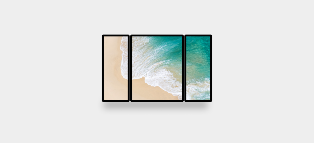
Unlike CSS, JavaScript has the concepts of arrays, loops and conditionals which make the mapping between the Window Segments Enumeration API and a device with N display regions more direct. For the imaginary device illustrated above, when the browser is spanned across all 3 display regions, calling the getWindowSegments() method will return an array of 3 DOMRects and using simple language primitives like a loop or the built-in array methods you could learn more about how the display regions are configured (e.g. are all screen of the same width?, etc.)
In CSS, the current plan is to simply add new values to the screen-spanning media feature representing new screen topologies.
Start enhancing your websites for foldable experiences today
The CSS screen-spanning media feature and the Window Segment Enumeration API are available behind an experimental flag, you can enable them at edge://flags/#enable-experimental-web-platform-features.
Starting in Microsoft Edge 86, web developers can use Microsoft Edge DevTools to emulate dual-screen & foldable devices on Windows and Mac desktop platforms. Alternatively, you can download and install the new Surface Duo emulator preview (version 2020.806.1 or newer) to test and debug using the built-in Edge browser after enabling experimental platform features flag.
Both the JavaScript Window Segments Enumeration API and the CSS screen-spanning media features are available as Origin Trials, where you can acquire tokens and safely experiment with these new primitives in production in exchange for providing us with feedback about the APIs. Sign up for an Origin Trial if you’re interested in testing out these APIs!
The road ahead
These APIs are available for you to experiment with today after many iterations and improvements with the collaboration of the Chromium project, Google, Intel, W3C’s CSSWG, Second-screen WG and many others.
We have contributed both the CSS and JavaScript primitives for desktop platforms to the Chromium open-source project and now the DevTools’ foldable and dual-screen devices emulation is available not only in Edge, but also in Chrome and soon in other Chromium-based browsers. We are currently working on upstreaming the Android implementation so all Chromium-based browsers on Android OS can support web developers delivering exciting new experiences for this flexible device category.
If you have feedback about either one of the APIs, please let us know by opening an issue on GitHub or alternatively you can reach out to us on Twitter (@_zouhir or @MSEdgeDev).
– Zouhir Chahoud, Program Manager
– Daniel Libby, Principal Software Engineering Manager


