To provide a consistent experience throughout the WP7 platform, it’s important to follow a common structure while placing buttons. Doing so will provide a consistent, and simple structure for users to navigate through.
It is also important to understand what the hardware and software will give you for free. Using these freebies, will mean that you tap into the muscle and mental memory that user develops when using their Windows Phone. For starters, all Windows Phones contain three hardware buttons—back, home and search. Understanding how these buttons are utilized throughout the system can mitigate issues within the UI and flow of your application.
Home buttons/back stack
Placing home button within your user interface deviates from the WP7 navigation model. While innovating on the platform is not necessarily bad, changing the expected interaction model of the platform can have a potentially negative impact. Specifically, you might be requiring the user to develop a new mental model, one that they may only apply in your application. Thus making your application and the platform feel harder to use.
Implementing a home button in your application may also cause a second issue, one that has a much more severe implication for your application. You might inadvertently create a scenario where a user can get stuck in an infinite (or near infinite loop) when using both your home and the product’s back button to navigate your application’s interaction. Specifically, if a user has to repeatedly rely on a home button to start tasks within your application, when they try to leave the application using the back button you might be forcing them to retrace every step they took in your application. That is bad. This loop may get worse if they use the back button to move from one application back through your application just to get to another. You should be sure that these issues does not occur in your application. If you absolutely believe you must have a home button test for these negative scenarios and do your best to eliminate them.
We understand that all applications have a different interactive flow, some more complicated than others, our recommendation is to try to keep the architecture of your application as shallow as possible and to leverage the use of list and pivots so the user can navigate back to the landing screen with few steps back and from there to previous launched apps. When in doubt try to mimic common elements and navigation structures already in the platform , you’ll be less likely to confuse the user.
Back and Close buttons
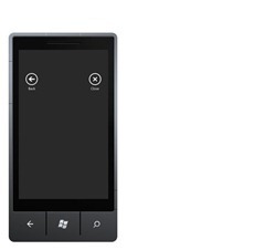
This one is simpler, it should be no “Back” or “Close” buttons at all within the user interface. Again, we give you a back button for free. So use that extra space to keep your app clean and simple.
Floating Buttons
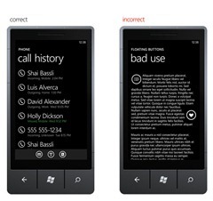
Floating buttons within an application produces an inconsistent, confusing navigation. Utilizing the app bar is the best way to add actions on a particular page. When those icons/buttons couldn’t be on the app bar, be sure to place them consistently within your UI. Variable placement may interfere with content browsing—the icon may not even look like an interactive element. Therefore, an accidental tap from the user could lead to an unexpected result. Providing structure and incorporating an standardized placement for the main tasks on your app creates a familiar experience for the user, page after page. The WP7 library of common controls provide a consistent approach to implementing icons/buttons within your UI—we recommend to follow layouts suggested by the design guidelines in order to achieve interaction that is common throughout the WP7 platform.
– Alfred Astort
Follow the Windows Phone Design Team on Twitter: @WPdesignteam


