Welcome to a new series of posts written for web developers who target the Windows Phone platform. We will start with topics that are relevant to IE7 though we understand the excitement about IE9 and will be sharing more information about it soon. Your feedback on this blog would be appreciated. Let us know if there are web development topics you’d like us to cover in future posts.
As web browsing on mobile devices continues to grow in popularity, it’s more important than ever to design mobile web sites that match the look and feel of native applications. One of the features provided by the browser in Windows Phone that helps with this task is programmatic control over the browser layout viewport.
Screens, windows, and viewports…
Once upon a time, when browsers only lived on desktop computers, the web content canvas (the area on the screen that the web site can draw things on) was tied in nicely with the size of the browser window. This was convenient, predictable, and works very well. Then rich mobile browsers grew in functionality to the point where the same sites could be displayed on the mobile screen. Unfortunately, the desktop model didn’t work very well because phone screens generally have fewer pixels than desktop monitors and are most often held in portrait orientation. The result was that the layout of many sites was compressed horizontally on mobile browsers, as you can see here:
Windows Phone 7 decoupled this canvas from the window creating two different viewport concepts. The first one is used during layout and it is independent of the browser window size and screen resolution and the second one that represents the visible portion of the page that is device and application specific. For more information about this concept, see this posting by Peter-Paul Koch.
Controlling the viewport
On Windows Phone 7, all web sites have a default layout viewport width of 1,024 pixels. Before rendering any content, the browser sets the zoom level so that the layout viewport fits horizontally on the screen. This is what gives the user a thumbnail view of the website when it initially loads.
Developers and designers can control the layout viewport width by utilizing a special META tag called viewport. If this tag is present, the browser will assume the page content is optimized for mobile browsers and will disable all the optimizations the browser makes to enhance the readability of desktop sites. This means that the page will be rendered exactly as specified by the markup.
Note: The height of the document in a mobile browser is always calculated based on the phone’s orientation and the desired viewport width, so the page is at least a tall as the visual viewport.
Now, we’ll dig in into the details on how this tag works on Windows Phone 7. First, we’ll create an HTML document with four rectangles of different sizes:
<!DOCTYPE html PUBLIC "-//W3C//DTD XHTML 1.0 Transitional//EN"
                      "http://www.w3.org/TR/xhtml1/DTD/xhtml1-transitional.dtd">
<html xmlns="http://www.w3.org/1999/xhtml">

<head>
<meta content="text/html; charset=utf-8" http-equiv="Content-Type" />
<title>Viewport Test</title>
<style type="text/css">
.auto-style1 {
    font-size: large;
    color:white;
}
</style>
</head>

<body>
<div style="position:absolute;top:0px;left:0px;width:1024px;
            height:1024px;background-color:gray">
    <p style="text-align:right" class="auto-style1">1024px</p>
</div>
<div style="position:absolute;top:0px;left:0px;width:480px;
            height:480px;background-color:green">
    <p style="text-align:right" class="auto-style1">480px</p>
</div>
<div style="position:absolute;top:0px;left:0px;width:320px;
            height:320px;background-color:maroon">
    <p style="text-align:right" class="auto-style1">320px</p>
</div>
<div style="position:absolute;top:0px;left:0px;width:240px;
            height:240px;background-color:navy">
    <p style="text-align:right" class="auto-style1">240px</p>
</div>
</body>

</html>
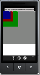
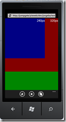
When loaded on Windows Phone 7, the document will look like this:
Specifying a constant viewport size
When your site is designed for a specific viewport width, having a hard-coded value on the viewport tag will always produce the expected behavior, independent of device or screen orientation. The browser will adjust the initial zoom factor so that the content fits the device’s visual viewport.
For example, on the example site, if we use:
<meta name=”viewport” content=”width=320″ />
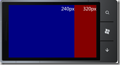
The site will look like this in portrait orientation:
After rotating the device to landscape orientation, the content is zoomed-in so that the viewport width remains constant:
But, if we change the tag to:
<meta name=”viewport” content=”width=480″ />
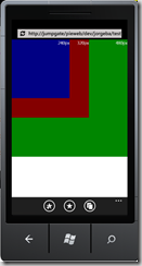
The page will instead look like this:
Dynamic viewport sizing
You can use the special value ‘device-width’ to enable Internet Explorer to select the viewport size. This value tells the browser that the site is designed to handle multiple resolutions. The result is that the browser will be ready to change its layout on the fly if there are orientation changes.
Internally, Windows Phone 7 will resolve device-width to 320px when in portrait orientation, and to 480px in landscape orientation. Those values were chosen when Windows Phone 7 launched because the majority of mobile web sites at that time weren’t ready to scale to the higher DPI screens we use on our phones, and so would have provided a less-than-ideal experience for our users. This is consistent with how other platforms are doing this, although I would encourage all web developers to use dynamic sizing only if their sites can scale to different device configurations.
We’ll put this knowledge to use now by modifying the viewport META tag to use dynamic sizing:
<meta name=”viewport” content=”width=device-width” />
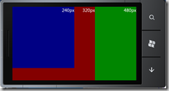
And then load it on Windows Phone:
After rotating the screen, we see that the document has been resized as expected:
Alternative ways to change the size of the viewport
Windows Phone 7 will automatically resize the layout viewport if it determines that the content would be better rendered as a mobile-optimized page. This includes sites that use the XHTML Mobile profile or use the MobileOptimized or the HandheldFriendly META tags.
Jorge Peraza
Program Manager
Windows Phone Browser Team

