As the mobile Web has grown in importance, so too have the challenges facing developers who have to create pages that work across multiple screen sizes. In this post, I’m going to outline some simple tips to follow when creating Web pages that will make the process of optimizing them for different form factors using responsive layout much easier. Specifically, these are:
- Focus on creating semantic markup – use CSS and JavaScript for appearance and behavior
- Avoid embedding inline styles and JavaScript in your page – use external styles and scripts
- Create media queries to apply styles based upon the form factor of the device display
- Use CSS properties such as “display” to create layouts that work well across devices
- Avoid embedding images directly in the page in cases where the page will be used across platform – use CSS to specify background images
Same Markup, Different Form Factors, Tailored Experience
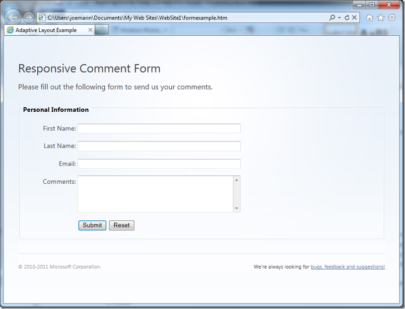
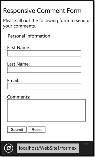
Let’s begin by taking a look at a sample Web page that is laid out for both desktop-sized screens and mobile device screens:
Typical feedback form, laid out for desktop screen size
Same form, laid out for mobile device screens
The same Web page with the same content and markup is displayed differently for each of the form factors. How is this possible? First, let’s examine the content of the document’s <body> section:
<body>
<div class="container">
<h1>Responsive Comment Form</h1>
<p>Please fill out the following form to send us your comments.</p>
<div class="content">
<form action="" method="get">
<fieldset>
<legend>Personal Information</legend>
<p><label for="firstname">First Name:</label> <input id="firstname" type="text"></p>
<p><label for="lastname">Last Name:</label> <input id="lastname" type="text"></p>
<p><label for="emailaddr">Email:</label> <input id="emailaddr" type="email"></p>
<p><label id="comments" for="commentfield">Comments:</label> <textarea id="commentfield" rows="5"></textarea></p>
<p id="submitform"><input type="submit" value="Submit"> <input type="reset" value="Reset"></p>
</fieldset>
</form>
</div>
<ul class="footer">
<li>We're always looking for <a href="#">bugs, feedback and suggestions!</a></li>
<li>© 2010-2011 Microsoft Corporation.</li>
</ul>
</div>
</body>
Semantic Markup
Notice that the code consists entirely of semantic markup – markup that simply defines the elements of the page according to their semantic meaning without any regard to physical appearance. In fact, there’s nothing in the code here that has anything to do with the appearance of the page. The width of the form fields, their alignment, the background images on the desktop version, etc. are all specified in style sheets and separated from the main content of the page – no inline styles or script handlers. This makes it much easier to tailor the layout to a given form factor by applying different styles to the page elements using media queries.
Using Media Queries
Speaking of tailored layout, the way to apply different styles to a page based on attributes such as width is to use CSS Media Queries. The way I’ve defined the <style> tags in this example is:
<style type="text/css" media="screen and (min-width: 481px)">
// Style definitions here for large screens
</style>
<style type="text/css" media="screen and (max-width: 480px)">
// Style definitions here for smaller screens
</style>
Essentially, Media Queries allow you to selectively apply styles based upon certain characteristics of the display device. In this particular case, my media attribute specifies that the style should be applied to screen devices of certain widths: one for screens that are 481 pixels wide and larger (min-width:481px), the other to screens that are up to 480 pixels wide (max-width:480px).
Why use a boundary of 480px? That happens to be a pretty good width to use for a large number of phones and covers the cases of both portrait and landscape too. For example, when Windows Phone is in portrait mode and the Viewport tag is set to “width=device-width”, the screen width is 320px, just like it is for iPhone and Android. When the phone is rotated to landscape, then the same page with the same Viewport setting is 480px wide.
Tweaking the Styles
Inside each style definition are the style rules that govern how the page elements look. In particular, I’ve used certain style definitions to achieve changes in how some of the page elements are not only rendered but how they are laid out for each form factor.
For example, notice how the desktop layout has background images applied, the form element labels are positioned to the right of their respective input fields and are aligned on their right edges, the input fields all have equal widths, and the Submit and Reset buttons are lined up with the left edge of the input fields.
Specifying the Background Images
On the mobile layout, there’s no background images, the form labels are on top of their input fields and aligned to the left, the input fields all have a more narrow width, and the Submit and Reset buttons are left-aligned to the page.
These differences are all due to the style definitions. For the desktop layout, the html and body tags are styled as:
html { background: transparent url('webx-bkg.png') repeat-x; margin: 0; padding: 0; }
body { font-family: "Segoe UI", Tahoma, Helvetica, Arial, sans-serif;
margin: 0; padding: 0; line-height: 150%;
background: transparent url('webx-content-bkg.jpg') no-repeat center top;
border: 0; outline: 0; font-size: 100%; vertical-align: baseline; color: #434343; }
This technique places the inclusion of images in the style sheet rather than specifying them directly in the markup. It’s used here for the background images, but you can do the same thing elsewhere in your content by using a <div> tag and specifying a background image for it instead of using an <img> element. This allows you to easily specify different size images for different form factors.
For the mobile layout, there’s no style for the html tag, and the style for the body tag is:
body { font-family: "Segoe WP", sans-serif; margin: 0; padding: 0; line-height: 120%;
background: white; border: 0; outline: 0; font-size: 100%;
vertical-align: baseline; color: black; }
Here, there’s no background image and the text is styled slightly differently to give it a more natural look on Windows Phone if Segoe WP is available (otherwise it falls back to basic sans-serif).
Customizing the Form Layout
For the form elements, changing how the labels are sized and aligned along with the input elements is also straightforward. For the desktop, these styles are defined as:
label { width: 120px; text-align: right; display: inline-block}
input[type=text], input[type=email],textarea { width: 350px; }
legend { font-weight: bold; margin-left:2pt;}
#comments { vertical-align:top }
#submitform {margin-left: 124px;}
The input fields are styled to have the same width, while the comments label is vertically aligned to the top of its associated <textarea>. The Submit and Reset buttons are wrapped in a <p> tag that is given a margin-left that indents the buttons to be aligned with the input fields. The form labels are styled to display as inline-block, which allows them to have a width and height while appearing on the same line as each input field.
For the mobile layout, the form elements are styled a bit differently:
input[type=text], input[type=email], textarea { width: 250px; }
fieldset { border: 0px; }
label { width: auto; text-align: left; display: block}
Here, the input types are a bit more narrow, and the border around the <fieldset> is removed to give the page a cleaner look on the smaller screen. The labels are styled to align to the left and display as block elements, which places them above their input fields and optimizes the layout for vertical scrolling. This also prevents the labels from being edged out of the screen when the associated input field has the focus and is “zoomed in” on the mobile browser.
Conclusion
Creating Web pages that work well on various form factors isn’t necessarily hard, it just takes some forethought and planning. By following the guidelines I’ve outlined here, you can start to see how Web pages can be made to work well across form factors through a combination of clean semantic markup, and style sheets that are tailored to the display capabilities and characteristics of the target device.
Happy Coding!
Joe Marini
Principal Program Manager, Internet Explorer Windows Phone


