- Build responsive apps
- Target the right device family
- Include additional scaling assets
- Create multi-screen experiences
Build responsive apps
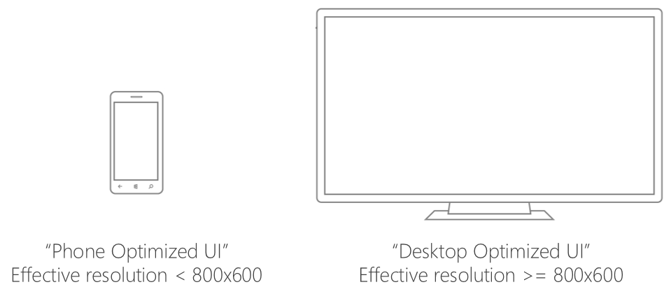
Using responsive techniques will ensure your app works beautifully on any screen size, regardless of Windows device family. There are no APIs or tools specific to Continuum; when your app is activated or moved to the connected display, your app will simply receive a SizeChanged event similar to when a desktop window is resized. When you receive this event, be sure your app adjusts as needed to optimize for the given size. In general, users should see a phone-optimized UI when using your app on their mobile device, and a desktop-optimized UI when using Continuum to use your app on the connected display. Note that users can interact with the connected display with a keyboard and mouse, or the Continuum touchpad app on the mobile device (which mimics a precision touchpad).
With today’s hardware, it is safe to assume your app is running on a connected display if the effective resolution is greater than or equal to 800×600 effective pixels. See Responsive design 101 for Universal Windows Platform Apps for details on effective pixels and responsive techniques for all UWP apps.
Tools for responsive XAML apps
A plethora of responsive tools are available to XAML developers. See “Make your app look great on any size screen or window” for a deep dive, but here are a few of the available tools.
The RelativePanel class allows you to anchor UI elements relative to each other and the container such that they reflow to any screen size.
The VariableSizedWrapGrid class make it easy to wrap pictures and text in a grid according to window size.
The SplitView class can be used to create a top-level navigation experience, adjusted according to window size.
Finally, the VisualStateManager class allows you to define visual states that correspond to certain conditions, such as window size or custom triggers such as input type.
UserInteractionMode API
The UserInteractionMode API gives you context about the form factor of the display your app is running on. It returns “mouse” when the device UI is optimized for mouse input, and “touch” when the device UI is optimized for touch input. These returns do not describe the current input method, but rather what input method the shell your app is running in is optimized for.
With Continuum, “touch” will always be returned when your app is on the mobile device, and “mouse” will always be returned when your app is on the connected display. UserInteractionMode will only change when your app is moved between screens. UserInteractionMode does not send events – you’ll need to query this API upon receiving a SizeChanged event. Note that UserInteractionMode is also used to inform developers when a desktop device is in tablet mode – Continuum is not the only use case.
Here is an example of how you might use UserInteractionMode in C# to switch between a mobile view and a desktop view for Continuum.
[code lang=”csharp”]using Windows.UI.Xaml;
using Windows.UI.ViewManagement;
public sealed partial class MainPage : Page
{
public MainPage()
{
InitializeComponent();
// Every view gets an initial SizeChanged, so we will do all our
// work there. This means that our view also responds to dynamic
// changes in user interaction mode.
Window.Current.SizeChanged += SizeChanged;
}
private void SizeChanged(object sender, RoutedEventArgs e)
{
switch(UIViewSettings.GetForCurrentView().UserInteractionMode)
{
// When mouse is returned, use desktop layout
case UserInteractionMode.Mouse:
VisualStateManager.GoToState(this, "DesktopLayout", true);
break;
// When touch is returned, use mobile layout
case UserInteractionMode.Touch:
default:
VisualStateManager.GoToState(this, "MobileLayout", true);
break;
}
}
}
[/code]
DisplayInformation Class
The DisplayInformation class monitors and controls physical display information. This class provides events to allow clients to monitor changes in the display an app view is running on. You can use DisplayInformation to tailor experiences based on display properties. For example, if you want your app to adapt based on the physical screen size of the device (as an estimate for form factor), you can use the DiagonalSizeInInches property as a trigger.
Target the right device family
If you build a UWP app that can run on a Windows mobile device, your app will run on Continuum by default. If you only have a Windows Desktop and/or Xbox app, your app will not be supported on Continuum.
Universal device family
The best thing you can do is to make sure your app targets the universal device family, so that it can run on any Windows device. If you do, you’re already doing everything needed to work on Continuum. For more details, see Packaging Universal Windows apps for Windows 10 and Guide to Universal Windows Platform (UWP) apps.
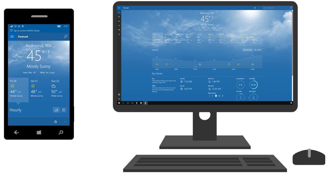
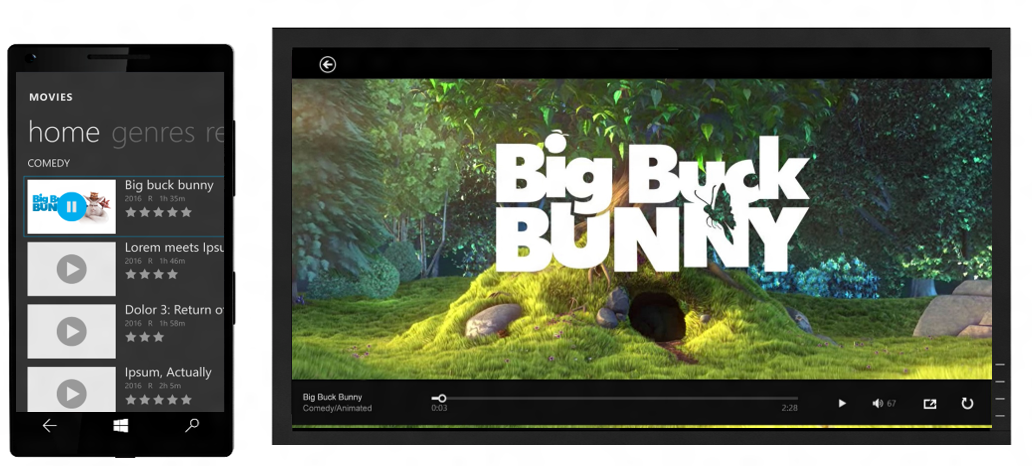
This weather app is a good example. The developer of this app did not know Continuum existed before they built the app. They were delighted to find that because they targeted the universal device family, their app worked just like it does on a desktop PC by default.
Note: On Continuum, apps are single instance – an app can only run on one screen at a time (except with multi-screen scenarios as described below). These side-by-side illustrations show how the app adapts across screens.
Mobile device family
While we recommend targeting the universal device family where possible, we understand that many developers come from mobile-only backgrounds. If your app only targets the mobile device family, you can incorporate responsive techniques and get some basic reflow behavior for free. This will make your app work better on a connected display.
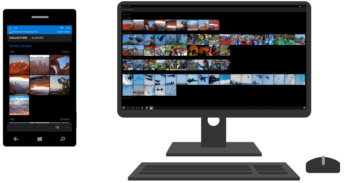
For example, the photos app below was built targeting only the mobile device family. However, because the developer leveraged the RelativePanel and WrapGrid classes to define how their app responds to various phone sizes and orientations, their app content automatically responded and took advantage of the larger connected display screen sizes.
If you want make your mobile app look even better on Continuum, you can use the responsive techniques discussed above to further optimize the big screen layout of your app. If you find yourself building new UI components or app views for Continuum, we suggest targeting the universal device family so your effort can be realized across all Windows devices.
Considerations for separate mobile and desktop packages
If you’re a developer with separate packages targeting the mobile and desktop device families, users will only get the behavior of your mobile app when they use it on Continuum. However, you can improve the way your app works on Continuum by bringing views and/or assets from your desktop app to your mobile app, and triggering them when appropriate.
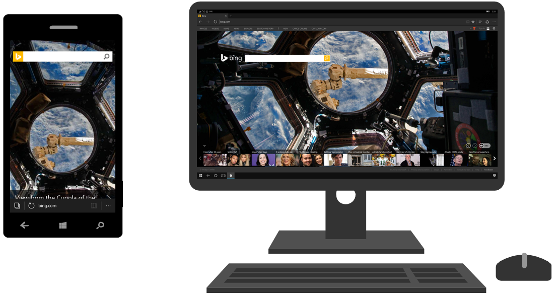
For example, the Microsoft Edge browser dynamically loads a mobile view or desktop view depending on which screen the app is running on. Because a desktop view already existed, Edge was able to port desired UI components to their mobile app for use on the connected display rather than rebuilding anything.
You can use triggers such as effective resolution or UserInteractionMode to determine when to show your desktop view vs. your mobile view. See the code snippet in the UserInteractionMode section above for an example of switching between a mobile and desktop view on SizeChanged event. You can also reference the VisualStateManager class for more information on building triggers.
Opting out of the connected display
If your mobile app isn’t ready for Continuum right away, no worries. Simply add the following lines to your manifest to block your app on the connected display. Making this change will cause your app tile to be greyed out on the connected display’s Start menu until it is enabled. If the user tries to launch your app on the connected display while it is greyed out, they will see the following:
The namespace to be added to the <Package> tag:
[code lang=”xml”]<Package
xmlns="http://schemas.microsoft.com/appx/manifest/foundation/windows10"
xmlns:mp="http://schemas.microsoft.com/appx/2014/phone/manifest"
xmlns:uap="http://schemas.microsoft.com/appx/manifest/uap/windows10"
xmlns:mobile="http://schemas.microsoft.com/appx/manifest/mobile/windows10"
IgnorableNamespaces="uap mp mobile">
[/code]
The actual “true” / “false” restriction value:
[code lang=”xml”]
<Extensions>
<mobile:Extension Category="windows.mobileMultiScreenProperties">
<mobile:MobileMultiScreenProperties RestrictToInternalScreen="true"/>
</mobile:Extension>
</Extensions>
[/code]
This <extensions> block is a child of <Application>.
When your app is ready for Continuum, simply set RestrictToInternalScreen to “false” and submit an update!
Additional scaling assets
To optimize for connected displays, you can provide UI assets (e.g. icons, pictures, bitmaps, etc.) for a variety of resolutions and scales.
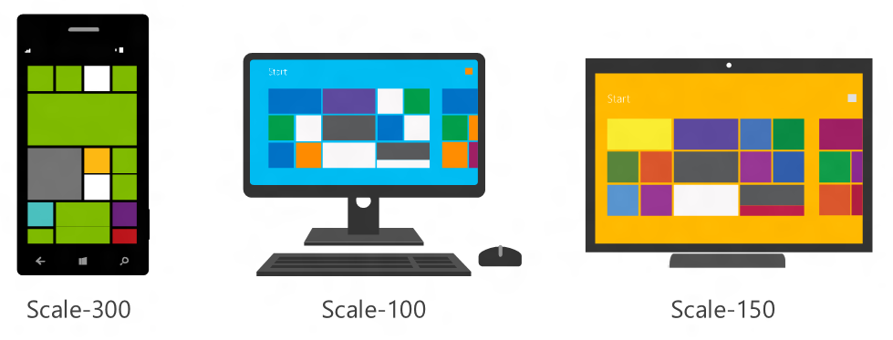
Every device on the Windows platform is associated with a specific scale, derived from the effective resolution, which is computed from the physical pixel density and theoretical viewing distance. There is no direct correlation between device size and scale. These scales are used by the resource management system to determine which developer-provided assets will work best on a given display.
Here are a few examples:
The mobile device will generally have a scale between 200 and 400. The connected display will most likely have a scale of 100 (most monitors) or 150 (most TVs). When the user downloads your app from the Store, only scale assets for the mobile device screen will be deployed to the mobile device by default. After this, an app update will be triggered each time the user connects to an external display with a new scale factor. This update will pull down the best assets for the new display. If the best assets are already on the mobile device, then no update is necessary.
For example, let’s say you have a scale-300 mobile device and scale-100 monitor. When apps are running on the monitor, they want to use scale-100 assets. The first time the user connects to this monitor no apps will have scale-100 assets available because they are not deployed to the mobile device by default, so the next best assets (scale-300) will be used. Upon connection, the system will query all of the user’s downloaded UWP apps to see which ones have better scaled assets available, and an update will be triggered to pull down those assets. In some cases, this may mean that scale-150 or scale-200 assets are flagged if scale-100 assets are not available. An update will be triggered to pull down those assets. The system will automatically apply the best-scaled assets to each display independently. To save space, assets for screens that go unused for more than 30 days are removed.
Adding and referencing scale resources
To support more scale factors, simply include more scale resources in your app solution. There are two ways to do this.
- Add new resources with .scale-xxx notation in an “Assets” folder
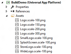
- Add new scale resource folders, with the identically named assets in each folder
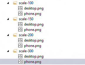
If you use one of these two options, you can reference the desired resource with a URI (leaving out the “scale-xxx”) and the system will grab the best scaled asset for a given display. For example: “ms-appx:///Assets/Logo.png” or “ms-appx:///desktop.png”. A tag in XAML could look like this: <Image x:Name=“LogoImage” Source=“ms-appx:///Assets/Logo.png”/>.
Create multi-screen experiences
With UWP APIs, you can take advantage of the mobile device and connected display simultaneously.
Media casting
You can use the built-in casting capability of the MediaElement control to show a media element on the connected display while your app remains on the primary display. Simply feed the desired media element to the system, and Windows creates a view and plays that media element on the connected display.
Here’s an example of how you might leverage the MediaElement Control:
[code lang=”csharp”]
//Create a casting picker
CastingDevicePicker picker = new CastingDevicePicker();
//Filter it to only videos
picker.Filter.SupportsVideo = true;
//Add the event listener for the device selected event.
picker.CastingDeviceSelected += picker_DeviceSelected;
async void button_Clicked(object sender, RoutedEventArgs args)
{
//Show the selection UX when the button is pressed
await picker.Show(new Rect(0, 0, 5, 5), new Placement.Above);
}
void picker_DeviceSelected(CastingDevicePicker sender, CastingDeviceSelectedEventArgs args)
{
//Get the selected device from the arguments
CastingDevice selectedDevice = args.SelectedDevice;
//use the casting device as desired
await selectedDevice.RequestStartCastingAsync(mediaElementVideo.GetAsCastingSource());
}
[/code]
ProjectionManager Class
The ProjectionManager class allows you to create rich, interactive multi-screen experiences. It is easy to begin and end multi-view sessions, where you have full control over the view on each display. Here are some additional guidelines. Because you cannot guarantee the user has a keyboard and mouse, you should assume that the view on the mobile device (internal view) must fully control the view on the connected display (projected view).
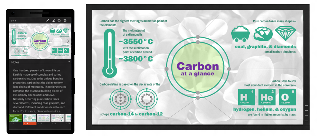
As an example, Microsoft PowerPoint leverages the ProjectionManager class to create a robust multi-screen presentation experience, powered by a mobile device. The view on the mobile device contains a slide preview, notes, and slide selection tool. With this view, the user is in full control of the slides showing on the connected display.
Here’s an example of how you might leverage ProjectionManager to create a multi-screen experience:
[code lang=”csharp”]
private async void StartProjecting_Click(object sender, RoutedEventArgs e)
{
//Check whether there is already active connection to an external display
if (ProjectionManager.DisPlayAvailable)
{
int thisViewId;
thisViewId = ApplicationView.GetForCurrentView().Id;
var thisDispatcher = Window.Current.Dispatcher;
await CoreApplication.CreateNewView().Dispatcher.RunAsync(CoreDispatcherPriority.Normal,()=>
{
// Display the page in the view. Not visible until “StartProjectionAsync” called
var rootFrame = new Frame();
rootFrame.Navigate(typeof(ProjectionViewPage), initData);
Window.Current.Content = rootFrame;
Window.Current.Activate();
});
// Show the view on a second display
await ProjectionManager.StartProjectingAsync(rootPage.Id, thisViewId);
}
}
private async void StopProjecting_Click(object sender, RoutedEventArgs e)
{
await ProjectionManager.StopProjectingAsync(rootPage.ProjectionViewPageControl.Id,thisViewId);
}
[/code]
Start building
Most developers who build responsive UWP apps that run on mobile devices won’t have to do any work to support Continuum. But of course, every app is unique so we recommend testing and validating how your app works in this scenario.
Here’s an overview of what you should consider for Continuum, and a few additional resources.
- Most importantly, use responsive techniques to ensure your app reflows beautifully to any screen. Targeting the universal device family will benefit you most on Continuum and across all Windows devices.
- Remember that users will most likely interact with your app on the connected display with keyboard and mouse. Consider implementing and testing UI optimized for keyboard and mouse if your app is primarily touch-driven.
- Include additional scaling assets in your app package to make your app pixel perfect on any display. Most screens a user might connect to will be scale-100 or scale-150.
- Leverage multi-screen APIs to create rich, interactive, robust multi-screen experiences.
To learn how to get set up, check out the Microsoft Display Dock and other hardware on microsoft.com, the wireless Actiontec ScreenBeam Mini2 Continuum Edition, and read about our Continuum for phone hardware configurations.
We look forward to using your apps on Continuum!
Post written by Liz Threlkeld, a Program Manager on Windows

