This blog is the first in a multi-part series on app design for developers. We’ll introduce you to the tricks of the design trade so you can create more attractive and more successful UWP apps.
There is a well-known gap in the software industry between developers and designers, coders, and creatives that you don’t really see in other areas of the field. To improve the flow between development and QA teams, developers long ago rolled up their sleeves and came up with automated unit testing frameworks and continuous integration platforms. To better understand and improve project management, developers taught themselves how to analyze business requirements and adopted agile methodologies (lots and lots of them!).
When it comes to design, however, developers up to now have tended to run for the hills. Why is that?
Demystifying design
Like development, design is really just made up of a core set of skills, best practices, and parcels of information. Over the weeks to come, you can gain basic mastery of design skills, such as:
Knowing these building blocks contributes to what designers rather loosely define as “good taste” — the ability to quickly judge what works visually and what does not. By applying and practicing these skills, you’ll train your eyes to see things you’ve probably overlooked in the past regarding color, balance and alignment. More to the point, you’ll be able to take a decent-looking app and understand how to tweak it in order to make it into a great-looking one.
Getting started
Design shouldn’t be an afterthought. As an app developer, you’ve probably discovered that just as an app’s functionality contributes to how it looks, figuring out how the app should look often affects its functionality. Features that seemed important might turn out not to be, once you see that you’re already doing too many things in your navigation menu. Sometimes, after laying out the app screens and writing lots of code for it, you may even realize that you’ve really got two apps on your hands and not just one. Designers have several tricks to help identify these types of issues early on, so you don’t have to change course late in the process and lose valuable time.
What is the focus of your app?
This may seem incredibly obvious, but you should always start by figuring out what your app does. What do you want your users to be able to do? If you are a visual person, start by imagining a blank canvas and figure out what you want to put in it. If you are more verbal, you should use a list instead. Either way, just start adding all the features and colors and menus you think you might need.
Now you want to simplify. This may seem counter-intuitive after all the work you’ve put in, butthe single greatest principle of modern app design is that less is always more. Too many features could confuse users. Too many screens are hard to navigate or remember. So simplify.
Draw a line through every feature you don’t absolutely need. Then draw a line through features you think you need, but which don’t fit well with the other things on your list. At the end of this process, you’ll have reduced your app idea down to its purest form.
Understand your customers
Now you need to figure out who your app is for.
Is your app intended for children or adults? Busy professionals or people relaxing at home? Is it for the technologically savvy, or are you writing it for someone who needs more help? Understanding these sorts of things will help you picture the overall look, feel, and layout of your app. Busy professionals don’t have time for lots of text, while a less technical audience may need extra clues on how to use your app. Children probably will like bright colors and illustrations more than a millennial would.
Once you know who your target customers are, go talk to them. It may seem like overkill, but the more effort you put into understanding your customers, the better off you will be in the long run. Take video of your intended customers (with their permission, of course), observe them, ask them questions, find out what they would like from your app.
Be inspired
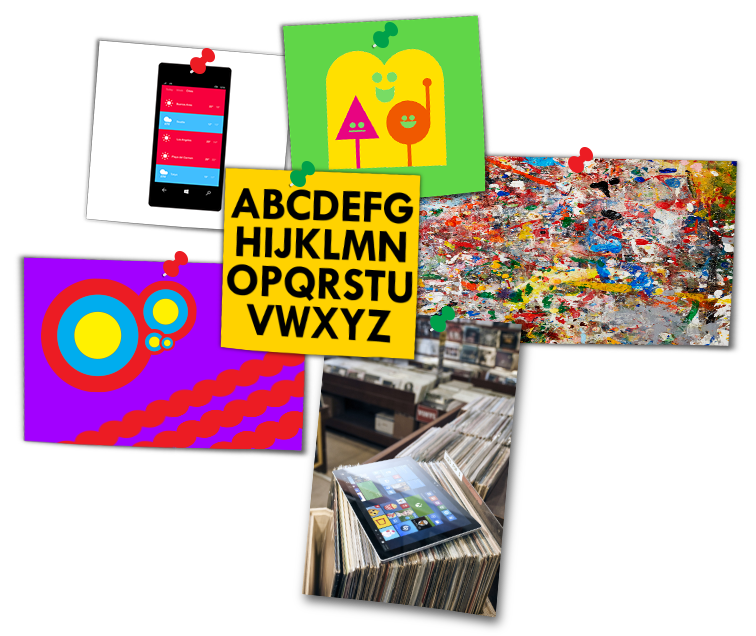
Always be on the lookout for inspiration. Collect images, fonts, quotes, textures, and layouts related to your app and your customers — or even just assets that appeal to you at the time — and use them as sources of inspiration throughout the process of coding and designing your app. (Of course, don’t actually use them in your app without permission,). Take a look at what other apps in your category are already doing. Is there anything yours can do better?
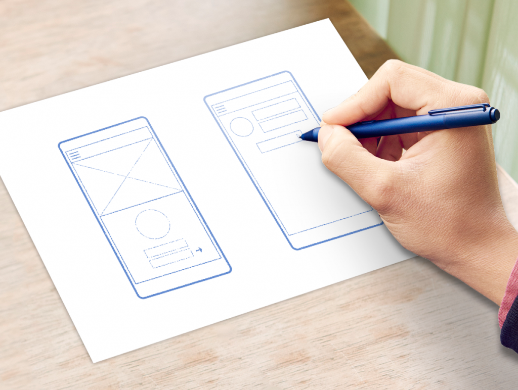
Just as important, make sketches throughout the process. You don’t have to be a good artist to doodle (one of the best kept secrets of the digital design world is that many designers are actually poor artists – that’s why they spend their days in front of Photoshop). Get a pen or a crayon and make scratches on paper about your app whenever you get a chance. This is another exercise that will help keep your design mind nimble. Keep all your sketches in a safe place and go through them when you are closer to the end of your app dev cycle. You’ll be happy to discover later that you have a full history of all the ways your app has changed.
Fail early, fail fast: Prototypes
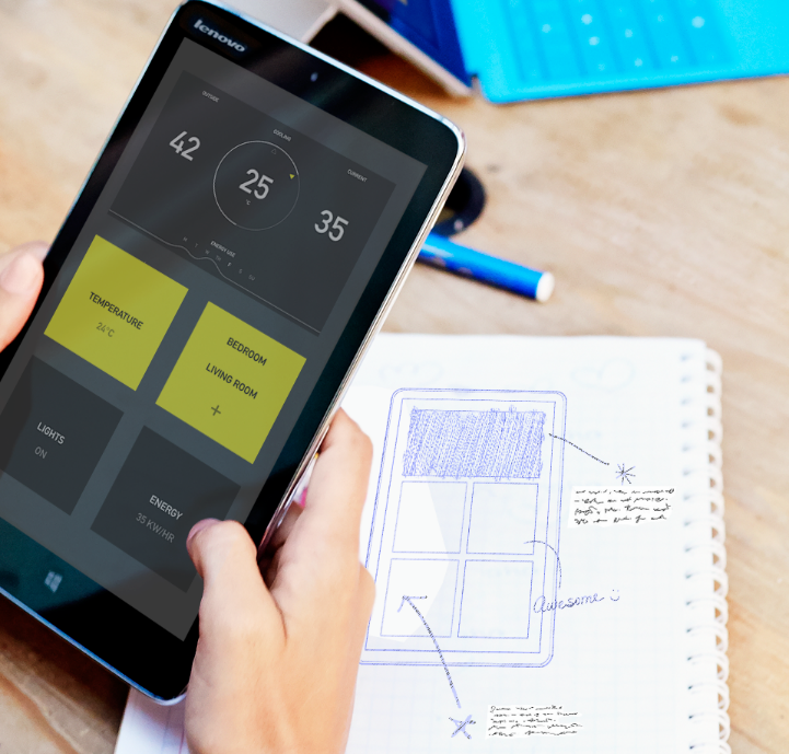
Mock up different screen designs based on your customer feedback, either as sketches or wireframes, and imagine the workflow that customers will go through to accomplish their tasks. You can use whatever method works best for you to create these prototypes. If it’s faster for you to do rough interface designs in Visual Studio or Blend, use these tools. But note that you don’t need specialized software for this process, nor do you need to be able to draw. Notecards and sketchpads are just fine.
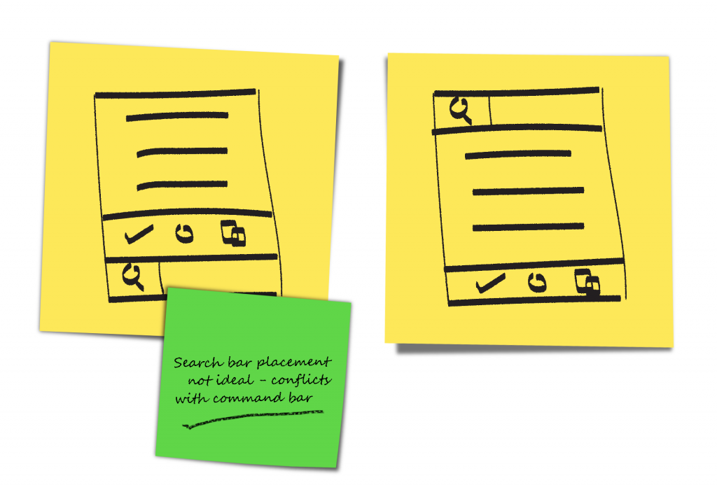
Even better, you can sketch your app design on sticky notes. This way you can easily move screen elements around to see how they look — and, more importantly, quickly put them back if things don’t work out the way you expect.
If you aren’t sure what to try first, take a look at apps that are similar to yours, then see how the workflow might look for your app.
Now try moving screen elements around. If you started with top navigation, you can try left navigation instead. If you have a large header with text, try moving it to the bottom. Buttons and content panels can go just about anywhere. Move them around. Switch out buttons with text; switch out text with links. Experiment. Iterate through this process for every screen until your gut tells you that you’ve gotten your layout to where it needs to be.
Validate your gut
Now try to find a few test users (at least five or so is usually best) to give feedback on your paper prototype. Just to clarify, this is what’s known as usability testing (and sometimes just market research) rather than any sort of QA testing.
If you can’t find a few people to help, then try to imagine that you are seeing this app for the first time. What’s the initial impact? Do you know, just from looking at it, what the app is supposed to do? Do you know what you are supposed to do next?
If any of the answers you receive are unsatisfactory, hit the sticky notes again and figure out a better way. Remember, you are early on in the process and all you’ve invested so far is a pen, some paper, and a bit of doodling time. Keep at it until you get the results you are looking for.
Wrapping up
Thinking about your app’s design at the very start helps you prioritize both code and the design accordingly. By following the planning guidelines and exercises in this post, you can catch problems early and avoid expensive mistakes later on.
For more information, check out Plan your Universal Windows Platform (UWP) app.
Check out our other posts in this series!

