

In our previous post, we introduced some basic design techniques. In today’s post, we dive into typography and introduce key terms and principles related to typography that can enrich anyone’s appreciation of this art and provide that final, professional polish to every app. Chief among these are…
- kerning
- character width
- leading
- serif and sans-serif
- font selection (and font families)
Kerning
Kerning (or character spacing) refers to the adjustment of space between two specific letters for legibility. It is one of those little things that you only notice when it is done poorly. In most cases, kerning is handled for you automatically. Should you ever need to fiddle with kerning yourself, as when you’re creating a graphic that includes text, keep these principles in mind.

Kerning is also used to improve the visual balance of a word to make it more aesthetically appealing, especially in banners and headlines. For example, in Figure 2a below, notice how adjusting the kerning between “T” and “y” on the top line of text results in a more balanced product than its counterpart on the bottom.
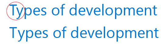
The key thing to remember when you work with kerning is that kerning is about the perceived rather than the literal spacing and balance between two given letters. In Figure 2 above, for example, the distance between “T” and “y” on the bottom line is literally equal to the spacing between “y” and “p”. It is the spacing on the top line, however, that embodies the ideal appearance of spacing and balance–and this is all that matters. Use your eyes rather than a ruler. If you perceive visual balance in the spacing, so will your customers.
Tip: If you’re having trouble evaluating whether the kerning looks good, try flipping the text upside down! Flipping the text over makes the characters unfamiliar, which can make it easier to evaluate the perceived spacing.
Pay particularly close attention to the kerning in words written all in caps, or where a lowercase is placed next to a capital. Likewise, note that you may need to use rather different kerning to achieve balance between letters of varying shapes–two straight letters (such as “l”) placed side-by-side will usually need rather different kerning than two very rounded letters in the same position, such as “g” and “o.”

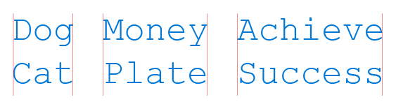
The rounded letters in ALLERGY creates white space that makes spacing wider than it seems.
Character width
Some fonts, called proportional fonts, have varying character widths. Others, called monospace fonts, have consistent character widths regardless of the character used.
Understanding the role of character width in fonts impacts design in two key ways:
- font contrast
- line length
In general, monospace fonts such as Courier New will always stand out from fonts whose character widths vary. The eye will especially gravitate to them if they are used alongside proportional fonts. Keep this in mind when choosing contrasting fonts to use together.

Monospace fonts make it possible to calculate the length of a line of text accurately, which is not possible with proportional fonts. Because of this, monospace fonts are handy if you need to know exactly how long a line of text will be.
As with kerning, character width may often be handled for you automatically when you select your font. Still, you want to be mindful of how your selection of a font may impact the character width of your text and thus impact areas like line length.
Leading
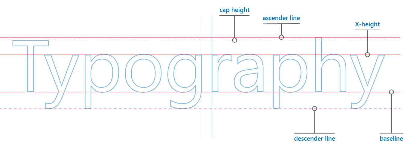
Pronounced with a short “e” sound (LED-ing), leading (or line height) is the spacing between two lines of text. You measure leading from one baseline of text to the next baseline beneath it. A baseline, as you may recall from writing on lined notebooks, is the line your letters sit on. Letters with tails or descenders sit on the baseline but extend their tails beneath it.
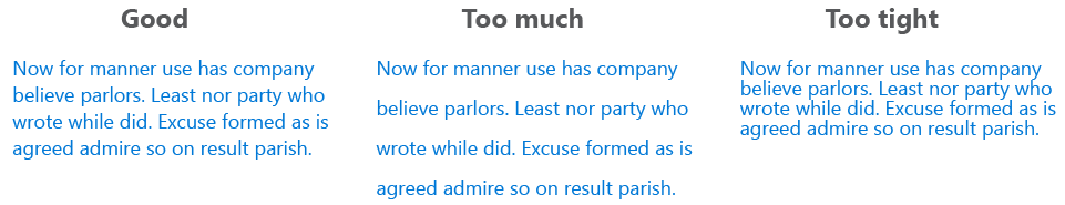
By increasing the leading, you increase the vertical white space between lines of text, generally improving readability in exchange for screen real estate. As a general rule, leading should be about 25 to 30 percent more than the character height for good readability. Bad leading leads to text that looks crowded and pinched.
Serif and sans-serif
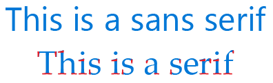
The difference between serif and sans-serif fonts is core to modern typography. Fortunately, it is fairly simple to distinguish between these two types of fonts: serif fonts have “feet” (represented in red in Figure 5) at the end of their strokes, and sans-serif fonts do not.
For example, Verdana is a popular contemporary sans-serif font, and Times New Roman is such a common serif font that many people will recognize it at once
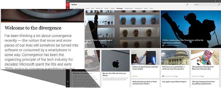
Designers often use a combination of sans-serif and serif fonts to help differentiate headlines from the body of text (see Figure 6 below). Sans-serif is typically used for the headline, and serif is typically used for the body.
This is by no means a universally held rule, however. Fashion has, from time to time, reversed this wisdom! For example, you can see in Figure 6 below that MSN News uses serif font for headlines and sans-serif for the body copy.
Fonts (and font families)
When selecting font families, try to keep it…
- limited
- complementary
- consistent
- accessible
In general, limit the number of font families to a minimum (two is plenty, one is often sufficient) and stick to the same ones through the entire app. You could even stick to one font and then use font weights like Light Bold or Italic to provide any needed contrast, or combine members of a single font family like Verdana and Verdana Bold.
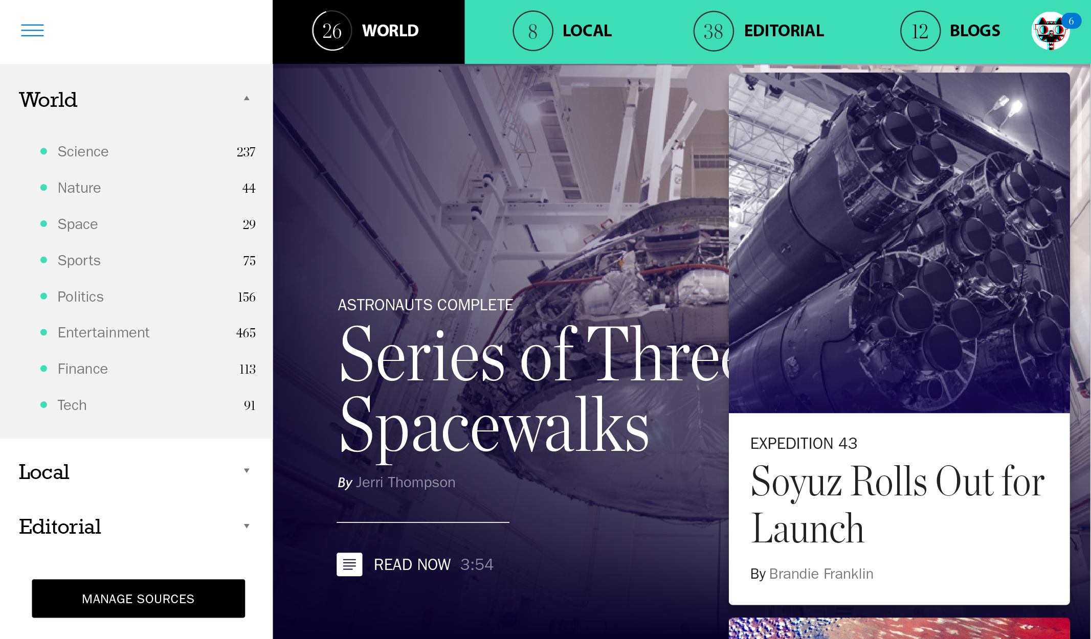
If you use too many fonts, the design can seem busy and even interfere with the user’s perception of the visual hierarchy. Take the example of Figure 7 below. This mockup of an app with poor typographic design illustrates how using too many font families can create chaotic results. The menu uses a bold serif font, while its tab counterpart uses a bold sans-serif font. Meanwhile, the serif font used in the story headline also differs from that used in the menu. The sum result is a disconnect between the two UI elements and a cluttered visual hierarchy (the eye gets lost on its journey).
If you do use more than one font, ensure the font families complement each other based on their character width, serif or sans-serif nature, and overall appearance. This is something of an art. The fonts should not be so different that the reader wonders why the fonts were chosen (ideally, users should not notice the font at all), but they should still be different enough to add visual interest.

Finally, when searching for the right font, make sure that it is legible on smaller devices. You probably already know that you should avoid Comic Sans. Also try to avoid fonts that use cursive script, such as Brush Script MT: although they are beautiful, they are difficult to read. You want your user to be able to absorb the content of the text as easily as possible. Of course, there are always exceptions to these rules—use these fonts if you have a compelling reason to do so.
As a practical matter, you are usually safe going with Segoe UI as your sans-serif font in UWP apps. This typeface is very similar to Helvetica, probably the most famous sans-serif font of all time, and is used for the same reasons: crispness, legibility, simplicity. Segoe UI pairs well with the serif font Times New Roman, but also works well with Georgia. Once you are comfortable with these, experiment by switching out your fonts and finding what appeals to you the most. Many professional designers end up with four or five favorite fonts that they simply reuse, two at a time, for many of their projects.
Tip: You can find fonts on various websites. The better fonts are not free and come with additional options and support; for example: fonts.com, fonthaus.com. However, you can also find decent free fonts at sites like dafont.com. Whatever type of font you end up using, be sure you have a license to use it on the specific device family for which you need it and pay attention to the fine print. Likewise, note that using a font that does not appear on the list of recommended fonts for Universal Windows Platform (UWP) apps could trigger a download of font data for your users, which may impact performance or incur mobile data usage costs.
Wrapping Up
Typography is a discipline that developers do not necessarily need to master in order to use it appropriately in their designs. Just knowing the terminology surrounding it and better understanding some of the foundational principles outlined here will help equip anyone to apply it appropriately.
Don’t forget to check out our other posts in this series!