If design can be said to have one big secret, something that makes designers what they are and distinguishes them from coders, it is sketching. At the same time, it is an easy skill to learn—though not to master—and you have probably been doing it all of your life without realizing it.
In previous posts of this design series for developers, we have covered hard skills like typography and visual communication, as well as soft skills like finding inspiration. This is the first post in the series, however, in which you will be asked to actually do something with your own hands. Sketching is a design practice rather than a design theory, and to understand it, you have to actively engage in it. In this way, it shares some things in common with developer practices like agile and test-driven development (TDD). Simply reading about these practices won’t ever tell you if they are effective or not. You can’t know if they actually work unless you try them for yourself.
How to sketch
Sketching has four core attributes that make it both a time saver as well as a conserver of emotional energy. Sketches are:
- disposable
- quick
- timely
- inexpensive
Pablo Picasso used to sketch on paper napkins and pay for his drinks that way. If nothing else is available, then you can use napkins, too—and plenty of designers will swear that nothing else will do.
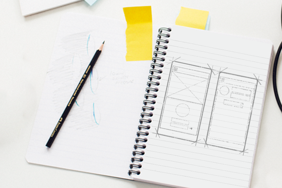
There is a certain amount of pleasure to be gained from using better tools, however. For a small sum of money, you can purchase a Moleskine notebook in which to save your sketches. If you drop by an art store, you can pick out a set of thin anime pens or colored pencils. In all honesty, however, a standard No. 2 pencil will work just as well.
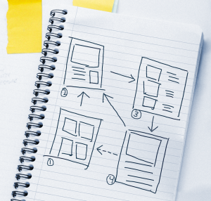
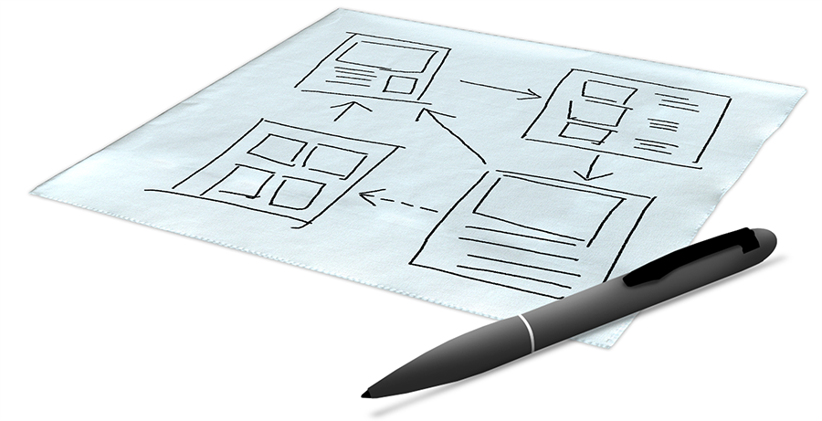
To start, get your writing surface—napkin or otherwise—and drawing instrument ready. Think of a project you are currently working on. Consider the layout, or possibly the workflow. Now draw it. Draw whatever comes to mind when you think of this project.
To make this exercise easier, plan to throw whatever you draw into the waste bin once you are done. Remember: the first attribute and rule of sketches is that all sketches are disposable.
Try to sketch quickly and enjoy the simplicity of the activity. Though it may seem irrelevant at first, take a moment to note the resistance of the pencil as it scratches across the paper, or the smoothness of the pen on paper, or the way the mouse rolls across your pad if you are using a drawing program. Are there sticky bits on your mouse that make it occasionally skip? This attention to the experience of sketching is to remind yourself that it is the activity of sketching as much as the result which is important.
Are you done? Throw your sketch away and start another. The practice of sketching epitomizes the principle of fail early and fail fast. It allows you to think about your app without investing much time or resources into it.
In his book Design for Software: A Playbook for Developers, Erik Klimczak, creative director at Truth Labs in Chicago, writes “Sketching is the quickest and most disposable form of generating ideas.” Like code-first and similar coding practices, it is a way to jumpstart yourself with little effort or commitment. The benefits, however, are extraordinary.
One of the keys to good sketching is to keep your ideas loose. Chicken scratches and stick figures are fine. The drawings are just byproducts of your creative process. In fact, if you are already a good artist, you might even want to reign yourself in a bit. Once you ease into the practice, you will find that sketching lets you develop your ideas and find any potential problems early. It helps you to find alternatives and stay flexible instead of locking into one path early in your design process. Perhaps most helpful of all, it can be done at any step in the software creation workflow. Whenever you need more ideas, pull out a napkin and start sketching.
The philosophy of sketching
With his 2007 book, Sketching User Experiences, Bill Buxton took the design community by storm by showing how sketching can and is being used in digital design, and more importantly for us, how it is essential for technology design, in which everything we do is—in some sense—a brand new experience.
The first-time reader of Sketching User Experiences is often surprised to find that all of the great things they’ve heard about the book are difficult to actually pin down. Buxton’s book is a meandering journey with insights into the gradual design of the iPod, the nature of creativity, some projects he’s worked on in the past, and lots and lots of examples of sketching. Along the way, his readers also learn about mountain bike design, Bill’s obsession with orange juicers, and a bit about canoeing.
This peculiar format of the book distills what it means to think like a designer. It goes down rabbit holes, pulls together apparently incongruent anecdotes, and constantly tells stories to pull readers along until the readers resolves for themselves certain insights about design thinking.
Arguably, the most important insight are these:
- that the user interface is the same thing as the user experience
- that sketching is a way of thinking
- that sketching is a way to communicate with others
What is the user experience?
Buxton’s favorite orange juicer is legendary in the design world. He uses his various experiences with orange juicers to illustrate what it means to design a user experience. Whereas a UI is simply how a product looks, the user experience includes not only how a product feels but also the anticipation of using it and the enjoyment of it when you aren’t using it.
Translated to the app world, user experience is not just about the color theme you choose and the navigation scheme you implement, but also how your user responds to your app and feels about it. In what hand does the user hold the app? Where is the user when using your app? Is he or she with other people or alone?
Sketching is a way to approach these bigger experiential questions about how your users interact with your app. Quick sketches aid the imagination and let you figure out design issues before you even have a line of code written yet.
Sketching as a way of thinking
Sketching allows us to work out our ideas without consequences, which in turn gives us a lot of freedom to wander and explore. According to Buxton, “Sketching in the broad sense, as an activity, is not just a byproduct of design. It is central to design thinking and learning.”
There is a great temptation to think of sketching as a first draft of the app or as a tool for prototyping. It is not. To think of it in this way immediately places importance on the sketches themselves, which in turn ratchets up our performance anxiety and potentially causes the paralyzing fear that besets many projects.
Remember: the sketches themselves are utterly disposable. It is the act of sketching that is invaluable.
Sketching is collaborative
Sketching is the design equivalent of whiteboarding for developers.
Most developers have much more experience with whiteboarding than with sketching. Have you ever noticed how sloppy whiteboards are? There is usually no real concern with legibility even though we all pretend that whatever is written needs to be saved and will be referred to again at some future, indeterminate time. This is a peculiar lie we tell ourselves so we can use whiteboards to facilitate talking and communicating about our ideas. There’s a reason we don’t use permanent markers on white boards. That’s not what whiteboards are for.
Sketches function in a similar way. They let us think through our ideas privately and then communicate them publicly. At the same time, no importance should be placed on the physical sketches themselves.
Your sketching challenge
The most important thing at this stage is to prove to yourself that sketching provides some personal benefit. Here’s your challenge: spend an hour and make 30 sketches. That’s about a sketch every two minutes.
You may find that it opens creative doors for you and provides a mighty new tool in your arsenal for developing beautiful apps. What have you got to lose? At worst, it’s just an hour of your time.
And don’t forget to check out our other posts in this series!


