In porting your phone app to the Universal Windows Platform (UWP), one of the main challenges you’ll face is coming up with reasonable visual designs for the wide variety of devices and form factors supported by UWP. The advantage of taking the time to do this upfront design thinking is that you can have a beautiful app running not only on Windows 10 Mobile but also on desktops, tablets, Surface Hubs and Xbox Ones connected to large screen TVs. Your UWP app can even run as a mixed reality experience in HoloLens if you want it to.
In an earlier post, we looked at technical tips for porting from Silverlight Phone to UWP. In this post, we’re going to look at design considerations when migrating from a phone screen to larger displays. In addition to a quick tour of adaptive design practices, we will also look at the appropriate visual design patterns to use when transforming six common Windows Phone Silverlight app designs into an equivalent UWP design that will work across a variety of Windows 10 devices:
- App tabs (Pivot)
- Feed reader app
- Ebook / Ezine app
- Master-detail
- Lifestyle app
- Utility app
UWP and adaptive design
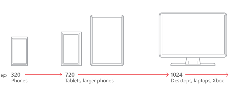
Sometimes also referred to as responsive design, adaptive design is a set of practices that enables an app’s UI to resize and restructure itself when the display screen changes its size, orientation, or aspect ratio. When a UWP app runs in desktop mode on Windows 10, adaptive design also comes into play when users resize the app window.
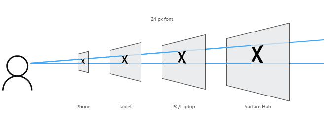
The good news is that some of this occurs automatically. Windows 10 uses an algorithm to scale fonts and other UI elements for each device. Instead of actual pixels, the scaling algorithm takes effective pixels into account in order to make sure that your fonts look good on a Surface Hub at a standard 10-foot distance as well as on a mobile device at a typical 5-inch distance from your face.
UWP also provides tooling for implementing adaptive design, such as adaptive triggers, the RelativePanel, and the SplitView control. In the 10 x 10 blog series, I provided an overview of how to effectively use these tools in your app.
Six visual design patterns for scaling your app
Typical UWP UX guidance recommends starting with a desktop or tablet app and then working back to a phone design only after those visuals and layouts are mostly fleshed out. This doesn’t help so much, however, if you are starting with a pre-existing phone design. For Silverlight phone developers in particular, it seemed more helpful to start with some typical Windows Phone app categories and seeing what it would take to make them adaptable for larger screen real estate.
App tabs (Pivot control)
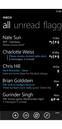
A large number of Windows Phone Silverlight apps in the Windows Store use the Pivot control for layout. Most of these apps, in turn, seem to use it to render navigation tabs, with each app containing three to four tabs (pivot panels). The built-in e-mail app on Windows Phone 8.1 uses this layout:
UWP includes an updated Pivot control (as well as an updated Hub control) that will automatically resize to fill larger displays as well as different orientations and aspect ratios. Combined with the automatic scaling to effective pixels discussed earlier, this means that in the majority of cases, porting a tab design to UWP will be a smooth transition initially.
The most important thing to do is to view your app on a physical device or through the emulator and simulator options in Visual Studio 2015. For larger displays, you will probably notice large empty spaces inside the pivot panels.

One of the ways to deal with this is by resizing UI elements. For instance, if your content includes images, you will want to make the images larger to give users a higher fidelity experience. It is also recommended that you center-align your content so the empty areas can be naturally divided to the right and to the left of the main content.
When porting an app that uses a Pivot control as its central design element, I suggest that you follow these steps for an easy but effective port of your design:
- Use UWP pivot control.
- Allow it to resize on its own.
- Resize UI elements if needed.
- Center content.
Feed reader app
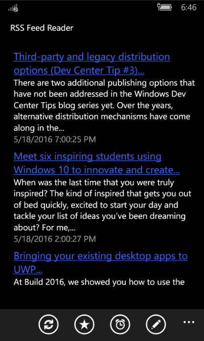
Feed readers —apps that involve reading lists of updates throughout the day—is another significant app category. This style of app can also have a huge social networking aspect when updating your own status is also an important component of the app. The Silverlight phone UI design for feed readers typically involves a list of updates, navigation filters at the top of the device, and an app bar at the bottom.
For this style of design, your easiest path is to keep the same design for Windows 10 Mobile phones. On larger devices, however, allow the content to resize to fill the screen as was recommended with the app tabs example above.
For the AppBar and any additional top navigation buttons, your strategy should be to reposition these elements depending on the display size. For Windows Mobile, leave your AppBar and Nav Pane at the top or bottom of the screen.
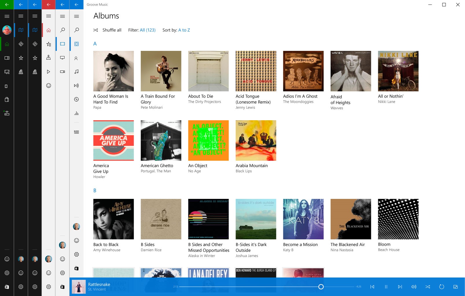
For tablets and larger devices, however, you can use the new Nav Pane design positioned to the left of the content, as is shown in the example below. In its narrow form, the Nav Pane shows a hamburger button and icons.
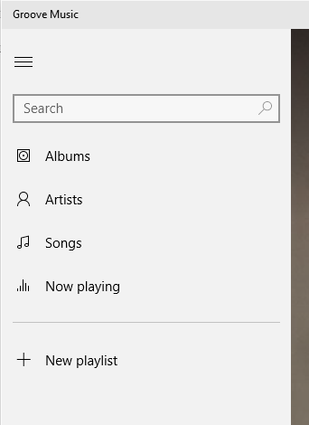
If the device size calls for it, the Nav Pane also has a wider mode which displays text descriptions next to the navigation icons.
For a feed reader type app, we recommend that you:
- Resize content on larger displays.
- Reposition app bars and nav menus.
- Use the standard Nav Pane design pattern.
Ebook / Ezine app
Apps are a great delivery channel for older media such as books, manga and magazines. They are also relatively easy to create once content has been digitized. The Windows Store are full of apps for every imaginable publisher as well as every imaginable format for the written word.
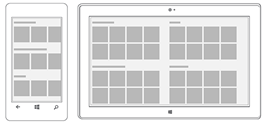
As you plan out your design for larger screens and different aspect ratios, remember that the effective pixel algorithms on Windows 10 may make resizing of fonts unnecessary. Instead, you will likely find that changing the layout of your text for readability will be more important than resizing. On wider screens, text is easier to read if it is grouped into columns in a newspaper layout, or reflowed into pages in a side-by-side layout for eBooks (with page flipping animations totally optional).
For eBook and Ezine apps, we recommend that you:
- Resize images as needed.
- Allow Windows 10 to resize fonts for you.
- Reflow text so it is easier to read on wider displays.
Master-detail
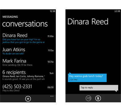
The list with details is a prevalent UI design in Silverlight phone apps. In this layout, selecting items from a main list would bring up a new page that provided more details and sometimes additional actions related to the selection. The built-in messaging app on Windows Phone 8.1 is a good example of this design.
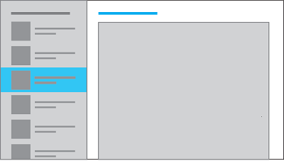
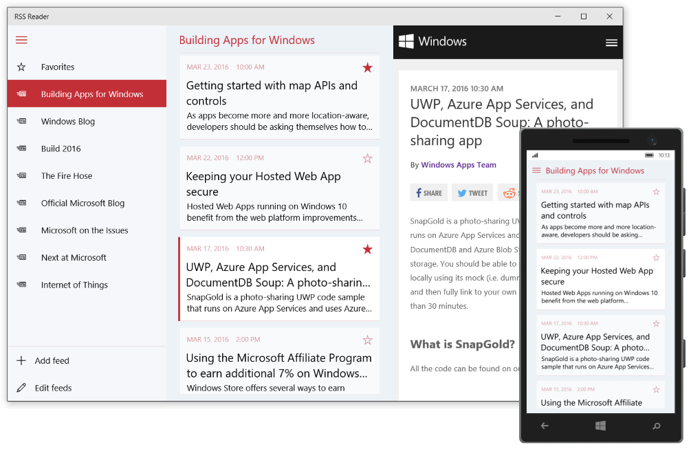
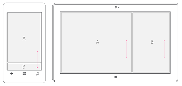
This design is familiar and can be reused for Windows 10 Mobile apps. For tablets and above, however, it makes more sense to use a side-by-side master/details visual design pattern. The side-by-side design makes context switching between different pages unnecessary and improves the user experience. It is enabled when there is more generous screen real-estate.
In order to alternate between these two UI designs, you need to pursue a strategy of replacing your UI for different device families. Limited content will be shared between the two designs. Instead, you effectively will be displaying two different pages.
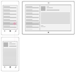
A full sample of the master/details pattern can be found on GitHub. The sample code demonstrates a working RSS Reader.
When starting from a list with details phone design, it is recommended that you:
- Replace pieces of your UI between mobile and larger displays.
- Use the standard master/details design for tablets and up.
Lifestyle app
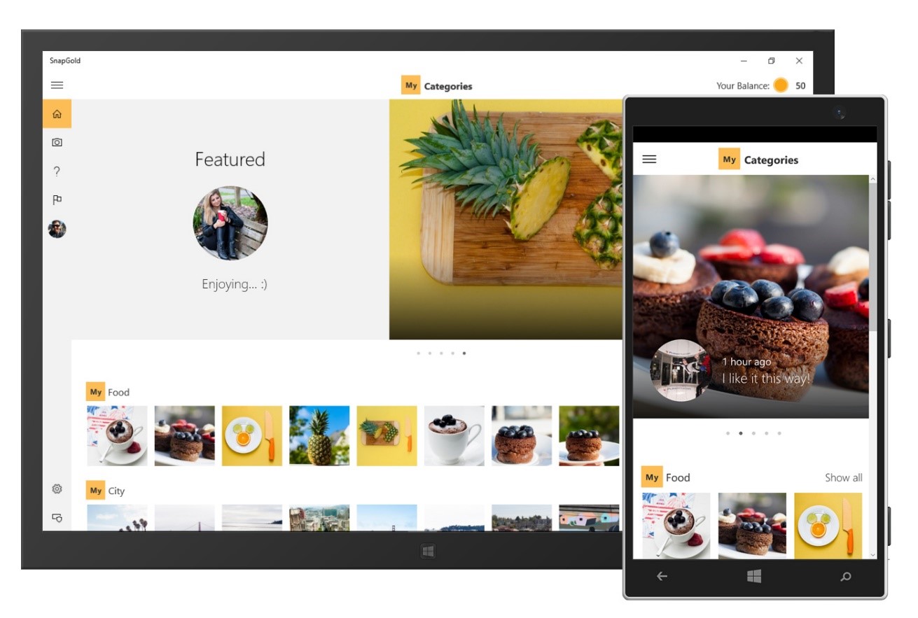
Given the richer control set available in UWP, the lifestyle app—apps containing beautiful photography and video content, also known as “aspirational apps”—is a category where it may be best to simply re-architect your UI from the ground up.
We recently made sample code for a photo sharing app available. It demonstrates how to use UWP’s unique controls and can be used as a starting point for implementing your own rich media app UI.
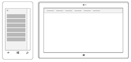
For lifestyle apps, it is recommended that you:
- Take advantage of the richer controls available in UWP.
- Re-architect your design for maximum impact.
Utility app
A Windows Phone Silverlight utility app typically does one thing and it does it well. It may take pictures, keep time, find your location on a map, display videos or play back your own voice at a higher pitch. A telling characteristic of the utility app is that it is typically a single page app. The design, consequently, tends to be a blend of custom components as well as some common ones such as an App bar.
You will need to resize your custom UI elements for larger screens. This will involve increasing the size of assets programmatically and possibly even repositioning your assets for aesthetic balance. More importantly, utility apps typically receive a higher level of interaction than other app categories.
Mobile apps tend to be held in the left hand while either the left thumb or the right index finger is used for interactions (this is reversed for lefties, of course). On tablets, however, users often will use both hands for interactions if the tablet is resting on their laps, or both thumbs if they are holding the tablet in their palms. Repositioning interactions so they occur in the center of mobile displays but on the edges of tablet displays will make your app more convenient for both types of users.
In some cases, you may decide that you want different layouts for each device. In this case, you can fork your design depending the display resolution and device orientation, re-architecting it for each experience. Unlike other app categories with more complex navigation, this is generally a good approach for single-page utility apps.
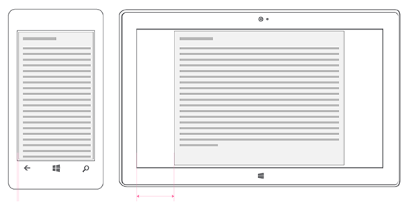
When starting with a utility app, it is recommended that you:
- Use resize and reposition as your main strategies for porting your design.
- Don’t be afraid to re-architect your design for each device. This is easier to do with utilities than with any other styles of app.
Wrapping Up
Bringing a Windows Phone Silverlight app over to the Universal Windows Platform involves many design considerations that didn’t come up when initially building it. This post provides strategies for redesigning the most common Windows Phone app categories. Sometimes a little bit of resizing is all you need to get your phone app to look good on a desktop or larger device. Sometimes, when a common UI is simply not possible, it may require building distinct user experiences for different screen sizes. The following links provide even more information about adaptive UIs, UWP controls and Windows 10 design best practices.

