The “Internet of Stranger Things” Wall, Part 2 – Wall Construction and Music
I do a lot of woodworking and carpentry at home. Much to my family’s chagrin, our house is in a constant state of flux. I tend to subscribe to the Norm Abram school of woodworking, where there are tools and jigs for everything. Because of this, I have a lot of woodworking and carpentry tools around. It’s not often I get to use them for my day job, but I found just the way to do it.
In part one of this series, I covered how to use Windows Remote Wiring to wire up LEDs to an Arduino, and control from a Windows 10 UWP app. In this post, we’ll get to constructing the actual wall.
This post covers:
- Constructing the Wall
- Music and UWP MIDI
- Fonts and Title Style
The remainder of the series will be posted this week. Once they are up, you’ll be able to find the other posts here:
- Part 1 – Introduction and Remote Wiring
- Part 2 – Constructing the wall and adding Music
- Part 3 – Adding voice recognition and intelligence (this post)
If you’re not familiar with the wall, please go back and read part 1 now. In that, I described the inspiration for this project, as well as the electronics required.
Constructing the Wall
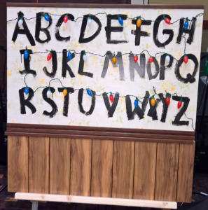
In the show Stranger Things, “the wall” that’s talked about is an actual wall in a living room. For this version, I considered a few different sizes for the wall. It had to be large enough to be easily visible during a keynote and other larger-room presentations, but small enough that I could fit it in the back of the van, or pack in a special box to (expensively) ship across the country. That meant it couldn’t be completely spread out like the one in the TV show. But at the same time, the letters still had to be large enough so that they looked ok next to the full-size Christmas lights.
Finally, I didn’t want any visible seams in the letter field, or anything that would need to be rewired or otherwise modified to set it up. Seams are almost impossible to hide well once a board has traveled a bit. Plus, demo and device-heavy keynote setup is always very time-constrained, so I needed to make sure I could have the whole thing set up in just a few minutes. Whenever I come to an event, the people running it are stunned by the amount of stuff I put on a table. I typically fill a 2×8 table with laptops, devices, cameras, and more.
I settled on using a 4’ x 4’ sheet of ½” plywood as the base, with poplar from the local home store as reinforcement around the edges. I bisected the plywood sheet to 32” and 16” to make it easier to ship and also so it would easily fit in the back of the family van for the first event we drove to.
The wallpapered portion of the wall ended up being 48” wide and 32” tall. The remaining paneled portion is just under 16” tall. The removable bottom part turned out to be quite heavy, so I left it off when shipping to Las Vegas for DEVintersection.
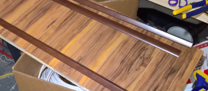
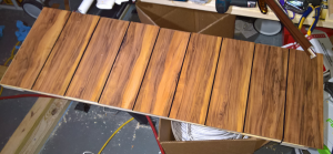
To build the bottom panel, I considered getting a classic faux wood panel from the local Home Depot and cutting it to size for this. But I really didn’t want a whole 4×8 sheet of fake wood paneling laying around an already messy shop. So instead I used left-over laminate flooring from my laundry room remodel project and cut it to length. Rather than snap the pieces tight together, I left a gap, and then painted the gaps black to give it that old 70s/80s paneling look.
The size of this version of the wall does constrain the design a bit. I didn’t try to match the same layout that the letters had in the show, except for having the right letters on the right row. The wall in the show is spaced out enough that you could easily fill a full 4×8 sheet and still look a bit cramped.
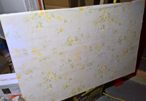
The most time-consuming part of constructing the wall was finding appropriately ugly wallpaper. Not surprisingly, a search for “ugly wallpaper” doesn’t generally bring up items for sale :). In the end, I settled for something that was in roughly the same ugliness class as the show wallpaper, but nowhere near an actual match. If you use the wallpaper I did, I suggest darkening it a bit with a tea stain or something similar. As-is, it’s a bit too bright.
Note that the price has gone up significantly since I bought it (perhaps I started an ugly wallpaper demand trend?), so I encourage you to look for other sources. If you find a source for the exact wallpaper, please do post it in the comments below!
Another option, of course, is to use your art skills and paint the “wallpaper” manually. It might actually be easier than hanging wallpaper on plywood, which as it turns out, is not as easy as it sounds. In any case, do the hanging in your basement or some other place that will be ok with getting wet and glued-up.
Here it is with my non-professional wallpaper job. It may look like I’m hanging some ugly sheets out to dry, but this is wallpaper on plywood.
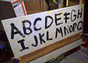
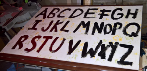
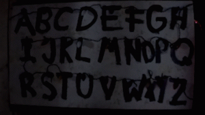
When painting the letters on the board, I divided the area in three sections vertically, and used a leftover piece of flooring as a straight edge. That helped there, but didn’t do anything for my letter spacing / kerning.
To keep the paint looking messy, I used a cheap 1” chip brush as the paint brush. I dabbed on a bit extra in a few places to add drips, and went back over any areas that didn’t come out quite the way I wanted, like the letter “G.”
Despite measuring things out, I ran out of room when I got to WXYZ and had to squish things together a bit. I blame all the white space around the “V”. There’s a bit of a “Castle of uuggggggh” thing going on at the end of the painted alphabet.
Once the painting was complete, I used some pre-colored corner and edge trim to cover the top and bottom and make it look a bit more like the show. I attached most trim with construction glue and narrow crown staples (and cleaned up the glue after I took the above photo). If you want to be more accurate and have the time, use dark stained pine chair rail on the bottom edge, between the wallpapered section and the paneled section.
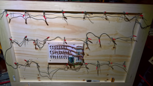
Here you can see the poplar one-by support around the edges of the plywood. I used a combination of 1×3 and 1×4 that I had around my shop. Plywood, especially plywood soaked with wallpaper paste, doesn’t like to stay flat. For that reason, as well as for shipping reasons, the addition of the poplar was necessary.
You can see some of the wiring in this photo, so let’s talk about that.
Preparing and Wiring the Christmas lights
There are two important things to know about the Christmas lights:
- They are LEDs, not incandescent lamps.
- They are not actually wired in a string, but are instead individually wired to the control board.
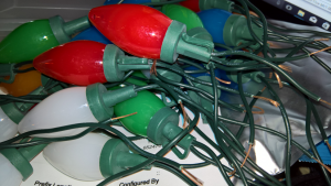
I used normal 120v AC LED lights. LEDs, like regular incandescent lamps, don’t really care about AC or DC, so it’s easy enough to find LEDs to repurpose for this project. I just had to pick ones which didn’t have a separate transformer or anything odd like that. Direct 120v plug-in only.
The LED lights I sacrificed for this project are Sylvania Stay-Lit Platinum LED Indoor/Outdoor C9 Multi-Colored Christmas Lights. They had the right general size and look. I purchased two packs for this because I was only going to use the colors actually used on the show and also because I wanted to have some spares for when the C9 housings were damaged in transit, or when I blew out an LED or two.
There are almost certainly other brands that will work, as long as they are LED C9 lamps and the wires are wrapped in a way that you can unravel.
When preparing the lamps, I cut the wires approximately halfway between the two lamps. I also discarded any lamps which had three wires going into them, as I didn’t want to bother trying to wire those up. Additionally, I discarded any of the lumps in the wires where fuses or resistors were kept.
For one evening, my desk was completely covered in severed LED Christmas lamps.
Next, I figured out the polarity of the LED leads and marked them with black marker. It’s important to know the anode from the cathode here because wiring in reverse will both fail to work, and likely burn out the LED, making subsequent trials also fail. Through trial and error, I found the little notch on the inside of the lamp always pointed in the same way, and that it was in the same position relative to the outside clip.
Once marked, I took note of the colors used on the show and following the same letter/color pairings, drilled an approximately ¼” hole above each letter and inserted both wires for the appropriate colored lamp through to the back. Friction held them in place until I could come through with the hot glue gun and permanently stick them there.
From there, I linked each positive (anode) wire on the LEDs together by twisting the wires together with additional lengths of wire and taping over them with electrical tape. The wire I used here was spare wire from the light string. This formed one continuous string connecting all the LED anodes together.
Next, I connected the end of that string to the +3.3v output on the Arduino. 3.3v is plenty to run these LEDs. The connection is not obvious in the photos, but I used a screw on the side of the electronics board and wired one end to the Arduino and the other end to the light string.
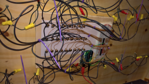
Finally, I wired the negative (cathode) wires to their individual terminals on the electronics board. I used a spool of heavier stranded wire here that would hold up to twisting around the screw terminals. For speed, I used wire nuts to connect those wires to the cathode wire on the LED. That’s all the black wire you see in this photo.
To make it look like one string of lights, I ran a twisted length of the Christmas light wire pairs (from the same light kit) through the clips on each lamp. I didn’t use hot glue here, but just let it go where it wanted. The effect is such that it looks like one continuous strand of Christmas lights; you only see the wires going into the wall if you look closely.
I attached the top and bottom together using 1×3 maple boards that I simply screwed to both the top and bottom, and then disassembled when I wanted to tear it down.
The visuals were all done at that point. I could have stopped there, but one of my favorite things about Stranger Things is the soundtrack. Given that a big part of my job at Microsoft is working with musicians and music app developers, and with the team which created the UWP MIDI API, I knew I had to incorporate that into this project.
Music / MIDI
A big part of the appeal of Stranger Things is the John Carpenter-style mostly analog synthesizer soundtrack by the band Survive (with some cameos by Tangerine Dream). John Carpenter, Klaus Shulze and Tangerine Dream have always been favorites of mine, and I can’t help but feel a shiver when I hear a good fat synth-driven soundtrack. They have remained my inspiration when recording my own music.
So, it would have been just wrong of me to do the demo of the wall without at least some synthesizer work in the background. Playing it live was not an option and I wasn’t about to bring a huge rig, so I sequenced the main arpeggio and kick drum in my very portable Elektron Analog Four using some reasonable stand-ins for the sounds.
At the events, I would start and clock the Analog Four using a button on the app and my Windows 10 UWP MIDI Library clock generator. The only lengthy part of this code is where I check for the Analog Four each time. That’s a workaround because my MIDI library, at the time of this writing, doesn’t expose the hardware add/remove event. I will fix that soon.
[code lang=”csharp”]
private void StartMidiClock()
{
// I do this every time rather than listen for device add/remove
// becuase my library didn’t raise the add/remove event in this version
SelectMidiOutputDevices();
_midiClock.Start();
System.Diagnostics.Debug.WriteLine("MIDI started");
}
private void StopMidiClock()
{
_midiClock.Stop();
System.Diagnostics.Debug.WriteLine("MIDI stopped");
}
private const string _midiDeviceName = "Analog Four";
private async void SelectMidiOutputDevices()
{
_midiClock.OutputPorts.Clear();
IMidiOutPort port = null;
foreach (var descriptor in _midiWatcher.OutputPortDescriptors)
{
if (descriptor.Name.Contains(_midiDeviceName))
{
port = await MidiOutPort.FromIdAsync(descriptor.Id);
break;
}
}
if (port != null)
{
_midiClock.OutputPorts.Add(port);
}
}
[/code]
For this code to work, I just set the Analog Four to receive MIDI clock and MIDI start/stop messages on the USB port. The sequence itself is already programmed in by me, so all I need to do is kick it off.
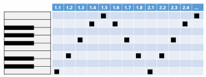
If you want to create a version of the sequence yourself, the main riff is a super simple up/down arpeggio of these notes:
You can vamp on top of that to bring in more of the sound from what S U R V I V E made. I left it as it was and simply played the filter knob a bit to bring it in. A short version of that may be found on my personal SoundCloud profile here.
There are many other components to the music, including a muted kick drum type of sound, a bass line, some additional melody and some other interesting effects, but I hope this helps get you started.
If you’re interested in the synthesizers behind the music, and a place to hear the music itself, check out this tour of S U R V I V E ’s studio.
The final thing that I needed to include here was a nod to the visual style of the opening sequence of the show.
Fonts and Title Style
If you want to create your own title card in a style similar to the show, the font ITC Benguiat is either the same one used, or a very close match. It’s readily available to anyone who wants to license it. I licensed it from Fonts.com for $35 for my own project. The version I ended up using was the regular book font, but I think the Condensed Bold is probably a closer fit.
Even though there are tons of pages, sites, videos, etc. using the title style, be careful about what you do here, though, as you don’t want to infringe on the show’s trademarks or other IP. When in doubt, consult your lawyer. I did.
That’s using just the outline and glow text effects. You can do even better in Adobe Photoshop, especially if you add in some lighting effects, adjust the character spacing and height, and use large descending capital letters, like I did at the first event. But I was able to quickly do this above mockup in PowerPoint using the ITC Benguiat font.
If you don’t want to license a font and then work with the red glow in Adobe Photoshop, you can also create simple versions of the title card at http://makeitstranger.com/
None of that is required for the wall itself, but can help tie things together if you are presenting several related and themed demos like I did. Consider it a bit of polish.
With that, we have the visuals and sound all wrapped up. You could use the wall as-is at this point, simply giving it text to display. That’s not quite enough for what I wanted to show, though. Next up, we need to give the bot a little intelligence, and save on some typing.
Resources
- My stranger things repo on GitHub
- Get started with UWP and Windows 10
- Windows Remote Wiring
- Netflix series: Stranger Things
- com synth sounds of Stranger Things
- Pete’s MIDI helper library
- Pete’s SoundCloud
Questions or comments? Have your own version of the wall, or used the technology described here to help rid the universe of evil? Post below and follow me on twitter @pete_brown
Most of all, thanks for reading!

