Navigation involves structuring your app in a way that promotes ease and efficiency, not merely design aesthetics. Unlike the other topics covered so far, which rely in part on personal taste as well as an awareness of changing fashions, navigation—and UX in general—tends to rely heavily on usability research.
In this post, we will explore the three key principles that both research and experience have shown underpin good navigation design:
- Consistency — meet user expectations
- Simplicity — don’t do more than you need to
- Clean interaction — keep out of your users’ way
Keeping these principles in mind as you design will help you to achieve the ideal navigational structure—that is, one that the user never notices.
Consistency
Navigation should be consistent with user expectations, leaning on standard conventions for icons, location and styling.
For example, in Figure 1 below, you can see the spots where users will typically expect to find functionality like the menu and back buttons. The user expectation that the menu button will be at the top-left of the screen is so strong that you can even consider using a non-traditional icon to represent it, although the traditional “hamburger” icon is often the preferred choice across most platforms. For the back button, it is better to stick with Windows convention and keep it in either the leftmost spot or, if there is a Windows button, in the second-to-the-left spot.
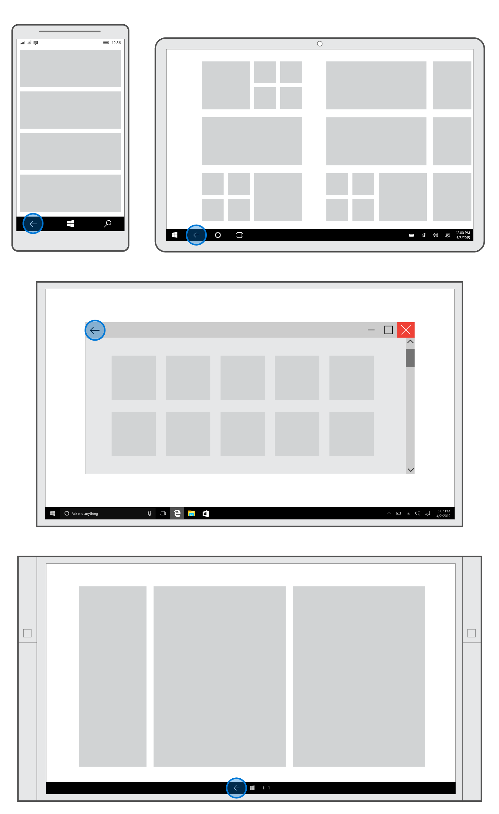
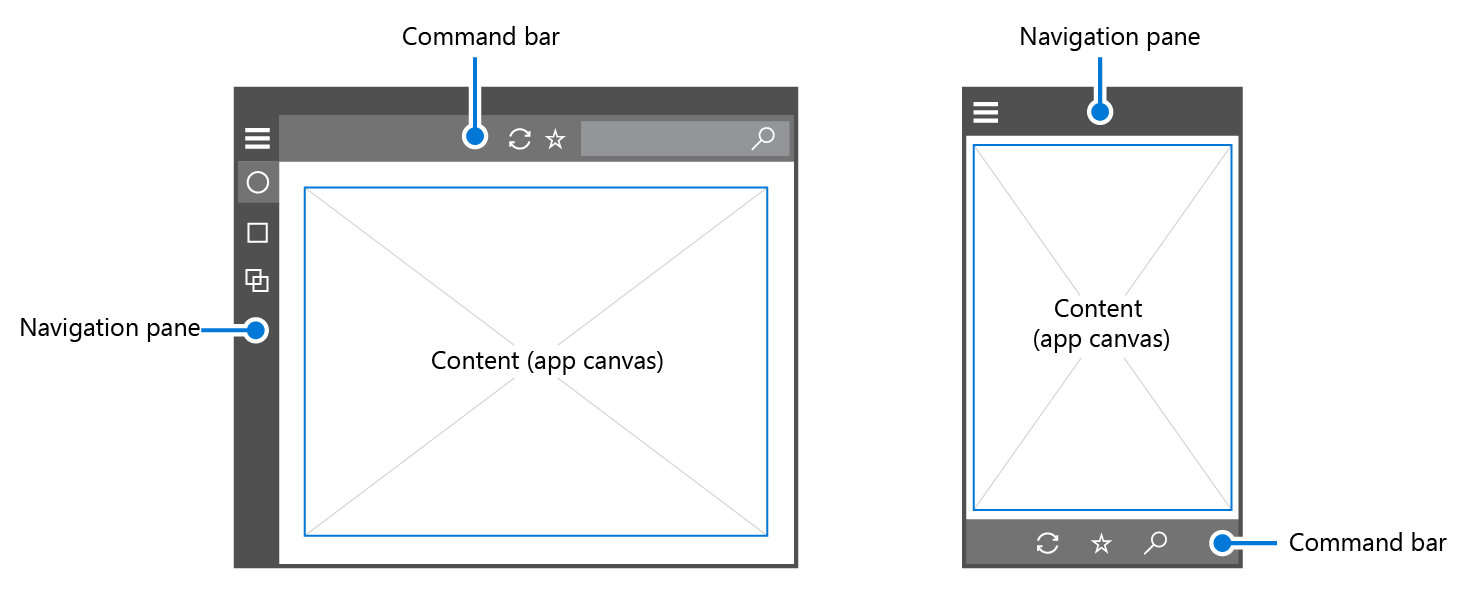
Placement of navigational elements should also change for different device families. For example, on tablets and laptops/PCs, the navigation pane is usually placed on the left side, whereas on mobile, it is on the top.
Simplicity
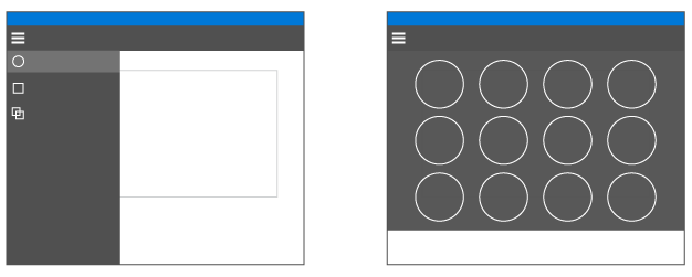
Another important factor in navigation design is the Hick-Hyman Law, often cited in relation to navigational options. This law encourages us to add fewer options to the menu (see Figure 3 below). The more options there are, the slower user interactions with them will be, particularly when users are exploring a new app. The same law can be applied to media content. Rather than overwhelming the user with a vast selection of media options, consider providing brief tidbits for users to explore if they choose.
Clean interaction
The final key characteristic of navigation is clean interaction, which refers to the physical way that users interact with navigation across a variety of contexts.
This is one area where really putting yourself in the user’s position will inform your design. Try to understand your users and their behaviors. If you’re designing a cooking app, and you’re expecting it to be used in the kitchen, you might want to take into account that the user will probably want to avoid using food-covered fingertips to navigate to the next cooking step. Instead, the user might use a knuckle, the back of his or her hand, or even an elbow. This should influence the size of your touch targets and the appropriate spacing between navigational elements, at the very least.
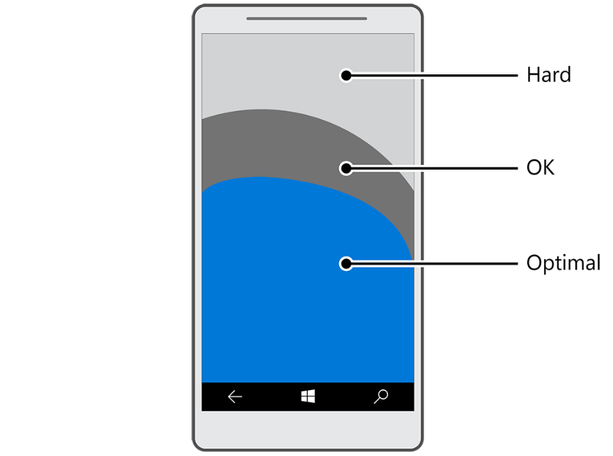
You should also keep in mind which areas of the screen are considered easy to reach. These are known as interaction areas. In the mobile device illustration below (Figure 4), for example, the blue area represents the optimal touch points for users (in this case, a user with the phone held in her left hand). Here, users expend the least amount of effort to interact —remember that most users hold their phones with their left hands and interact with their thumbs. Correspondingly, the dark grey region requires somewhat greater effort for interaction than the blue, and the light gray area requires the greatest amount of effort overall.
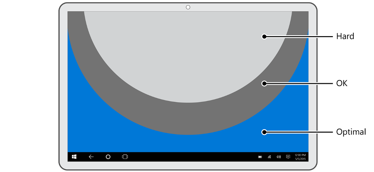
Tablet devices introduce an additional complexity because users have multiple ways of holding their device. Typically, users grip a tablet with both hands along the sides. Figure 5 below shows the interaction area for the most common pose and grip of a tablet. Keep in mind as you design your navigation, however, that tablet users often switch between posing their devices in landscape and portrait orientations. Finally, note the alternative ways you yourself interact with tablets and consider whether your navigation is convenient for those scenarios, as well.
Rules of Thumb
Several rules of thumb help designers to encapsulate consistency, simplicity and clean interaction in their navigation design. Most of these come from the web design world and have been around for nearly a decade. These rules happen to work well for UWP apps, but as with any rules of thumb, use them as starting points and tweak as needed.
- Avoid deep navigational hierarchies. How many levels of navigation are best for your users? A top-level navigation and one level beneath it is usually plenty. If you go beyond three levels of navigation, then you break the principle of simplicity. Even worse, you risk stranding your user in a deep hierarchy that they will have difficulty leaving.
- Avoid too many navigational options. Three to six navigation elements per level seem about right. If your navigation needs more than this, especially at the top level of your hierarchy, then you might consider splitting your app into multiple apps, since you may be trying to do too much in one place. Too many navigation elements usually lead to inconsistent and unrelated objectives in your app.
- Avoid pogo-sticking. Pogo-sticking occurs when there is related content, but navigating to it requires the user to go up a level and then down again. Pogo-sticking violates the principle of clean interaction by requiring unnecessary clicks or interactions to achieve an obvious goal—in this case, looking at related content in a series. (The exception to this rule is in search and browse, where pogo-sticking may be the only way to provide the diversity and depth required.)
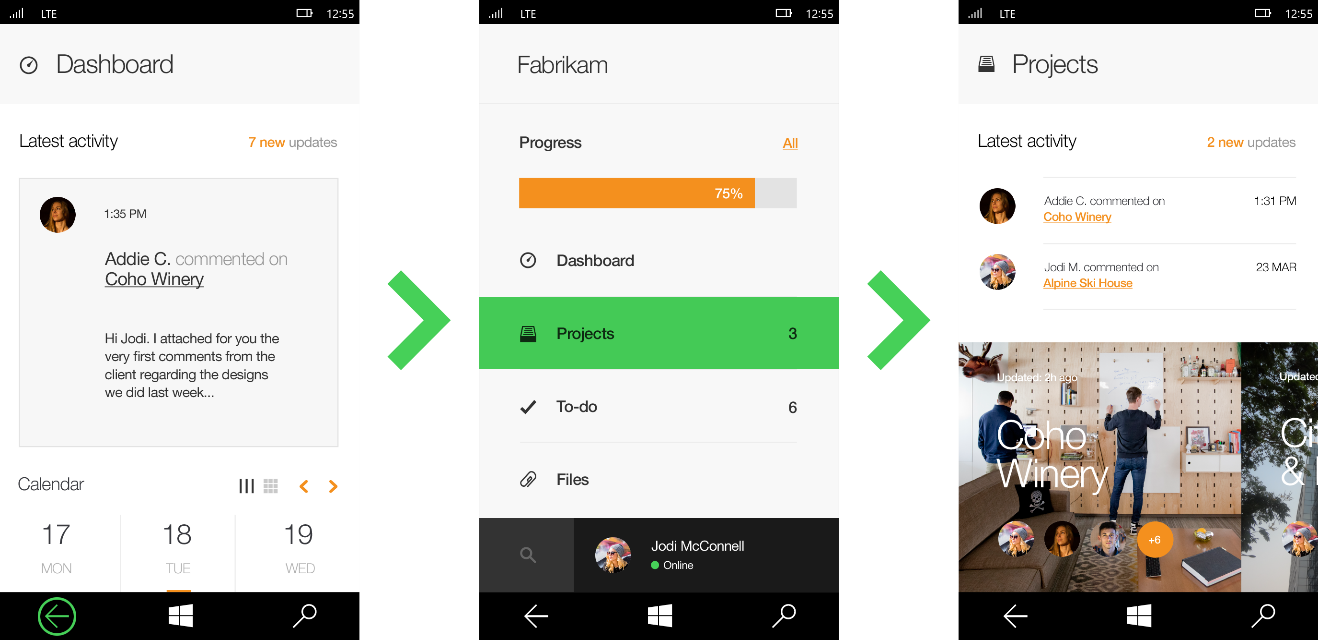
Having an icon (swipe gesture in green) helps to resolve this issue, as you can see in Figure 7.

- Mind your thumbs. Your users will typically use their thumbs to navigate your app. At the same time, they are also using their thumbs to grip their device, leading to a bit of clumsiness in interaction. To throw an extra wrench into this, thumbs are relatively big compared to other fingers and tend to hide the visual element with which a user is trying to interact. The technical term for this occurrence is occlusion. Keep occlusion in mind as you create your navigation structure.
Wrapping up
The goal of navigation design is to help your user move through your app without noticing your navigation structure at all. This is accomplished by making your navigation design simple and clean, typically through the reuse of the navigation idioms that everyone else uses whenever you can. By making your navigation uninteresting and consistent with standard conventions, you are actually helping your users to navigate your app intuitively.
For more information, refer to Navigation design basics for UWP apps and Navigation in UWP apps.
And don’t forget to check out our other posts in the series!
- Getting started with app design
- Understanding typography and UX design
- Visual communication and visual cues
- Design thinking: Finding your inspiration
- Sketching your app design
- Using iconography to enhance UX design
- Communicating with your users
