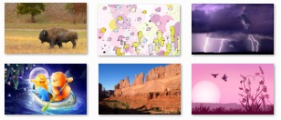
It’s very easy to create Windows 7 themes. With just a few clicks, you can transform a set of digital photos on your PC into a new look for your desktop. But creating an excellent Windows 7 theme that many people will enjoy can be more challenging. In this post I’ll give you some tips for creating great themes.
Showcase your work
First, you might be wondering why you’d want to create a theme for anyone but yourself. I can think of lots of reasons. Custom themes can be thoughtful gifts for your friends and family. For example, I made a theme for my sister, using some of my own photography and the Sonata sound-scheme (she likes classical music), and gave it to her on a shiny new portable drive for her birthday. You can create themes about specific events (a wedding, a vacation, etc.) to share with your circle of friends. Grandparents might enjoy receiving a theme that features photos of their grandchildren. But if you are an artist or photographer or a small business owner, or a community theater organizer, let’s say, you also might want to create themes for the general public to download. It’s another way to showcase your work, and it’s something you can offer on your website as a “freebie” to your customers.
Choose images that are not distracting
So, how do you create a polished, professional-looking theme? A big part of it is in choosing and preparing the images. Ideally, they should be beautiful (or dramatic, or exciting), but without being so distracting or having so much busy detail that objects on the screen are hard to see. Not every great image makes a great desktop background.
 |
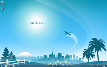 |
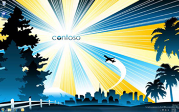
These two images feature the same basic subject, but the one on the right is less distracting and icons will be easier to see on it.
Create a consistent experience
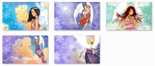
It’s also best to choose images that are all of the same style and feel like they fit together. You probably wouldn’t wear plaid pants with a striped shirt and a flowered vest. Well, choosing images that fit together in a theme is similar to choosing clothes that look sharp together, or furniture and décor that looks good together in a room. A theme that contains a mixture of different styles of artwork and/or photography—or images in which the logo (if any) moves from place to place from one image to the next—can give the impression of being jumbled and unprofessional. Or as if your theme got dressed in the dark.
|
|
|
|
These images do not go together, and would create |
These images are all in a consistent style and |
Choose images that can have areas cropped or covered
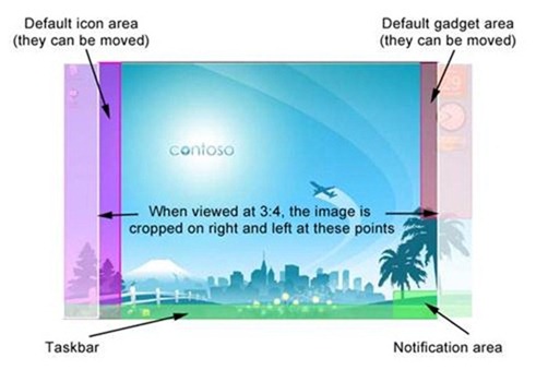
Another thing to keep in mind is that, unlike a picture in a frame hanging on the wall, a picture on the desktop is in a space that is constantly being used and interacted with. There are parts of the desktop that are especially likely to be obscured, as shown in this example:
So, it’s best to choose images that don’t have key elements in areas that will be hidden or cropped.
Fit images to all displays, aspect ratios, and resolutions
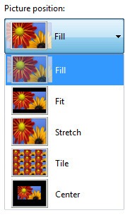
Another thing to keep in mind is that while many users still have standard 3:4 displays, widescreen is becoming more and more common, as are other display proportions. (If you aren’t familiar with image aspect ratios, this Wikipedia article explains it well.) When creating your theme, it’s best to choose a picture position of “Fill” so that the desktop background fits screens of all display sizes and aspect ratios. For more information on setting picture position, see Tips and tricks for creating a theme.
However, it is also important to prepare your images so they will look good on as many different screen resolutions and proportions as possible. Here’s an example of two different images and how they look when viewed on widescreen versus on a standard 3:4 PC display:
Viewed on widescreen 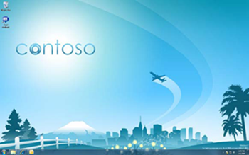 |
Viewed at 3:4 aspect ratio 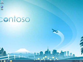 |
This image looks fine on widescreen, but appears awkwardly cut off when viewed on a standard PC display.
 |
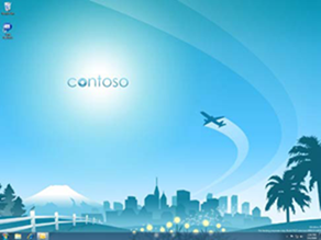 |
This image looks good on both widescreen and on a regular size display. The elements have been positioned so that when the image is cropped, key details are not lost.
Size your images
Another consideration is the size of your images, both in terms of pixels and in terms of file size. If the images in your theme are too large—for example, 3 megabytes (MB) each, or larger—you might notice that your PC runs a bit slower or is a little less responsive, especially when the slide-show transition occurs. On the other hand, if the images are too small or too low-resolution, they might look grainy or low-quality. The image size we use for the themes on the Personalization Gallery is 1920 pixels wide by 1200 pixels tall, at 96 dots per inch (DPI). We try to keep the file size between 700 kilobytes (KB) and 1.5 MB, although there are a few images that are either larger or smaller than that.
Special tips for photographers
By the way, for you photographers out there, Microsoft blogger Mike Swanson has a fantastic post on the subject of how to take photographs that work well on the desktop. He really knows his stuff. This Windows 7 theme featuring some of Mike’s beautiful nature photography is the 7th most popular theme on the Personalization Gallery (out of a total of about 140 themes) and it’s been downloaded 1,728,044 times so far. It’s one of my personal favorites.
I hope these tips will help you create great themes that will wow your friends, family, customers, and fans. Stay tuned for more tips and tricks in future posts—and be sure to keep checking the Personalization gallery for new Windows 7 themes. I add more almost every week.

