In my previous post I gave you several tips for creating great Windows 7 themes. The points I detailed in that post will take you 90% of the way to designing a polished, professional-looking theme. However, there are a few more aspects I also like to keep in mind as finishing touches when I am working on a new theme, and I thought I’d share those with you too.
Order your images to create balance
Whenever I produce a theme I think about the overall balance of the images in it, and I almost never use the “Shuffle” slideshow feature. I like to control the order in which users see each image, because this can contribute to the smoothness of the overall experience. The pictures will transition in the alphanumeric sort order of the image file names, so I name and number the graphics to create the order I want (e.g. Lovebirds1.jpg, Lovebirds2.jpg, and so forth).
For example, in the Arctic theme roughly half of the images feature wildlife, whereas the rest are scenic shots of the Arctic landscape (or waterscape). I intentionally alternated the wildlife and landscape images because I felt that would create a more balanced whole.
Another example is the Harvest Time theme. About half of the images I chose for that theme were landscape shots with a view into the middle or far distance, with the rest of the photos being close-ups of particular types of crops (grapes, corn, rice, blackberries, etc.). I tried to alternate the distance shots and the close-ups to create an experience with overall balance.
Other aspects to keep in mind when ordering your images are the focal area or “direction” of each image (whether the emphasis is towards the right or the left); the darkness or lightness of each image; and the overall color/tone of each image.
Order your images to create a good theme icon
The icon for a theme is automatically created from the first three images. I’m not sure why this is, but the second picture in the theme is the one that appears in the front on the icon, and the first image appears in back.
When choosing a sort-order for your images, you’ll want to choose an image for position #2 that looks good at a small size and expresses the overall personality of your theme, since it will be in front on your icon. (I also try to choose an image in which the key details are not on the left, as this will be obscured by the icon’s glass tile.) And of course the first image should be one that creates a strong first impression – for example in the Shrek and Megamind themes, the first images are the “poster art” that shows all the characters together, whereas subsequent images may focus on individual characters or show scenes from the movie.
Create smooth transitions
In some cases, instead of creating overall balance between your images you may want to focus on creating smooth transitions between them. For example in the Lovebirds theme I positioned the dark images together, so that images with similar color tone and composition will follow one another in the sequence (remember that the last and first images are together in the repeating cycle).
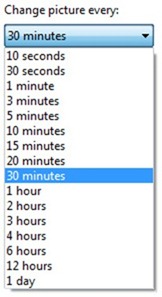
Don’t set image transitions to be too frequent. Changing the background every 10 seconds will quickly become annoying. Also, when the transition occurs, a tiny bit more of the CPU is busy switching from one image to the next, and this takes away some processing power that you might want for more important things, such as the spreadsheet you’re working on, or the video you’re watching. I recommend not setting the desktop background slideshow transition to occur more frequently than every 10 minutes. Most of the themes I release on the gallery transition to the next background image every 15 or 30 minutes.
Use the slideshow feature creatively
Something I would love to do is create themes that use the desktop background slideshow feature to create an “animation” effect. For example, a theme that shows the same scene over the course of a day as the light changes from dawn through noon to dusk and nightfall, or through the seasons of the year, or that uses time-lapse photography to show something changing (a flower blooming, etc.).
I explored this idea a little bit with the Shamrocks theme, but I think that talented artists and photographers out there could take the theme “art form” (if you can call it that) in far more creative and interesting directions than anything I have done thus far.
Create a custom glass color
The “frame” for the art that is your theme is the glass color. When the colors in your photographs or artworks are fairly consistent, you can create a glass color that goes with and sets off all the images the way a well-chosen frame enhances a great piece of art. I was able to do this with the Lightning, Avatar, Blue Water, and Fireworks themes because there was a consistent color tone throughout most or all of the images in those sets.
But when your theme contains photography of many different scenes or subjects (like the Bing themes) it can be challenging to choose a color that goes with all the images. In cases like that it’s best to choose something neutral.
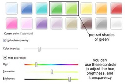
My main rule of thumb with the glass color is to keep it subtle. I almost always create custom colors that are much more soft and toned-down than the pre-set colors in the Window Color and Appearance control panel, because I don’t want the window color to feel glaring and distracting. For example, for the Shamrocks theme I created a custom glass color instead of using either of the two preset shades of green.
|
This color is less saturated and more transparent than the pre-set colors |
|
Choose sounds
You have the option of either using a built-in sound-scheme as-is, modifying it by adding new sounds, or creating an entirely new sound-scheme. If you customize or create your own sound-scheme, however, there are a few important things to keep in mind.
The sounds in Windows can be thought of as being a little bit like a movie sound-track. You want to choose sounds that go with and reinforce the ambiance or story you are trying to create with the visuals. But there are two very important differences between a film soundtrack and Windows sounds. Firstly, Windows users will hear the exact same sounds over and over and over, and secondly, people using your theme are trying to do something else. I mean, they aren’t 100% focused on your theme like they would be focused on watching a movie; their priority is to use their PC to get things done. So if you add custom sounds to your theme, keep in mind the annoyance factor. A sound that was really cool (or really funny or really dramatic) the first time is likely to be really annoying the 50th time it’s heard.
The built-in Windows 7 sound schemes do a fairly good job of not crossing the line into annoyance, (although I have to admit that the sound-scheme that was my favorite during development ended up being one I couldn’t use later, because the sounds are just too attention-grabbing for me). But if you are creating your own theme, you might not want to limit yourself to the built-in sound schemes.
In fact if you are a musician this is another great way to showcase your work. You can show off a bit in the .WAV files you use with the Windows Logon, Windows Logoff, and Windows Change Theme events, with longer and/or more dramatic sounds or music. But I strongly recommend that for the Asterisk, Default Beep, Exclamation, System Notification, and New Mail Notification events, the audio clips be kept short and subtle. These events occur often enough that you do not want their associated sounds to be so long, loud, or startling that they quickly become annoying to the user.
My final recommendation, if you really want to go for the gold with your custom sound-scheme, is try to match each sound to the meaning of the event. In other words, the logon sound should ideally be welcoming, whereas the logoff sound should seem like a conclusion or farewell. Sounds that signal positive events should seem more up-beat and cheerful than those that indicate a warning or error.
I hope these tips will help you have even more fun with your theme creation projects. If you have additional ideas and recommendations to share, please add them to the comments. And keep checking back on the Windows Personalization Gallery for more themes. We recently published two new themes for the Year of the Rabbit, a new theme (Lovebirds) for Valentine’s Day, a theme featuring the wildlife and dramatic landscapes of Antarctica, and a theme for the new Paramount animated film Rango. And as always, more are in the works.


