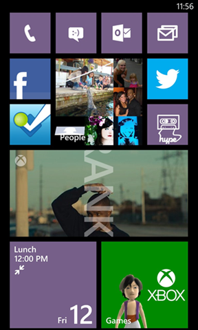
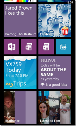
I remember the exact moment I fell in love with Windows Phone and its Start screen. I’d just started on the engineering team here and been handed my first Windows Phone 7 prototype. It wasn’t long before I discovered that when I “pinned” a friend’s contact info to Start, their latest status updates also started showing up.
I was hooked: My phone, it seemed, cared about the same people I did.
Flash forward a bit. Windows Phone 8 has arrived. For the past nine months, I served as the program manager responsible for driving the redesign of its Start screen—a tall order for a part of the phone that customers and critics already liked and found distinctive. I began one of our first meetings by challenging the team with a single question: “How can we make Start even more personal?”
These before-and-after screenshots show how the designers and engineers here ultimately answered that question in Windows Phone 8. In the rest of this post, I’ll give you the backstory of how we arrived there and why.
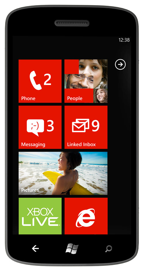
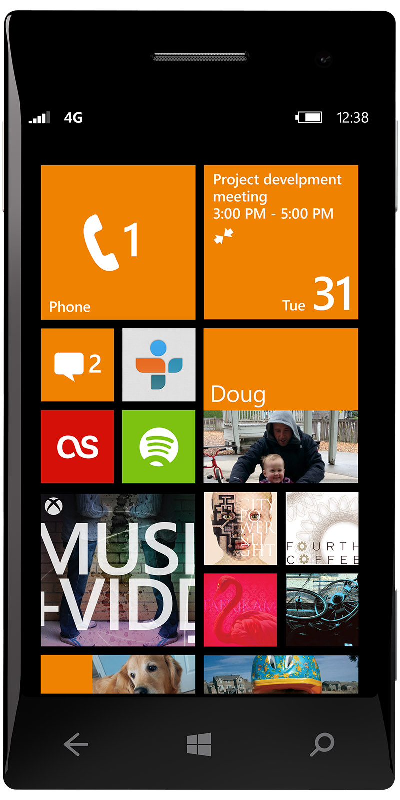
Before and after: The redesigned Start screen in Windows Phone 8 (right) features resizable Live Tiles and other improvements designed to make it even more personal, fun, and informative.
The best home screen on any phone
You’re probably already familiar with Windows Phone’s award-winning design and Start screen. If not, here’s the most important thing you need to know about how it’s different from everyone else: Windows Phone replaces the static, do-nothing icons found on competitors’ home screens with an innovation we call Live Tiles. Customizable and constantly refreshed, Live Tiles provide up-to-the-instant info and updates on whatever you most care about (or app developers make possible).
On Windows Phone, Start is more than just a place to launch apps. You can pin your best friend there to see her status updates throughout the day, the CNN app for the latest headlines, or an eBay item to see if you’ve been outbid. Whether it’s a person, an app, a photo album, or a musician you care about—Windows Phone makes it possible to stick everything you love right on the part of the phone you see and use the most. That’s what makes Start so different: it’s completely relevant, personal, and unique to each of its users.
As the engineering and design teams began to discuss what made the original Start so great and how we could make it better in Windows Phone 8, a few themes started to emerge.
First, Live Tiles are popular because they’re alive with the content people care about, so let’s find ways to squeeze even more of them onto Start. Second, people care about some things they pin to Start more than others, so let’s make it possible to reflect this visually. Third, how can we make the Start screen even more distinctive?
Finally, everybody loves decorating their phones with different colors—so let’s provide even more.
How-to: See how easy it is to personalize the Windows Phone 8 Start screen.
Squeezing more onto Start
Set a Windows Phone down next to an iPhone or an Android device and one thing you’ll probably notice is how much more empty, or “negative,” space we use. Compared to other smartphones, there are also fewer visual frills like borders, shadows, or glassy reflections. This isn’t an accident. Our goal is a more balanced, uncluttered look that puts the focus on your stuff, not our stuff.
In Windows Phone 8, we wanted to shave away even more user interface “chrome” to make room for your content on Start. So you’ll notice the arrow that formerly pointed to the App list has been relocated, while the column of space (or “gutter” in design speak) down the right side of the screen is also now gone. These changes created room for both more and bigger tiles, so you can see even more of what a loved one has to show or say. I also can’t wait to see what app developers do with this expanded canvas.
That arrow, by the way, was a tricky little guy—and provides some insight into how the software design process typically works.
Initially we figured we could safely remove it. But when we began bringing real people into our usability labs to play with the redesigned Start screen—something we always do as part of the design process to double check our hunches—we saw that quite a few of them weren’t finding the App list, which requires a quick left swipe to see.
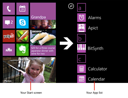
So we went back to the drawing board, trying the arrow in various places. At the top it added too much visual clutter. At the bottom it’s out of the way but still provides a nice hint to new Windows Phone owners that there’s something important off the screen. After we made that change, none of our testers overlooked the App list.
Supersize me
It’s great that Windows Phone lets you to pin all the stuff you care about to Start. But some things you like, and some things you love. Why does the tile showing my dog have to be the same size as the one I tap to make a phone call?
Now it doesn’t.
In Windows Phone 8, we’re introducing resizable Live Tiles, so you can not only position them anywhere you want, you can also make them bigger or smaller with a tap. Make your wife’s Live Tile large to see her face in gorgeous high-res; shrink your friends’ tiles to get more of them onto Start. By supporting as many as four tiles across, the range of fun and unique layouts in Windows Phone 8 is practically limitless.
Steve’s phone: Curious what Microsoft CEO Steve Ballmer’s Start screen looks like?
Design geeks might wonder: How did we land on a four-column layout? Over the months we tested hundreds of design iterations (a process that was both exhilarating and exhausting). Three-column layouts didn’t feel like enough flexibility, whereas five-column layouts left tiles too small to read and tap. In the end, four felt just right. Every app supports small- and medium-sized Live Tiles. But since Start screen real estate is valuable, only apps with something useful to show (like Calendar, Mail, or People, to name just a few) offer a large option.
Color me beautiful
Windows Phone has always embraced color more than any other smartphone because we think it’s one of the best ways to express personality. And the only thing better than great colors is more great colors. Windows Phone 8 now supports a total palette of 20—twice as many as before. Besides vibrant new options like cobalt, yellow, and indigo, there are more muted tones like olive, steel, and mauve. And these don’t just show up on Start. We’ve sprinkled more accent color throughout the phone, including on places like the keyboard. I’ll leave it up to you to find where else we snuck in a little bit of color in.
Picking these might seem like a fun job, but it’s actually really hard work. Our design studio spent countless hours creating a palette for this release that’s beautiful yet always works with whatever’s showing on screen. Accent colors, for example, can’t make the white text of Live Tiles illegible, or clash with the black or white backgrounds of the phone’s dark and light themes.
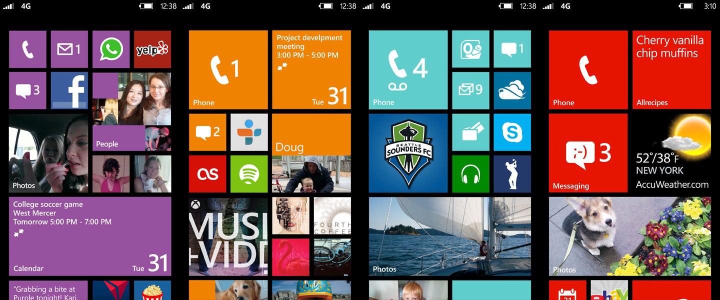
New hues: The new Windows Phone 8 Start screen comes in lots of new colors—and makes possible all kinds of new arrangements for Live Tiles.
Meet my Start screen
So that’s the story behind the new Start. It’s been really fun watching folks on the Windows Phone team use it: Everyone’s Start screen is different, and the moment you look at someone’s, you get a real sense of who they are and what they value.
It’s been even more fun reading some of the new Windows Phone 8 reviews, like this one from The Verge: “Windows Phone 8 has the best home screen — the perfect combination of flexibility, design, and simplicity — of any major platform right now.”
By the way, here’s a look at my real-life Start screen. Trust me: No one else has a one like it. I can’t wait to see yours.
RELATED:
Q&A: The new Windows Phone 8 lock screen
Learn more about the Start screen and how it works in Windows Phone 8

