

I’d like to share some thoughts about the design work we’re doing on Windows 10 for the phone. I and many on the team have been working on phone design since Windows Phone 7 and we take pride in our design work. But it isn’t always perfect and we’ve heard a lot of feedback on our current flight—we love all the enthusiasm and we rely on our Insiders to help preview our work and share their thoughts about what they see. For example, lots of people are talking about the Menu icon or Hamburger. In fact, I can’t remember so many people talking about a hamburger since I made my first Ramen Burger with Sriracha mayo, Fried Egg and side of Papaya Salad….creating new recipes isn’t easy, lots of trials before you get the balance right.

Today, I’d like to share more about how we’re working to get the balance right. First, I want to share a bit about our approach, especially now that we’re flighting Windows 10 and our work-in-progress is more visible. Just like creating a new recipe, we’re still not done with our designs and I’ll share some specific insights into areas where we’ve heard the most feedback so far and what we’re doing to improve the experience. In some cases, we already had these changes in our plans before hearing from you, but in other cases your feedback is adjusting our path, which is awesome. All paths are in pursuit of delivering the best Windows we’ve ever shipped.
We’re more excited than ever about design as an approach to helping deliver more personal computing, productivity, and fun—in a beautiful and usable way at Microsoft and across the industry. But with that excitement comes some hard tradeoffs, and part of taking our designs to the next level is facing new challenges and solving new problems. That’s what we’re doing now.
About our design approach
Our design approach is evolving from our rich history in transportation graphics and the International Typographic Style. Today we’re moving toward an approach that is somewhat like designing a city. We’re creating a foundation, or a common grid, that maintains the order and standards that make a city work, yet also has flexibility that enables expression and a distinct sense of place.
For the foundation in our design, we had to set down some common patterns and controls. We want to deliver an experience that flexes elegantly across a continuum of devices…and we’ve heard frequently from developers that it needs to be easier to use for people joining us from other platforms. These desires have led us to define some new, more flexible global controls and to create an “adaptive UX.”
We started by exploring concepts to push the boundaries of our design system, going from mild to wild variation, trying out new patterns and controls, new type treatment and using color in bold fresh ways. We looked at making content even more expressive in our system and strived for overall simplicity while allowing for more personal expression. Below are samples of explorations the team did when we started our Windows 10 design journey last year.

As our direction took shape, we started to apply the design intent into our apps and begin the work to build, flight, learn, iterate, re-iterate, and continuously refine to create our plan of record.
Learning? Yep, by Design
We’ve learned a lot from the earlier Windows flights for PCs and we’re finding out more now from the January Technical Preview for phones. This has been a fascinating process for our team. While the construction of Windows 10 has been following a predictable and expected path amongst our team (with rough edges exposed before the cohesive design elements and finishing touches are applied), our new collaborative development model with our Windows Insiders has introduced this process publicly. Many have applauded our desire to incorporate feedback. Others, of course, have questions on how this will all come together.
We’ve seen on blogs and Twitter, “wow, these phone flights are pretty rough—I hope it’s not too late for Microsoft to hear us saying this feels a long way from done!” Here’s the good news—we knew when we released the builds that there’s still a long way to go, but this ‘roughness’ is part of the deal when we send code out early. We’re used to seeing things in these rough states along the way, so it feels very normal for us. But now many of you are seeing this too, and the roughness feels different when we hear your thoughts about it. But we all agree that this is by far the best way for us to actually incorporate feedback – while there is still time in the development process.
The builds you see have many different parts of Windows 10 in various states of being finished. The core code has come a long way—it’s generally reliable, with good battery life, and you’ve probably noticed that your phone calls work very well. However, many of the apps in these flights are still early code, built as universal apps that run across PC and phone, but without the tailoring completed that makes them adapt to the phone-size screen and our desired phone interaction model. Thus, what you’re seeing today are apps only partially-adapted for the phone UI that we intend to ship when we’re finished.
Here are some good examples of areas where we’d like to tell you more about what’s coming, and where we’ve learned and adjusted:
- Menu icon (Hamburger)
- Outlook Mail and Calendar
- Project Spartan
- Task switching
- People
- Photos
Hamburgers
This one is tricky. Fire up your mobile browser and go to your favorite website, like Facebook, Bank of America, or Huffington Post. You’ll likely see a hamburger control (Menu icon) in the top left or top right corner as the main navigation element. How has the hamburger become a UX convention for navigation? Check out this post. As with all UX design, it’s not the control that’s bad; it’s how it’s implemented. The right tool for the right job. The hamburger is often used as a consistent navigation element that’s the “home” for an app, always there, helping you go where you want to go. It’s less effective when the items listed in it don’t have a clear hierarchy, or when you need to access it frequently to accomplish your task. Sometimes the app bar, tabs, pivot, or a combination could be better controls for the job.
With our universal apps and adaptive UX we have an approach to design that lets developers build one app, but still tailor the UX to each device when it makes sense. We can use a hamburger icon without pivots on a PC version of the app for better keyboard and mouse navigation and then customize the same app to have pivots with swipe control for better one-hand-use on mobile. We’re making it possible for an app to have both hamburger and pivot controls—but to display the right control at the right time on the right device.
This is one of the benefits of the new adaptive UX design. And we’re continuing to iterate our app designs to address Insider feedback on how the hamburger control is used, making sure it’s usable, useful, and delightful on every device.
So, that’s some background on our approach, now let’s look at some specifics of what we’re working on right now.
Outlook
Commands at the bottom of the screen
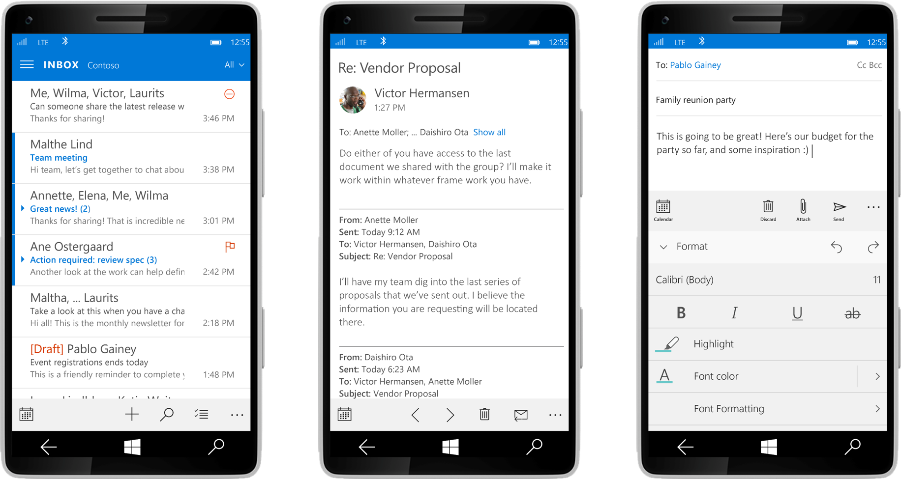
Without a doubt, the highest volume of dissatisfaction we’ve heard about Outlook Mail and Calendar for phones has been that people really like and really miss the Windows Phone 8 pattern of having most commands at the bottom of the screen, with an appbar that shows titles with the icons. We’re happy to let you know we’re not moving away from that pattern—the builds you’ve seen have an incomplete implementation of the “command bar” from Office and in the coming weeks you’ll see most of the commands back in a familiar-but-updated control at the bottom.
In our latest builds, we’re all seeing early versions of what we call “in-box apps.” The Universal Outlook apps have a UI that’s partly rewritten from scratch with a new codebase that we’re committed to for the long-run. The Outlook team is moving fast and you can expect rapid improvement over the next weeks and months. People have told us they miss features like Unified Inbox and Multi-Select. More good news: these will be available in upcoming updates, before our code is final—along with a long list of other updates and improvements.
Now about the Menu icon (hamburger) in Mail. A bit of context first: for many people, an important part of using email is understanding which account and folder a message is in. The familiar Outlook app for the desktop represents this with three panes—on the left is a folder pane with a selected folder, in the middle is the list of messages in that folder, and a pane on the right shows the message:
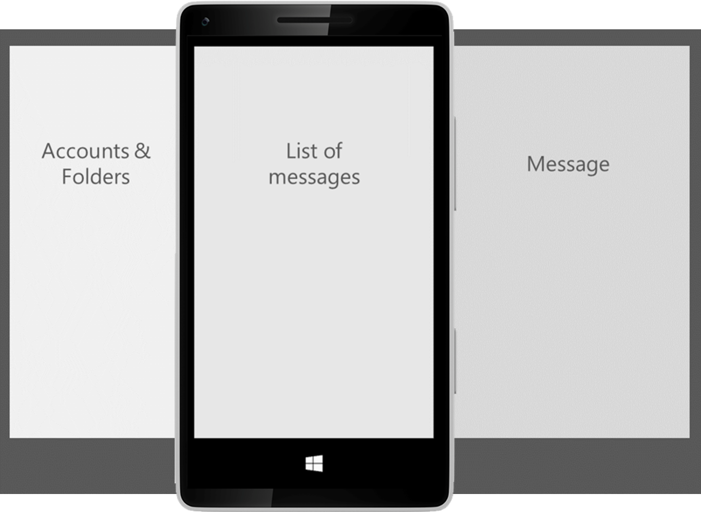
On a phone, we can only show one of these panes at a time. A fly-out menu from the left (that you can get to through the Menu icon or hamburger) is useful to show this relationship between folders and a list of messages and makes it easier to stay oriented to where you are in the app. Although it’s a longer reach for your thumb, we’ve seen that people don’t do this very often. And, in a coming flight you’ll be able to pin commonly used mail folders so the need to switch folders drops down even more. We’re going to keep a close eye on this one to see if pinning mail folders remains a common activity and whether people want to switch folders more frequently.
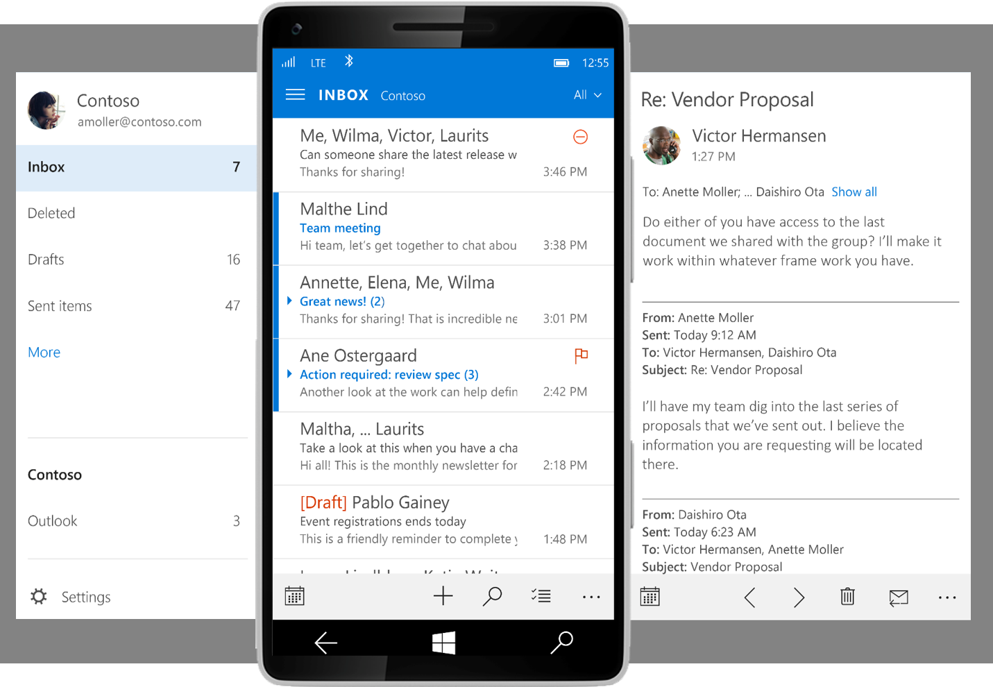
Here’s how things will look in later builds, showing the icons at the bottom of the screen and how people can use the hamburger button to access the accounts & folders at left:
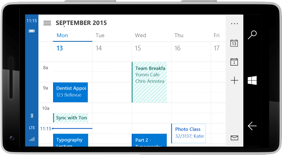
Calendar
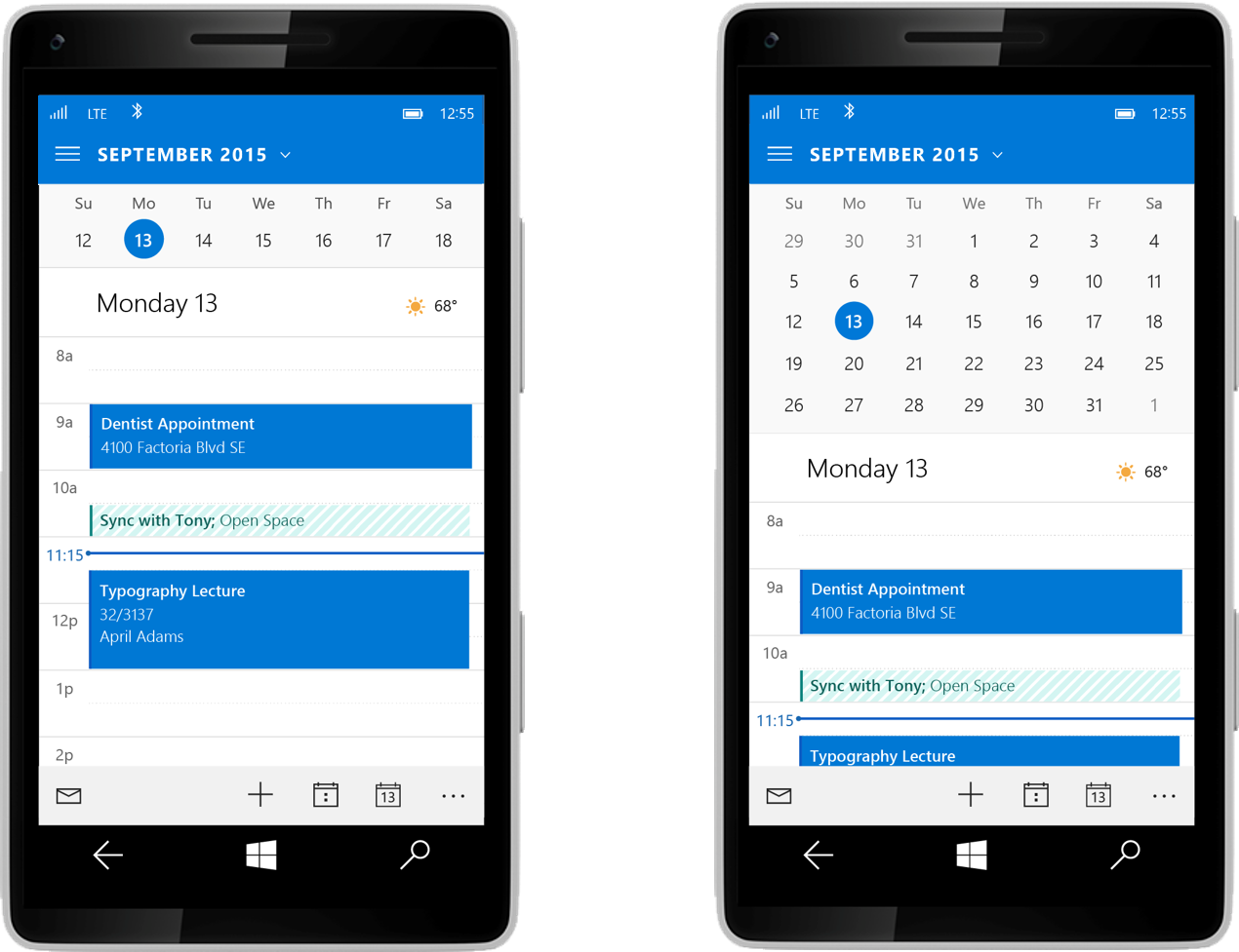
Many people have also asked us to bring back the week and month views in the Calendar. In Build 10051, there is a way to access a mini-month view, but we didn’t make it discoverable—you have to tap the month name. We’re going to make it easier to find that.
Here are some changes you’ll see in the coming weeks:
- Make it easier to discover the mini-month.
- For phones with larger displays, increase the number of weeks shown in the mini-month.
We believe this design strikes a reasonable balance between people who use month view most often and people who want to see a day or agenda view, but want to easily get to month view to peek into the future.
We’re working on a week view in landscape, but it wasn’t ready for flighting in 10051. It’s coming!
Here’s how things are looking:
Microsoft Edge
Microsoft Edge is our new browser experience for Windows 10. It includes a new web engine and is built on the Universal App Platform. From the PC to the phone, we’re introducing a design in Microsoft Edge that’s more contemporary and simple, and is better integrated with the overall Windows 10 experience.
We’ve also focused on creating an experience that’s consistent and familiar from device-to-device. This includes both a common visual style for the app across the Windows 10 device family, and consistent top edge placement of the address bar as the most prominent element of the browser.
Since announcing Microsoft Edge (“Project Spartan”) in January and launching our first flight, we’ve been listening to feedback from our Insiders about the placement of the address bar on the phone and we’re still investigating designs for this experience, but we don’t have a final approach ready to share just yet. Keep sharing your thoughts and we’ll keep you updated on our work here.
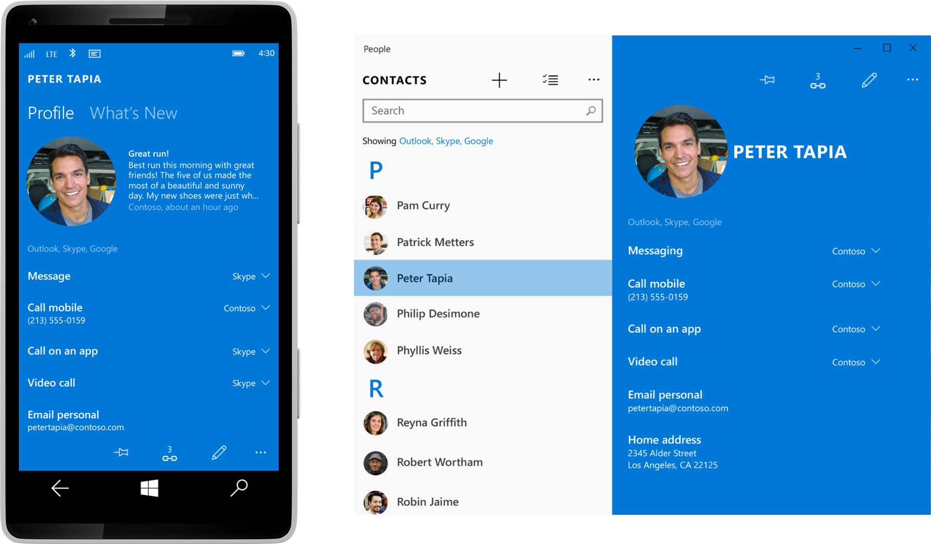
People aren’t squares
We’ve also heard that using circles to represent people doesn’t reflect our overall design and feels out of sync with what we’ve done in the past.
I’m going to segue a bit into some of our design thinking here, but stay with me for a bit….We did a lot of thinking about this during our planning stages for Windows 10, and what we tried to accomplish was to help the people in your life really stand out visually. This is particularly important in experiences like Start, and when you’re moving through different apps where there are people mixed with other content types. So for now, we’re going to stick with using circles to represent people, and we hope we’ll hear that you enjoy how easy it is to spot a friend when you’re glancing through all the things you do on your phone.
Here’s a peek at the design we plan to deliver:
Photos
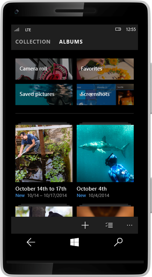
Here’s a great example of where the Menu icon (hamburger) and pivots can be tailored to each device.
With our Photos app, we want to help our customers create a collection of favorite moments and have a new, richer stage to present those photos. Another goal is to automatically organize pictures into albums, while also making it easy to get to photos from ANY device.
We looked at using the Menu icon (hamburger) navigation across devices, and discovered that for phones, the ability to switch between collections and albums would be easier with one hand by using a pivot and swiping. While we’re still iterating on the navigation within the Photos app, the final design will have the Menu icon in the PC app and pivots for phone, allowing greater flexibility whether you’re using a keyboard, mouse, or touch.
Take a look at what’s coming:

Task switching
Lots of people have noticed that our task switching on the phone seems to be backwards (i.e. the reading order is going from left-to-right instead of right-to-left the way it was in the past). We’re still gathering feedback and considering the tension: the PC task order is left-to-right, while historically on the phone the order is right-to-left. Should we make these the same across devices so your muscle memory works as you go from 8” tablet to phone? Or should we keep the experience the same for all our phone users who upgrade. We want to have a good understanding of how tough it is for phone users to relearn before we make a final call.
Beginning the journey
Phew! That’s a lot of sharing. Over time, we’ll be iterating our design work to balance the need for flexibility across devices with the goal of creating consistent and delightful experiences for each device. Windows 10 is just the start of a new way of designing and operating. Keep in mind, we’re thinking of Windows 10 “as a service” with a plan to provide ongoing updates and improvements. In particular most of the apps we talked about here will be getting regular updates through the store so you’ll see refinements continue to happen after our broad public availability.
This is also the first of many design conversations about our products and services. To hear more, catch us at Build 2015. We’ll also continue to talk about our designs in the weeks to come.
P.S. Thanks for reading this far! I’ll add that most of the images you see above are design comps – as we work through the actual implementation and continue to get feedback from you, we might still tweak things and the final end result may not look exactly like these images.