The people behind Windows 11: Working with communities to improve input and accessibility
John Porter is an input and accessibility designer who is unable to use what so many take for granted: a keyboard and mouse.
Porter relies almost entirely on his voice and speech recognition technology, in addition to switches (a series of buttons with pre-defined actions to cover a small range of motion) to interact with his PC.
Working on Windows 11 as part of the Modern Input & Accessibility team, he’s been creating solutions to help others who use their PCs in different ways.
“My role on the team is to think about how we can create new and more inherently inclusive input modalities that will not only address the needs of customers with disabilities, but have mainstream value as well,” says Porter, who joined Microsoft three years ago while in a doctorate program at the University of Washington in the department of Human Centered Design and Engineering.
In Windows 11, you’ll now see Accessibility in Settings, new contrast themes and an ongoing commitment to engage with the disability community in doing even more with their feedback.
“Having someone on the team like me who didn’t grow up entrenched in a traditional notion of what it means to interact with a computer allows me to think outside the box,” says Porter, who has a neuro-muscular condition called spinal muscular atrophy.
When he was a young child – about 5 – he had enough manual dexterity to use a keyboard and mouse on his first computer. But as his condition evolved, he had to adapt, using a pencil to “hunt and peck” on the keyboard, and a stylus instead of a mouse.
“When I think back to my own childhood, being in the classroom or computer class, my most vivid memories include using alternate input devices and the way all the kids crowded around to witness this novelty. For me, I was incredibly fortunate, that manifested as a pretty positive experience, but I also recognize that is far from typical,” Porter says. “Often, for people with disabilities – sensory, physical or cognitive – accessibility features and assistive technologies you rely on to mediate your interaction with the world around you may as well be a flashing neon sign that says ‘I’m different.’ So with Windows 11, that was one of our real commitments and priorities. Regardless of whether you’re using Windows with mouse, touch or voice typing, using a default color theme, etc. – all of it had to feel like you were using Windows in the way it was meant to be used.
“It was critical to recognize that no two people with disabilities are alike. One person who’s blind or low vision can’t act as a proxy for an entire community. What I try to communicate to my team and all of our partner teams is that we’re off to a good start, but how do we push this further? I’ve broken down that door, so to speak, so how do I use that privilege in the world of Windows to find more seats to that table, bring more people into that conversation? The only way we’re going to be able to move forward to represent the full spectrum of human diversity is by being understood and represented in the things we create,” Porter says.

Porter’s manager, Jiwon Choi, has been at Microsoft for eight years, straight out of college, channeling her experience on Windows into a mindset pervasive throughout her team.
They acknowledge people have different preferences and abilities. So, they asked, how do these folks prefer to interact with Windows? Do they have low vision, and so therefore the software experience needs to be kind of augmented so that it helps them see the screen better or see based off the way that they like? Or, some people can’t see at all. They might need an experience where everything is read out loud.
“We always knew that Windows 11, even before it was called that, that it was going to be this big push and that it was going to be this new page. We wanted to make sure we really buckled down on the things that we believed in and the things that we felt like was going to really move the needle for people, for the customers,” says Choi, who admits she learned a great deal from her team, reinforcing the understanding that “We’re building this together, so we did really try to uplift each other and teach each other.”
The Carnegie Mellon School of Design instilled in Choi the basic principle of form follows function.
“It’s always about questioning what the problem is. And I think that hunger to always identify the nugget at the real core is something that I always continue to hold on to, and I think it’s helped us limit our distractions,” she says. “We’re really trying to create meaningful, intentional and thoughtful solutions.”
Choi thought she’d end up in print design – even studying abroad in Switzerland in a school that specialized in print design – but changed her mind after she visited a Microsoft booth at a recruiting event.
“We’re really trying to create meaningful, intentional and thoughtful solutions.”
Choi thought she’d end up in print design – even studying abroad in Switzerland in a school that specialized in print design – but changed her mind after she visited a Microsoft booth at a recruiting event.
“I was blown away at how unexpected that experience was, back in 2013. You never really heard Microsoft and design put in the same sentence together, but I could tell these design leaders who came to our school really believed in the vision and the power of what design could bring in,” says Choi, who grew up back and forth between the East Coast and South Korea. “There was just something super compelling about working for a company that had such a large reach and potential for impact that I think it was really contagious, that feeling.”
Choi has developed that feeling into listening to people and working with others within the company to evolve to their needs. Her team collaborated with teams working on hardware, which gave them insights into how people hold their devices, acknowledging the fact that not everyone has a desktop tower setup. They looked at how people used their PCs beyond a stationary desktop setup and observed the needs of people who prefer to work in fluid ways like on the couch and on-the-go. And places where typing when the keyboard and mouse aren’t readily available. It helped her and her team design around a variety of postures and environments.
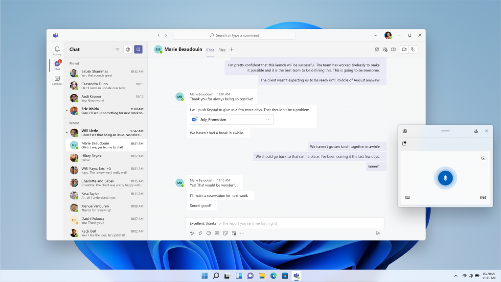
Her team heard from customers that they wanted to use their voices to type and create content across these postures (physical arrangements of a user and their device), so Choi and her team embraced that.
These input solutions, such as Windows voice typing, also often have natural accessible outcomes as well. For example, although voice typing was initially designed primarily for a mainstream use case for convenient text entry across diverse device postures, the team found that the feature was also valuable for customers with physical impairments that made traditional typing difficult.
“That’s a game changer,” she says. “We really want to double down on those efforts.”
They made it easier for people to find the places where they could use their voice.
“We hope people find it an elegant solution that tries to really meet you where you are,” she says. “It’s reliable, it’s valuable and I hope people really get to try it out and see what the benefit is and for us to learn from that.”
What also meant a lot to her with this release was the rebranding of the Accessibility icon.
“Accessibility wasn’t an afterthought. All those aspects were important,” Choi says. “We wanted it to be consistent to that message of Windows 11 being this new journey and everyone’s included. What I like the most about the icon being a human figure is that we’re not just talking about one type of disability. We want to embrace the fullness of that range in the spectrum. And to recognize first and foremost, that what it means to be human means to have differences and diversity and to celebrate that. We really felt like the human figure really embraces those principles. We’re just getting started.”
Before she joined Choi’s input and accessibility team as a designer, Natassia Silva worked directly with people every day. As a manager at a sushi restaurant in San Francisco, she jotted down notes about regular customers, remembering names of family members, allergies and favorite dishes.

“I found myself learning about the customers, learning their habits, the menu and trying to find ways to improve the menu. I helped build it. I did things that were outside expectations,” she says. “But I was really passionate about not just making a business successful, but also making the people that come to it happy and have a memorable experience. I have a deep empathy for folks and learning and listening to feedback.”
Born and raised in Hawaii, Silva took some time to figure out what she wanted to do. She was always very creative. She loved computers, drawing and fashion. She even made her own zines. But she also knew she wanted to do something that helped people.
Silva went to The Academy of Art University and worked in the men’s fashion industry – doing a little bit of everything – before a chance meeting changed her life.
“I was at a point when I was considering going back to school for graphic design. I met someone at the restaurant that I was managing who was a UX [user experience] designer and he asked me, have you thought about UX design? He shared all these resources that sparked my curiosity. Long story short, I decided to move to Seattle just to switch it up, try a new city,” says Silva, whose cousin urged her to join a design program there. “On the very last day of my interaction design classes, my instructor was showing us portfolios of designers to look up to and one of them was the same designer I met in San Francisco who told me I should go into UX design.”
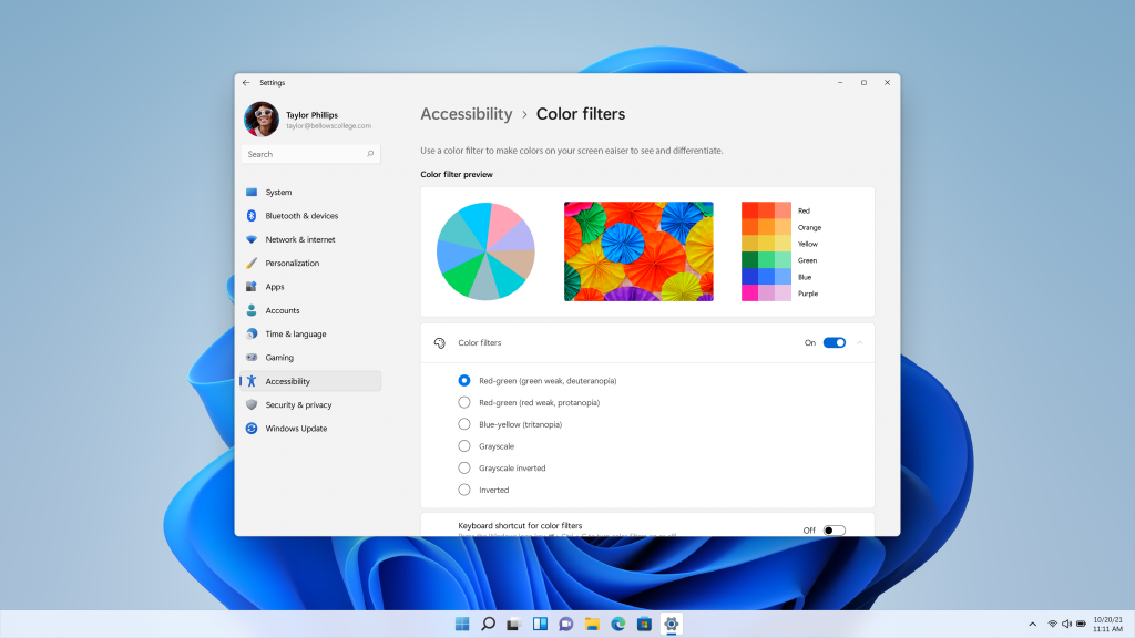
For Windows 11, Silva worked on the pen menu, the handwriting panel, the language switcher and the input method editor (IME) for East Asian languages. She also worked on accessibility settings such as text size, visual effects and color filters. But the bulk of her focus was on high contrast themes, something she wasn’t familiar with when she started.
She relied heavily on past research as well as talking directly to customers, especially those who have experience with needing/using such themes. The team worked with a low vision advisory board, made up of external customers who identify within the spectrum of low vision, whether it’s color blindness or light sensitivity.
“I didn’t realize how difficult it can be for them,” Silva says. “There are so many problems I wasn’t aware of.”
For instance, some folks had a hard time distinguishing where the borders of one window met the other when they had many windows open. Others would use the magnifier tool because they would have difficulty being able to view their display, so they would use that accessibility tool to zoom in. But when they zoomed in closely, it could be even harder to differentiate between various elements in the user interface. These insights helped Silva create more aesthetically pleasing contrast themes that give people more choices in what works for them.
“When it comes to human-centered design, it’s people at the root of it all and being able to empathize with our customers,” Silva says, of her approach to solving these pain points for users. “I was also very fortunate to work with a product manager who did identify as someone with low vision. It was helpful to have multiple perspectives and it’s those multiple perspectives and listening to those with lived experiences that helped shape and drive the design.”
Find out more about Windows 11 and check out previous stories about the people bringing Windows 11 to you that focus on widgets and the taskbar/Start.


