Accessibility enables people of all abilities to realize their full potential. By virtue of designing apps with assistive technology features, you can create a better experience for anyone who uses your app. Accessibility features may include clearly visible text, navigable controls with various input and output methods and content viewable and usable when zoomed in.
Whether you’re in the process of planning, developing or updating a Windows Store app, there are tools available to test your app. To help you get started, follow these tips and check out the convenient accessibility tools.
- Use standard controls and Visual Studio templates
- Use the UI accessibility Checker (AccChecker)
- Test keyboard accessibility by navigating with the Tab key
- Verify your app by turning on Narrator
- Verify the contrast ratio of visible text at W3C.org
- Activate and verify your high-contrast assets
- Verify your app by making everything bigger
Use standard controls and templates
Use standard Windows controls whenever possible, because they are fully compatible with User Interface Automation (UIA) guidelines. In cases where custom controls are needed in XAML, try and derive them from an accessible standard control and gain the accessibility benefits. For apps written in JavaScript, refer to the ARIA sample as well as the WinJS source code, where all the UI controls are fully accessible.
For more information, see Using Standard Windows controls.
Use the UI Accessibility Checker (AccChecker)
In order to take advantage of the screen reader in Windows, Narrator, see Exposing basic information about UI elements (XAML) or Mapping HTML and ARIA properties to UI Automation.
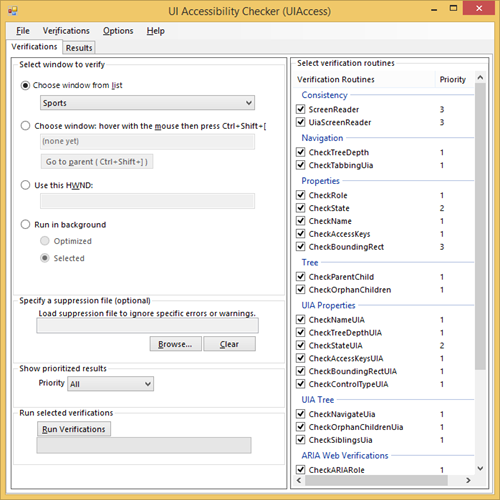
After you’ve done that, you can verify the accessibility of your app with accessibility testing tools included in the Windows Software Development Kit (SDK). One of them is called UI Accessibility Checker (AccChecker). You can find this tool in <install_dir>Program Files (x86)Windows Kits<version>bin<architecture>AccCheckeracccheckui.exe. It iterates through all the UI elements in your app to find accessibility issues.
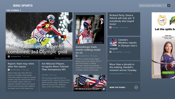
Here we can see the tool in action. We use Bing Sports as an example. From a UI perspective, everything looks great. But how does it look from an accessibility standpoint?
Using this tool, you can quickly find out what the problem areas are. Begin with opening the tool and choosing your app. Here we’re using the Sports app. On the right, pick out the verification routines to check for. Each routine has a corresponding priority.
When you’re done, click Run Verifications and the tool iterates all the UI elements in your apps to check for accessibility issues.
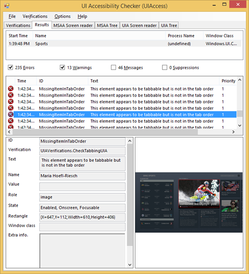
One great thing about this tool is that each result is accompanied by a screenshot. You can select a particular issue and see the problem area highlighted by a red outline in the screenshot. The result can also be saved as an .xml file for closer look later.
Before designating your app as accessible, it’s a good idea to address all the Priority 1 errors called out by this tool.
To find specific the description and possible causes of specific findings, look for the issue ID in Verification Log Messages.
Test keyboard accessibility
Blind and visually impaired users can use Windows Narrator to read out the names of app’s UI controls and special keystrokes and touch gestures to navigate the app. The user can run through the main app scenario with Narrator on, and with either the keyboard or touch gestures.
The best way to test your keyboard accessibility is to unplug your mouse or use the On-Screen Keyboard if you’re using a tablet device. Test keyboard accessibility navigation by using the Tab, arrow and return keys. You can cycle through all interactive UI elements by using Tab key to move between major sections, arrow key to move from one item to the next, and the return key to activate an item. However, make sure the tab order doesn’t include non-interactive elements. Users generally expect to be able to interact with UI elements in the tab order. If they can’t, they may get confused.
An important tip here is that keyboard navigation steps through each UI element in the tab order sequentially. Arrange the tab order in a way that facilitates major work flows. For example, if a work flow calls for a certain sequence of UI interaction, place each UI element in that sequence near the top of the tab order.
For more info about how to implement keyboard accessibility, see Implementing keyboard accessibility (XAML) or Implementing keyboard accessibility (HTML).
Verify main scenarios using Narrator
Now it’s time to see if you can run through the main use cases in your app using Windows Narrator with either the keyboard or touch gesture.
Here are some basic keyboard commands to get you started:
- Windows key + Enter to start Narrator
- Tab jumps to next section
- Caps lock + left and right arrow to move to next or previous item
- Caps lock + spacebar to invoke interactive element
- Caps lock + Enter to show all available UI controls as a table
For testing keyboard commands, give priority to Caps lock + left and right arrow as this is the main way Narrator users will experience the UI.
Here are some gesture commands:
- Swipe from right and use Search to find and start Narrator
- Navigate using touch
- 1-touch: Up and down to move between levels, left and right to move between items within level
- 2-touch: left and right to scroll in the intended direction
- 3-touch left and right: left and right to move between sections
- 3-touch up: read everything in the page
For touch, it’s most important to test one- and two-finger gestures.
- Interacting with controls
- Double tap after an item is selected to activate
- Triple tap for secondary action
For touch, one- and two-finger gestures are the important ones to test.
Here is a full list of Narrator commands for keyboard and touch gestures.
Use these commands and gestures to navigate your app. While doing so, look for elements and controls that narrator can’t get to. Make sure that all the important information is read and that extraneous information (i.e., the URL of a link) is not included in the reading.
For steps to test Narrator function in your app, see Verify main app scenarios by using Narrator (XAML) / Verify main app scenarios by using Narrator (HTML).
Verify the contrast ratio of visible text at W3C.org, Color Contrast Analyzer
Accessible text means clearly visible text. Having high contrast between text and background improves readability for all audiences. The W3C has guidelines (WCAG 2.0) that outline the requirements for text accessibility. The requirement calls for the contrast ratio between text and surrounding pixels to be at least 4.5:1. Note that WCAG 2.0 is a web standard. Other accessibility standards apply in countries or regions where accessibility is mandatory. Please check the accessibility standard in your region for the exact requirements. You can find more info about ISO accessibility standards at ISO Accessibility Standard – ISO 9241-171 and ISO Technical Report 13066-2.
To check whether your text has high enough contrast, start with downloading Color Contrast Analyzer. This third party tool checks the contrast ratio between two colors against WCAG 2.0 and can simulate what your app would look like for people with different vision conditions.
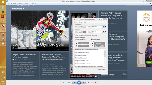
Let’s see Color Contrast Analyzer in action. Below you can see the screenshot of an app. Notice the touch target labelled “Hoefl Riesch wins super combined; 3rd Olympic gold” overlaid on the skier’s photo? Because the color of text is so similar to parts of the background image, it’s hard to distinguish between the two.
In general, it’s not a good idea to overlay text directly on top of a photo if the color of the photo is not known beforehand. There’s a chance the text can get lost in the photo. Because of this, it’s best to avoid text overlays on pictures in general. However, if this must be done for layout reasons, a common technique is to shadowbox the text.
The tool can sample the color of the text and its surrounding pixels to see whether the contrast is compliant with the accessibility guideline.
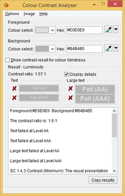
We find out that the contrast ratio is 1.57:1. It’s below the minimal contrast of 4.5:1 as stated in WACG2.0 article 1.4.3. In the next screenshot, you can see that the tool shows this as a failure at the AA level, for both normal size and large text. We recommend that your app meets this standard if accessibility is one of your priorities. The AAA level is for enhanced accessibility, a stricter guideline that is out of scope for this post.
For more on the W3C guideline, see WACG 2.0 article 1.4.3.
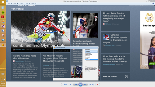
Another great thing you can use the tool for is to simulate how people with different vision conditions see your app. The screenshot below shows the tool simulating the view of someone with cataracts.
The key here is to beware of what your app might look like to people with impaired vision. Use this tool to view areas of your app that is busy or is low in contrast to see whether the content is legible and interactive UI elements are visible.
Activate and verify high contrast mode
Windows provides high contrast color schemes for UI elements, which makes the content on the screen more visible to people with vision. High contrast mode works by changing the text and background color in your app to create high contrast.
To activate high contrast mode, swipe from the right and tap on Settings > Change PC settings > Ease of Access > High contrast and then select a high contrast color scheme. There are several high contrast color schemes to choose from.
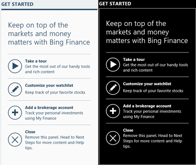
Use your app while a high-contrast theme is active to verify that all the UI elements display correctly. Make sure all text is readable and all images are crisp and clear. High contrast mode changes the color of text to make it more visible against the background, but it cannot change the color of text that is part of the pixels in the image. This is another reason why it’s important to keep text and image separate.
Make sure to include high contrast versions of your graphics. When your app detects that high contrast mode is activated, it swaps in the set that matches the particular high contrast color scheme (there are four in total). For example, in the example above, if the play button is named play.png, there should be a corresponding high contrast version of the button in the resources named
- play.png
- play.contrast-black.png
- play.contrast-white.png
The appropriate high contrast version of the button is swapped in when the selected high contrast mode is activated.
You can find more info for apps in Supporting high-contrast themes (XAML) or Supporting high contrast themes (HTML).
Verify your app with magnifier
Windows 8 has a built-in magnifier function that allows the user to zoom into a particular part of the screen. In this mode, only a portion of your app is shown on the screen. The user has to pan to access areas that don’t fit.
The next image shows what the user sees when magnifier is engaged. To navigate, the user zooms in and out by using the “+” and “-“ buttons in the corners. To pan, the user touches the vertical and horizontal borders.
The key here is to make sure all controls can be reached, all text is visible, and that no UI elements overlap. Occasionally, the magnifier may zoom in on a part of the zoom with no content. This can cause disorientation for the user. To avoid this, try reducing large blank spaces in your app.
Wrapping up
Designing and developing your app with accessibility in mind improves the user experience for everyone. I’m hoping this post gives you what you need to start testing your app for accessibility.
Here is some material on the design, development and testing of an accessible app:
- Design for accessibility
- How to Build an Accessible Windows 8.1 App (Video)
- Accessibility for Windows Store apps
- Guidelines and checklist for accessibility (XAML) / Guidelines and checklist for accessibility (HTML)
- Testing your app for accessibility (XAML) / Testing your app for accessibility (HTML)
- Practices to avoid for accessible apps (XAML) / Practices to avoid for accessible apps (HTML))
- ISO Accessibility Standard – ISO 9241-171
- ISO Technical Report 13066-2
The content of this site is for informational purposes only. Accessibility requirements may vary by jurisdiction and could change. Microsoft cannot guarantee your compliance.
—Joseph Shum, Program Manager, Developer Engagement

