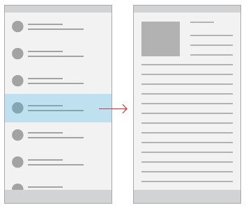
What is a master-detail?
The answer to this will depend on what kind of information your application is trying to show, but at a high level, the “master” is an area in the UI where you have a list of something and the “detail” is the area that shows the relevant information of a selection in the master.
You can find a great example of the master-detail pattern in the Windows 10 email app, “Mail.” The master is the list of emails and the details is the selected email.
The master-detail pattern is easy to understand and doesn’t need a lot of explanation to the user. When the user selects something in the master, they see the information and any actions relevant to that detail item. For example, selecting an email shows the body of the email as well as the buttons for: reply, reply-all and delete.
The pattern works well for these types of application scenarios:
- You have a list where it makes sense to show details (e.g. list of contacts, products, etc.)
- You have a large list that has items that need to be prioritized (e.g. RSS readers)
- You need to switch between items frequently but want to stay in the same context (e.g. email)
Let’s use the Microsoft RSS Reader UWP example app to illustrate the master-detail pattern’s features.
If you want to follow along or see the code first-hand, find the RSS Sample’s source code here on GitHub.
Master-detail modes
The master-detail pattern works well on a wide range of device types and display sizes. However, you should consider how you want to use the pattern on different display sizes.
There are two popular modes that will help with this:
- Side-by-side
- Stacked
The determination between which approach to take comes down to how much horizontal room your app has. Here’s a table of typical effective pixels available per “size class” (if you’re not familiar with Effect Pixels (epx) see this one minute video).
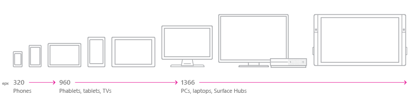
| Size class | small | medium | large | |
| Typical screen size (diagonal) | 4″ to 6″ | 7″ to 12″, or TVs | 13″ and larger | |
| Typical devices | Phones | Phablets, tablets, TVs | PCs, laptops, Surface Hubs | |
| Common window sizes in effective pixels | 320×569, 360×640, 480×854 | 960×540, 1024×640 | 1366×768, 1920×1080 | |
| Window width breakpoints in effective pixels | 640px or less | 641px to 1007px | 1008px or greater |
Side by side
There many scenarios in which your application will have plenty of horizontal space to stretch. The recommended guidelines for this mode is when your application has 720 epx or more available; this puts us in to the “Medium” and “Large” size classes seen above.
A few of these are:
- Devices that let you size the app window larger (PC, HoloLens, Surface Hub)
- Windows 10 Mobile running Continuum
- Windows 10 Mobile (landscape orientation)
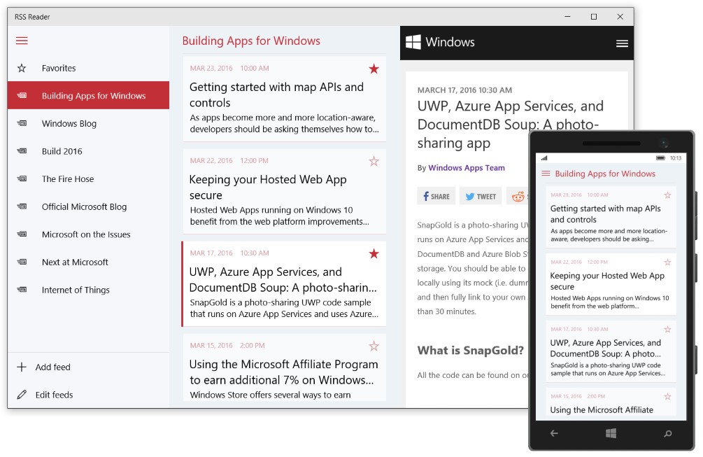
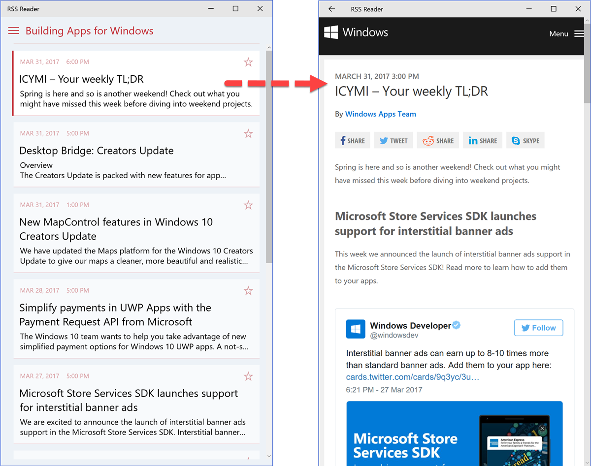
In the side-by-side approach, you can have both the master view and the detail view showing simultaneously. Using our RSS example, here’s the side-by-side approach:
Stacked
If your application is running in between 320 to 719 epx, you can’t comfortably fit the master and details next to each other, so we’ll need another way to display the master and detail.
A few examples of this scenario are:
- Any device that lets you resize the app window (e.g. PC, HoloLens)
- Windows 10 Mobile (portrait orientation)
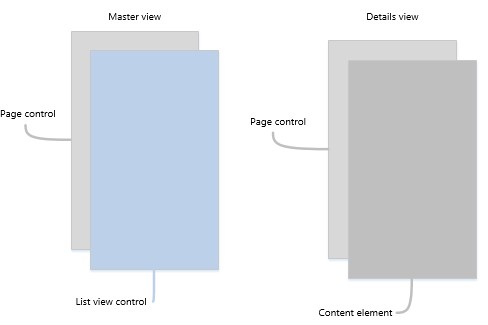
For this case, you can use the stacked approach. In stacked, the master view gets the full screen space, then, when a selection is made, the detail view gets the full screen space.
With this approach, we’re “stacking” the pages in a single area and navigating between them. For example, the user selects an item in the master, the app will navigate to the Details View. When they want to see another item, they’ll navigate back to the master and select another item.
The stacked approach can be implemented with page navigation within a Frame element. In the diagram below, the “page control” you see is where the navigation occurs between the master view and the detail view.
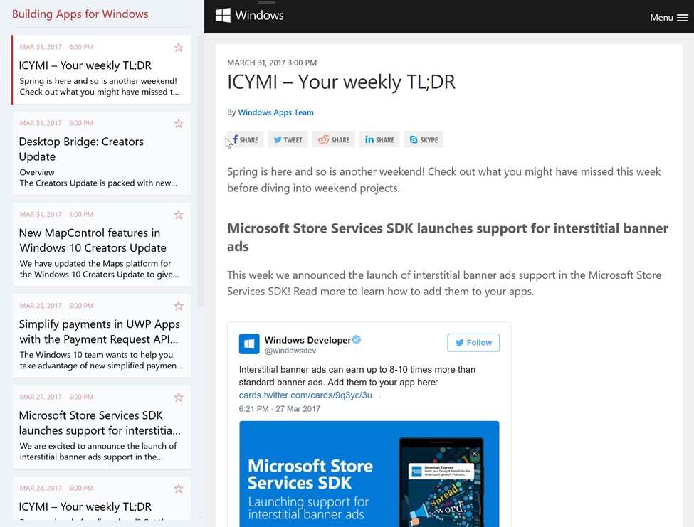
Using our RSS sample app, here are a couple screenshots of the master and detail in stacked mode. Note that the app is running on a desktop PC, but with the window sized small, you’ll see the same appearance as it were on a mobile device. What matters is not the device, but the available screen space!
The “Breaking Point”
You’ll notice that we have this point where we need to change between the two different modes, depending on the current app width. For our master-detail, we’ve decided to do this at 720 epx. This means that once the application window gets resized to above or below 720 epx, we should be switching between side-by-side or stacked mode.
The Universal Windows Platform has a great feature to help with changing modes: the AdaptiveTrigger. Using an AdaptiveTrigger in your view’s VisualStates, you can adapt the UI when the application’s window size reaches that “breaking point.” In the RSS sample, you can see how this is done on the MasterDetailPage.xaml.
First, let’s look at the master-detail layout; there’s a Frame element for the master content (ListView of feeds and articles) and a WebView for the detail content (the selected article). Notice the default width of the MasterColumn is set to 360.
[code lang=”xml”]
<Grid.ColumnDefinitions>
<ColumnDefinition x:Name="MasterColumn"
Width="360" />
<ColumnDefinition x:Name="DetailColumn"
Width="*" />
</Grid.ColumnDefinitions>
<Frame x:Name="MasterFrame" />
<WebView x:Name="ArticleWebView"
Grid.Column="1"
Visibility="Collapsed" />
</Grid>
[/code]
Now, let’s look at line 49 in the VisualStateGroups. You’ll see the VisualState named “NarrowState.” In this visual state, the MasterColumn.Width changes to * (star, which means “take all the available space”) and the DetailColumn.Width changes to 0.
Because the AdaptiveTrigger is set to 720, anything between 0 and 719 will use the NarrowState and anything 720 or larger will use the DefaultState.
[code lang=”xml”]
<VisualStateManager.VisualStateGroups>
<VisualStateGroup>
<VisualState x:Name="DefaultState">
<VisualState.StateTriggers>
<AdaptiveTrigger MinWindowWidth="720" />
</VisualState.StateTriggers>
</VisualState>
<VisualState x:Name="NarrowState">
<VisualState.StateTriggers>
<AdaptiveTrigger MinWindowWidth="0" />
</VisualState.StateTriggers>
<VisualState.Setters>
<Setter Target="MasterColumn.Width" Value="*" />
<Setter Target="DetailColumn.Width" Value="0" />
</VisualState.Setters>
</VisualState>
</VisualStateGroup>
</VisualStateManager.VisualStateGroups>
[/code]
To see this in action, run the RSS reader example and resize the window from big to small and back. You’ll see the visual states change and switch between the side-by-side and stacked modes.
Additional Detail Functionality
In the beginning of this article, we briefly touched on how you can have context-aware functionality when using a master-detail. The example was having a “reply” button for an email app. However, you can go much further with it. Here are some more examples of functionality you can put into the detail view:
- Product list: Order, track, add to wish list
- Contact list detail options: Call, email, drive to
- Inventory list detail: Reorder, mark damaged, ship
Another takeaway is that you can share the same controls (e.g. Buttons) for frequently used functionality and that functionality would intuitively be for that selected item in the detail view.
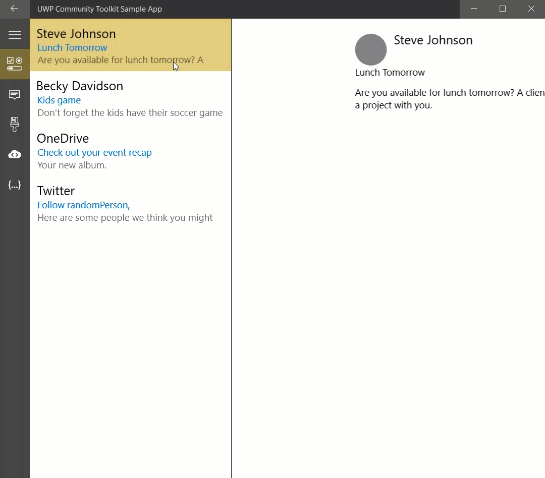
UWP Community Toolkit
If you’re building an application that could benefit from a master-detail implementation, you can skip a lot of the work by using the MasterDetailView control in the UWP Community Toolkit. With as little as a few lines of code and a couple DataTemplates (one for the master’s items and the one for the detail view), you can be up and running quickly.
Here’s the example from the UWP Community Toolkit demo app:
[code lang=”xml”]
<controls:MasterDetailsView
ItemsSource="{Binding Items}"
ItemTemplate="{StaticResource ListTemplate}"
DetailsTemplate="{StaticResource DetailsTemplate}">
</controls:MasterDetailsView>
[/code]