

Building in 10k: Content and Strategy
Editor’s note: This is the first in a series of posts from the team that built the 10k Apart contest page, exploring the process of building for interoperability, accessibility, and progressive enhancement in less than 10kB.
When Jeffrey Zeldman first approached me about bringing back the 10k Apart contest, my mind began to race. I’d been a judge on the 2011 incarnation of the contest, so I had seen it from that angle before, but he presented me with an amazing opportunity… not just bring it back, but to evolve it into the 10k Apart contest our industry so desperately needs today.
The 10k Apart (and the 5k before it) have never operated in a vacuum. They’ve always taken the pulse of industry trends and and then challenged us to do more, to do better, and with less. In 2010, the contest pushed us to embrace HTML5. In 2011, we were challenged to make our work responsive. And so I began to ask myself: what are the challenges we, as an industry, are struggling with today. Anyone who has followed my work could probably have guessed my answer: progressive enhancement.
And so I put together a list of changes to the contest that would help us move away from the very JavaScript-heavy entries I’d judged last time toward entries that would be usable by anyone. Entries that respected low-bandwidth connections, were considerate of users who rely on assistive technology, and embraced the inherent flexibility and malleability of the Web. And, of course, entries that broke the stereotype of progressively-enhanced projects being “boring”.
I was so excited when Jeffrey and Eric Meyer responded to my suggestions with overwhelming enthusiasm. Their encouragement challenged me to think about the rules I’d drafted to govern the contest and inspired me to make the contest site abide by those very same rules as a way of demonstrating how progressive enhancement can enable our web projects to do so much more. It’s not a yoke, holding us back; it’s a powerful philosophy that challenges us to look at experience as a continuum and pushes us to think outside of our comfortable high-tech bubble.
This is the first in a series of posts about the process of building the 2016 10k Apart contest site. I, and the wonderful team that helped me make it a realty, wanted to share what we did, but moreover why we did it. We’ll talk about the sacrifices we made in designing and building the site as well as the ways markup, style, and script took a simple transactional site and gave it the polish it so richly deserved.
Thanks for joining us on this journey…
What are you here to do?
Before tucking into code, information architecture, or even copy, I took some time to stroll through previous incarnations of the contest. I poured over the structure of the sites and examined the tone of voice they used, of course, but I also took the time to examine the purpose of every page. Who were the different audiences coming to the sites? What did they want to do? Did their goals change over time?
Asking all of these questions helped me to break the site’s audience into two main camps: Folks interested in entering the contest and folks interested in spectating. I also recognized that the motivations and goals of these groups would change as the contest progressed. Folks who entered might become spectators once they’d submitted their entry. Some spectators might be inspired to enter the contest themselves after seeing someone else’s project. And so I set about organizing the site to not only support these different, potentially overlapping audiences, but to make it easy to transition back and forth between them.
To accomplish this, the site would need to evolve with our audience through several phases:
- Launch – When we don’t have any entries (which is what is live as I am writing this);
- In progress – When we have entries that we want to show off, but the contest is still open (this phase will be kicking in soon);
- Close – When the contest is over and we aren’t accepting new entries, but instead focus on highlighting the folks that entered and ask you to vote for your favorites; and
- Winner announcement – When we celebrate the awesome works judged by our expert panel and you, the community, to be the best of the best.
With that outline in place, I began putting together lists of the sorts of content we would need on each page in each phase of the contest. I was ruthless in stripping away the cruft and the nice to have bits. In many ways, I followed the model Luke Wroblewski wrote about in Mobile First, by focusing on the core purpose of each page. I got rid of any bit of content or UI was a distraction from that purpose or that simply failed to propel people toward accomplishing their goal on that page. Each page, each step in the process, was ruthlessly stripped to its essence. And then the real work began.
How do we talk to one another?
Steph Hay is often quick to point out that every interface is a conversation we’re having with out users. With that in mind, I set about authoring copy that embodied that idea. I wanted your experience of the site to be just like sitting down next to me and talking about the contest.
In their book Nicely Said, Kate Kiefer Lee and Nicole Fenton offer a ridiculous amount of great advice on not just how to write, but how to write for people. In it, they talk about writing like you speak and even go so far as to recommend you read your work aloud. Looking to the future of “headless” UIs—Cortana, Alexa, Siri—and the current crop of screen reading options out there, it was pretty obvious that this was not only good advice… it was beta testing!
I applied the wisdom I learned from these amazing content strategists (and no doubt countless others) to everything from the page titles and body copy all the way down to form labels and error messaging. I read the content aloud and in many cases had my computer read it to me as well. I know there’s room for improvement (there always is), but I’m pretty happy with the way it turned out.
Where are the patterns?
Once I had drafted copy for each page in the site, I began to organize the content into basic wireframes. In the interest of time, I focused on wireframes for large-screen views of each page, making note of the content priorities so I would know how to arrange things on smaller screens as well.
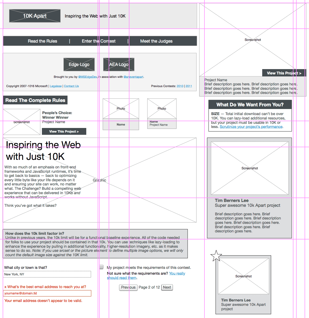
While working on the wireframes, I made notes (some mental, some in the wireframes themselves) about where we could shave off some page size or where certain content was helpful, but more of an enhancement than core to the purpose of the page. I also looked for places where we could use markup or style to improve the experience greatly for very little cost. HTML5 input types, for example.
For more complicated interactions, I used Interface Experience Maps (IxMaps, which are effectively flowcharts) to outline the different ways users might be able to experience an interface. For example, on an entry page the most important information is the name of the project, the name of the person (or people) who made it, the description of the project, and a link to view it live. A screenshot, while helpful, is unnecessary. So I used an IxMap to explore lazy loading the screenshots only when JavaScript was available.
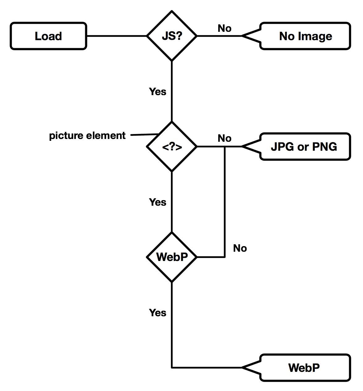
In that exploration, it dawned on me that I didn’t have to settle for only one image format—I could lazy load a picture element and supply alternate image formats for browsers that support WebP (which tends to be much smaller than JPGs and PNGs). That’s one of the reasons I love IxMaps: they allow for low-cost exploration and discoveries like this.
Once the wireframes and IxMaps were complete, I went through them and teased out repeating patterns and unique components, copying them to a new page in the wireframe document. In doing so, I also found opportunities to reuse enhancements I’d come up with for specific page components. Taken together, this pattern guide have our designer, Stephanie Stimac, a good overview of the site’s overall UI needs. It helped her avoid the trap of designing pages and let her create a design system instead. Stephanie will join me to talk about the design process in the third installment of this series.
What did we learn?
They may seem obvious, but in case you’re a fan of takeaways, here are a few relating to content, strategy, and information architecture:
- Minimize distractions – Focus on the core purpose of every page, get rid of anything that is not supportive or detracts from that;
- Write like you speak — Write for people like you would speak to them in person and read your work aloud;
- Set content priorities — Ensure the flow is right and leads your users where they want (or need) to go;
- Look for opportunities to enhance — Some supportive content may be nice to have but non-essential, consider removing it by default and bringing it back in certain scenarios; and
- Look for patterns — Focus on creating a design system rather than individual pages.
Where to next?
With a good set of bones in place, the next step for me was to tuck into the markup, but that’s the story for another post. Stay tuned!
― Aaron Gustafson, Web Standards Advocate