Great design helps your Windows Store apps stand out from the crowd. Improvements to the Windows platform in 8.1 Preview, such as an expanded common controls set with greater design flexibility, allow Windows Store apps to achieve richer designs than ever before. In this blog post and related Build talk, I discuss how the Microsoft design language is evolving in key areas of Windows user interface–personality, patterns, principles, and platform. Windows in-box apps and experiences are used as examples to show how these “4 P’s” can be leveraged to create compelling app experiences.
Personality
Windows Store apps have visual and interactive design personality. Personality helps to differentiate your app, strengthen your company’s brand, and create a positive emotional connection with your users. To achieve a great personality, be creative with the composition, typography, color and motion of your app.
There is a misconception that the Microsoft visual language consists only of uniform rectangles in a grid. Yes, this is one way to compose your user interface but not the only one. Windows experiences are structured, clean, and have a clear information hierarchy, but they’re not boring.
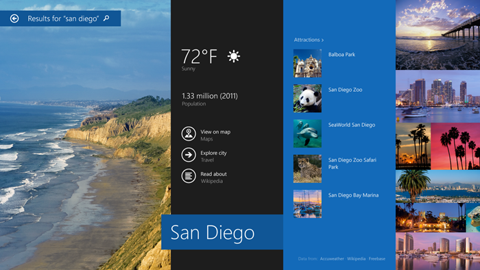
The new Windows 8.1 Preview Search results could have displayed all the information in a uniform grid layout, but that would do a disservice to the richness of the content provided by Bing. The design consists of a collage of beautiful full-bleed images using an accent color to make the information more visually pleasing.
Search results in Windows 8.1 Preview
Search results layout diagram in Windows 8.1 Preview
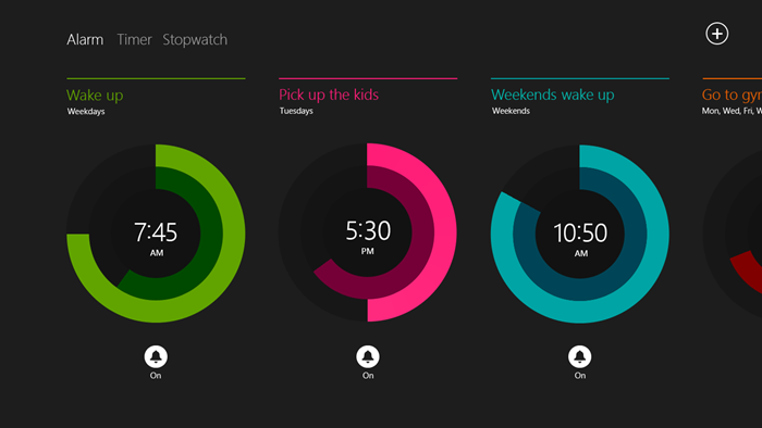
We believe typography is beautiful. Typography plays an important role in the personality of the new Alarms app. We use a 32 point Segoe UI Light font to display the time, which is centered within the radial dial to emphasize its importance. Colored alarm labels create a connection to the colored alarms.
The Alarms app features great typography design
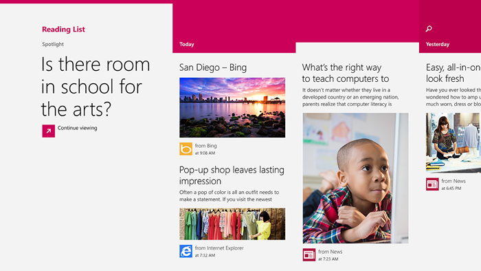
Windows colors are rich, saturated and vibrant. The new Reading List app uses its rich app brand color to create visual interest in the user interface. Swatches of color that begin at the group headers and reach to the app’s edge make the app feel immersive and provide visual cues about the freshness of content, getting darker for older content.
Reading List
Reading List layout diagram
Windows is alive with motion. Great motion helps connect what comes before to what comes after, making the experience feel fast and fluid. Many animations are built into the common controls, such as the list controls, and are available for use in the Windows animation Library. Use these to make your app feel dynamic or to add moments of delight.
Design flexibility is built into the platform, so be creative with your app personality.
For more info, see:
Patterns
Windows UIs exhibit common user interface patterns. In Windows 8, we provided a set of patterns for navigation, commanding, scrolling content, presenting data, text editing, and essential controls. In Windows 8.1 Preview, we’ve made additions that provide more design flexibility and support for multiple windows sizes and orientations.
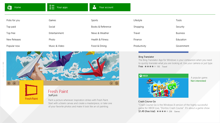
The hub is a key pattern for content-rich Windows Store apps. This highly flexible pattern consists of groups of heterogeneous content, which provide a consistent way to navigate across sections as well as deeper into a section. In Windows 8.1, there is a common Hub Control (WinJS and XAML) that supports this pattern with many built-in features, such as the ability to call out hero content, common experience with mouse, touch and keyboard, and responsive performance.
Anatomy of a Hub
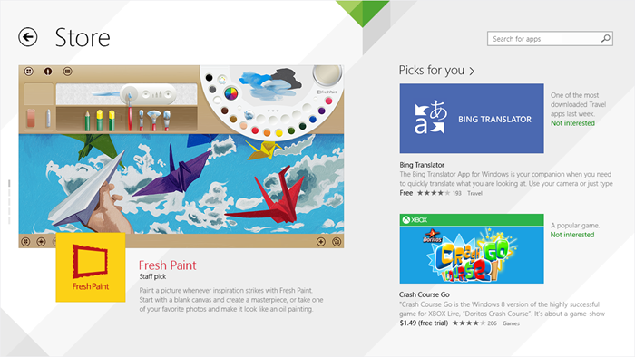
The Windows Store for Windows 8.1 is built using the Hub control
The Navigation Bar (WinJS only) is another new common pattern for Windows 8.1 Preview. It’s a specialized app bar that contains navigation commands and is invoked by swiping from the top or bottom edge with touch and by right-click for mouse. It provides a consistent, global navigation across an app. It scales to handle many links and can show one or more levels of hierarchy.
The Windows Store uses the nav bar as global navigation
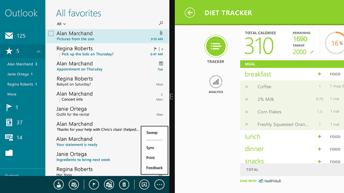
The app bar pattern itself has evolved to support more flexible and scalable commanding. As the app window decreases in width, the commands get closer together and labels get dropped automatically. Commands can be easily grouped together. Users can now easily use the keyboard across commands.
At full screen, the command labels are visible
Labels drop off as the window width is decreased. Commands can also be grouped into flyouts.
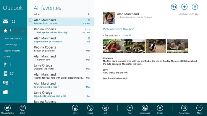
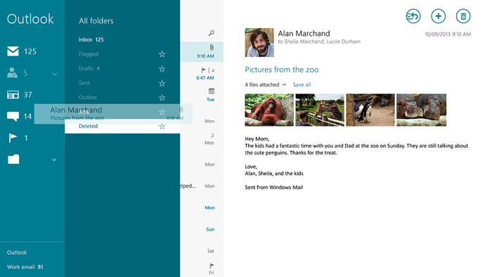
Patterns around presenting data have evolved for Windows 8.1 Preview. In addition to the familiar horizontal grid, you’ll see more apps starting to take advantage of support for both horizontal and vertical grids, cell-spanning grids, and drag-and-drop. We encourage you to consider taking advantage of these patterns to deliver the best presentation of data for your user and scenarios.
Drag and drop between lists in Mail
Text editing in Windows 8.1 Preview benefits from more intuitive selection including the ability to easily select entire words and fine cursor placement with touch.
For more info, see:
Navigation design for Windows Store apps
Command design for Windows Store apps
Paul Gusmorino’s 2011 //build talk on creating Windows Store apps using common controls
Principles
Windows UIs are grounded in a set of design principles. These five principles represent our design philosophy:
- Pride in craftsmanship
Engineer the experience to be complete, thorough, and polished at every stage. - Be fast and fluid
Make users faster and provide connections to what comes before and after. - Authentically digital
Exemplify the capabilities of hardware and software. Take full advantage of the digital medium. - Do more with less
Be great at something instead of mediocre at lots of things. - Win as one
Optimize for the overall experience.
These principles are a valuable tool used across our engineering team to ensure that everyone is building towards a product with a clear point of view that’s cohesive and consistent. They’re used by the Windows engineering team to create the beautiful experiences in Windows 8 and 8.1. We highly encourage Windows app builders to adopt our principles or build upon them to guide you towards achieving that great app.
For more info, see:
Microsoft Design Principles in the Windows Dev Center
Windows Design Director Sam Moreau’s 2011 //build talk on principles and personality
Platform
Windows UIs are built on the Windows platform. Taking advantage of the controls and other features of the platform enables you to build a really great Windows UI. This is because so much of the look and feel of your app comes down to the fundamental behaviors and characteristics of the platform itself. Examples include all the details of how users can select and edit text, the way touch panning sticks to your finger, and how users can navigate around using touch, mouse, and keyboard.
Windows lets you build apps with the look and feel of Windows apps using either XAML or HTML/JavaScript, all backed by the same underlying Windows platform capabilities and features. For Windows 8.1 Preview, we’ve continued to evolve the full platform stack including XAML and WinJS/HTML to give you more built-in controls and support for the evolving patterns, more flexibility to differentiate and optimize your apps to showcase their own personality, and many other improvements in fundamentals like performance and debug-ability that enable you to build experiences that truly embody the principles.
Wrapping up
As you design and build your Windows Store apps, take advantage of the improvements we’ve made in the 4 P’s of user interfaces–
- More visually rich and compelling personality
- More scalable, flexible, and complete UX patterns
- Grounded in the same principles
- Better support for patterns in the platform
You can learn about these in more detail and see more great examples from my and Paul Gusmorino’s Build talk: Designing and Building Windows User Interfaces:
Download this video to view it in your favorite media player:
High quality MP4 | Lower quality MP4
Let your creativity shine and go forth and create great Windows Store apps!
–Moneta Ho Kushner, Senior Design Lead, Windows

