The ListView control makes it easy for you to organize content in a beautiful and meaningful way. The ListView control takes advantage of the Windows 8 grid system, a design tool that provides a structure for variation and maintaining user interest.
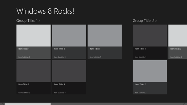
Visual Studio’s Grid App Project Template showcases a simple usage of an HTML ListView that’s databound to hierarchical data.
Figure 1: VS “Grid App” Project Template
Our Sports and Entertainment inspiration samples takes the framework from the VS template to the next level by building on top of it and simply changing content size, spacing and content positioning. In this post, I’ll show you how easy it is to do so!
Different is beautiful
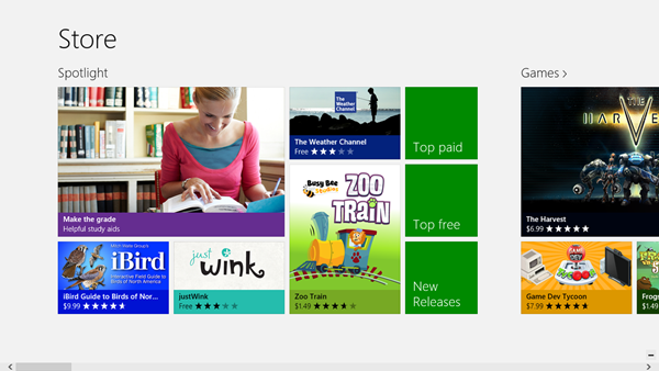
Just because our design tool is called the “Grid System” doesn’t mean your layout needs to be identical squares. The Windows 8 grid system lets you use size, space and position to set expectations for your users.
You can see this in action in the Windows Store.
- Larger content draws users’ attention, allowing you to emphasize certain content.
- Larger white space between content indicates a break in continuity, enabling users to understand relationships and grouping.
- For left-to-right locales, the furthest left is the “beginning” of an app, so users understand the order in which they should consume your content and its relative importance. (Similarly, for right-to-left locales, the furthest right is the “beginning” of an app.)
Layouts that uses a variety of size and space are perceived as more crafted and professional. Users enjoy and have more confidence using apps that are polished. This is why we built the ListView control to make it easy for you to leverage size, space and positioning to create meaningful and engaging layouts.
In this post, we will focus on how to create content with different sizes with the ListView by using cell spanning in JavaScript and HTML.
Cell spanning
The ListView control supports “cell spanning”, which allows your content to span across more than one row or column. It’s similar in concept to a table, where the smallest unit in the grid is called a cell, and every item must be some multiple of cells wide and high.
To leverage cell spanning, you first need to provide a groupInfo function to the CellSpanningLayout.
(Note: CellSpanningLayout is available in WinJS 2.0 for Windows 8.1. Similar capabilities are available in WinJS 1.0 and Windows 8 through the GridLayout. For details, refer to scenario 4 of the HTML ListView item templates sample that can be found in the Windows 8 app samples pack.)
JavaScript:
// groupInfo function
function myGroupInfo () {
return {
            enableCellSpanning: true,  // enables cell spanning
            cellWidth:  100,            // cell width in pixels
            cellHeight: 100             // cell height in pixels
        };
    }
HTML:
<div data-win-control="WinJS.UI.ListView" data-win-options="{
    ...
layout: {type: WinJS.UI.CellSpanningLayout, groupInfo: myGroupInfo } }">
</div>
The groupInfo function should return an object with three properties set that determine how cell spanning should operate:
- enableCellSpanning – enables the cell spanning when set to true.
- cellWidth – establishes the width of a single cell, measured in pixels. You should set this to be the smallest width of any item you’re planning to put into your list.
- cellHeight – establishes the height of a single cell, measured in pixels. You should set this to be the smallest height of any item you’re planning to put into your list.
Once the groupInfo function has been provided, you can create items of different sizes by modifying your itemTemplate so that it returns each item according to the size you want that item to have. Conceptually, items are multiples of the cell width and height, but in practice there’s a bit more to it due to the margins between items.
Consider the example above where you have defined a 100×100 pixel cell size. You’d imagine your cellSize (either cellHeight or cellWidth) as the size of the smallest item that will show up in your cell spanning list. All other items in the list should be some multiple of the cellSize—meaning if your cellSize is 100×100, then you can have items 100×200, or 200×100, or 200×200, or 400×400, but never 400×450.
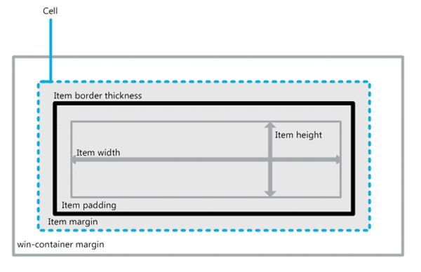
In actuality, the size of each item in your cell spanning list isn’t an exact pixel-multiple of the cell size, since each item has margins and those need to be taken into account. To determine the correct sizes for content that will contain two or three cells stacked on top of each other, we need to include margins into the calculation.
To better illustrate this, let’s take the example above where the smallest unit is 100×100 pixels, and you want 5 pixels of padding around your cell, but no border or margin.
Step 1: Calculate cell size
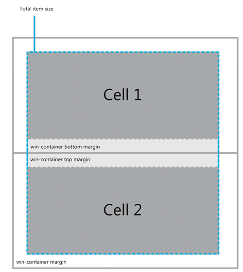
Before we start, let’s take a look at what happens when you have two 100×100 pixels cells stacked on top of each other:
As you can see, we need to take into account the win-container bottom margin from Cell1 and the top margin from Cell2. This means, when you stack two 100×100 px cell on top of each other, you actually get more than 200px! So, we need to find out what the margin values are. We can do so by looking in default.css where this is defined:
.win-horizontal .win-gridlayout .win-container {
margin: 5px;
}
.win-vertical .win-gridlayout .win-container {
margin: 5px 24px 5px 7px;
}
.win-rtl > .win-vertical .win-gridlayout .win-container {
margin: 5px 7px 5px 24px;
}
From the default values, we can see that for a ListView using horizontal grid layout, the top & bottom margin is 5px.
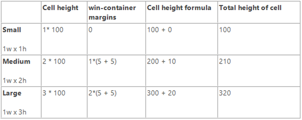
So plugging that value in, we get our calculation for 2*cellHeight:
2 * 100px + 5px (bottom margin) + 5px (top margin)
= 200px + 10px
= 210px
Now, to calculate 3* cellHeight— remember, there’s one more set of margins to keep track of:
3 * 100px + 2 * (5px (bottom margin) + 5px (top margin))
= 300px + 2 * (10px)
= 300px + 20px
= 320px
Given the two calculations below, we can turn the calculation into an equation:
Let x be the number of cells, cellWidth be the width of a single cell, and cellHeight be the height of a single cell:
total cell width = x * cellWidth + (x – 1) * (win-container left margin + win-container right margin)
total cell height = x * cellHeight + (x – 1) * (win-container top margin + win-container bottom margin)
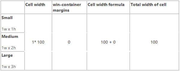
Calculating each cell height:
Calculating each cell width:
Step 2: Calculate itemTemplate size
Now that we know how big each cell is, we need to determine the itemTemplate’s height. As previously mentioned, we want an item padding of 5px around the content (i.e. top, bottom, left and right), no border, and no margin.
Calculating itemTemplate’s height:
Calculating itemTemplate’s width:
Step 3: Plug this into code
Now that we have our values, all we need to do is plug this into our CSS, HTML and JavaScript!
First we put the itemTemplate height, width, padding, and border properties into the CSS.
CSS:
/* Small size */
.small
{
width: 90px;
height: 90px;
border: 0px;
padding: 5px;
overflow: hidden;
background-color: Pink;
}
/* Medium size */
.medium
{
width: 90px;
height: 200px;
padding: 5px;
border: 0px;
overflow: hidden;
background-color: LightGreen;
}
/* Large size */
.large
{
width: 90px;
height: 310px;
padding: 5px;
border: 0px;
overflow: hidden;
background-color: LightBlue;
}
We use the total cell height in our JavaScript code:
// Cell spanning data that has a type property that can be used to select an item size
var myCellSpanningData = new WinJS.Binding.List([
    { text: "...", type: "small" },
    { text: "...", type: "medium" },
    { text: "...", type: "large" }
]);

// Total size of item excluding the exterior margin
var sizeMap = {
// Item height:   90
// Item padding:  10
// Item border:    0
// Total height: 100
    small: { width: 100, height: 100 },
// Item height of 2 items:  180
// Item padding of 2 items:  20
// Item border of 2 items:    0
// Margin between items:     10
// Total height:            210
    medium: { width: 100, height: 210 },
// Item height of 3 items:  270
// Item padding of 3 items:  30
// Item border of 3 items:    0
// Margin between items:     20
// Total height:            320
    large: { width: 100, height: 320 },
// Default to small size
    defaultSize: { width: 100, height: 100 }
};

// Item info function that returns the size of a cell spanning item
function myItemInfo(itemIndex) {
var size = sizeMap.defaultSize;

// Get the item from the Binding.List
var item = myCellSpanningData.getAt(itemIndex);
if (item) {
// Get the size based on the item type
        size = sizeMap[item.type];
    }

return size;
});
Tip: In itemInfo functions above, you might noticed that instead of mapping out each individual data item, we added an attribute to each data item to represent the size of the item. Then using that attribute we return the item’s size. This is a great way to reduce the size of the map!
Finally, make sure you provide the myItemInfo function to the layout in your ListView:
HTML:
<div data-win-control="WinJS.UI.ListView" data-win-options="{
    ...
layout: {type: WinJS.UI.CellSpanningLayout,
groupInfo: myGroupInfo,
itemInfo: myItemInfo } }">
</div>
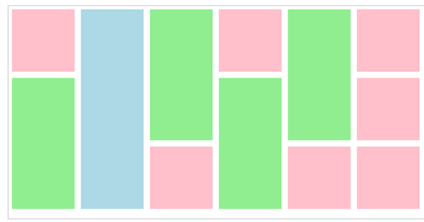
Results:
Remember that conceptually, the width and height of each item needs to be a multiple of the width and height of the cell; for example, if a cell is 1x wide and 1x high, then you can make an item 4x wide by 1x high, or 2x wide by 3x high, etc. However, you can’t have an item that is 1x wide by 2.5x high, since that’s not an even multiple.
In closing
Varying the sizes of your ListView items is easy and can help create a polished and captivating app that users will be delighted to use. In this post I’ve only covered how to create different sizes of cell, but you can also vary the amount of white space between content by updating the margins and padding.
For more information, see the following:
- HTML ListView
- How to display items that are different sizes using JavaScript & HTML
- HTML ListView Item template sample
-Kathy Kam, Senior Program Manager, Windows (@kathykam)
A special thanks to Ryan Demopoulous, Senior Program Manager, Windows, and Paul Gildea, Program Manager II, for this post.

