There are many different types of apps that require special text handling, for example, apps that have strict alignment requirements, apps that need to utilize small text areas, and apps that display multiple languages, just to name a few. We know that in these special text handling apps, it’s important that you get each pixel perfect for the best viewing experience. For this reason in Windows 8.1 we’ve added some new text features to make your development experience better and your desired end product easier to achieve.
In total there are ten new feature enhancements that I will discuss throughout this blog post. Here are a few highlights to give you a taste of what is coming:
- Color fonts to display colorful Emoji characters – things like emoticons and symbols – by default, without any extra work for you. This new feature also enables font designers to create and use layered color fonts.
- A margin alignment feature that allows you to align text at a specific vertical margin. This feature is helpful for aligning text of different FontSizes.
- A trimming option that allows you to clip text at the logical beginning of the text. This is great for bidirectional text scenarios such as trimming text in a TextBlock that has both English and a right-to-left language such as Arabic.
- A feature that allows you to set the maximum lines of text in a TextBlock. This is great for scenarios when you only want a certain amount of text to be displayed from a source such as movie titles or newspaper headlines.
- A hyperlink feature that allows you to easily put hyperlinks into a block of text. You might prefer this option over the HyperlinkButton because it allows the hyperlink to be a part of the text flow, meaning that the hyperlink will wrap across lines.
These new feature enhancements are improvements based on existing support and so no changes are needed for existing apps. In this post, I’ll give you the basics of each new feature enhancement, some example code to try them out and link you to the MSDN documentation. Let’s get started!
Adding more color
Color fonts
Color fonts are a new typography feature for DirectWrite in Windows 8.1, and we have exposed support in XAML. We’ve updated the font system to support multiple color layers for each glyph. This enables font designers to create layered color fonts. XAML has color fonts enabled by default for Windows 8.1, but you can disable it on a per control basis using the IsColorFontEnabled property on the text controls, for apps that desire to opt out of color font rendering.
Windows 8.1 ships with a new color font “Segoe UI Emoji,” which includes the color layer for Emoji characters. We’ve incorporated the Segoe UI Emoji font into the font fallback mechanism, so unless the specified font includes glyphs for the Emoji characters, it will fall back to the color Emoji font. This means for most apps, you should get color Emoji glyphs by default. Here’s what this new feature looks like.
<TextBlock FontSize="100"> Hello ☺⛄☂♥♦♨⛅ </TextBlock>
Renders as:
Emoji Color Font Example
Note: In high contrast mode, XAML reverts to rendering text without color so that you can see maximum contrast for the glyphs.
For more info about this topic, check out these blogs:
- Petzold Book Blog: Multicolor Font Characters in Windows 8.1
- Microsoft adds mulit-color fonts in Windows 8.1, proposes OpenType standard
- Color Emoji in Windows 8.1 – The Future of Color Fonts?
SelectionHighlightColor
All the text controls now have a SelectionHighlightColor property you can use to set the highlight color for selected text. This means your app can use its own unique color for highlighting text within the app; this might be useful for making text fit into a specific color scheme, as an example.
The templates for the text controls use a ThemeResource TextSelectionHighlightColorThemeBrush to set the default color. If you want to override the selection color for all text controls, you can set the ThemeResource in app.xaml.
For this next example in C#, the SelectionHighlightColor property is being applied to just one TextBox (TextBox1).
Example of the SelectionHighlightColor when text is highlighted. Both the C# and the XAML render the same result and thus only one picture is shown.
TextBox1.SelectionHighlightColor = new SolidColorBrush(Colors.Red);
For the next example in XAML, the TextSelectionHighlightColorThemeBrush is being used as an application resource and so it is used in all the textboxes in the app.
<Application
x:Class="MyApp.App"
xmlns="http://schemas.microsoft.com/winfx/2006/xaml/presentation"
xmlns:x="http://schemas.microsoft.com/winfx/2006/xaml"
>
<Application.Resources>
<SolidColorBrush x:Key="TextSelectionHighlightColorThemeBrush" Color="Red" />
</Application.Resources>
</Application>
Note: In high contrast mode, Color is overridden by the XAML framework.
More alignment opportunities
The Windows Store App design language suggests how to lay out and display text in apps. We’ve added some additional properties to TextBlock and RichTextBlock to help with text layout.
Optical margin alignment
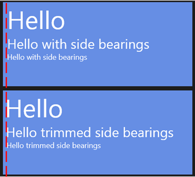
Font definitions for glyphs generally include some spacing to the left and right of each character so that adjacent characters don’t run into each other (unless explicitly intended). When aligning text to the Windows design language’s 20px grid or within a tile, in some cases you might want to remove the spacing at the start. Setting OpticalMarginAlignment to TrimSideBearings removes that extra space and visually aligns the text to the edge it is justified to. In the next examples, you can see that when OpticalMarginAlignment is set to TrimSideBearings, all the text, no matter what size, lines up at the margin edge specified. In this picture you can see that in the TrimSideBearings example (bottom) all the text is aligned with the margin specified. The red line is a visual aid and isn’t part of the markup.
TrimSideBearings Example: The top TextBlock is with OpticalMarginAlignment set to None and the bottom picture with OpticalMarginAlignment set to TrimSideBearings.
<StackPanel Orientation="Vertical">
<Border>
<TextBlock OpticalMarginAlignment="None">
<Run FontSize="60">Hello</Run><LineBreak/><Run FontSize="32">Hello with side bearings</Run><LineBreak/><Run FontSize="18">Hello with side bearings</Run>
</TextBlock>
</Border>
<Border>
<TextBlock OpticalMarginAlignment="TrimSideBearings">
<Run FontSize="60">Hello</Run><LineBreak/><Run FontSize="32">Hello trimmed side bearings</Run><LineBreak/><Run FontSize="18">Hello trimmed side bearings</Run>
</TextBlock>
</Border>

<StackPanel.Resources>
<Style TargetType="Border">
<Setter Property="Background" Value="#FF668EE4" />
<Setter Property="Margin" Value="5" />
<Setter Property="Width" Value="450" />
<Setter Property="Height" Value="200" />
</Style>
<Style TargetType="TextBlock">
<Setter Property="Foreground" Value="White" />
<Setter Property="Margin" Value="10" />
</Style>
</StackPanel.Resources>
</StackPanel>TextLineBounds
Text is usually laid out with some space above and below the glyphs based on the glyph metrics. You can use the TextLineBounds property to trim to the text’s baseline, bottom, cap height or top. Below is a diagram that shows and defines the terms: ascent, descent, baseline, top, bottom, line box height and cap height, which we use in the following explanation.
|
|
Ascent = Height above the Baseline to “Top” Descent = Height below the Baseline to “Bottom” Line Box Height = Ascent + Descent Cap Height = the Capital Height |
A main reason to use this property is to control alignment of text elements, for example, to align the baseline of page headers, as recommended for the Windows design language. The property affects how the height of a line of text is measured. That value in turn affects how a line of text is laid out in relation to other elements, for example, other lines of text, or containing elements, such as borders that can adapt their size to the size of the content.
This next example shows a series of textblocks, with different TextLineBounds, using a border to illustrate the size of each block when measured. The border is being used as a visual aid and is not necessary for producing this behavior. Note that a VerticalAlignment set to bottom is used to align all the borders.
- When Full is set, it’s the same as not setting the property and the line box height is used for calculating the space around the text.
- When Tight is set, the baseline and the cap height are used for calculating the space around the text.
- When TrimToBaseline is set, the baseline and the top are used for calculating the space around the text.
- When TrimToCapHeight is set, the bottom and the cap height are used for calculating the space around the text.
You can see the visual effects of these properties as well as multiple-line behavior in TextLineBounds.
From left to right (TextLineBounds set to): Full, Tight, TrimToBaseLine, TrimToCapHeight.
<Grid Background="White">
<StackPanel Orientation="Horizontal" VerticalAlignment="Center">

<Border>
<TextBlock Text="Aaby" TextLineBounds="Full" />
</Border>
<Border >
<TextBlock Text="Aaby" TextLineBounds="Tight" />
</Border>
<Border >
<TextBlock Text="Aaby" TextLineBounds="TrimToBaseline" />
</Border>
<Border >
<TextBlock Text="Aaby" TextLineBounds="TrimToCapHeight" />
</Border>

<StackPanel.Resources>
<Style TargetType="Border">
<Setter Property="Background" Value="#FF32ACD1" />
<Setter Property="Margin" Value="5" />
<Setter Property="BorderThickness" Value="1" />
<Setter Property="VerticalAlignment" Value="Bottom" />

</Style>
<Style TargetType="TextBlock">
<Setter Property="TextWrapping" Value="Wrap"/>
<Setter Property="Margin" Value="1" />
<Setter Property="FontSize" Value="48" />
<Setter Property="Foreground" Value="Black"/>
</Style>
</StackPanel.Resources>
</StackPanel>
</Grid>
Other use cases for this property are to eliminate extraneous space from a text element, such as a heading that has no letters that go below the baseline, or to create a tighter text layout effect.
More wrapping and trimming
Wrapping
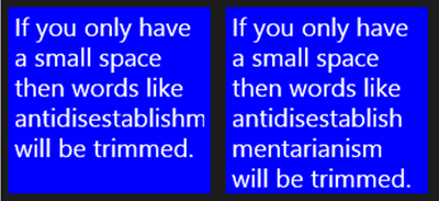
We’ve added three new values you can use for text wrapping and text trimming. The text wrapping property controls how text flows from line to line. The additional value is WrapWholeWords, which only wraps lines at whole-word intervals even when the layout width is too small for even a single word. This property is designed for very small components, such as tiles, that can only display a small amount of text. When a very long word, URL, or file name is displayed, you might want to trim the text so the user can see all the text. WrapWholeWords only wraps whole-word intervals so the user can see the rest of the text in the tile. The Figures below show the results of the new WrapWholeWords property next to the result of the Wrap property, which wraps words when the layout is too small.
Comparison between TextWrapping Properties: WrapWholeWords (Left) and Wrap (right)
<StackPanel Orientation="Horizontal">
<Border>
<TextBlock TextWrapping="WrapWholeWords">If you only have a small space then words like antidisestablishmentarianism will be trimmed.</TextBlock>
</Border>
<Border>
<TextBlock TextWrapping="Wrap">If you only have a small space then words like antidisestablishmentarianism will be trimmed.</TextBlock>
</Border>

<StackPanel.Resources>
<Style TargetType="Border">
<Setter Property="Background" Value="Blue" />
<Setter Property="Margin" Value="5" />
<Setter Property="BorderThickness" Value="1" />
<Setter Property="Height" Value="150" />
</Style>
<Style TargetType="TextBlock">
<Setter Property="Foreground" Value="White" />
<Setter Property="Margin" Value="5" />
<Setter Property="FontSize" Value="20" />
<Setter Property="Width" Value="150" />

</Style>
</StackPanel.Resources>
</StackPanel>
Trimming
The TextTrimming property allows you to trim text in four different ways. You may already be familiar with WordEllipsis, which trims text at a word boundary and draws an ellipsis with the remaining space, and None, which trims the text without drawing any ellipsis, and is also the default value.
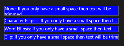
We brought back CharacterEllipsis, which many of you may know and love from WPF. CharacterEllipsis trims text at a character boundary and draws an ellipsis with the remaining space. We also added a new enum value called Clip. Clip trims the text without drawing an ellipsis similar to None, however there is a difference when text is wrapped and there’s a defined MaxHeight.
- When None is set for TextTrimming and a MaxHeight is specified, the text is cropped so it meets both specifications, even if it means cropping off part of the word horizontally.
- For all the other enum values (Character Ellipsis, Word Ellipsis, and Clip) the text isn’t cropped horizontally even when the MaxHeight is specified.
You can see examples of all these behaviors in this image.
Comparison between all the TextTrimming Properties. From top to bottom: None, Character Ellipsis, Word Ellipsis, and Clip
<Grid Background="{ThemeResource ApplicationPageBackgroundThemeBrush}">
<StackPanel Orientation="Vertical" VerticalAlignment="Top">
<Border>
<TextBlock TextTrimming="None"> None: If you only have a small space then text will be trimmed.</TextBlock>
</Border>
<Border>
<TextBlock TextTrimming="CharacterEllipsis">Character Ellipsis: If you only have a small space then text will be trimmed.</TextBlock>
</Border>
<Border>
<TextBlock TextTrimming="WordEllipsis">Word Ellipsis: If you only have a small space then text will be trimmed.</TextBlock>
</Border>
<Border>
<TextBlock TextTrimming="Clip">Clip: If you only have a small space then text will be trimmed.</TextBlock>
</Border>

<StackPanel.Resources>
<Style TargetType="Border">
<Setter Property="Background" Value="Blue" />
<Setter Property="Margin" Value="5" />
<Setter Property="BorderThickness" Value="1" />
<Setter Property="Width" Value="500" />
</Style>
<Style TargetType="TextBlock">
<Setter Property="TextWrapping" Value="Wrap"/>
<Setter Property="MaxHeight" Value="40"/>
<Setter Property="Foreground" Value="White" />
<Setter Property="Margin" Value="1" />
<Setter Property="FontSize" Value="20" />
</Style>
</StackPanel.Resources>
</StackPanel>
id>
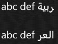
One other important difference between Clip and None is how bidirectional text is handled. For example, if you were trying to display English and Arabic (right-to-left, aka RTL, language) text in the same TextBlock, None would trim the text from right-to-left, therefore cropping the beginning of the Arabic text. Clip would trim the Arabic text from the center of the block moving left-to-right. Therefore, Clip trims the logical end of the text, even when it means trimming from left-to-right. In the example below, I compare these two strings where the red portion of the Arabic text is being trimmed.
The top Textblock is using “None” for the text trimming option and has trimmed the Arabic text from right-to-left, which trims the logical beginning of the Arabic text. The bottom is using “Clip” for the text trimming option and has trimmed the Arabic starting in the center of the block and trimming from left-to-right, which trims the logical end of the Arabic text.
<TextBlock FontSize="30" Text="abc def العربية" TextTrimming="None" Margin="653,420,558,289"/>
<TextBlock FontSize="30" Text="abc def العربية" TextTrimming="Clip" Margin="653,503,558,214"/>
MaxLines
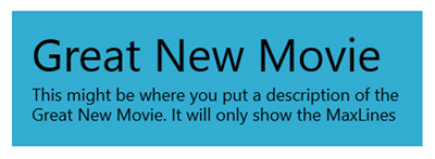
The MaxLines property allows you to set the maximum lines of text displayed in a TextBlock. The default is 0, which is a special value that represents “Auto” behavior. The text control adjusts its height to show no more than the specified number of lines, regardless of the font size, font style, or text length. This property is generally used with the TextWrapping property set to either the Wrap or WrapWholeWords values.
One use case allows only a certain amount of text to be displayed from a source such as movie titles or newspaper headlines.
This picture shows a use case for the MaxLines property. In this picture MaxLines was set to 3, and 3 lines of text were displayed. If you look at the XAML markup, the sentence actually keeps going, but this extra text was not shown.
<StackPanel>
<Border>
<TextBlock MaxLines="3">
<Span FontSize="48"> Great New Movie </Span> <LineBreak></LineBreak> <Span FontSize="18"> This might be where you put a description of the Great New Movie. It will only show the MaxLines specified. </Span>
</TextBlock>
</Border>


<StackPanel.Resources>
<Style TargetType="Border">
<Setter Property="Background" Value="#FF32ACD1" />
<Setter Property="Margin" Value="20" />
<Setter Property="BorderThickness" Value="1" />
<Setter Property="VerticalAlignment" Value="Bottom" />
<Setter Property="Width" Value="430" />

</Style>
<Style TargetType="TextBlock">
<Setter Property="TextWrapping" Value="Wrap"/>
<Setter Property="Margin" Value="1" />
<Setter Property="Foreground" Value="Black"/>
<Setter Property="Width" Value="430" />
<Setter Property="Padding" Value="20" />
<Setter Property="OpticalMarginAlignment" Value="None"/>
</Style>
</StackPanel.Resources>
</StackPanel>
Hyperlink
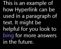
We’ve received many requests for a hyperlink option that allows for the hyperlink to be a part of the text flow, and so we added one. The Hyperlink element is a new Inline derived class and inherits from span. This means it can be placed into an InlineCollection. You might prefer this new Hyperlink element over the HyperlinkButton because it allows the Hyperlink to be a part of the text flow, meaning that Hyperlink will wrap across lines.
It’s intended to be part of the text content of a RichTextBlock or a TextBlock but within other text containers. The main purpose of this new element allows you to easily put hyperlinks into blocks of text. This example shows how you can use Hyperlink.
This is an example of how Hyperlink can be used in a block of text. In this example the word bing is a hyperlink to http://www.bing.com.
<Grid Background="Black">
<TextBlock Width="400" TextWrapping="Wrap">
<Span FontSize="40">This is an example of how Hyperlink can be used in a paragraph of text. It might be helpful for you look to <Hyperlink  NavigateUri="http://www.bing.com"> bing </Hyperlink> for more answers in the future.  </Span>
</TextBlock>
</Grid>
Paste event
There are times when as an app developer you want to be able to control the experience for how content is pasted into a TextBox or RichEditBox in your app. We have added a Paste event to these controls so that you can override the default behavior if you need to.
For example, in a mapping app, if you have a single line text control and somebody pastes a multi-line address, only the first line is pasted in. By handling the event, the app can access all the text and reformat it to a one-line address. This sample code reformats the contents pasted to replace multiple lines in an address with a space and a comma.
XAML:
<TextBox Name ="TextBox1" Paste = "TextBox1_Paste" />
C# code behind:
private async void TextBox1_Paste(object sender, TextControlPasteEventArgs e)
{
//Marking as handled to prevent the default paste behavior
    e.Handled = true;

    var clip = Windows.ApplicationModel.DataTransfer.Clipboard.GetContent();
string pasted = await clip.GetTextAsync();

if (pasted.Contains('r'))
    {
        pasted = pasted.Replace("rn", ", ");
        pasted = pasted.Replace("r", ", ");
        pasted = pasted.Replace("n", ", ");
    }

if (TextBox1.SelectionLength > 0)
    {
        TextBox1.SelectedText = pasted;
    }
else
    {
int i = TextBox1.SelectionStart;
        TextBox1.Text = TextBox1.Text.Insert(i, pasted);
        TextBox1.SelectionStart = i + pasted.Length;
    }
}
Wrapping up
We hope that these new features make it easier for you to achieve your desired end product. They can bring more color to your apps, as well as give you more opportunities to align, wrap and trim text, and use hyperlinks. We hope you find these new features useful, and we’ll keep our eyes out for future ways to deliver helpful features for you as a XAML developer.
Mariah Dunn, Program Manager, Windows


