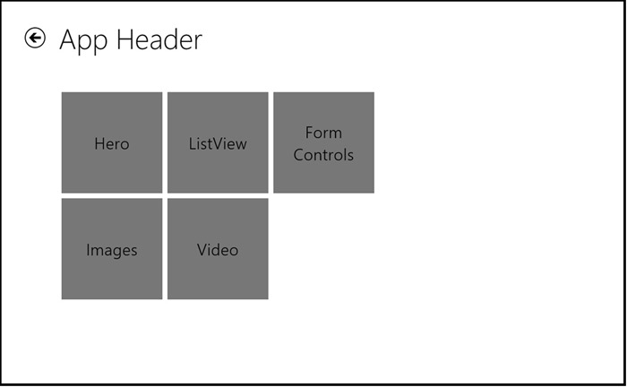
In Windows 8, we introduced several concepts and controls to deal with large collections of data. The XAML and HTML ListView control allows you to create uniform grouped lists with a single, homogeneous data source. We also provided guidelines for the hierarchical presentation of data called the hub pattern. Many developers adopted these controls and patterns to create great apps. We saw a lot of innovation and new usage cases in these apps, and heard feedback from you about the additional features you’d like to see in the future.
In Windows 8.1, we got the opportunity to analyze these evolving designs. ListView, as the name suggests, is the control that’s optimized for presentation of information with a common data source in terms of lists, grids, and the ability to group them. However, we saw developers trying to use ListView to present different types of data—typically from different sources—using a hub pattern. As you can imagine, and perhaps as you have experienced, trying to force multiple heterogeneous data sources into a control designed for a single, homogeneous source, is difficult and time-consuming. We heard your concerns and built the hub control, which is optimized for implementing the hub pattern and presenting different types of data in separate sections.
The hub control, available for both HTML/CSS/JavaScript and XAML/C++/C#/Visual Basic, makes it easy for you to present heterogeneous content in a beautiful and meaningful way. The info can be in the form of lists, text, videos, links and images. Each data type might have a unique layout, a specific interaction model, different controls for each interaction, and widely varied data sources. The control is typically used as a landing page for the app, but can also be used in subsidiary pages as a part of the larger hierarchy. The hub control, in short, lets you build highly productive apps that are consistent with the Microsoft design language. Users can expect consistent interactions, and the experience has been fine-tuned for all input types— touch, or keyboard and mouse.
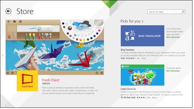
The Windows Store for Windows 8.1 uses the hub control
Hub and hub sections
As already mentioned, the hub control is built around the existing hub pattern, in which the hub page is the user’s entry point to the app. The content is divided into sections that correspond to different types of content, allowing the user to quickly explore the content in each section and then easily dive into more detailed pages. Typically, the content is laid out in a horizontally panning view.
Getting started with the hub control is easy. To match the existing hub pattern we added the ability to specify each hub section distinctly. Each section can take any type of content, interactive or non-interactive, and can host both platform and custom controls.
HTML
<div data-win-control="WinJS.UI.Hub">
<div data-win-control="WinJS.UI.HubSection" >
<div data-win-control="WinJS.HtmlControl">
</div>
</div>

<div data-win-control="WinJS.UI.HubSection">
<div data-win-control="WinJS.UI.ListView">
         …
</div>
</div>

<div data-win-control="WinJS.UI.HubSection">
<input type="email" />
<div>
             …
</div>
</div>
</div>
XAML
<Hub>
<HubSection>
<DataTemplate>
<Grid>
                …
</Grid>
</DataTemplate>
</HubSection>

<HubSection>
<DataTemplate>
<StackPanel>
                …
</StackPanel>
</DataTemplate>
</HubSection>
…
</Hub>
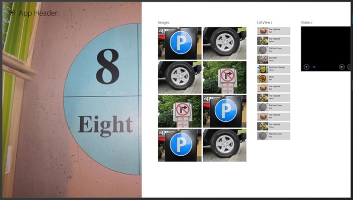
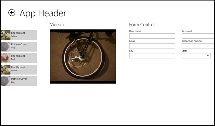
This separation between different content types in the markup allows you to tie them to separate data sources and provide unique interaction models. For example, one of the sections can contain videos that the user can view by clicking on the play button; the section next to it can contain a list that a user can swipe to select to perform an additional action like delete; and the next section can simply be a block of noninteractive text. In this screen shot, you see an example of ListView and Video sections next to each other with different content and types of items.
Hub sections with heterogeneous content
Smart loading
We’ve consistently heard that startup time can be a challenge to manage when you’re building an app with heavy information density. Apps built with the hub pattern can have a considerable number of sections, and it takes time to load those sections and content inside them. Users might think the app is unresponsive and slow if they have to wait for all that content to load. To address this, we added smart loading to the hub. The sections visible on the screen are preloaded before the app is displayed, and the rest of the sections are loaded afterwards. This allows users to interact with the visible content right away. The best part is that you don’t need to do anything to get this running—it’s built directly into the hub control!
Parts of the hub
In addition to the sections, the hub control also contains different headers and something called a hero section.
Anatomy of a hub
Hub header
When you build an app with the hub pattern, even if it contains heterogeneous content, there is always a unifying theme. The hub header helps to highlight that theme and let users know what they can expect to see in the app. In certain cases, the hub header can also include a back button. By default, the sections are laid out relative to the hub such that the space for the hub header is reserved at the top. Take a look at scenario 1 of HTML and XAML hub samples to see how to add this main header to your hub page.
Section headers
Because the hub pattern is a hierarchical pattern, we’ve made it easy for you to navigate to detailed pages. Hub sections usually depict only a small fraction of your app’s content, for faster performance and to provide more data to users in concise format. We also got feedback that sometimes it was hard for users to find a way to get into more detailed sections. To address this common scenario, we have made two types of headers: interactive and noninteractive. An interactive header has a chevron next to it to let the users know that these sections contain more content, and it raises an event that you can use to hook up to the detailed page. Of course, section headers don’t have to be boring. You can style every part of the header including the chevron. And you can place any type of content under them, whether it’s a nice graphic logo representing your app or an interactive control such as a flyout to give users more options.
Let’s take a look at the transition between the main section and detailed content in the Flora & Fauna section in an app named Field Guide . The user clicks, taps, or selects the interactive header (Flora & Fauna) to navigate to the detailed content.
Landing page
Detail page
To see the code to declare interactive headers and wire up the raised event, take a look at scenario 3 of the hub samples for HTML and XAML .
Hero section
To make the app more visually engaging and unify the content in it, we are introducing the notion of a hero section. The hero section doesn’t have any margins or padding, so it stands out among other sections and highlights the most important part of the app. Typically this is an image that bleeds to the left edge of the screen, reaches from top to bottom, and doesn’t contain any section headers. For example, in a news apps, this can be an image of the top article of the day. In the Windows Store, which uses a hub control, notice that the hero section features a FlipView control that allows the users to cycle through the spotlight apps. Take a look at scenario 2 of the hub sample apps for HTML and XAML see how to create a hero section.
The hero section in the Field Guide app is the first section
Vertical layout
In Windows 8.1, we also added support for launching apps side by side. This means that apps aren’t always launched in full-screen state. Since apps often transition to or launch in different sizes and layouts, we added the ability to lay out hub sections vertically so you can easily design for smaller app views (below 500 pixels wide). You can switch between horizontal and vertical modes without changing the content. The sections are laid out vertically, and the touch, keyboard, and mouse interactions are updated accordingly. Take a look at scenario 5 of the hub samples for HTML and XAML to see how to switch to vertical mode.
Horizontal layout
Vertical layout
Navigating through sections
Preferred landing points
Users can of course pan through the sections by using touch. To improve users’ confidence and help them to land on the correct section, we’ve integrated preferred landing points into the hub. This means that, when the user pans, if the edge of a preferred section is close enough to center of the screen, the hub control will adjust the section so that it lands in the optimal location for viewing.
Keyboard support
To make the interaction with the hub control as smooth and productive as possible, we’ve added built-in keyboard support. Users can browse through the hub’s sections by using the arrow keys and can jump in and out of section content area by using the tab key. The in-built keyboard experience ensures that the correct section is always in view in the optimal location on the screen.
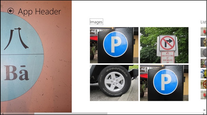
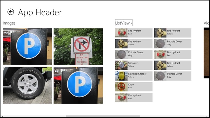
Here’s an example of the user going from the Images section to the ListView section in the sample app. Notice the focus around the header to indicate keyboard interaction, and how the ListView section is positioned after the user presses the Right Arrow key to move to it.
Keyboard focus is around current section header
Right Arrow key brings the next section into view and moves the keyboard focus
Maintaining app state
Because the hub control is for hierarchical patterns, we paid a lot of attention to the experience of navigating to more detailed pages of the sections. We added a scroll-position API to the hub interface to enable you to maintain position when the user navigates away from the hub page. This way, upon returning to your hub page, the user is back at exactly the same spot as before. Check out scenario 3 of the HTML and XAML hub samples to learn how to use this API.
Launching on a specific section
Hub control also lets you launch the hub on any section, to cater to specific scenarios and create unique app experiences. Here’s an example of how to use these APIs. This markup launches the hub on the third section (since the section index starts from 0).
HTML
   <div data-win-control="WinJS.UI.Hub" data-win-options="{sectionOnScreen: 2}">
       ...
</div>
XAML
   <Hub DefaultSectionIndex="2">
       ...
</Hub>
Semantic zoom
Like we did with the ListView control, we’ve also established a contract between the hub and semantic zoom control. This makes it extremely easy for you to add a zoomed-out view of your sections so users can navigate faster to any specific section. This especially becomes very useful in apps launched side by side, when there isn’t enough room to pan large surfaces. Take a look at the HTML and XAML hub samples to see how you can add semantic zoom around the hub. Also, take a look at the guidelines for the semantic zoom control at http://msdn.microsoft.com/en-us/library/windows/apps/hh465319.aspx .
Zoomed-out view of the sample app
Zoomed-in view of the Video section of the sample app
We’re really excited about the hub control, and we’d love to see what you can do with it. Be sure to leave the comments below! And check out Guidelines for the hub control for ideas and tips on how to style your hub control to be unique and make your product and content pop.
Additional Resources
- Guidelines for the hub control
- XAML Hub control sample
- Hub control (C#/VB/C++ and XAML)
- Windows.UI.Xaml.Controls Hub class
- HTML Hub control sample
- Hub control (JavaScript and HTML)
- WinJS.UI.Hub object
— Nitin Sharma, Program Manager, Windows UI Platform
Thanks to Mike Henderlight, Senior Program Manager, Windows
and Paul Gusmorino, Principal Program Manager Lead, Windows
for their contributions to this post.

