Communicating effectively with your users requires the following three virtues:
- be friendly (and compassionate)
- provide guidance
- project a gentle tone
Friendliness, helpfulness and a gentle tone should all combine to provide a smoother, more seamless experience for your users even in the toughest situations, such as an app meltdown or user confusion.
Friendliness
An important aspect of compassionate design is the character of the communication between you and your user. You want users to feel as if there are real people behind the app who care that their experience is a good one.
First, the app should demonstrate a considerate attitude toward the user’s success—both in terms of messaging for errors, user actions and potential experience improvements, as well as accommodations for the users themselves when they do the wrong thing (possibly an indicator that the design was not sufficiently intuitive).
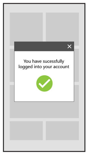
Messaging, especially errors, should be clear and generally upbeat. In Figure 2 below, for example, notice how MeeDJ uses clear messaging to convey that the playlist is loading—a positive affirmation of the desired behavior. Without this messaging, the user might assume that the black screen and delay are a failure of the app to function rather than a momentary and fully expected delay. Here, just a little bit of text helps to avoid a potentially frustrated user who abandons the app altogether.
Note: Messaging requires balance: while it is important to reassure your users, you also want to be careful not to disrupt the user experience unnecessarily.

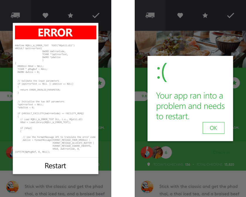
When it comes to the messaging of errors, remember numerous informative, but ultimately un-actionable messages from the app are not necessary (Figure 3, left). The focus should be more on getting the user back on track than on fully documenting what’s happening for them in painful detail (Figure 3, right). The user doesn’t really care what happened. They just want the app to start working again.
A little forethought can also go a long way toward reducing both the frequency of issues and ensuring the user is treated gently if and when they do happen.
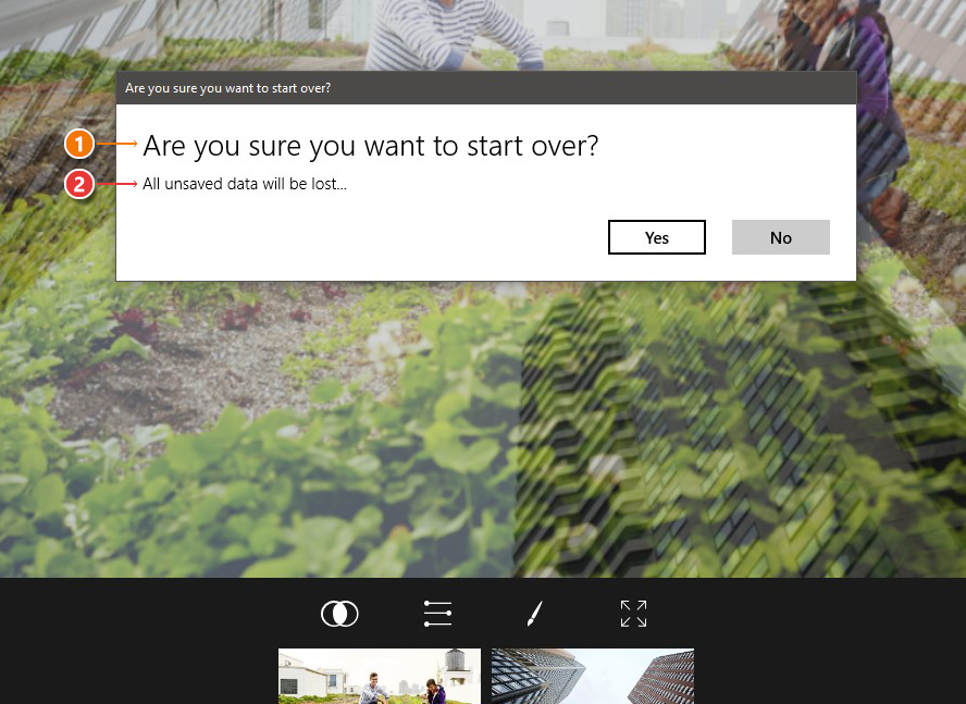
For example, you can anticipate that users will occasionally tap on the wrong spot. You can prepare for this by making the touch targets large enough to accommodate some impreciseness. And, if users do still manage to tap on the wrong spots, you can ensure they have a means for easy recovery, as Fused does in Figure 4 below. Here, the app (1) prompts the user to confirm the action before proceeding and (2) reminds the user that proceeding will result in a loss of changes.
A word here about the attitude of design forgiveness: Never blame the user. Instead, use your opportunities to communicate with your user to reinforce the notion that any app issues are the creator’s fault and not the users’.
Remember that if the users did something wrong, it was probably because the interface wasn’t clear or accommodating enough. If the user gets confused, it was because the user experience should have been friendlier. Users are justifiably impatient and have many alternatives to your app.
Take each opportunity you can to treat your users like the very important human beings they are.
Provide a helping hand
Speaking of which, remember that no one likes to feel stupid or confused. One way to create human moments with your users at crucial moments or with critical features that may generate confusion is to take them by the hand and show them around.
A powerful example of this principle in action is the initial walkthrough, which lets users know that you have thought carefully about their experience and want to make it as easy for them as possible. Keep in mind, though, the walkthroughs should be in addition to an intuitive care application and should not be used as a crutch for poor design.
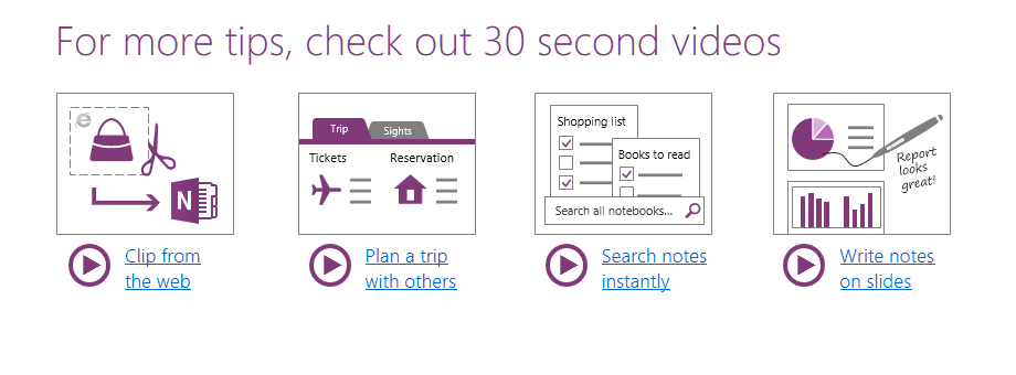
Microsoft’s OneNote does a good job of this by providing simple instructions covering how to use the app. In Figure 5, squiggly lines, arrows and exclamation points provide a sense of fun and informality to the walkthrough. Even though OneNote is a very sophisticated app, the walkthrough portrays it as something different—an approachable, easy-to-use app you can use as much or as little of as you want.

OneNote also creates an ongoing sense of discovery. Different aspects of the app can be explored over time. This creates the powerful suggestion that OneNote is more like a game than a line-of-business app. You learn how to use it by playing with it rather than by reading a manual.
Tip: You should always provide your users with a way to dismiss the guidance if they feel they don’t need it. By the same token, there should also be a checkbox in your app settings to bring the guidance back if a user changes his or her mind.
Consider the role of guidance in your app. It might be a full walkthrough upon first launch or access of critical features, helpful pop-up tips or a little question mark on each page for easy access to guides. Whatever you choose, remember that the primary purpose is to reduce user confusion and show that you, as the app creator, care about the user experience and want them to succeed.
Tone
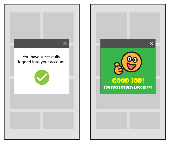
In previous posts of this series, we have discussed how typography and iconography are all effective ways to set the tone for your app. Some apps need to stay professional and the language used in communicating with the user will reinforce this approach. If it is appropriate, however, you may find that being less formal creates a more positive tone for your app. Take the two examples below of a successful log-in notification. The tone of a standard message can be shifted by adding a few exclamation points and a note of encouragement.
Professional: You have successfully logged into your account.
Playful: Good job! You successfully logged in!
The important thing in setting tone is to be consistent and sincere. You can’t switch back and forth between being professional and being playful, which might create confusion with the users, as well as a sense that you are talking down to them. Instead, think of your tone as a way to convey the personality of the people behind your app.
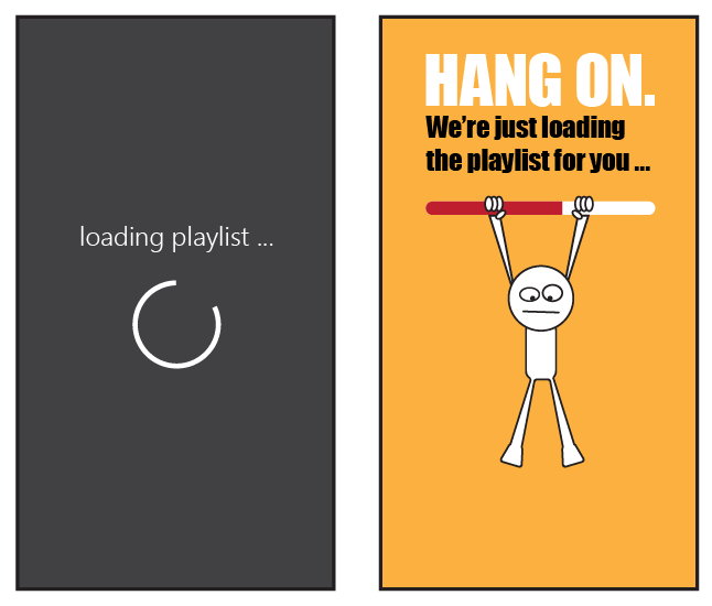
Professional: Loading playlist …
Playful: Hang on. We’re just loading the playlist for you …
Most of all, make sure the tone feels comfortable to you. If you ever feel as an app creator that your app’s tone doesn’t reflect who you are, your user is going to feel it, too. The best way to communicate with your user on a human level is to be yourself.
Wrapping up
Good app design is about human-to-human communication. While words should be used sparingly in an app, you want them to have maximum impact when you do use them—so choose your words carefully! Choose words that convey your desire to help your user learn your app. Choose words that soften the impact when accidents happen either through user action or technical glitches. Finally, choose words that communicate the tone of your app and the personality of its creator(s).
And don’t forget to check out our other posts in the series!
- Getting started with app design
- Understanding typography and UX design
- Visual communication and visual cues
- Design thinking: Finding your inspiration
- Sketching your app design
- Using iconography to enhance UX design
- Designing for intuitive navigation
Download Visual Studio to get started!

