

Read Windows Ink 1: Introduction to Ink and Pen
Read Windows Ink 3: Beyond Doodling
In the last post, we explored a brief history of pen computing and introduced you to how easy it is to get started with Windows Ink in your Universal Windows Platform app. You saw that you can enable inking by adding a single line of code, an InkCanvas, to your app to enable inking. You also saw that adding another single line of code, the InkToolbar, gives the user additional pen-related tools like pen-stroke color and stroke type.
In this post, we’ll dig deeper into how we can further customize the pen and ink experience to make your application a delightful inking experience for the user. Let’s build a Coloring Book application!
Customizing The Inking Experience
Getting Started
To get started, let’s put in an InkCanvas on the page:
[code lang=”xml”]
<InkCanvas x:Name="myInkCanvas"/>
[/code]
By default, the InkCanvas’s input is set to only accept strokes from a Pen. However, we can change that by setting the InputDeviceTypes property of the InkCanvas’s InkPresenter. In the page constructor, we want to configure the InkCanvas so that it works for pen, mouse and touch:
[code]
myInkCanvas.InkPresenter.InputDeviceTypes = Windows.UI.Core.CoreInputDeviceTypes.Pen
| Windows.UI.Core.CoreInputDeviceTypes.Mouse
| Windows.UI.Core.CoreInputDeviceTypes.Touch;
[/code]
As we did in the last article, we’ll add an InkToolbar and bind it to myInkCanvas, but this time we’re going to put it within a CommandBar. This is so we can keep it next the other buttons that we’ll add later, like Save and Share.
[code lang=”xml”]
<CommandBar Name="myCommandBar" IsOpen="True" >
<CommandBar.Content>
<InkToolbar x:Name="myInkToolbar" TargetInkCanvas="{x:Bind myInkCanvas}"/>
</CommandBar.Content>
</CommandBar>
[/code]
Note: If you see a XAML designer error when you add the InkToolbar, you can safely ignore this as it is a known issue that is being worked on. Your code will run fine.
However, this time, we also want to provide the user with some additional InkToolbar options. We have two main ways to do this using the InkToolbar, we can use a
- Built-in InkToolbar pen button
- Custom InkToolbar pen button
Built-in InkToolbar pens
Let’s start with an example of a built-in option, the InkToolbarBallPointPenButton. This is an ‘out-of-the-box’ InkToolbar button that, when selected in the InkToolbar, activates the BallPointPen. To add this, you place it within the InkToolbar’s content, like so:
[code lang=”xml”]
<CommandBar Name="myCommandBar" IsOpen="True" >
<CommandBar.Content>
<InkToolbar x:Name="myInkToolbar" TargetInkCanvas="{x:Bind myInkCanvas}">
<InkToolbarBallpointPenButton Name="penButton" />
</InkToolbar>
</CommandBar.Content>
</CommandBar>
[/code]
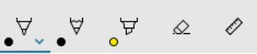
If you ran the app now, your InkToolbar would look like this:
Custom InkToolbar Pens
Creating a custom pen is rather straightforward and requires very little code. Let’s start with the basic requirement: We need to create a class that inherits from InkToolbarCustomPen and give it some attributes that define how it will draw. Let’s take this step by step and make a custom highlighter marker.
First, let’s add a new class to your project. Name the class “MarkerPen,” add the following using statements and inherit from InkToolbarCustomPen:
[code lang=”csharp”]
using Windows.UI;
using Windows.UI.Input.Inking;
using Windows.UI.Xaml.Controls;
using Windows.UI.Xaml.Media;
class MarkerPen : InkToolbarCustomPen
{
}
[/code]
In this class, we only need to override the CreateInkDrawingAttributesCore method. Add the following method to the class now:
[code lang=”csharp”]
protected override InkDrawingAttributes CreateInkDrawingAttributesCore(Brush brush, double strokeWidth)
{
}
[/code]
Within that method we can start setting some drawing attributes. This is done by making an instance of InkDrawingAttributes and setting some properties. Here are the attributes I’d like the pen to have:
- Act like a highlighter
- Has a round pen tip shape
- Has a red stroke color as the default color
- Be twice as thick as the user’s stroke
Here’s how we can fulfill those requirements:
[code lang=”csharp”]
InkDrawingAttributes inkDrawingAttributes = new InkDrawingAttributes();
// Set the PenTip (can also be a rectangle)
inkDrawingAttributes.PenTip = PenTipShape.Circle;
// Set the default color to Red
SolidColorBrush solidColorBrush = brush as SolidColorBrush;
inkDrawingAttributes.Color = solidColorBrush?.Color ?? Colors.Red;
// Make sure it draws as a highlighter
inkDrawingAttributes.DrawAsHighlighter = true;
// Set the brush stroke
inkDrawingAttributes.Size = new Windows.Foundation.Size(strokeWidth * 2, strokeWidth * 2);
return inkDrawingAttributes;
[/code]
That’s it, your custom pen is done. Here’s the completed class:
[code lang=”csharp”]
using Windows.UI;
using Windows.UI.Input.Inking;
using Windows.UI.Xaml.Controls;
using Windows.UI.Xaml.Media;
class MarkerPen : InkToolbarCustomPen
{
protected override InkDrawingAttributes CreateInkDrawingAttributesCore(Brush brush, double strokeWidth)
{
InkDrawingAttributes inkDrawingAttributes = new InkDrawingAttributes();
inkDrawingAttributes.PenTip = PenTipShape.Circle;
SolidColorBrush solidColorBrush = brush as SolidColorBrush;
inkDrawingAttributes.Color = solidColorBrush?.Color ?? Colors.Red;
inkDrawingAttributes.DrawAsHighlighter = true;
inkDrawingAttributes.Size = new Windows.Foundation.Size(strokeWidth * 2, strokeWidth * 2);
return inkDrawingAttributes;
}
}
[/code]
Now, let’s go back to the page where you have your InkToolbar and InkCanvas. We want to create Resources section for your page that contains a StaticResource instance of the custom pen. So, just above the root Grid element, add the following Resources code:
[code lang=”xml”]
<Page …>
<Page.Resources>
<local:MarkerPen x:Key="MarkerPen"/>
</Page.Resources>
<Grid Background="{ThemeResource ApplicationPageBackgroundThemeBrush}">
…
</Grid>
</Page>
[/code]
A quick note about XAML Resources: The page’s resources list is a key/value dictionary of objects that you can reference using the resource’s key. We’ve created an instance of our MarkerPen class, local:MarkerPen, and given it a key value of “MarkerPen” (if you want to learn more about XAML resources, see here).
We can now use that key in a InkToolbarCustomPenButton’s CustomPen property. This is better explained by the code. Let’s break it down:
In your InkToolbar, add an InkToolbarCustomPen and give it a name:
[code lang=”xml”]
<InkToolbar>
<InkToolbarCustomPenButton Name="markerButton"></InkToolbarCustomToolButton>
</InkToolbar>
[/code]
The InkToolbarCustomPen has a CustomPen property:
[code lang=”xml”]
<InkToolbarCustomPenButton Name="markerButton" CustomPen="">
[/code]
We can now set that CustomPen property using the key of our resource:
[code lang=”xml”]
<InkToolbarCustomPenButton Name="markerButton" CustomPen="{StaticResource MarkerPen}">
[/code]
Now, let’s set the SymbolIcon for the button:
[code lang=”xml”]
<InkToolbarCustomPenButton Name="markerButton" CustomPen="{StaticResource MarkerPen}">
<SymbolIcon Symbol="Highlight" />
</InkToolbarCustomPenButton>
[/code]
Next, let’s add an InkToolbarPenConfigurationControl:
[code lang=”xml”]
<InkToolbarCustomPenButton Name="markerButton" CustomPen="{StaticResource MarkerPen}">
<SymbolIcon Symbol="Highlight" />
<InkToolbarCustomPenButton.ConfigurationContent>
<InkToolbarPenConfigurationControl />
</InkToolbarCustomPenButton.ConfigurationContent>
</InkToolbarCustomPenButton>
[/code]
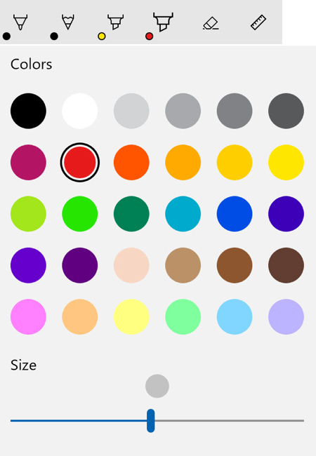
Let’s take a look at what the InkToolbarPenConfigurationControl does for you. Even with a custom implementation of a pen, you still get to use the out-of-the-box Windows Ink components. If the user clicks on your pen after it’s selected, they’ll get a fly-out containing options to change the color and the size of the pen!
However, there’s one little tweak we want to make. By default, you get Black and White as the only colors in the flyout:

We want a lot of colors, and fortunately, the BallpointPenButton you added earlier has a palette full of colors. We can just use that same palette for our custom pen by binding to it:
[code lang=”xml”]
<InkToolbarCustomPenButton Name="markerButton" CustomPen="{StaticResource MarkerPen}" Palette="{x:Bind penButton.Palette}" >
[/code]
Now, here’s what the pen configuration control looks after binding the Palette:
Whew, okay, the toolbar is coming along nicely! Here’s what we have so far for our CommandBar:
[code lang=”xml”]
<CommandBar Name="myCommandBar" IsOpen="True">
<CommandBar.Content>
<InkToolbar x:Name="myInkToolbar" TargetInkCanvas="{x:Bind myInkCanvas}">
<InkToolbarBallpointPenButton Name="penButton" />
<InkToolbarCustomPenButton Name="markerButton" CustomPen="{StaticResource MarkerPen}" Palette="{x:Bind penButton.Palette}" >
<SymbolIcon Symbol="Highlight" />
<InkToolbarCustomPenButton.ConfigurationContent>
<InkToolbarPenConfigurationControl />
</InkToolbarCustomPenButton.ConfigurationContent>
</InkToolbarCustomPenButton>
</InkToolbar>
</CommandBar.Content>
</CommandBar>
[/code]
Now, let’s start adding some commands.
Custom InkToolbar Tool Buttons
The first thing you’d really want in a drawing application is the ability to undo something. To do this we’ll want to add another button to the toolbar; this is easily done using an InkToolbarCustomToolButton. If you’re familiar with adding buttons to a CommandBar, you’ll feel right at home.
In your InkToolbar, add an InkToolbarCustomToolButton and give it a name, “undoButton.”
[code lang=”xml”]
<InkToolbar x:Name="myInkToolbar" TargetInkCanvas="{x:Bind myInkCanvas}" Palette="{x:Bind penButton.Palette}" >
…
<InkToolbarCustomToolButton Name="undoButton"></InkToolbarCustomToolButton>
</InkToolbar>
[/code]
The button has your familiar button properties, such as a Click event and supporting a SymbolIcon for content, so let’s add those as well.
Here’s what your XAML should look like:
[code lang=”xml”]
<InkToolbar x:Name="myInkToolbar" TargetInkCanvas="{x:Bind myInkCanvas}" Palette="{x:Bind penButton.Palette}">
…
<InkToolbarCustomToolButton Name="undoButton" Click="Undo_Click" >
<SymbolIcon Symbol="Undo"/>
</InkToolbarCustomToolButton>
</InkToolbar>
[/code]
Now, let’s go to the button’s click event handler. Here we can do the following to undo strokes that were applied to the InkPresenter, here are the steps:
First, make sure you add the following using statement to the code-behind:
[code]
using Windows.UI.Input.Inking;
[/code]
Then get all the strokes in the InkPresenter’s StrokeContainer:
[code]
IReadOnlyList<InkStroke> strokes = myInkCanvas.InkPresenter.StrokeContainer.GetStrokes();
[/code]
Next, verify that there are strokes to undo before proceeding:
[code]
if (strokes.Count > 0)
[/code]
If there are strokes, select the last one in the container:
[code]
strokes[strokes.Count – 1].Selected = true;
[/code]
Finally, delete that selected stroke using DeleteSelected():
[code]
myInkCanvas.InkPresenter.StrokeContainer.DeleteSelected();
[/code]
As you can see, it’s pretty easy to get access to the strokes that were made by the user and just as easy to remove a stroke. Here is the complete event handler:
[code lang=”csharp”]
private void Undo_Click(object sender, RoutedEventArgs e)
{
// We can get a list of the strokes that are in the InkPresenter
IReadOnlyList<InkStroke> strokes = myInkCanvas.InkPresenter.StrokeContainer.GetStrokes();
// Make sure there are strokes to undo
if (strokes.Count > 0)
{
// select the last stroke
strokes[strokes.Count – 1].Selected = true;
// Finally, delete the stroke
myInkCanvas.InkPresenter.StrokeContainer.DeleteSelected();
}
}
[/code]
Final InkCanvas configuration
Before we conclude the drawing logic, we need to make sure the page loads with some InkDrawingAttributes presets and InkPresenter configuration. To do this, we can hook into the InkCanvas’s Loaded event.
We can do this in the XAML:
[code lang=”xml”]
<InkToolbar x:Name="myInkToolbar" TargetInkCanvas="{x:Bind myInkCanvas}" Palette="{x:Bind penButton.Palette}" Loaded="InkToolbar_Loaded">
[/code]
The attributes are set in a similar way that we set them for the custom pen, instantiate an InkDrawingAttributes object and set some properties. However, this time, we’re passing those attributes to the InkPresenter.
Additionally, a few other things thing should be addressed:
- Give the custom pen the same color palette as the ballpoint pen
- Set the initial active tool
- Make sure that users can also use the mouse
Here’s the code for the InkCanvas’s Loaded event handler:
[code lang=”csharp”]
private void InkToolbar_Loaded(object sender, RoutedEventArgs e)
{
// Create an instance of InkDrawingAttributes
InkDrawingAttributes drawingAttributes = new InkDrawingAttributes();
// We want the pen pressure to be applied to the user’s stroke
drawingAttributes.IgnorePressure = false;
// This will set it to that the ink stroke will use a Bezier curve instead of a collection of straight line segments
drawingAttributes.FitToCurve = true;
// Update the InkPresenter with the attributes
myInkCanvas.InkPresenter.UpdateDefaultDrawingAttributes(drawingAttributes);
// Set the initial active tool to our custom pen
myInkToolbar.ActiveTool = markerButton;
// Finally, make sure that the InkCanvas will work for a pen, mouse and touch
myInkCanvas.InkPresenter.InputDeviceTypes = Windows.UI.Core.CoreInputDeviceTypes.Pen
| Windows.UI.Core.CoreInputDeviceTypes.Mouse
| Windows.UI.Core.CoreInputDeviceTypes.Touch;
}
[/code]
Saving, Sharing and Loading
Now that you’ve got a decent working area, we want to be able to save, load and share the user’s work. In the last post, we showed a simple way to save and load the canvas. However, in our Coloring Book app, we want to have the image and the ink data saved separately so that we can easily share the image for display and sharing purposes, but save, load and edit inking data as well.
Saving Ink Data
As we did in the last post, you can save the ink strokes to a file using the StrokeContainer’s SaveAsync method. What we’ll do differently here is right after we’ve saved the ink file, we’ll also save a parallel image file in the cache. Although we’re able to embed the stroke data into the gif we saved, having a temporary image stored in the cache makes sharing and displaying the image in the app more convenient.
So, at the end of your save button’s click handler, you want to create a new (or get an existing) StorageFile for the image:
[code]
// Save inked image.
StorageFile myInkedImageFile = await folder.CreateFileAsync(Constants.inkedImageFile, CreationCollisionOption.ReplaceExisting);
await Save_InkedImagetoFile(myInkedImageFile);
[/code]
Next, we pass the myInkedImageFile StorageFile reference to the Save_InkedImageToFile method, which saves the image to the file:
[code lang=”csharp”]
private async Task Save_InkedImagetoFile(StorageFile saveFile)
{
if (saveFile != null)
{
…
using (var outStream = await saveFile.OpenAsync(FileAccessMode.ReadWrite))
{
await Save_InkedImageToStream(outStream);
}
…
}
}
[/code]
And finally, we get that bitmap from the canvas into the file in the Save_InkedImageToStream method; this is where we leverage Win2D to get a great looking bitmap from the canvas:
[code lang=”csharp”]
private async Task Save_InkedImageToStream(IRandomAccessStream stream)
{
var file = await StorageFile.GetFileFromApplicationUriAsync(((BitmapImage)myImage.Source).UriSource);
CanvasDevice device = CanvasDevice.GetSharedDevice();
var image = await CanvasBitmap.LoadAsync(device, file.Path);
using (var renderTarget = new CanvasRenderTarget(device, (int)myInkCanvas.ActualWidth, (int)myInkCanvas.ActualHeight, image.Dpi))
{
using (CanvasDrawingSession ds = renderTarget.CreateDrawingSession())
{
ds.Clear(Colors.White);
ds.DrawImage(image, new Rect(0, 0, (int)myInkCanvas.ActualWidth, (int)myInkCanvas.ActualHeight));
ds.DrawInk(myInkCanvas.InkPresenter.StrokeContainer.GetStrokes());
}
await renderTarget.SaveAsync(stream, CanvasBitmapFileFormat.Png);
}
}
[/code]
You might ask, why is there a separate method for getting the stream instead of doing it in one place? The first reason is that we want to be a responsible developer and make sure our method names define what action the methods perform. But more importantly, we want to reuse this method later to share the user’s art. With a stream, it’s not only easier to share, you can even send the image to a printer.
Sharing the result
Now that the image is saved, we can share it. The approach here is the same as other UWP sharing scenarios. You want to use the DataTransferManager; you can find many example of how to use this here in the Official UWP samples on GitHub.
For the purposes of this article, we’ll focus only on the DataTransferManager’s DataRequested method. You can see the full sharing code for this here in the Coloring Book demo on GitHub). This is where the Save_InkedImageToStream method gets to be reused!
[code lang=”csharp”]
private async void DataRequested(DataTransferManager sender, DataRequestedEventArgs e)
{
DataRequest request = e.Request;
DataRequestDeferral deferral = request.GetDeferral();
request.Data.Properties.Title = "A Coloring Page";
request.Data.Properties.ApplicationName = "Coloring Book";
request.Data.Properties.Description = "A coloring page sent from my Coloring Book app!";
using (InMemoryRandomAccessStream inMemoryStream = new InMemoryRandomAccessStream())
{
await Save_InkedImageToStream(inMemoryStream);
request.Data.SetBitmap(RandomAccessStreamReference.CreateFromStream(inMemoryStream));
}
deferral.Complete();
}
[/code]
Loading Ink Data from a file
In our Coloring Book app, we want the user to continue working on previous drawings as if they never stopped. We’re able to save the ink file and capture and save the image of the work, but we also need to load the ink data properly.
In the last post we covered how to load up the stroke from the file; let’s review this now.
[code lang=”csharp”]
// Get a reference to the file that contains the inking stroke data
StorageFile inkFile = await folder.GetFileAsync(Constants.inkFile);
if (inkFile != null)
{
IRandomAccessStream stream = await inkFile.OpenAsync(Windows.Storage.FileAccessMode.Read);
using (var inputStream = stream.GetInputStreamAt(0))
{
// Load the strokes back into the StrokeContainer
await myInkCanvas.InkPresenter.StrokeContainer.LoadAsync(stream);
}
stream.Dispose();
}
[/code]
That’s all there is to loading sketch’s ink data. All the strokes, and the ink’s attributes, will be loaded into the InkCanvas and the user can continue working on his or her creation.
In the next post, we’ll look at some other real-world applications of Windows Ink and how inking can empower educational and enterprise applications. We’ll also take a look at some of the new hardware and APIs available that make using Windows Ink a go-to item for design professionals.
Resources
- Support on Inking with the new Surface devices
- Windows Ink 1: Introduction to Ink and Pen
- Windows Ink 3: Beyond Doodling
- Pen Interactions and Windows Ink in a UWP Application (documentation)
- Store and Retrieve Ink data (documentation)
- Full Coloring Book UWP app demo
- Use Windows Pen and Ink to build more engaging enterprise apps (video)
- Using Ink and Speech to support natural input
- Using Ink in Your UWP App Channel 9