At the same time, too much standardization can potentially lead to conformity, so with each new release more powerful visual features like the new custom animations are also added, which allow developers who are willing and able to dive into them to customize their user interfaces and stand out from the crowd. This inherent tension between ease of use and the power to customize rewards developers for their efforts while also making sure that no one gets left behind.
Hide and show animations for page transitions
Page transitions, often accompanied by state transitions as visual elements, are added to the visual tree of the new page. In fact, a lot of interactivity in UWP simply involves deciding which content to show and which content to hide as the state of the app changes. More often than not, this is tied to changing the value of the Visibility properties of the elements on the screen.
In the Creators Update, two new implicit animation techniques have been added to help you make these transitions more fluid: ElementCompositionPreview.SetImplicitShowAnimation and ElementCompositionPreview.SetImplicitHideAnimation. Whenever a UIElement is loaded or when that element’s Visibility property is set to Visible, the implicit animation associated with it using SetImplicitShowAnimation will play. Similarly, whenever the user navigates away from a page or when a UIElement is hidden, an animation associated with it using the SetImplicitHideAnimation method will be invoked. These two mechanisms make it easier for you to include motion as an inherent aspect of all your visual elements, while providing a seamless experience for your users.
Connected animations
Implicit animations are great for animating controls inside a page. For navigation transitions between pages, however, the Visual Layer provides a different mechanism known as connected animations to help you make your UI even sweeter. Connected animations help the user stay oriented when she is performing common tasks such as context switching from a list of items to a details page.
The Windows UI platform APIs provide a class named the ConnectedAnimationService to coordinate animations between the source page and the destination page during navigation. You access the service by calling the static GetForCurrentView method. Then in the source page, you invoke PrepareToAnimate, passing in a unique key and the image that should be used for the transition animation.
[code lang=”csharp”]
ConnectedAnimationService.GetForCurrentView().PrepareToAnimate("MyUniqueId", image);
[/code]
In the destination page, you retrieve the image from your ConnectedAnimationService service and invoke TryStart on the ConnectedAnimation while passing in the destination UIElement.
[code lang=”csharp”]
var animation = ConnectedAnimationService.GetForCurrentView().GetAnimation("MyUniqueId");
if (animation != null)
{
animation.TryStart(DestinationImage);
};
[/code]
In the Anniversary Update you did not have much control over this animation technique. Everyone got pretty much the same standard one. With the Creators Update, on the other hand, you have lots of new superpowers to personalize your transitions with:
- Coordinated animations
- Custom animations
- Better image animations
Just to reiterate the point made in the introduction, the goal in designing the Windows UI platform APIs is to provide an awesome experience out of the box so you can copy the standard samples and get beautiful, fast and visually appealing visuals. At the same time, this shouldn’t ever take away from your ability to personalize the user experience to create something truly unique and wonderful with powerful new tools, like coordinated animations and custom animations.
Coordinated animations
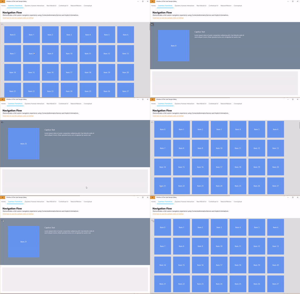
A coordinated animation is a type of animation that appears alongside your connected animation and which works in coordination with your connected animation target. A coordinated animation gives extra visual flair to your page transition.
In the coordinated animation sample above, caption text that is not present in the source page is added to the destination page. The caption text is animated in tandem with the connected animation. We are doing two things here (in designer terms): providing context between the source and the destination using our connected animation while also adding visual interest with a coordinated animation at the destination. In user experience terms, though, all we’re doing is making the app’s transition animations look really cool.
Coordinated animations are fortunately also easy to implement. The TryStart method of the ConnectedAnimation class provides an override that allows you to pop in an array of visual elements you want to animate in a coordinated fashion. Let’s say that your caption text is in a visual element that you’ve named “DescriptionRoot.” You can add this as a coordinated animation by tweaking the previous code like so:
[code lang=”csharp”]
var animation = ConnectedAnimationService.GetForCurrentView().GetAnimation("MyUniqueId");
if (animation != null)
{
animation.TryStart(DestinationImage, new UIElement[] { DescriptionRoot });
};
[/code]
That’s a lot of power packed into a little argument.
Custom animations
By default, the connected animations in the navigation sample move in a straight line from the origin position in the source page to the target position in the destination page. If you select a box in the far-left column, it will move more or less straight up, while if you select a box in the top row, it will more or less move directly left to get to that target position. But what if you could put some English on this?
You can with custom animations, introduced in the Creators Update. The custom animations feature lets you modulate your transitions in four ways:
- Crossfade – Lets you customize how elements crossfade as source element reaches destination
- OffsetX – Lets you customize the X channel of Offset
- OffsetY – Lets you customize the Y channel of Offset
- Scale – Lets you customize scale of the element as it animates
In order to customize a particular part of a connected animation, you will need to create a keyframe animation and add it to your page transition using the SetAnimationComponent call like so:
[code lang=”csharp”]
var animation = ConnectedAnimationService.GetForCurrentView().GetAnimation("MyUniqueId");
var customXAnimation = Window.Compositor.CreateScalarKeyFrameAnimation();
customXAnimation.Duration = ConnectedAnimationService.GetForCurrentView().DefaultDuration;
customXAnimation.InsertExpressionKeyFrame(0.0f, "StartingValue");
customXAnimation.InsertExpressionKeyFrame(0.5f, "FinalValue + 25");
customXAnimation.InsertExpressionKeyFrame(1.0f, "FinalValue");
animation.SetAnimationComponent(ConnectedAnimationComponent.OffsetX, customXAnimation);
[/code]
Note that you use expressions to get the starting and ending values of the connected animation.
Awesome image animations
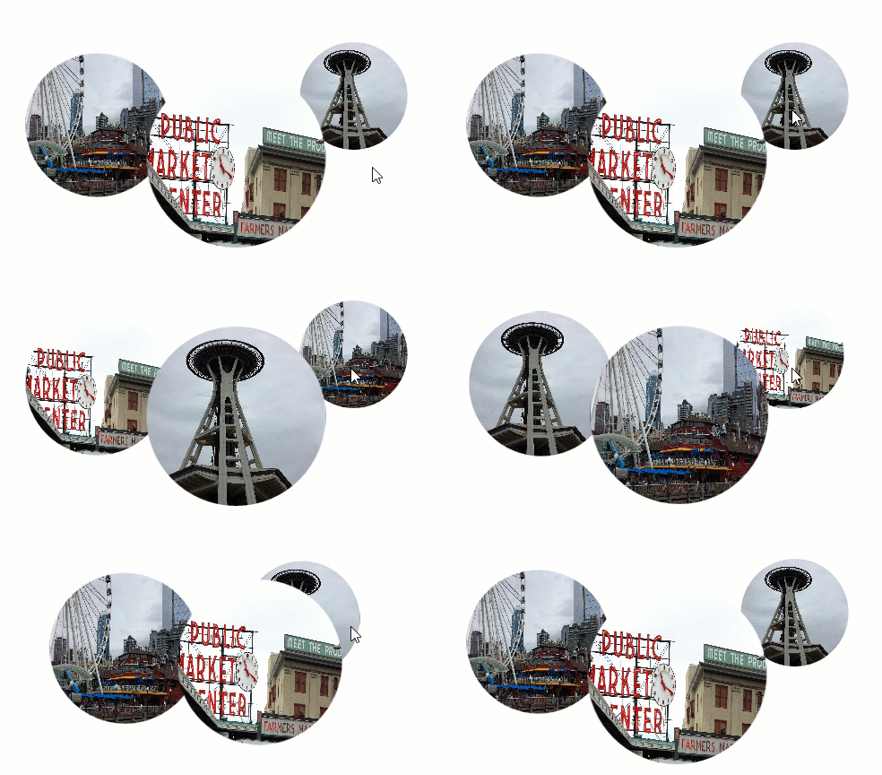
The Creators Update also introduces improved image interpolation for connected animations where the image size and even the relative dimensions are changing between the source and the destination—for instance transitioning from a square to a rectangular image.
This interpolation happens automagically so you have less to worry about.
Implicit animation support for property sets and shadows
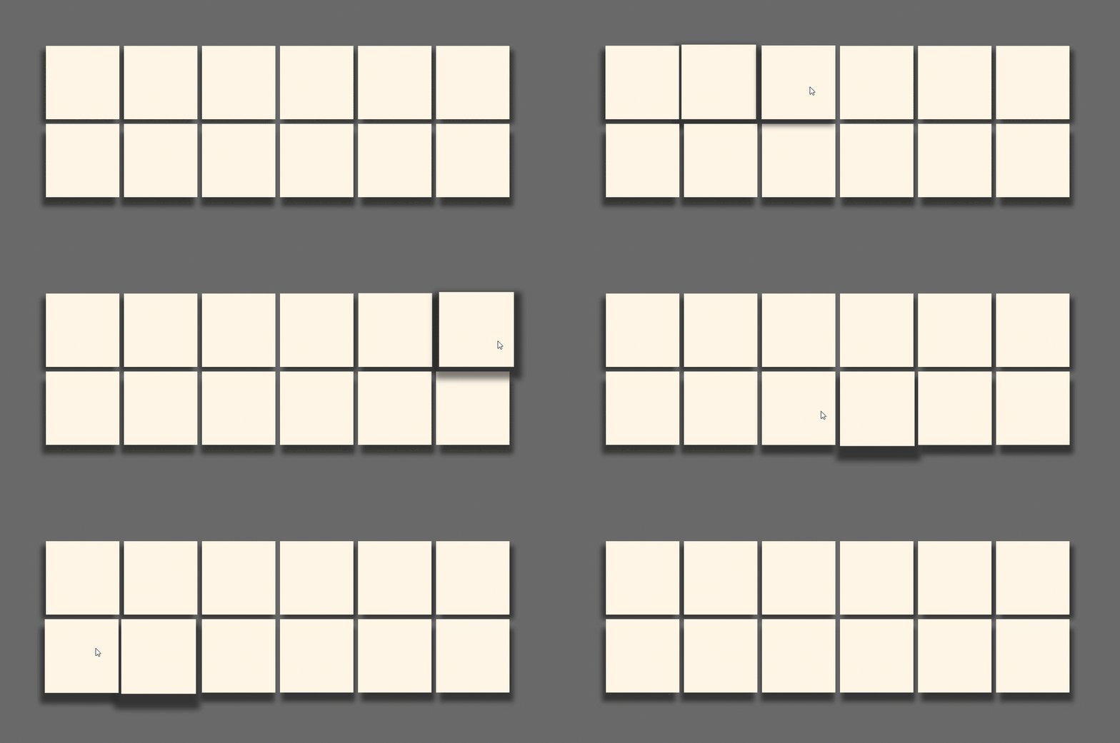
Finally, animation capabilities are also extended in the Creators Update by allowing you to apply implicit animations to property sets and shadows.
This change provides developers with even more creative flexibility and the ability to modify shadows in interesting new ways, as shown in the code sample below.
[code lang=”csharp”]
var shadowBlurAnimation = compositor.CreateScalarKeyFrameAnimation();
shadowBlurAnimation.InsertExpressionKeyFrame(1.0f, "this.FinalValue");
shadowBlurAnimation.Duration = TimeSpan.FromSeconds(1);
shadowBlurAnimation.Target = "BlurRadius";
//Associating animations with triggers
implicitAnimationShadow["BlurRadius"] = shadowBlurAnimation;
implicitAnimationShadow["Opacity"] = shadowOpacityAnimation;
implicitAnimationShadow["Scale"] = shadowScaleAnimation;
implicitAnimationVisual["Translation"] = translationAnimation;
//Applying Implicit Animations to objects
content.Properties.ImplicitAnimations = implicitAnimationVisual;
shadow.DropShadow.ImplicitAnimations = implicitAnimationShadow;
[/code]
Wrapping up
The visual power being made available to developers through the Windows UI platform APIs have basically always been a part of the UI Framework. They just haven’t always been accessible until now. Think of this as a UI nuclear reactor being handed over to you to play with. With this awesome power, however, also comes the responsibility to create sweet UI and beautiful interactions. Go forth and be amazing.
To learn more about the topics covered in this post, you are encouraged to voraciously consume the following articles and videos:


