This update builds on top of the previous version and continues to align the toolkit closer to the Windows 10 Fall Creators Update SDK. Thanks to the continued support and help of the community, all packages have been updated to target the Fall Creators Update, several controls, helpers, and extensions have been added or updated, and the documentation and design time experience have been greatly improved.
Below is a quick list of few of the major updates in this release. Head over to the release notes for a complete overview of what’s new in 2.1.
DockPanel
This release introduces the DockPanel control that provides an easy docking of elements to the left, right, top, bottom or center.
#DockPanel is now part of #UwpToolkit get the pre-release from here https://t.co/ccEz8R6qSa thanks to @metulev & @dotMorten for their review pic.twitter.com/Gfp566kFAE
— Ibraheem Osama (@IbraheemOM) November 2, 2017
HeaderedContentControl and HeaderedItemsControl
There are now two controls, HeaderedContentControl and HeaderedItemsControl that allow content to be easily displayed with a header that can be templated.
[code lang=”xml”]
<controls:HeaderedContentControl Header="Hello header!">
<Grid Background="Gray">
</Grid>
</<controls:HeaderedContentControl>
[/code]
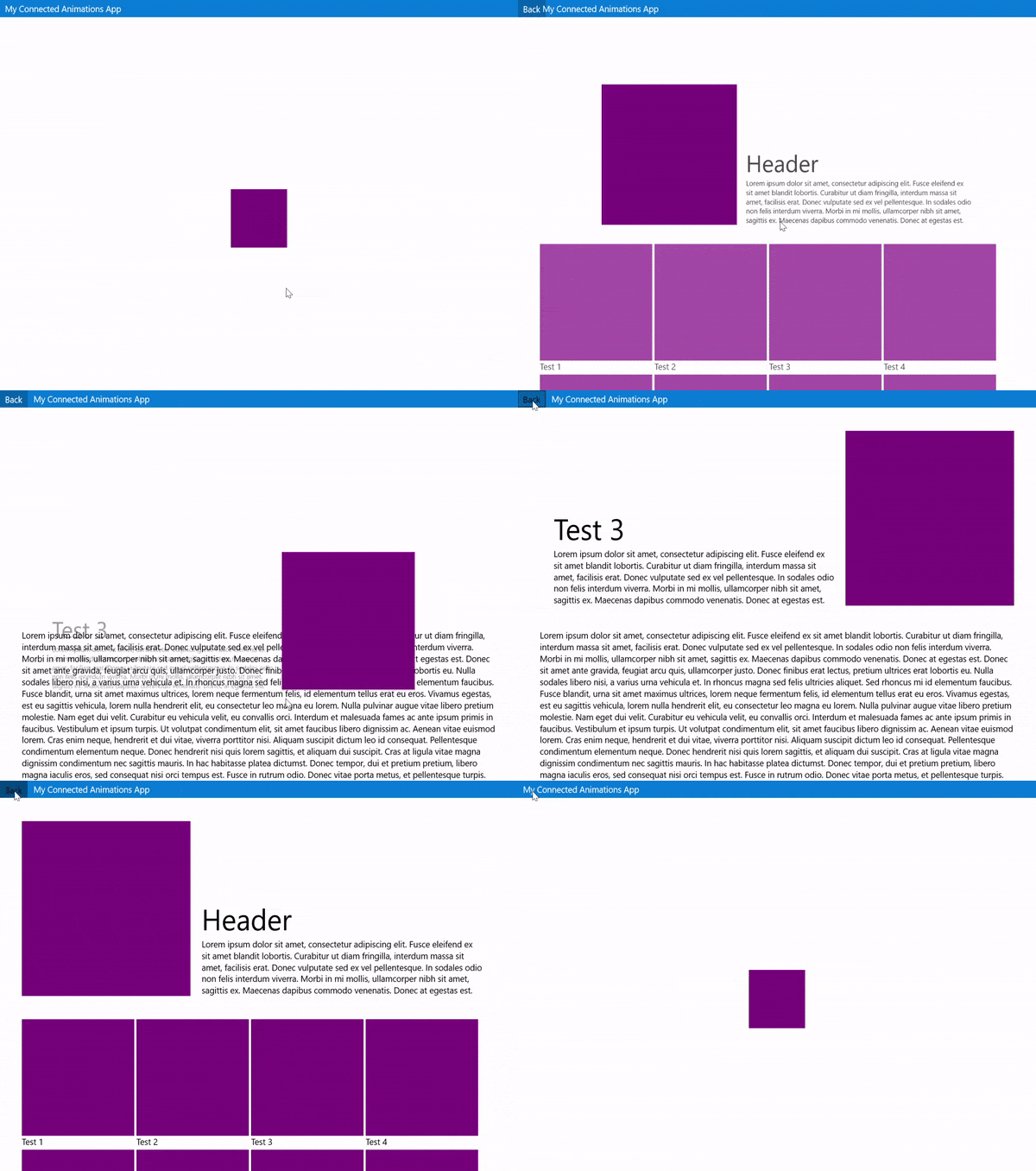
Connected and Implicit Animation in XAML
There are two new sets of XAML attached properties that enable working with composition animations directly in XAML
- Implicit animations (including show and hide) can now be directly added to the elements in XAML
[code lang=”xml”]
<Border extensions:VisualExtensions.NormalizedCenterPoint="0.5">
<animations:Implicit.ShowAnimations>
<animations:TranslationAnimation Duration="0:0:1"
To="0, 100, 0" ></animations:TranslationAnimation>
<animations:OpacityAnimation Duration="0:0:1"
To="1.0"></animations:OpacityAnimation>
</animations:Implicit.ShowAnimations>
</Border>
[/code]
- Connected animations can now be defined directly on the element in XAML by simply adding the same key on elements on different pages
[code lang=”xml”]
<!– Page 1 –>
<Border x:Name="Element" animations:Connected.Key="item"></Border>
<!– Page 2 –>
<Border x:Name="Element" animations:Connected.Key="item"></Border>
[/code]
Improved design time experience
Added designer support for controls, including toolbox integration and improved design time experience by placing properties in the proper category in the properties grid with hover tooltip.
Added @VisualStudio Toolbox integration to #UWPToolkit: https://t.co/SZ6Tf3b0cf #DragNDropLikeItsHot pic.twitter.com/G4s73wXUsi
— .Morten 🪁🗺💻 (@dotMorten) August 31, 2017
New SystemInformation properties
SystemInformation class now includes new properties and methods to make it easier to provide first run (or related) experiences or collect richer analytics.
The #uwptoolkit got some new SystemInformation properties fresh from the oven thanks to @mrlacey. What would you use these for? https://t.co/cFjGWSBxPX pic.twitter.com/Pft6nWbx0M
— Nikola (@metulev) October 13, 2017
Easy transition to new Fall Creators Update controls
To enable a smooth transition from existing toolkit controls to the new Fall Creators Update controls, the HamburgeMenu and SlidableListItem have new properties to use the NavigationView and SwipeControl respectively when running on Fall Creators Update. Take a look at the documentation on how this works.
Documentation
All documentation is now available at Microsoft docs. In addition, there is new API documentation as part of .NET API Browser.
Built by the Community
This update would not have been possible if it wasn’t for the community support and participation. If you are interested in participating in the development, but don’t know how to get started, check out our “help wanted” issues on GitHub.
As a reminder, although most of the development efforts and usage of the UWP Community Toolkit is for Desktop apps, it also works great on Xbox One, Mobile, HoloLens, IoT and Surface Hub devices. You can get started by following this tutorial, or preview the latest features by installing the UWP Community Toolkit Sample App from the Microsoft Store.
To join the conversation on Twitter, use the #uwptoolkit hashtag.

