Everyone needs a new look from time to time. After all, you might not know Stefani Germanotta or Norma Baker, but I bet you know Lady Gaga and Marilyn Monroe. The same holds true for companies fighting for eyeballs in a world saturated with imagery.
For reasons large and small, some of today’s familiar logos started life looking quite different – the original Starbucks logo, for example, was brown and advertised tea and spices. Most, however, have been through a gradual evolution. Coca-Cola remains one of the world’s most recognizable brands and Wal-Mart’s evolving design is as impressive as its global retail reach.
Logo design evolution plays a pivotal role in support of brand strategy, whether it’s signaling a change in direction, supporting a new promise, or merely taking a familiar mark and making it more modern, arresting and relevant. There’s always a balancing act between preserving visual equity and moving the design forward.
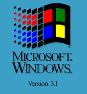
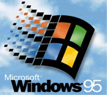
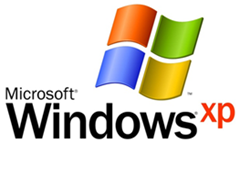
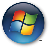
In Windows, we’ve also had our share of new looks. Below, you’ll find what our iconic Windows logo looked like at the time of each major new release:
Windows 3.1
Windows 95
Windows XP
Windows Vista
Windows 7
Round 4 of the Windows Recession Sweepstakes is now open! To win, leave a comment and let us know which logo you like best. You have until 6:00 am PT tomorrow (July 23) to enter.
Remember to follow me, Brandon, Ben and the Windows Blog on Twitter to find out more and hear about future rounds of the sweepstakes.
Full Terms & Conditions of the sweepstakes are here.
Good luck!


