

Building in 10k: Designing for Optimization and Performance
Editor’s note: This is the third in a series of posts from the team that built the 10k Apart contest page, exploring the process of building for interoperability, accessibility, and progressive enhancement in less than 10kB.
In the previous post in this series, I talked a lot about how the 10k Apart contest began to take shape in terms of markup. While I was busy doing that, Stephanie Stimac was tucking into the project form the design end of things.
I’ll step back for a bit and let he talk about her process.
Where do I begin?
As I started poking through the wireframes and information architecture documents for the 10k Apart website, I realized I would have to approach this a little bit differently than other microsites I’ve designed in the past. I knew I needed to keeping the code light and avoid excessive use of unique margins, padding, fonts, and font sizes. I needed to identify the patterns in the wireframes and focus on creating shared properties where possible—font-family, font-size, margin, and padding. Consistency and repetition would be key in keeping the CSS as small as possible.
Incidentally, consistency is a key tenet of design, so we had some solid alignment there.
With this in mind I set about creating three “themes” in Illustrator, following the style tiles approach championed by Samantha Warren. I’ll circle back to the style tiles, but first I want to touch on a few other things that I was thinking about during the design process.
What can I do in terms of typography?
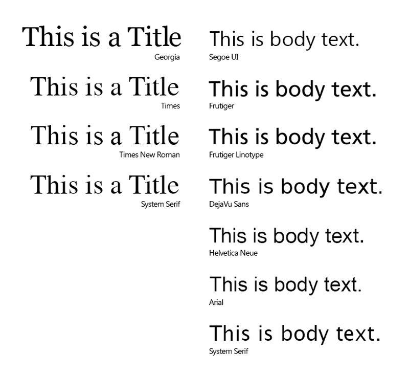
10kB is not a lot to work with when you start to think about fonts. Heck, most fonts clock in at double or triple that weight for a single face! Custom fonts were out the window. Instead, I focused on picking a pair of fonts—serif and sans-serif—that were web safe, were system fonts, or had a similar looking fallback font.
I considered Times New Roman—for a hot second—as the primary header and logotype font, but my personal aesthetic could not allow it. Georgia is thicker and softer around the edges. It sits a little more heavily on the page. But in the event Georgia isn’t available, falling back to Times New Roman wouldn’t be the worst thing in the world. We took it a but further though and came up with a well-supported font stack for all serif text:
[code language=”css”]
font-family: Georgia, Times, “Times New Roman”, serif;
[/code]
For body copy and other content blocks longer than a headline, my original style tiles used Arial. It’s pretty universally supported (and almost equally despised). In the end, though, we realized we could offer something a little better to our readers and built a stack around Segoe UI. We still use Arial in the rather exhaustive fallback list though:
[code language=”css”]font-family: “Segoe UI”, Frutiger, “Frutiger Linotype”,
“Dejavu Sans”, “Helvetica Neue”, Arial,
sans-serif;
[/code]
If you’re looking to use default fonts like this, CSS Font Stack is an incredibly useful resource. It contains information about availability on both Windows and Mac and offers suggestions for alternatives as well as font size recommendations.
Can I compress colors?
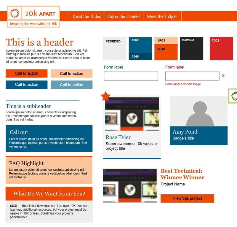
Color was a little bit trickier to work with. The color scheme is limited to three main colors with either a shade or a tint of one of those as an alternative for hover events, so you know when you’ve hovered or clicked on an item. I chose a limited palette, again, in order to reduce the amount of code it would require to build.
Once I picked my colors, I took things a bit further—some might say too far ;-)—and tuned them to create hex codes that were either alternating characters (e.g., #232323) or that used only a three-character hex code (e.g., #ccc).
The light and dark greys were not a problem; they were easy to pick with alternating characters. The initial blue and orange swatches took more time to match up with a three-digit hex code. When I converted the six-digit code to a three-digit code, the color difference was sometimes staggering. So I went through and tweaked a few of my initial colors in order to get as close as possible to the ones I wanted.
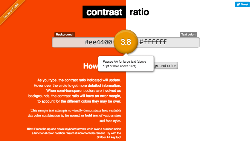
Of course, through all of this I was checking my color contrast to ensure the design would not cause accessibility issues. This led to further color adjustments along the way. Our goal in terms of color contrast was WCAG Level AA and we were able to achieve that. Of course it helped that we used rather large fonts across the board—a font size equivalent of 20px was our baseline.
How many themes should I create?
Even with all of these constraints, I had a bunch of ideas for how the site could look. I ended up sharing three approaches with the team, using style tiles to convey how each would apply to the various patterns and components throughout the site. They all shared many characteristics, but with varying color palettes, different header designs, and slightly different typography (Georgia rather than Times New Roman, for instance). As I was very confident in the overall design of patterns like projects, forms, and such, color was the primary differentiator across the three themes.
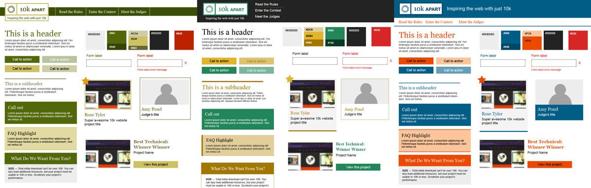
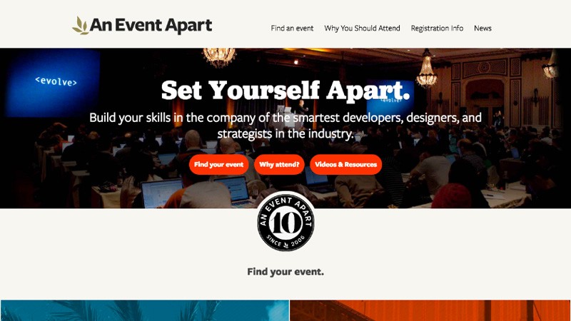
The green monochromatic style was developed after looking at An Event Apart and the original 10k Apart website from 2010. The colors were mostly muted with the exception of the buttons, which were red to draw your eye. Ultimately this direction didn’t provide enough contrast between elements with the monochromatic scheme.
Using that as a baseline, I created an alternate approach with a more serious, rigid tone. This option provided more contrast between the green and gold. I brightened up the green because the muted green did not offer enough contrast with the gold. I also introduced a dark grey to help punch up the contrast between elements.
The third theme ditched the green completely. I have a hard time using green and red together without a design screaming Happy Holidays! and I also wanted this third approach to have a completely different tone than the other two. In the end, I opted for a palette based on orange and a blue. The inspiration for this palette came from the call-to-action buttons on An Event Apart’s website, which are a bright, vivid orange.
I toned the orange down just a little bit and paired it with a blue that wasn’t too heavily saturated in order to balance the orange. The tone of the design changed completely—the orange immediately gave the design more energy. It made the whole design feel more creative and inviting. Ultimately, I think that’s why it was the direction we decided we should go.
We did end up using the header style from the monochromatic design in the end. Normally I don’t like to mix ideas from different designs, but without that big block of color at the top, the whole design felt lighter. It didn’t feel like a compromise… it just worked.
I’m normally a full page mock-up kind of designer, but I found that the style tiles worked really well. Perhaps it was because this was such a small site with only a handful of patterns, but they helped speed the visual design process along. And I was happy to see how well they translated into the final, realized design in code—after all, that’s where it really matters.
What about that hero illustration?
With the basic design handled (and Aaron busily implementing it), I turned my attention to the homepage hero. I knew I wanted the illustration to be a metaphor for the 10k Apart site and for the entries that would eventually be submitted to it. I also liked the old-time contraption design used in the 2010 edition of the contest.
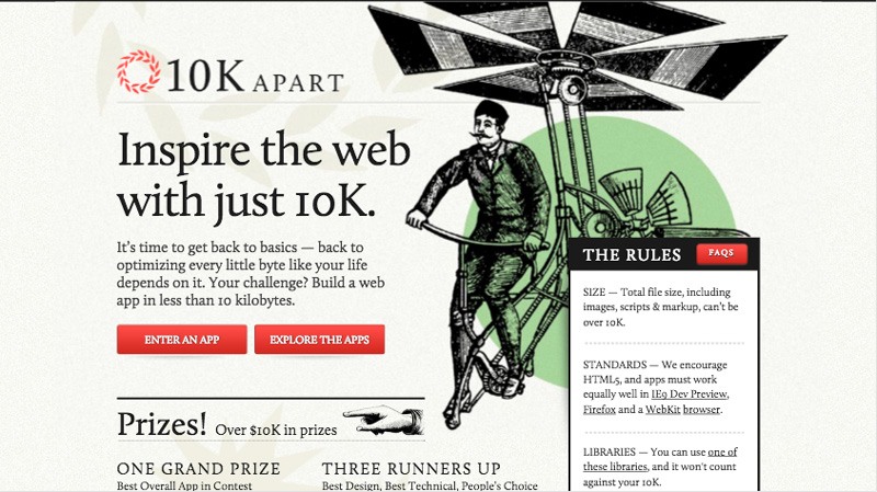
After seeing her amazing talk on SVG animations at SmashingConf, we approached Sarah Drasner about getting involved with the illustration. After all, what could be cooler (or smaller) than an animated hero shot in SVG? She was enthusiastic about the contest, and the challenge of building something both really cool and really small, so we set to work.
After a brief chat, we were all loving the idea of something antique and interactive. And so Sarah went away for a few days and came back with an early version of the hero you see today. She even figured out how to get the size of the SVG under 10kB while still keeping it interactive and highly detailed. (Aaron will discuss how it’s lazy-loaded in a future post.)
Sarah nailed the concept of a vintage contraption that required a lot of machinations to pop out something simple. And that’s really what this process and this contest is all about: working hard, iterating and re-iterating until we come up with something small, simple, and amazing!
What did we learn?
Stephanie’s walkthrough covered a lot of territory, so here’s a little summary of the takeaways:
- Consistency matters — not only are consistent designs more usable and cohesive, they’re also smaller;
- Fonts can be a bandwidth hog — even single typefaces can be quite large, consider using web safe or standard system fonts;
- “Web Safe” doesn’t have to be boring — just because you’re using a web safe font stack doesn’t mean you can’t get creative, you can even take things further by exploring larger font stacks with options that cater to the different platforms;
- Colors can compress — repetitive hex values and hexidecimal shorthand can help make your CSS smaller;
- Contrast is key — design is not painting a pretty picture, people need to use your work so make sure they can read it;
- Design systems, not pages — style tiles are a great tool for exploring design themes and get you to think in terms of a design system rather than a collection of pages; and
- SVG is amazing — it’s incredible how much you can do with SVg illustrations: they’re small, they scale, and they can even be animated.
Where to next?
With a beautiful and highly usable design direction in place, it’s time to write some CSS. Stay tuned!