

Moving from classic ‘Flat Design’ to Fluent Design requires the visual and performance capabilities that the Composition APIs offers along with the interop features that let you draw on this power from your XAML layer. In case you are not yet familiar with the concepts behind the Composition APIs, here’s a quick refresher on what the Composition APIs are all about.

The Windows.UI.Composition namespace allows Universal Windows Platform (UWP) developers to use a new Visual Layer that will get them closer to the metal, graphically speaking, while still using familiar technologies like XAML and C#. By getting closer to the metal, actually down to the system compositor level, developers are able to get great visual performance and custom UI experiences. By working through the XAML layer, developers get the ease of use they have come to expect out of UWP. This is basically a best of both worlds scenario that puts great responsibility in the developer’s hands. And with great responsibility, as we all know, comes great power.
So why do you need all these graphical and UX superpowers? In addition to giving pizazz to your UWP apps, access to the system compositor level also helps your users to accomplish their tasks faster and more fluidly. For instance, when you use Composition effects to blur a background in response to a click, you are focusing the user’s attention on her current task and removing distractions. This is the sort of subtle UI implementation that actually makes your user’s life easier – and it works best when your user doesn’t even know that you did anything for them. They are just left with the impression that your app is easy to use and feels fast, even if they can’t exactly put their finger on the reason.
The Visual family
To better understand the basic principles of Windows.UI.Composition, it’s important that we also introduce you to the visual family. In order to get fast and fluid effects, you need direct access to something called the system compositor (sometimes also referred to as the DWM). The system compositor is agnostic to the UI thread and doesn’t really care about being on the UI thread or blocking threads. Things happen very quickly at the system compositor level, where everything that is about to be sent to the display screen gets put together. This is also where you get to add additional effects if you want to just before shipping all your visuals to the display.
The visual family lives down at that compositor level where things happen rapidly. The visual family is made up of Visuals, ContainerVisuals and SpriteVisuals. The SpriteVisual class inherits from container visual, and the ContainerVisual class inherits from the base Visual class. There is also a Compositor class which acts as the senior member of the visual family. It quite literally creates visual objects if you need them and also manages the relationship between an application and the system compositor process.
The visual family is a lot of fun. Let’s say your XAML, many levels above, has a Grid object. That Grid will have a member of the visual family assigned to it. In technical parlance, we say that the Grid is backed by a visual. Once you grab hold of this backing visual, you can start to animate it using the composition animation system. If it is a ContainerVisual, then you can add additional visuals to it. Finally, you can also create sprite visuals, using the compositor factory class, in order to add brush effects to your visual using the Windows.UI.Composition effects system.
What’s new for sweet UI in the Windows 10 Creators Update
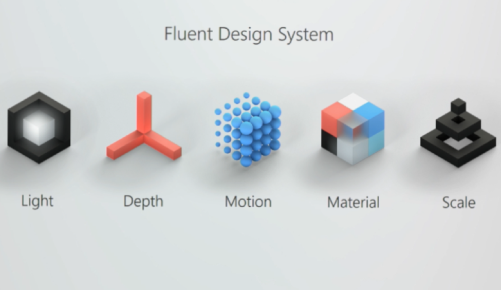
Several highly requested UI.Composition features have been added in the Creators Update to support fast and fluid UI as well as the Fluent Design System, for instance:
- SVG support
- Normal and Virtual Surfaces
- Hover Interactions
- Implicit Show and Hide
- Expression Helpers
- Offset stomping fix
At first these can seem like small disconnected improvements. Brought together, however, they will make creating beautiful UI both faster and easier.
XAML support for static SVG files
Vector images are often better for icons and logos because they can be resized without losing image quality. Before the Windows 10 Creators Update, however, vector graphics were not supported in XAML and working with iconography in UWP typically involved multiple versions of every image to adapt for multiple DPIs. Now that that problem is solved, not only does XAML support static SVG files, but they also work with the Composition APIs.
Normal and virtual surfaces
The CompositionDrawingSurface has been a core component of the Composition APIs since the beginning, facilitating interop between XAML and Direct2D or Direct3D. The Creators Update is introducing the CompositionVirtualDrawingSurface for situations where only a portion of the content needs to be shown to the user at any given time. It basically bridges the concepts of graphics culling in video games and the development of infinite lists in desktop enterprise apps.
Independent hover interactions off the UI thread
One of the most powerful things about the Composition APIs is that they allow effects and animations to run independently of your main UI thread at 60 frames per second. With the Creators Update, this feature will also apply to hover animations in order to light up the many pointer activated effects that are a major part of fluent design.

There is also a subtle computer etiquette benefit to this new feature. Have you ever watched a busy animation play while your app’s UI was hanging and tried to move your mouse around in circles to try to make the animation go faster, but it has no effect? That is now a thing of the past.
Implicit show and hide
If you look at the code behind any UWP app, you will likely find that a large portion of UI code is devoted to setting visibility properties on UIElements in order to alternatively hide and show content. With this understanding, the Composition APIs now allow you to associate animations with your visual elements that are implicitly triggered when you hide or show them.
[code lang=”csharp”]
ElementCompositionPreview.SetImplicitShowAnimation(MainContent, mainContentShowAnimations);
ElementCompositionPreview.SetImplicitHideAnimation(MainContent, mainContentExitAnimation);
[/code]
Implicit hide and show animations allow you to continue using this basic UI metaphor while also making it easier to create elegant visuals around them.
Expression helpers
Expression animations provide a way to create mathematical relationships between composition objects that can then be used to drive animations. The results of applying expression animations can often be breathtaking.
One piece of feedback we received about how we implemented expression animations is that it depends heavily on long strings of text like the following:
[code lang=”csharp”]
rotationAnimation.Expression = "ACos( ( (A.Offset.X * B.Offset.X) + (A.Offset.Y*B.Offset.Y) + (A.Offset.Z * B.Offset.Z) ) / ( Length(A.Offset) * Length(B.Offset) ) )";
lineVisual.StartAnimation("RotationAngle", rotationAnimation);
[/code]
The phrase “magic number” may even have been raised with respect to this. Just in time for the Creators Update, the Expression Builder Library is being introduced to provide you with type safety, IntelliSense and autocompletion as you create your own amazing expression animations.
Translation property
In earlier versions of the Composition APIs, there was a complication in the way UIElement properties were shared between the XAML layer and the Visual Layer that could cause the actual position of the visual to be overwritten or “stomped” in response to layout changes. While there was a workaround previously, there is now an actual fix with the new translation property. To prevent offset stomping, you now just need to enable the new Translation property through the ElementCompositionPreview class.
[code lang=”csharp”]
ElementCompositionPreview.SetIsTranslationEnabled(Rectangle1, true);
[/code]
This is one of those issues that, if you’ve run into it before, you will feel a slight sense of relief. Just add a mental bookmark for yourself about the Translation property until you need to use it.
The sample gallery
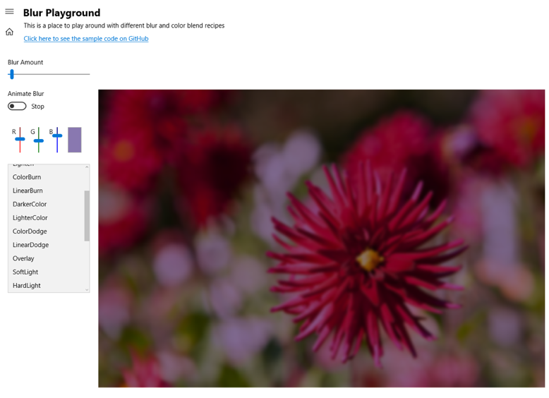
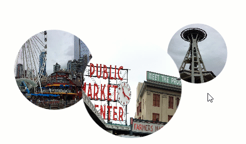
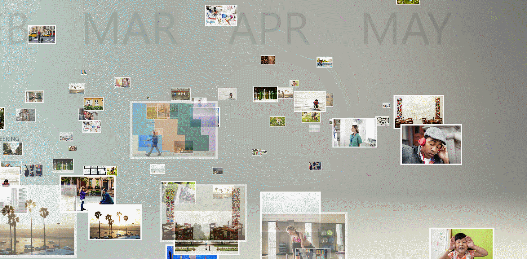
The best way to deep dive into Windows.UI.Composition is by pulling down the sample code that the Composition team created and published to Github. The Windows UI Dev Labs samples, as they’re called, are extensive and visually rich. The samples extend from simple photo effects to complex parallax animations on XAML controls.
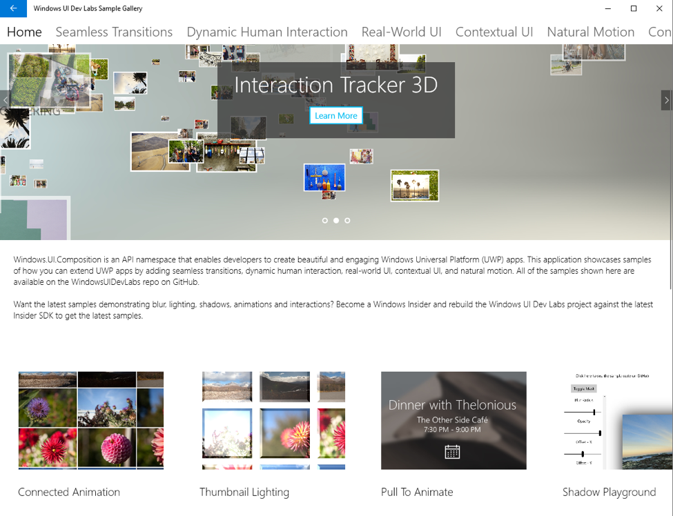
Don’t hesitate. It’s hard to really grasp the magnitude of the visual capabilities you are getting with Windows.UI.Composition until you see for yourself all that it empowers you to do.
Wrapping up
In addition to diving into the sample gallery on Github, which is highly recommended, you can also learn more about Windows Composition through the following articles, videos and blog posts.
- UI.Composition Overview on MSDN
- Creating Fluid and Beautiful UI Using the New Visual Layer
- Bring fluid, responsive, and highly scalable UI Experiences to your Universal Windows Apps with the new Visual Layer
- What’s new and coming for Windows UI: xaml and composition
- Explore the next generation of innovative UI in the Visual Layer
- Rob Mikhayelyan’s Windows Composition Blog
- Mike Taulty’s Windows Composition Blog posts