

Building a more accessible user experience with HTML5 and UIA
Recently, we introduced Microsoft Edge’s new accessibility architecture, which inherently supports modern web standards, and provides a foundation to make the web platform more accessible than ever. To build a comprehensive ecosystem across all products and users of every ability, assistive technologies build end user experiences on top of accessibility frameworks. In Edge, accessibility information is exposed through the UI Automation (UIA) framework. HTML, CSS, and ARIA markup is translated to UIA objects that assistive technologies use to provide a tailored experience.
In this post, we’ll walk through some concrete examples of how our new architecture improves the end user’s experience, and specifically how markup defines the experience of navigating with assistive technologies like screen readers. Our examples focus on Narrator, but any screen reader using UIA will be able to take advantage of these improvements.
Measuring success with HTML5Accessibility
As part of our ongoing work to advance Edge’s accessibility, we want to make sure developers and users can easily get accurate information on platform accessibility across browsers, making it easier to build more accessible sites and make informed decisions when using accessibility features. For example, we are working closely with HTML5Accessibility’s maintainer, Steve Faulkner of the Paciello Group, to update the site and refresh its design.
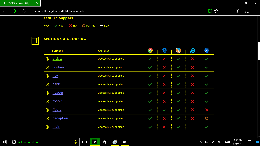
HTML5Accessibility is a popular resource for this information that summarizes and rates major browsers’ HTML5 platform accessibility. Some of the success criteria include mappings to the accessibility API, keyboard accessibility, and the accessibility of error states. The upcoming refresh (which you can preview today on GitHub) includes changes to clarify pass criteria, add additional tests, and even give the site a fresh and modern makeover.
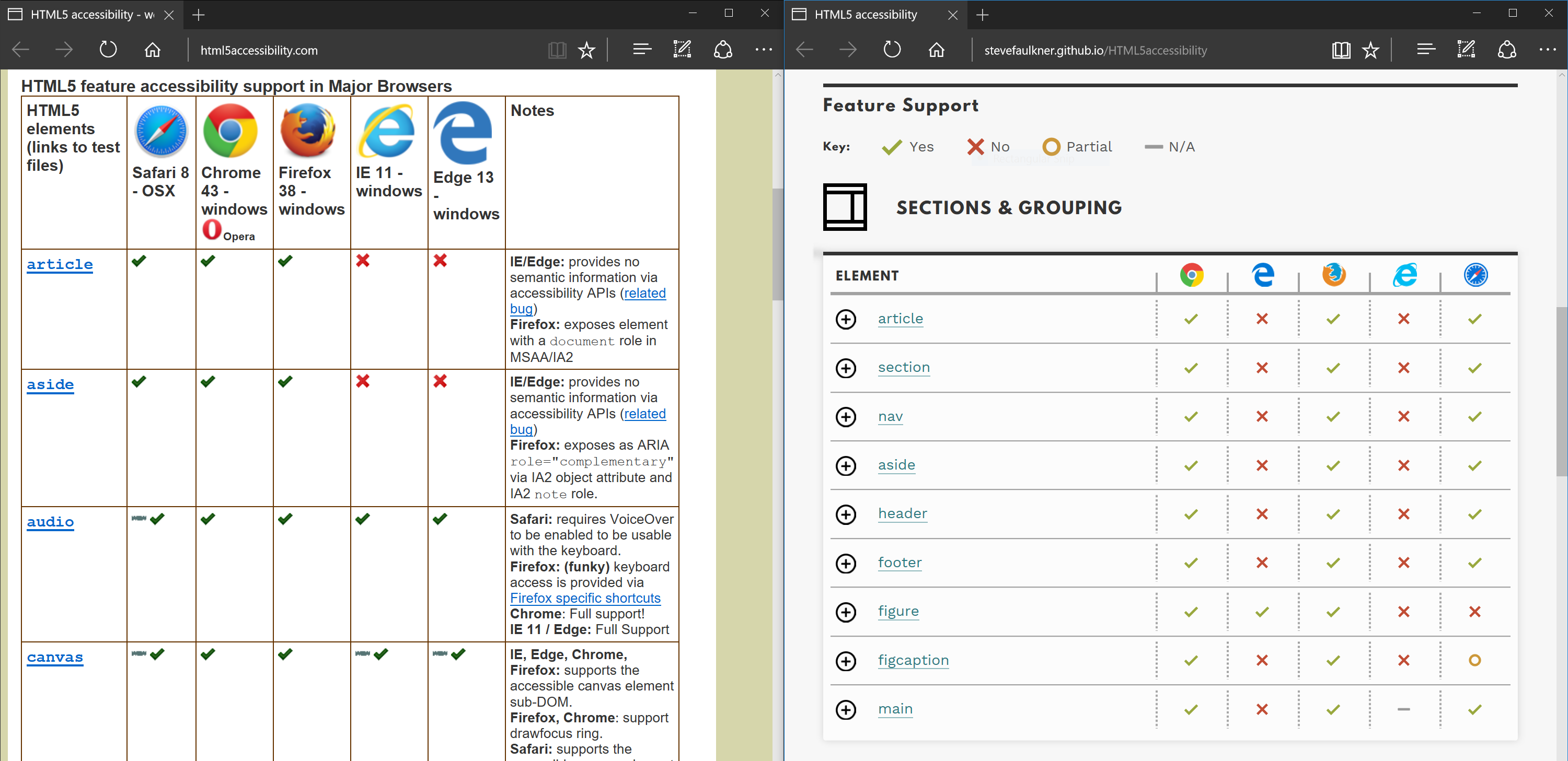
Many of the accessibility APIs discussed in this post are tracked on HTML5Accessibility, or were leveraged to build the site’s upcoming redesign. Each element or attribute has its own test page, so you can use Narrator to try out the user experience and open Inspect or F12 to see how they are mapped to UIA.
Note that HTML5Accessibility currently tracks the status of shipping versions of the listed browsers, and has not yet been updated with the new test criteria. With the work landing in EdgeHTML 14, we look forward to a much-improved score for Edge soon! We’ll share more when those updates are available.
Improving user experience with HTML5 semantic elements
HTML5 includes a number of new semantic elements and controls. A key benefit of these is improved accessibility. Traditionally, a header on a web page may have been marked up in the following way (see a live example on JSFiddle)
| <div class="header"> | |
| <h1>A wonderful web site</h1> | |
| <ul class="navigation"> | |
| <li>Some page</li> | |
| <li>Another page</li> | |
| </ul> | |
| </div> |
Even though this example uses “semantic” rather than presentational class names, neither the browser nor assistive technology (e.g. a screen reader) can infer any meaning beyond what is exposed by the HTML: a h1 heading and an unordered list.
Using HTML5, the page could instead be marked up as follows (see a live example on JSFiddle):
| <header> | |
| <h1>A wonderful web site</h1> | |
| <nav> | |
| <ul> | |
| <li>Some page</li> | |
| <li>Another page</li> | |
| </ul> | |
| </nav> | |
| </header> |
Now, instead of the semantically neutral div, we use a header element, and have wrapped the ul in a nav element. This is significant because screen readers interact with the browser via the accessibility tree, which is expressed in UIA or in equivalent APIs in other browsers. Starting in EdgeHTML 14, we’ve mapped these HTML5 elements to the corresponding UIA objects. We’ve also done the same for the ARIA landmark roles. In the example above, if we used ARIA instead we would have added role=”banner” to the div, and wrapped the ul in a div with role="navigation" (as those are the ARIA roles that map to the native HTML5 elements).
Let’s walk through a couple of scenarios highlighting user experience benefits.
Landmark navigation
Screen readers use landmark navigation to enable users to quickly navigate to important page locations, similar to how a visual reader uses the visible structure of a page to understand its structure. Screen readers take semantic cues, added by the author via HTML and/or ARIA, and expose them to the user in landmark navigation mode. Unless overridden by ARIA, the header, footer, nav, aside, main, and section elements in HTML5 are used as landmarks.
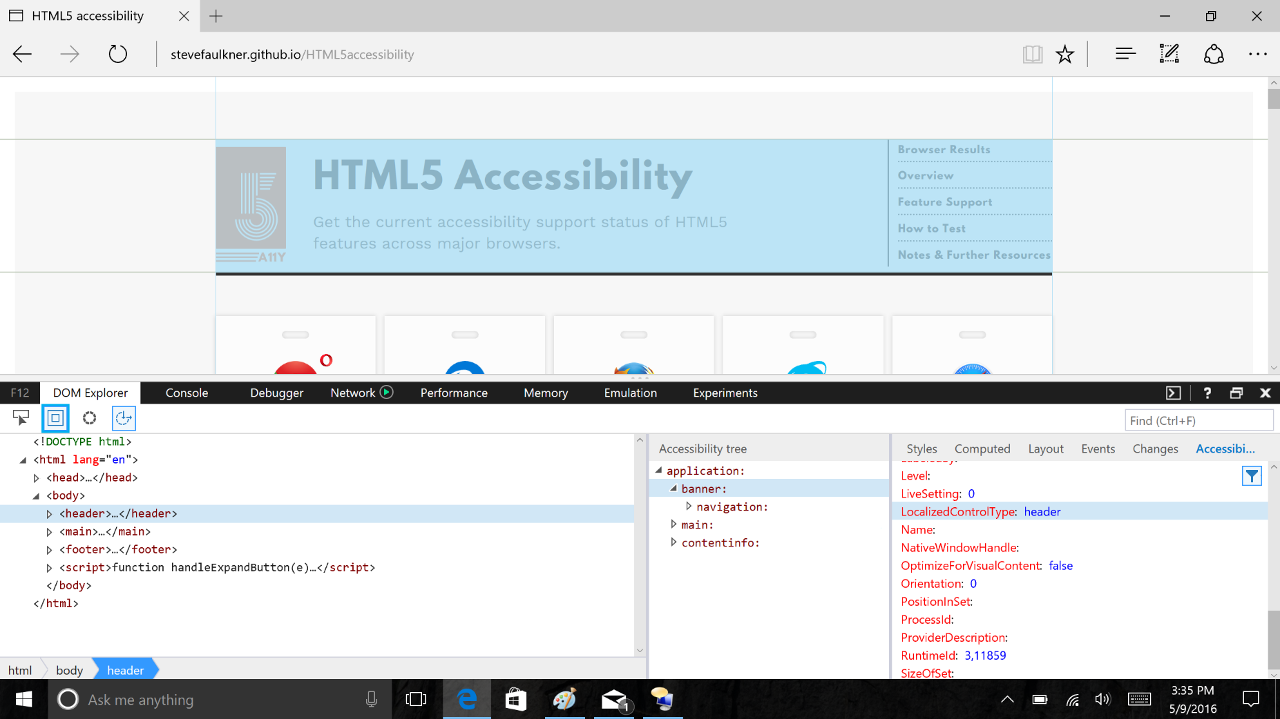
In Narrator (enabled with the Windows Key + Enter shortcut), the user switches to Landmarks mode by pressing Caps Lock and the up (or down) arrow until “landmarks” is read out. With touch, they can swipe up or down on the screen. Once in this mode, pressing Caps Lock and left or right (swipe left or right in touch) will cycle through the landmarks on the page. To hear this in action, try HTML5Accessibility.com with Narrator enabled.
Using F12’s new Accessibility Tree view (found in the DOM Explorer tab), you can inspect how HTML markup maps to UIA objects. The Accessibility panel shows all the properties for the current node. Landmarks are exposed with ControlType, LocalizedControlType and LandmarkType.
Jump to main content
One of the most common landmarks a user wants to access quickly is the main content of the page. This is covered by WCAG 2.0 Guideline 2.4.1: bypass blocks. Traditionally, this scenario has been achieved by implementing a visually hidden “skip to content” link.
The main element (or role="main" in ARIA) covers this scenario without the page author needing to add any custom styling or script. It’s included in the landmarks mode, but as it’s such a common use case, it also gets its own keyboard shortcut in Narrator: Caps-Lock + N.
Accessible form controls
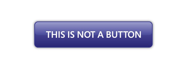
Form controls are some of the most complex HTML elements to make accessible. One common pattern is a div or span styled to look like a button, which is not actually a button. Even with the complexities of transforming a div into something exposed as a button to the accessibility tree, it’s easy to see how much more complex it is for compound controls such as combo boxes and date pickers.
With EdgeHTML 14, we’ve upgraded all our built-in HTML5 controls to map them to the correct UIA objects, match the accessible name and description specification, and expose any error messages to assistive technology.
To show what this means, let’s look at another common pattern: an input control with a label and placeholder. In this example, the control is a URL field (see the demo on JSFiddle):
| <form> | |
| <label for="url">Your Domain:</label> | |
| <input type="url" id="url" placeholder="Enter URL including HTTP://" /> | |
| </form> |
As we’ve mapped the new form controls to UIA, the URL input control is given a localized control type of “url.” Compatible screen readers will read this out so that the user knows that they’re expected to provide a URL.
Accessible labels and descriptions
Associating a label with a form control gives this control the accessible name, which is read out by a screen reader when the input is focused. W3C has created a comprehensive algorithm that defines how the name is calculated, but usually it is provided with a label for form controls, the element’s subtree for anchors and buttons, and the alt attribute for images. The name can be overridden by either providing an aria-label or aria-labelledby attribute. A good example is <nav aria-label="site">, which will read out that it is the site navigation, as opposed to say the in-page navigation.
Along with the name, you can provide an accessible description. This is used to describe the element in more detail or to give help text. In Narrator, pressing Caps-Lock + F reads out the description for the currently focused element. In our URL example, the placeholder attribute provides the accessible description. Beyond placeholders for form controls, the title attribute (if not used for the name) is one of the most commonly used attributes for the description. Alternatively, you can specify the exact description with aria-describedby. As with aria-labelledby, this points to another element on the page by its ID (see the live demo on JSFiddle):
| <form> | |
| <label for="url">Link to avatar:</label> | |
| <input type="url" id="url" aria-describedby="url-desc" required /> | |
| <p id="url-desc">Include the protocol (http:// or https://) with the URL. The image format must be either PNG, JPEG, or SVG. Maximum dimensions are 800×800 pixels.</p> | |
| </form> |
You can use F12 Accessibility panel to check Name and FullDescription property for accessible objects.
Exposing validation errors to the user
One of the great things about the new HTML5 controls is they provide free error handling when the input doesn’t match the required format. This pops up an alert similar to a tooltip in Edge. With our latest accessibility updates, these error messages are exposed so that the screen reader can alert the user and read out the message. Try typing something that isn’t a URL, or submitting the form without any value to trigger this behavior in the previous demo.
More complex controls
An example of a slightly more complex control is if turn our URL input into a combo box by adding a datalist element (see the demo on JSFiddle):
| <form> | |
| <label for="url">Enter URL:</label> | |
| <input type="url" id="url" list="urllist" placeholder="Enter URL including HTTP://" /> | |
| <datalist id="urllist"> | |
| <option value="http://www.bing.com/" label="Bing"></option> | |
| <option value="http://dev.microsoftedge.com/" label="Microsoft Edge Developer"></option> | |
| </datalist> | |
| </form> |
As the user needs to be able to both select an option from the list and type in the field, the input is mapped to the Combobox UIA object. As with the other control types, this will be read out by the screen reader so it’s clear what functionality is expected. There is also a relationship set up with the datalist to indicate that it is controlled by the input.
With all of this in place, the screen reader will be able to read out the suggestions in the datalist, and the user is able to navigate the list with the arrow keys.
Improving page readability with high contrast
Edge fully supports Windows high contrast themes, when enabled in the Ease of Access settings. High contrast mode adjusts Windows theme colors to guarantee certain contrast values and readability. This is an automated process, so it’s not always the best thing for every page. Often important information—such as icons, or images on a photo sharing site—are added via CSS background images. Previously, these would be stripped out, decreasing the usability of the page.
In EdgeHTML 14, we’re adjusting high contrast mode to preserve background images while rendering an opaque layer behind the line-box for all text. This preserves readability while maintaining the context of the page and pertinent information that may be contained in the background images.
Control over high contrast adjustments
Even with these improvements, you might want to tailor the experience even more. For this purpose you can use –ms-high-contrast-adjust property and -ms-high-contrast media feature.
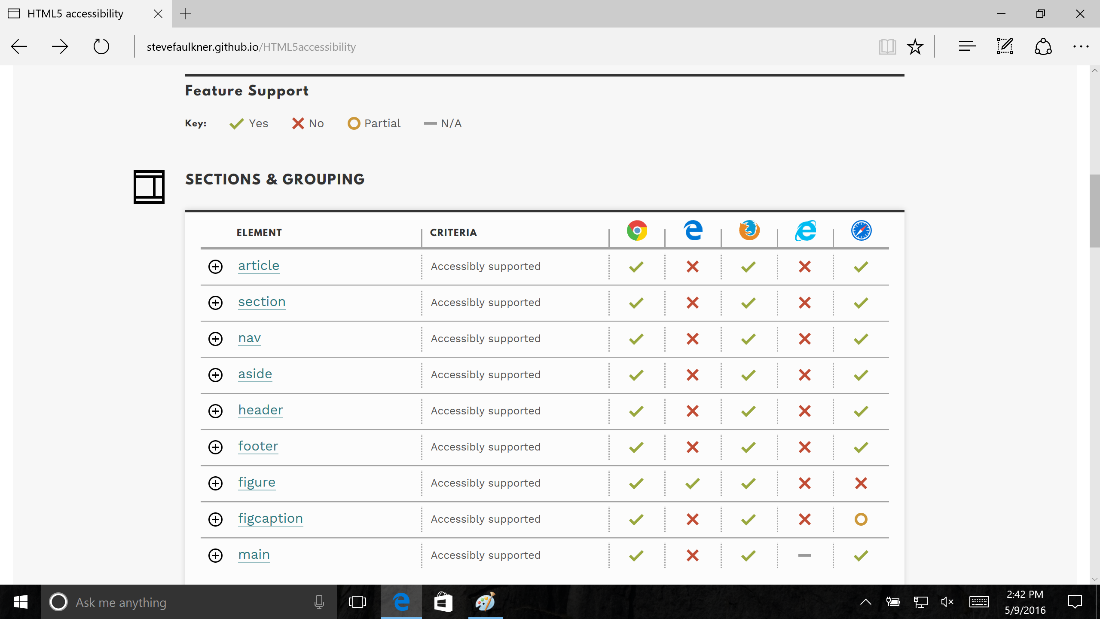
The -ms-high-contrast-adjust property with a “none” value stops any automatic adjustments from being applied to the desired elements. This is can be used to directly control when high contrast adjustments are applied, for instance if too much styling is being stripped away in the background of a bar graph or the selected state of a tab. This will also prevent the high contrast opaque layer from being applied behind text in instances where that might not be desirable. On HTML5Accessibility.com, we used –ms-high-contrast-adjust to control text presentation over the icons.
The -ms-high-contrast media feature can be used like any other media query, and applies when High Contrast mode is enabled.
This option is useful to provide a tailored experience in high contrast, such as replacing icon images with higher contrast versions. You can also remove additional styling that is purely decorative and doesn’t make sense in high contrast mode, especially now that background images are retained—removing background images that apply a textures or pattern, for instance. On HTML5Accesibility we removed the padding around tables and the border around the entire page.
Another use for this is to adjust colors when -ms-high-contrast-adjust: none is also applied. On HTML5Accessibility there are two places where color adds an additional–but not sole–hint to the meaning. One example is that the supported icon is a green tick, and unsupported is a red X. The original colors, while passing color contrast guidance in the default color scheme, needed a tweak to meet WCAG AA on both a black and a white background.
Looking ahead
These accessibility improvements are in active development. You can preview many of the above features in the latest Windows Insider Preview builds, and we are continuing to refine the implementation and fix bugs in the coming weeks. These features will be released to all Windows 10 customers with EdgeHTML 14 in the Windows 10 Anniversary Update this summer.
In an upcoming post, we’ll talk more about enabling accessibility testing with Web Driver.
As always, we look forward to your feedback!
– David Storey, Senior Program Manager, Microsoft Edge
– Cynthia Shelly, Senior Program Manager, Microsoft Edge
[ed. note – amended to normalize en-gb and en-us spellings.]