

Styling for Windows high contrast with new standards for forced colors
As Microsoft Edge prepared to re-platform on top of Chromium open source, we recognized our responsibility to continue supporting those who depend on Windows high contrast for web content. We also recognized a fantastic opportunity—it was time to finally standardize high contrast styling features.
CSS features for Windows high contrast have been available in Microsoft browsers for quite some time, but were -ms-prefixed and unsupported in other browsers. Thanks to collaboration with our partners in the CSS Working Group and the Chromium project, web developers can now use new web standards to style their content for forced color modes like Windows high contrast.
Microsoft Edge shipped these standards from our first Stable release in version 79. Now that a few final discussions in the CSS Working Group are reaching their resolution, and other browsers prepare to ship support, we’d like to share how you can use the new standards—and what differences you can expect from legacy implementations.
But first, what is high contrast?
Windows High Contrast
High contrast on Windows is an accessibility feature designed to increase text legibility and improve readability. The feature works by enabling the user to select theme colors for a scoped number of semantic elements. This scheme can then be applied to user interfaces and app content, reducing visual complexity while guaranteeing the user’s preferred contrast level. The name “high contrast” is actually a misnomer—users can set their theme colors to whatever they prefer, including themes that result in lower than common contrast levels.
There are many reasons why a particular individual might enable high contrast on Windows: to better see elements on the screen; to reduce visual noise so they can focus better; to ease eye strain, migraines, or light sensitivity; or simply because they prefer a very particular color scheme.
Whatever the reason, applications can integrate with the user’s system colors and apply the user theme to their UI. For example, browsers can apply high contrast theme colors semantically to HTML elements and adjust certain CSS properties to reduce visual noise. Web developers can then style on top of these defaults as needed using the new standards for forced colors.
New standards for forced colors
There are three key features authors can use to leverage the new standards for forced colors:
- The
forced-colorsmedia query, for detecting an active forced color mode. At time of writing, this is essentially a match for the high contrast feature on Windows, but there could potentially be other similar forced color modes in other operating systems in the future. - The
forced-color-adjustproperty, which controls whether user agent system theme colors overrides should be applied to an element and its descendants. - System color keywords, for applying colors in the user’s color scheme.
Modern implementations will also match prefers-color-scheme and prefers-contrast media queries based on the background color (light or dark) and contrast level of the user’s forced color scheme.
We expect that most web developers would need to write very few CSS rules for forced color modes, as the web platform does the heavy lifting on text legibility and applies user colors to semantic HTML out-of-the-box. Typically, any styles that web developers write for forced color modes will be web-application-specific tweaks.
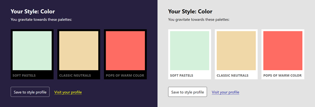
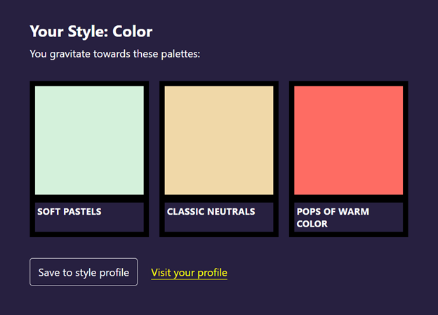
To take an example, let’s suppose that we are building out a website for a service that sends you clothing tailored to your individual preferences. We’re styling the following widget, which gives the user some suggested color palettes:
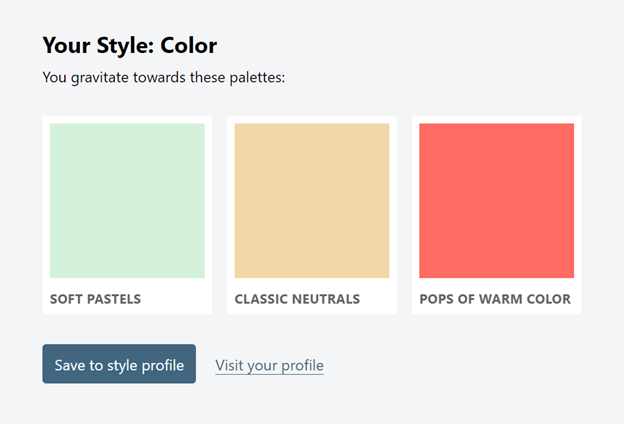
If we enable the high contrast feature (with a custom purple background)…
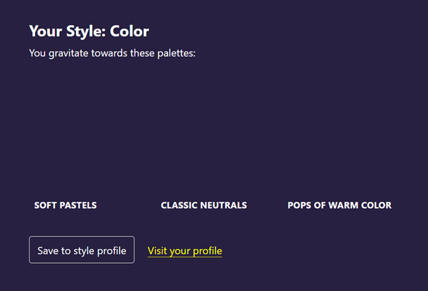
…the button, the text, and the links are all rendered in the user’s system colors—great! However, the palette swatches were adjusted to use the user’s purple theme, as well. Usually this is desirable for legibility. In this case, these swatches have meaning to the user and their original colors should be preserved.
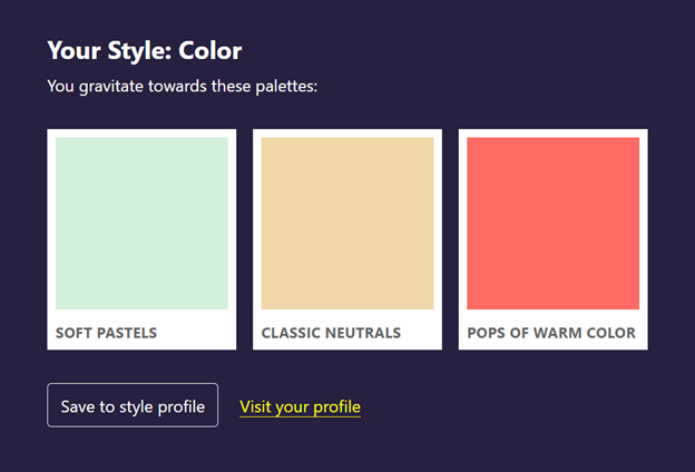
Our requirements for this widget are that:
- We preserve the color swatches in forced colors modes.
- The color swatches are always rendered on top of white or black, so as not to appear muddy. (Remember, users can set their theme colors to whatever they need!)
- The labels below the swatches are rendered in the user’s system colors, so that they can easily read the text.
First, we will detect a forced color mode using the forced-colors media query:
This removes the forced system colors, any text backplates (we’ll get to this in a bit), and any other adjusted CSS properties from the element and its subtree—basically rolling back any forced colors mode styling:
One of our stated requirements was that the swatches always render on top of a pure black or white background, so that these appear crisp no matter the user’s system colors (the swatches wouldn’t look great on top of a custom sepia-toned scheme!). The white background from our base styles is likely too bright for users who use a dark forced color scheme. We can swap this out for a black background by querying for the user’s preferred color scheme:
In Forced Colors Mode, prefers-color-scheme is evaluated based on the luminosity of the user’s preferred background color. In Chromium, a forced background with a luminosity of < 0.33 will match prefers-color-scheme: dark. Otherwise, prefers-color-scheme: light is true:
While we needed hex color values for this specific use case, web developers generally should avoid using static colors in forced color modes. It’s easy to make an incorrect assumption about what the user needs or accidentally introduce a visual contrast bug. Instead, web developers should embrace the use of system colors, which will automatically pick up whichever color the user specified.
Going back to our example, we can use CanvasText to apply the user’s text color, and Canvas to apply their background color:
Here are all our styles together now:
You can find a full list of system colors in the CSS Color specification. Check out the live demo.
prefers-contrast
In addition to the forced-colors media query, the ‘prefers-contrast’ media query was recently extended to include a forced keyword that can be used to detect when Forced Colors Mode is active. As such, the following two media queries will produce equivalent results:
The prefers-contrast media query is not yet implemented in Chromium, but authors can expect this media query to be available in future versions of Microsoft Edge and other Chromium-based browsers. This media query can be used to detect “less”, “more”, and “no-preference” states in addition to forced contrast. As previously noted, a preference for forced contrast does not necessarily equate to a preference for high contrast, though in the future the CSS WG may resolve to match “less” and “more” preferences automatically based on the user’s color scheme.
Adjusted CSS properties
When forced color modes are active, a scoped list of CSS properties related to color and similar decorations are adjusted in order to preserve the user’s color scheme, reduce visual distractions, and increase legibility. The CSS Color Adjustment specification provides a full list of properties affected by forced colors modes.
To take a common example, box-shadow is a versatile property which web developers can use to achieve various different glow and nested border effects. However, this property is reverted in forced color modes. If you use box-shadow to denote state this state information will be lost in forced color modes unless you plan accordingly.
For example, instead of completely removing an outline property and applying box-shadow…
You might use a transparent outline:
In forced color modes, you’ll get a visual outline on the element (as the color will be overridden by the user’s system colors), whereas in other modes you’ll get a visual box shadow:
Inheriting color in simple SVGs
Forced color modes do not adjust SVGs: these can be very complex documents, and the web developer has better insights than the platform as to how an SVG should be adjusted or not. But what if you just need a simple SVG icon to match the surrounding text color?
You can apply the currentColor keyword to fills and strokes within an SVG. Here’s an example with a logo, where we’ve specified a light and dark theme, but haven’t written any forced-color-mode-specific styles:
See the Pen
Forced Colors: Simple SVG Demo by Melanie Richards (@somelaniesaid)
on CodePen.
The computed color will be inherited from the SVG’s ancestors. Because we used the currentColor keyword in our base styles—as opposed to within the scope of a media query—the correct color propagated to the SVG across our light theme, our dark theme, and automatically in forced color modes:

currentColorText backplates
In addition to preserving the user’s systems colors and adjusting potentially distracting CSS properties, browsers that support forced color modes also draw “backplates” behind text. Text backplates were first introduced in EdgeHTML (legacy Microsoft Edge) after close collaboration with low vision users and help ensure legibility when text is overlaid on top of images:

This practice has been carried forward into standards-based implementations. Text backplates are not currently configurable by web developers, though using forced-color-adjust: none will disable these. We imagine that giving authors the ability to make subtle adjustments to the text backplate—e.g. changing border radius—could be an interesting future CSS feature.
Differences from legacy implementations
Standardizing forced color mode styling features brought an opportunity to reconsider legacy design choices and collaborate with other implementors on an interoperable approach. As such, there are some notable differences to be aware of between the new standards and previous high contrast support in MSHTML/EdgeHTML.
Syntax comparison
Most obvious among these changes is the update to CSS feature syntax:
| Internet Explorer and legacy Microsoft Edge | New Microsoft Edge and web standards |
|---|---|
| @media (-ms-high-contrast: active) {} | @media (forced-colors: active) {} |
| @media (-ms-high-contrast: black-on-white) {} | @media (forced-colors: active) and (prefers-color-scheme: light) {} Note: this is not exactly equal to the legacy black-on-white media query, which matched only specific default high contrast themes. The new implementation will observe the luminosity of the user’s background color in order to determine whether ‘prefers-color-scheme: light/dark’ are appropriate to match. In Chromium, a forced background with a luminosity of < 0.33 will be a match for dark color schemes; otherwise, ‘prefers-color-color-scheme: light’ will match. |
| @media (-ms-high-contrast: white-on-black) {} | @media (forced-colors: active) and (prefers-color-scheme: dark) {} Same note as previous. |
| -ms-high-contrast-adjust: none; | forced-color-adjust: none; |
If you need to support modern browsers and Internet Explorer, you can do so by stacking media queries and properties:
Note: there are also some behavioral differences—such as changes in how styles cascade—that you’ll need to account for if you plan to support both legacy and standards-based implementations. We’ll outline these updates in following sections of this article.
For compatibility purposes, the new Microsoft Edge will alias the original -ms-prefixed media queries and adjustment property to the new standard media queries. However, we plan to deprecate this aliasing in the future and recommend that authors adopt the new standards for forced color.
System color comparison
Some of the system colors that legacy implementations depended on are deprecated in web standards. New, standard system colors replace the old values:
| Theme color in Windows high contrast settings | Internet Explorer and Microsoft Edge Legacy | New Microsoft Edge and web standards |
|---|---|---|
| Text | WindowText |
CanvasText |
| Hyperlinks | -ms-hotlight |
LinkText |
| Disabled Text | GrayText |
|
| Selected Text | HighlightText (foreground), Highlight (background) |
|
| Button Text | ButtonText (foreground), ButtonFace (background) |
|
| Background | Window |
Canvas |
User agent (default) style differences
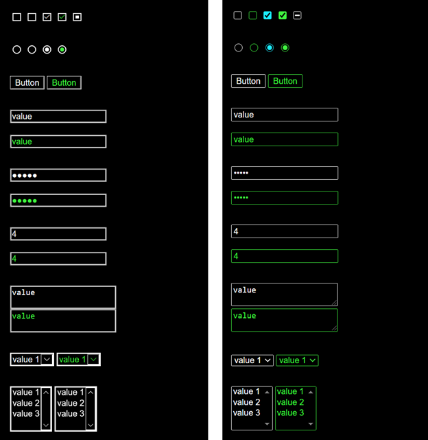
In collaboration with the Google Chrome team, we refreshed the native form controls for contemporary styles and accessibility improvements. This refresh included updated Windows high contrast designs.
In legacy implementations of high contrast support on the web, visited links rendered in the user’s “Disabled Text” color; this is because there is no “Visited Hyperlink Color” available in these scoped user color palettes. We received feedback that this color treatment was confusing, so visited links now get the usual “Hyperlink” color.
Behavioral differences
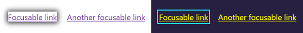
Most noteworthy for web developers is a change in how styles cascade in forced color modes. In legacy implementations of high contrast support, author styles set within ‘@media (-ms-high-contrast: active) {}’ would override colors applied by the browser on behalf of the user:
See the Pen
Forced Colors: Legacy Cascade Demo by Melanie Richards (@somelaniesaid)
on CodePen.
Taking into account implementability across browsers and cascade prior art, the W3C CSS Working Group initially rejected this legacy behavior and resolved that forced-colors-adjust: none is required in order to override styles in forced color modes. However, this resolution has recently been updated so that the use of CSS system colors by an author will override those set by the user agent. If authors wish to use non-system color values in forced color modes, they will need to supply forced-colors-adjust: none;.
See the Pen
Forced Colors: Modern Cascade Demo by Melanie Richards (@somelaniesaid)
on CodePen.
This behavior reflects the expectation that authors should nearly always use system colors when styling for forced color modes. The updated cascade behavior will be available in Microsoft Edge as of version 87.
Another upcoming change is how background images are treated. Internet Explorer reverted background images in Windows high contrast, but this caused user experience issues when CSS background-image was used for content images. Legacy Microsoft Edge fixed this issue by preserving the author’s background-image value. Standards have now landed on a middle ground: background-image will be preserved when the value contains the url() function, and reverted for all other background-image values (for example, linear gradients). This change will land in upcoming versions of Microsoft Edge.
Modern implementations also treat background-color a bit differently. The current approach preserves the user-preferred background-color on all channels except for the alpha channel. This change enables the web platform to provide more web developer flexibility for background styles, and legibility is still preserved due to the text backplates rendered behind text. This change has already landed in Chromium and Microsoft Edge.
Testing for High Contrast
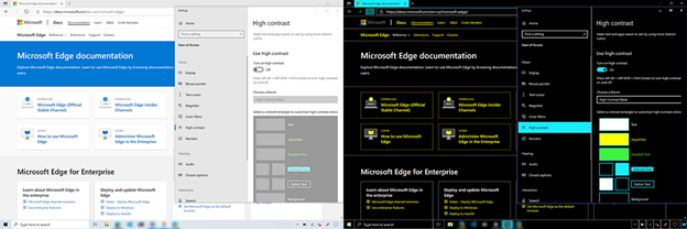
If you’d like to test how your website renders in Windows high contrast, on Windows 10 you can go to Settings > Ease of Access > High contrast, then “Turn on high contrast”. Switching between a couple different themes will give you a more holistic sense for how your site renders with user-selected colors. Windows high contrast can also be toggled on and off by pressing Alt + left Shift + Print Screen.
If you find issues or have any feedback, you can use the in-app feedback button (or Alt+Shift+I) or report issues in web content rendering using Chromium’s bug tracker. You can also reach out to us on Twitter.
We know that not all developers have access to a PC or a Windows Virtual Machine, and so we are working on a feature that will enable you to emulate high contrast within the Chromium DevTools. We’re excited to make Windows high contrast testing more efficient for developers, no matter your OS platform.
Thanks for testing your websites in Windows high contrast and contributing to a more accessible web for your users!
– Melanie Richards, Senior Program Manager, Microsoft Edge
– Alison Maher, Software Engineer, Microsoft Edge